Woohoo, I have done it!
My A Week In the Life 2011 album is officially finished. In about 3 short days I should have a nice and shiny Blurb photobook arriving on my doorstep.
And I could not be more excited.
Not only because I’m absolutely in LOVE with the finished album but because for the first.time.ever I have completed an Ali Edward’s inspired project.
Yes, that’s right, unlike my previous attempts at December Daily or A Week In the Life, this time around, my AWITL album will not be sitting on a shelf or in a folder on my harddrive mocking me in all it’s unfinished project glory.
Cue scrapbooking happy dance.
I’ll be the first to admit this project was a TON of work. Between spending a week documenting everything, selecting and editing photos, putting it all together, journaling, well…there’s a reason I just put the finishing touches on this album in September.
But I am head over heels in love with the end result, so all that hard work? Totally worth it.
As I mentioned in my pre-AWITL planning post back in July, my plan for my AWITL album was to create an 8×10 Portrait photobook through Blurb which I would design using Adobe InDesign. And I have to say, that plan worked out swimmingly.
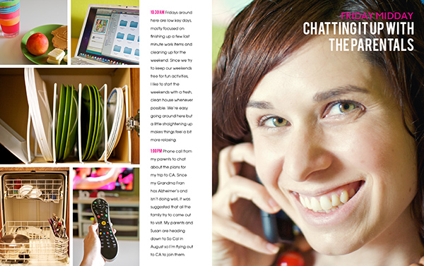
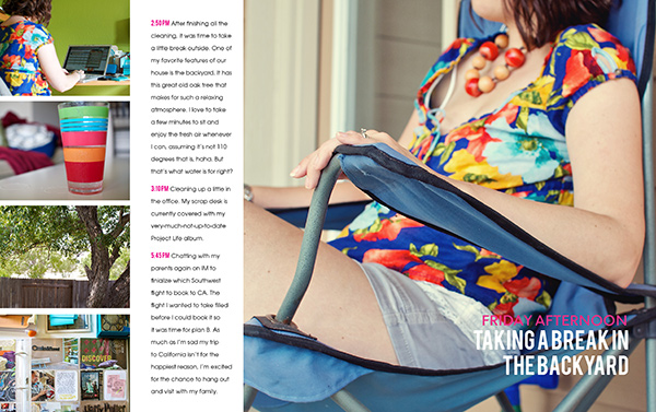
When I started brainstorming for my album, I knew I wanted the album design to be focused on words + photos with a clean, magazine style design and I also knew that I wanted to break my day into chunks (like morning, afternoon, evening) in order to simplify the documentation process.
But I wasn’t entirely sure about the exact design for my album until I came across this spread from an old West Elm catalog I had saved…
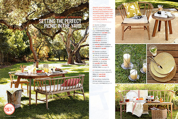
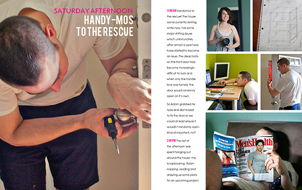
Not only did I love the clean design, the large focal photo and the fantastic use of type, but the theme for this particular edition of the catalog was exactly what I was looking to do with my AWITL album. The catalog was broken up into daily sections, with each spread themed around the idea of what furniture and accesories would be perfect for that part of the day (above is Saturday afternoon).
So I chose to use that page as inspiration and run with it for my album.
So with that in mind, I bring you my 2011 A Week in the Album…
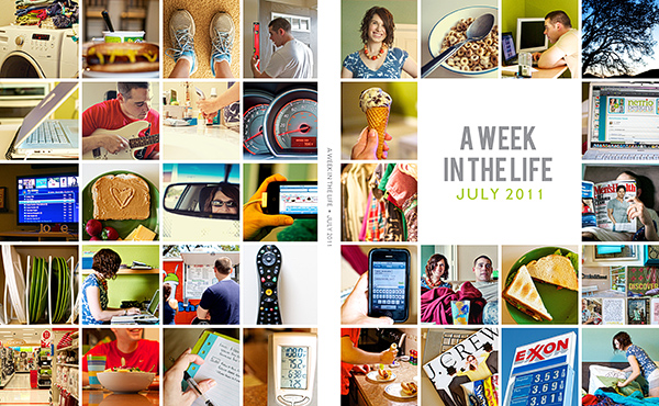
2011 Completed A Week In the Life Album
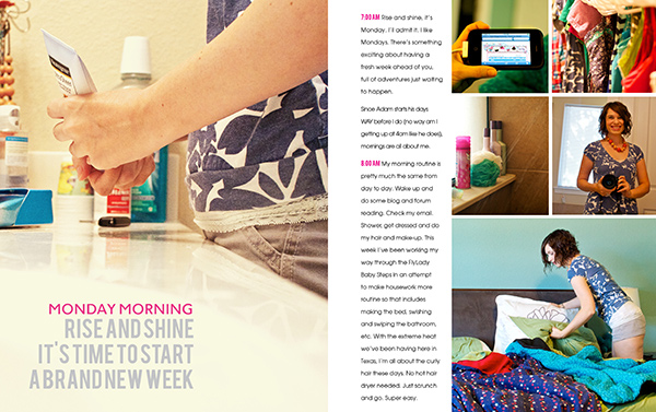
Below you’ll find the pages from my AWITL 2011 album. Each image represents a two-page spread made up of two side-by-side 8×10 pages. Since the spreads are rather small in order to fit on the blog, I’ve linked each image to a larger image on my Flickr account, in case you want to see the details or journaling.
Just a bit of warning, Adam and I are pretty awesome so try not to be too jealous of our super exciting life (and slankets), haha.
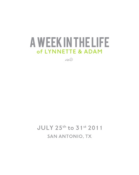
Cover + Intro
This may just be my favorite page from the album. Clean blocked design, yes please. It really brought everything all together.
I included our location, along with the date, on the intro page because, as a military family, where we live changes so often that it’s kind of necessary to document it, especially considering had I done this project in July 2010, we would have still been living in Colorado.
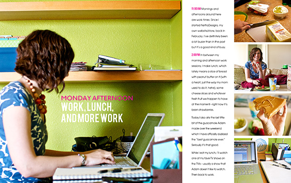
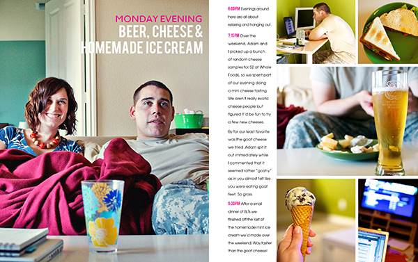
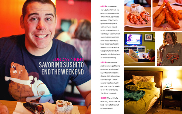
Monday
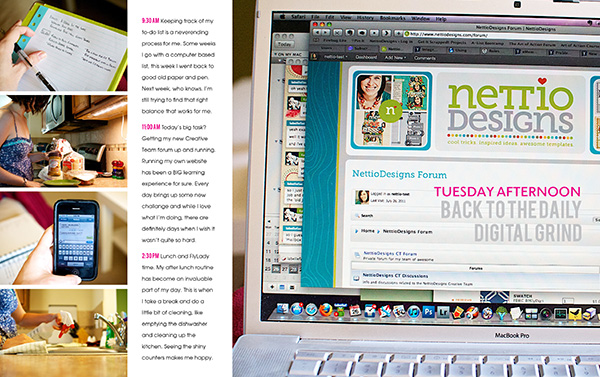
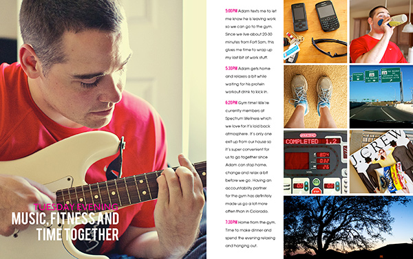
Tuesday
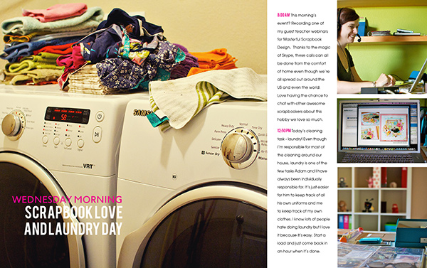
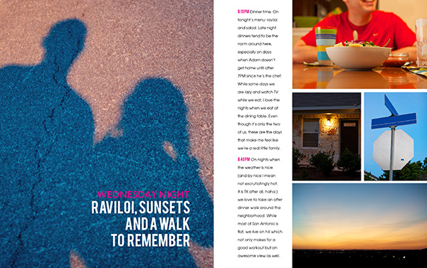
Wednesday
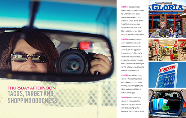
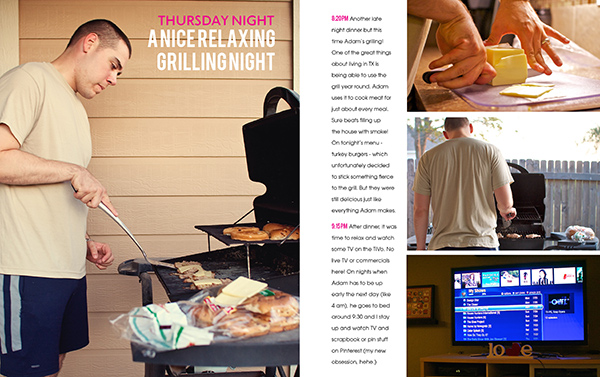
Thursday
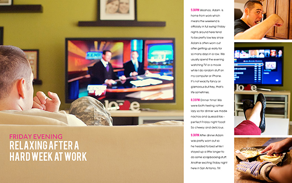
Friday
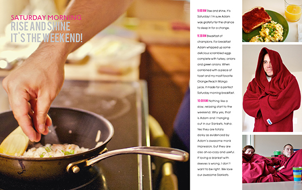
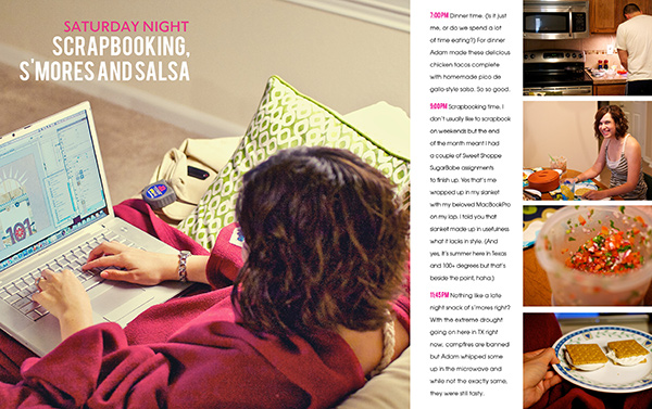
Saturday
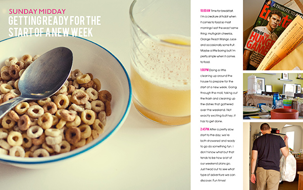
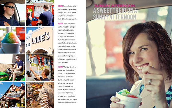
Sunday
A couple of notes about the design:
- Some days have more spreads than others, with a max of three spreads per day (morning, afternoon, evening). I didn’t plan which days would have more spreads ahead of time, it really just came down to which photos I felt told the whole story over the course of the week.
- It’s hard to tell without the page break line but the large square photos spread across two pages.
- I used a consistent accent color, pink, to tie all the spreads together. I’m not usually a pink girl but for some reason here I liked it.
- All the journaling is themed around time. I didn’t document the time as I went – I just used the time stamps from the photos and rounded to a nice number.
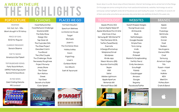
Highlight Pages
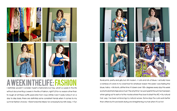
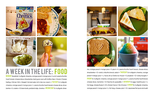
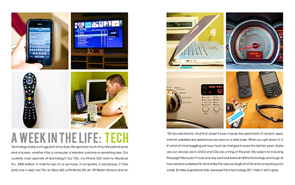
At the end of the album, I included some highlight pages that document some of the broader themes from our week, like food, clothing, etc. I figure it’ll be fun to look back on these pages years from now and remember laugh at all the things we use that no longer exist, haha.
Weekly Highlights: the journaling on this page came directly from a set of lists I kept in Evernote during the week. I loved the idea of capturing these items now knowing one day some of these items/brands will no longer be around.
AWITL Fashion: One of my goals for the week was to take a daily photo of myself in the mirror. I’m sure this page will be one of those that I cringe at years from now which is partly why I wanted to include it, haha. I mean, could you imagine if you had a page like this from high school? It’d be craziness.
AWITL Food: A simple list of the food we ate during the week. Again, I kept track of all this in Evernote so I just had to copy and paste it into InDesign.
AWITL Technology: A look at some of our most used tech stuff. I figure it will be funny to look back someday at what technology was considered “cool” in 2011. The future generation will probably be laughing at this page from their flying cars and in-brain computers, haha.
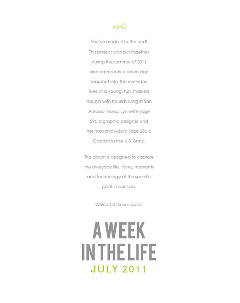
On the last page I included a little summary about who we are and what this album is about. It would have been a great intro page as well but since Blurb requires the first and last pages to be single pages, it worked better to include it here. I think it’s a nice little ending to the book.
And that’s my A Week In the Life 2011 album! In the end I ended up with 46 pages and I’m super thrilled with how it turned out.
This was my first attempt doing a photobook and I absolutely loved the simplicity and clean design of this format. Definitely something I’ll be doing again!
Lessons Learned from the Week In the Life 2011 Process
So what lessons can I take away from my first completed A Week In the Life album?
1) Having a plan is key
Having a clear design and plan before the week started made things SO much smoother.
Not only did I know what types of photos I needed (like the big focal photos) but it freed me up from feeling I had to capture every moment of every day.
2) Go with the best tools for the job
I’m sure I could have put together this album in Photoshop but using InDesign made it so much easier, especially when combined with the Blurb InDesign plug-in.
3) Take more detailed notes during the week
Next time I’d love to do more in-the-moment journaling rather than just keeping lists. Plus, trying to remember all the details a month later is tough.
4) Schedule time to complete the album
My biggest mistake this time around was underestimating just how much time and work it would take to put the album together. Next time I’d like to schedule time for working on each section of the album so I guarantee I can finished it in a reasonable amount of time.
5) Keep things simple
I know myself well enough to know if I tried to scrap all the pages for this album in my signature paper-lovin’ scrapbooking style, the album would never get done.
Which is exactly why I chose to keep things simple this time around. No fancy scrapbook products. Just words + photos. I LOVED it.
Having a clean, well-designed finished album definitely beats the pants off of an unfinished but super detailed scrapbook album any day.
A Week In the Life: Done and Done
And that’s it for my 2011 Week In the Life album!
By far my biggest take away from this project is I am actually capable of completing one of these major projects. That’s a pretty big exciting step for a girl who gets really excited about projects like this but then FAILS in the execution of them.
How about you? Did you learn any fun lessons from your finished (or unfinished) A Week In the Life album? Anything you would do differently? And is anyone else convinced like I am that Ali Edwards must have scrapbooking elves who come in the night to help her complete these projects? I love her projects but man are they a lot of work, haha.
If you have any questions about my album, please feel free to ask those in the comments section as well.
It looks amazing! I love that you added the appendix-like pages at the end! So smart! You’ll have to post pictures after you get the book. That’s always so exciting!
Glad to see a blog post again! 🙂
Thanks Natalie! And yes, I’ll definitely be posting pictures once I get the book. I’ve never ordered a photobook before so I’m not even sure what to expect, haha. And yes, I apologize for neglecting my poor blog. Hoping to do much better now that summer is mostly over. 🙂
Wow…congrats on the completion of your project. It’s beautiful, I love the clean lines and simplicity that makes it look so “together”. Great job. Thanks for sharing your finished project.
Thanks so much for the sweet comment!
oh WOW lynnette – i love love love this! i have never been inspired to do an album like this before (even though i love everything that ali does) – b/c i always felt like it wouldn’t “match” my other 12×12 albums w/ all my normal scrapbook pages … but this seriously is SO inspiring! i may have to do AWITL now! and completely copy you of course LOL! i LOVE the fashion pages especially – oh how i wish i had those from my youth and from my parents! LOVE this!!
You totally should! Matchy-matchy is overrated, it’s fun to mix it up every once in a while!
Okay I am SO blown away by your album! I love the clean design, your type choices, and how it all comes together! (Am giggling over Adam’s “Jedi” photo, lol!)
I LOVE your extra pages–the lists, the fashion, and the tech! I ended up doing a whole page on quick favorites during my week.
I thought it was a really nice touch that you added some other documenting details on the back of the book. This is one amazing album I’m sure you’ll treasure for years to come!
hehe, I’m still giggling over that slanket photo too.
Wow, Lynnette. Totally awesome!
Thanks Kellie!
yep, love love the clean design for projects like this. I did P365 in 2009 and keeping it totally simple was the only way I knew it was going to get it done. I used a set of templates given out at SBG at the beginning of the year- picked 2 pages out of the whole set and did my whole album with just that. I kept up with putting the pages together on a weekly basis- usually Friday nights- and when January 1 rolled around again I had an album ready to send to the printer. I love that book 🙂
Your album is great. I adore those end pages- especially the technology ones. I think you will be right and it will all seem old and antiquated in another 10 years LOL Congrats on getting it all accomplished! I’m still working on my summer staycation album- I think it is about half done. School and fall dance started and life got crazy again.
Yes I am a big project=clean design convert. SO much easier to get done and it still can look awesome. Plus I love me some clean, magazine style design anyway…
That’s awesome that you kept up with P365! My P365 album was a big fail, haha.
I didn’t start out 2009 thinking I was going to do it. There was a lot of talk in digiland about it at the end of 2008, but I wasn’t sure I could keep up with it so I was reluctant to commit. I ended up taking pictures every day in January without intending to and then into February. By then I was carrying my camera around with me everywhere and it had become a habit, so I stuck with it. Here’s my album:
https://www.facebook.com/media/set/?set=a.49851798732.64756.756953732&l=a8fe779606&type=1
See, I’ve done the everyday photo taking part several times. I just never get around to doing anything consistent with them, haha.
Your album is beautiful though! Love all those clean lines…
Holy macro!! Wow Lynnette, you outdid yourself!! Sooo gorgeous!!
Thanks Yari!
Damn, girl! That book is A-MAZING! Now I wish to redo my AWITL book… LOL! Must keep this in mind for Dec Daily – if I choose to attempt that again this year… and yes, you are not alone in your thinking about the elves that habitat Mrs. Edwards’ studio… ha ha!
LOL, don’t go doing your AWITL book, I’m sure yours in awesome too! And yes, December Daily is my other arch nemesis, will have to think about what I want to do for that project this year because what I’ve done in the past is definitely not working.
Do you think she’d be willing to share her scrapbooking elves? I could use some around here…
Oh Lynnette! I LOVE your take on AWITL!!! The clean style, the typography..and especially the listy details at the end in appendix form! Brilliant!!!
Aww, thanks Sara!
COMPLETELY Wonderful! I am in awe! I am the same as you… many attempts at the amazing Ali Edwards projects with HUGE fails on all counts. I started by AWITL album for this year, and am on day 2. 🙁 Love the clean design of your album! You are seriously inspiring! ♥
LOL, I’m glad I’m not the only Ali Edwards project failure. I imagine there are more of us who don’t finish than do, haha.
Lynnette, this is fabulous! I so wish I could conquer such a project!
Thanks so much Erica! Trust me, if I can do it, anyone can, haha.
Truly amazing, Lynnette. I am envious of your scrapping awesomeness and your beautiful finished book!!
Aww, thanks Kathleen!
Wow Lynnette, this is such a wonderful book! Your photography is beautiful and I LOVE how you included all those extra details at the end. Thank you so much for sharing this, you have inspired me! 🙂
Thanks so much for your sweet comment Kate! 🙂
Wow Lynette, that is one rocking album! I love the graphic style and your photos. Great, great job!
Thanks Kim!
I LOVE your album, it’s absolutely gorgeous. I completely failed at week in the life this year. I may have another go during a random week at some point. The conclusion I came to is that my life is just too boring during most of the time but I like the way you’ve done spreads for mornings, evenings and suchlike. I also noticed that I didn’t notice that you’d not got the same number of pages for each day until you mentioned it!
Well, I’ll say that no one’s life is too boring to document but yes I do understand how it can feel that way with this project! I tried to do AWITL once when my husband was deployed and it was just me – totally boring, every day was the same. I decided I didn’t need to document all that and that was ok, LOL!
Lynnette!!!!! I LOVE this. you did such a great job! I am so amazed by your album, too. REALLY awesome!!
Aww, thanks so much Amber!
WOW, this is absolutely amazing!! I am in love with all of your photos, the design, your type work…everything! Definitely inspired to create a book like this now 🙂 Thanks for the inspiration, again…you always inspire me 🙂
Aww thanks Jennifer! You should totally do a book. I’m so incredibly glad I did even if it was a lot of work.
What a great book Lynette! I love how you used InDesign and I’ve been wanting to break out and add that software to my arsenal. Was it hard to make the templates using InDesign? Love your graphic look and the parts you added at the end on fashion and food. It was funny because as I was looking through your book I thought to myself, “I like her style. I need to dress up a bit more.” Then I saw your fashion page and laughed. So way to go! A really, nice book which I would love to scraplift someday!
Saw you are from San Antonio. I’m heading there tomorrow with my mom for a trip. Looking forward to some fun photography time. Any recommendations?
Aww, thanks! Making the pages in InDesign was actually really easy since multi-page documents are what it’s designed for. It was definitely easier than doing it in Photoshop! And thanks so much for the style comments since I never think I have style, LOL.
Woohoo for coming to San Antonio, you’re here just in time for our cold spell…of low 70s. LOL I’m not originally from here as my husband is military but we’ve been here for a little over a year now. As far as recommendations, the Riverwalk/Alamo is really popular, Brackenridge Park (where the SA Zoo and Japanese Tea Garden are) is really pretty with lots of trees and such. If you want to venture outside of San Antonio, New Braunfels, Fredricksberg and Austin are all fun. Most of our local adventures revolve around food, haha, so I can tell you if you’re looking for good mexican food, we highly recommend Paloma Blanca in Alamo Heights, Rosarios in Southtown and Acenar down on the Riverwalk. Hope that helps and have a great trip! My parents were just here visiting from CA and they had a great time!
Okay, so I’ve come back to look at your book & process about 600 times now and love it more and more each time. I feel like a stalker of this series of yours!
Do you think you’ll be selling the ID templates? I’d LOVE to buy them! I have a 4 month old and am thinking of trying to do a couple AWITLs each year (at least at first) to highlight how much our routines change as our daughter grows and just love your designs and format.
Aww, thanks Maggie! So glad you’re enjoying the process! I have had a couple requests for the ID templates so I may consider them in the future. Will definitely let you know if I do!
I LOVE it, your clean design will never go out of style and you take fantastic photos that really look great in a spare magazine style layout. You will be very happy you’ve got this years from now!
Aww, thanks! I really love the clean, magazine look too. 🙂
This knocked my socks off and has majorly inspired the ‘Week in the Life’ I plan to document next month! LOVE LOVE LOVE.
Thanks Amanda! I’m planning to do Week in the Life again in September too and I’ll definitely be sharing my process again.
Where can I buy your WITL template?
Hi Rosa! You can find them in my shop here:
8×10 version: http://modern-school.flywheelsites.com/shoppe/product/photo-frenzy-awitl-8×10/
12×12 version: http://modern-school.flywheelsites.com/shoppe/product/photo-frenzy-awitl-12×12/
Both of those sets include cover templates, all the pages for the book and the WITL highlights pages found at the end. If you have any other questions about them, let me know!
Thanks Lynnette. I was looking for WITL templates and didnt see that photo frenzy was the right template! thanks!
Hey, I was wondering what program you used to create your Highlights page on? I love the way your book turned out I’m trying to make an awesome Family Yearbook.
Hi Lea! I used InDesign to create my original page but I also have a Photoshop template version available as part of the PhotoBook Frenzy templates in the shop: http://modern-school.flywheelsites.com/shoppe/product/photo-frenzy-awitl-8×10/