On Tuesday, I shared my completed A Week In the Life album (you can see it in all it’s photo-y goodness here). Now I don’t know about you, but I am always curious nosy when it comes to how people tackle large projects like this, so today I wanted to offer a little behind-the-scenes peek at how I put my Week in the Life photo book together.
Let me preface this by saying that this was my first attempt at creating a photo book so by no means do I consider myself a photo book expert. I’m just sharing what worked for me.
The tools I used:
- Apple Aperture
- Adobe InDesign
Yes, you read that right. No Photoshop.
Ok, well, that’s not entirely true. I did use Photoshop to run my most favorite Totally Rad “Lux” action on my big 8×10 and 10×10 focal photos.
If you’re wondering why I chose for this project to go with my first Adobe love, InDesign, over my old scrapbooking standby, Photoshop, there were a couple of reasons:
1) InDesign is designed for multi-page projects
In order create this photo book in Photoshop, I would have had to create a separate document for each page of my album. But because InDesign is built for multi-page print publications (think magazines, newspapers, books, etc), I was able to create one single file that included all 46 pages of my album.
Definitely WAY easier than keeping track of 46 individual Photoshop documents.
2) The Blurb InDesign PDF to Book plug-in
One of the reasons I chose to go with a Blurb is they offer a free downloadable PDF to Book plug-in for InDesign that creates a custom book template for you based on the size and number of pages you want in your photo book. And it includes all of the trim and bleed information right in the template so you don’t have to worry about parts of your text or images getting cut off. Plus you can save the entire file as a PDF and upload it directly to print. So so easy.
Now if you’re wondering if this means you need InDesign to your long digital goodies wish-list, the answer is NO. You can absolutely use Photoshop to create a photo book – lots and lots of scrapbookers do.
BUT if you’re one of those scrapbookers who happens to own the Adobe Creative Suite and has always wondered what you could use InDesign for scrapbookingwise, this post will give you a little overview about the awesomeness that is InDesign.
But before we get to InDesign, I want to talk a little bit about the first big hurdle for this project – the photos.
Part 1: Organizing Photos in Aperture
Over the course of A Week in the Life, I took over 750 photos. That’s a lot of photos! So I needed an easy way to select and edit my most favorite photos.
Enter Apple Aperture.
In another post I’ll explain more about why I’ve made the switch from Adobe Lightroom to Apple Aperture but for now, all you really need to know is that if I didn’t already love Aperture before, this project totally made me head over heels in LOVE with it.
After uploading all my photos from my Canon Digital Rebel XT, my Nikon P&S and my iPhone, I started organizing them in Aperture.
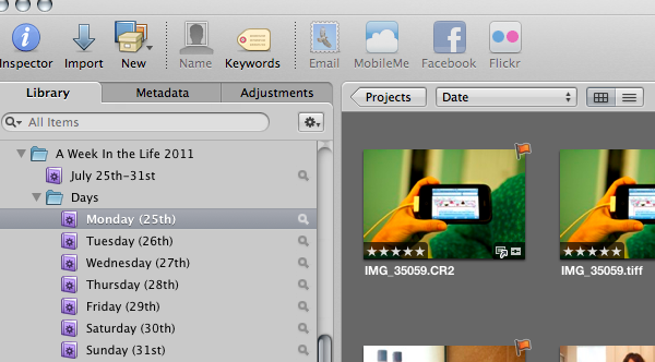
First I made a project folder for A Week In Life 2011 and added Smart Folders that pulled photos taken during the week divided by days:
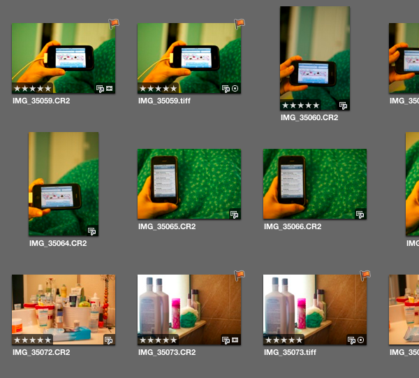
Next I added a five star rating to all the best photos, being careful to limit the number of too similar photos:
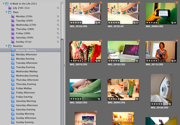
Once I had my five-star photos selected, I created Albums for each section of my days (I called them Routines) and dragged the five-star photos into their correct albums:
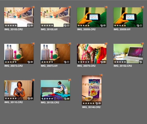
My final step was to Flag the small number of photos I wanted to include on my page. These are the only photos I edited and exported as JPGs to use in InDesign. As I mentioned, I used Aperture to edit the majority of my photos. The only photos that went to Photoshop were the large focal photos so I could add a little extra punch to them with my Totally Rad Actions.
My flagged photos (which you can also see in the earlier photos but only because I’ve already done the project, haha):
I then repeated this process for each daily routine album.
If you’re wondering why I chose to mix the flags with the star ratings, the answer is personal preference. I liked that it was easy to see the flagged photos rather than trying to see the difference between say 3-star and 5-star photos. You could definitely do it a different way, this was just what worked best for me.
Writing it all out it seems like a lot of steps but it actually went rather quickly. For all you fellow math nerds, here’s a little numbers breakdown of the photos at each step:
- 162: Number of photos taken on Monday
- 99: Number of photos that received a 5-star rating
- 40: Number of 5-star photos which were moved to the Monday Morning routine album
- 8: Number of flagged photos for Monday Morning which were then edited and exported as JPGs
- 6: Number of photos that made it onto the final version of the Monday Morning routine page in the photo book
Because I already had my design planned out, I had to be pretty ruthless since I knew at most I could only have 7 photos per spread.
Once I had all my photos edited and exported, it was time for some InDesign fun.
Part 2: Putting It All Together In InDesign
I don’t want to get too detailed about how I use InDesign, only because, if I did we’d be here all day and this post is already getting long, haha.
But I did want to show you the highlights of how I put my album together with InDesign. So if you’re curious in knowing more about InDesign or would like some more specific details/questions answered, please feel free to ask in the comments section.
My first step in InDesign was to download and install the Blurb PDF to Book plug-in. You can find the plug-in here.
Once you have the plug-in installed, you’ll be able to go to the File menu and find the Blurb Template Creator, which will bring up a dialog box that looks like this:
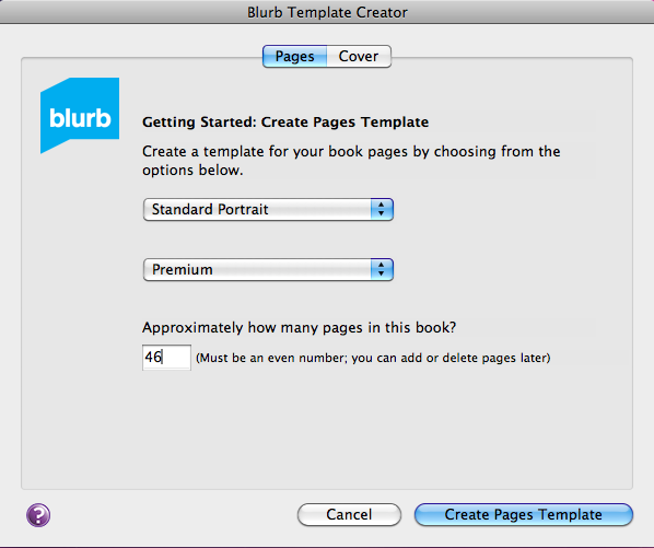
There you’ll choose the size of your book and the type of paper you want (some paper is thicker than others) as well as the number of pages.
If you’re not sure how many pages you’ll need, don’t worry about it. You can always add and remove pages as you work. The only time the correct page count matters is when creating your cover so make sure you don’t create your cover until you’re completely done with your book (or at least 100% sure on your finished book page count).
Once you’ve inputted all your book information, Blurb will create a book template that looks like this, a two page side-by-side spread just like you would have in the finished book:
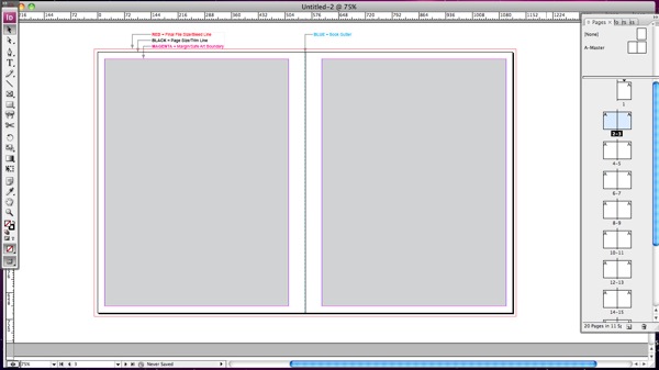
That main area is where you’ll design your pages and on the right side of the window, you have a list of all your spreads.
At the top of the page Blurb has included some bleed/trim information for the book. Here’s a closer look:
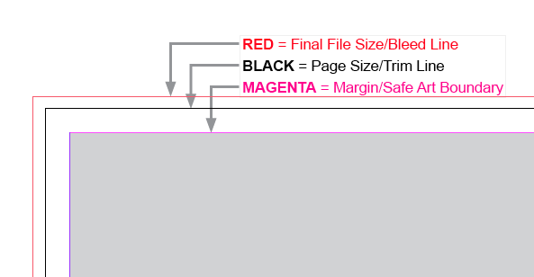
Included are are three sets of lines: one for the safe area, one for the trim area and one for the bleed area.
The black trim line represents the physical edge of the book pages while the big grey box is considered the “safe zone.” Anything important (like text) should go in that grey box as due to trimming inconsistences, Blurb can’t guarantee that anything outside that box will for sure not be trimmed. It shouldn’t be, but it’s a better-to-be-safe kind of thing.
The red outer line represents the bleed line. If you want your photos to bleed to the edge, aka no white edges, you want to make sure your photos go all the way to that red line.
In terms of designing the album, InDesign is a lot more simple than Photoshop in that you don’t deal with layers in the same way. It’s pretty much all boxes: either image boxes or text boxes.
The weekend prior to AWITL, I created two master pages (essentially templates) to serve as foundation pages for my design. This is what my two master pages looked like:
8×10 Focal Photo:
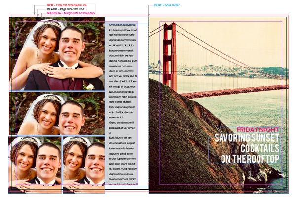
10×10 Photo:
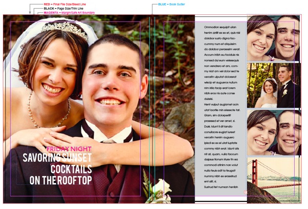
haha, yes, those are our wedding photos. They happened to be in an easily to grab folder along with these other prints.
To create my pages, I simply replaced the photos (in InDesign it is MUCH easier than Photoshop to replace and resize photos into pre-done image boxes) and adjusted the image and text boxes based on the number of photos I had chosen for that portion of my day.
Let’s just say there was a lot of repetition in this project – duplicating spreads, replacing photos and adding new text.
As far as planning, other than the basic design of the master pages, I didn’t have all my pages planned out in advance. I just moved the boxes around as I saw fit based on how the overall album was coming together. One of the great advantages of InDesign is you can see ALL of the spreads at once and really get a birds-eye view of how it’s all flowing together.
Now here’s the part in the cooking show where I miraculously pull my pre-made finished dish out of the oven. *cue the wavy time-is-passing lines*
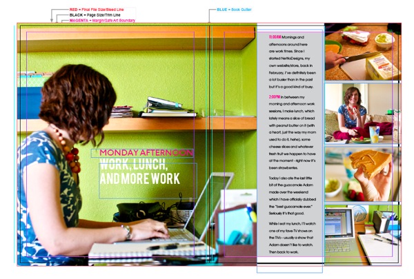
Here’s what my finished album looked like in InDesign after all the moving and replacing:
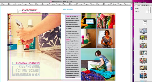
One of the finished square photo pages (if you look closely you can see how the big photo bleeds across the book spine and onto the second page):
A little bit more of a close up:
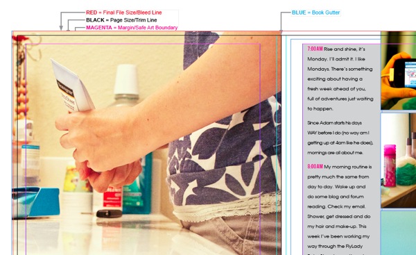
So you can see all my text is within that gray safe zone and all my photos bleed to the very edge where the red line is because I didn’t want any white space at the edge.
Here’s what the finished page will actually look like in the photo book (minus the grey background):
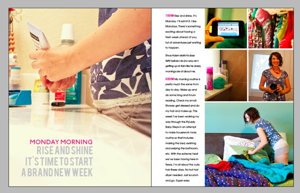
It’s kind of hard to tell from the screenshot, but everything outside of the black trim line has been basically “trimmed” to give a more realistic look of what the book will actually look like in print.
I haven’t received my printed Blurb book yet (possibly Friday!) so I’m not sure how much will really be trimmed off but I’m hoping it’ll be similar to this look. I’ll definitely be sure to share whatever happens!
Anyway, I hope you enjoyed this little long peek into the inner workings of InDesign, Aperture and my A Week In the Life album. If you have any questions or anything, feel free to leave me a note in the comments section!
Psst…want more A Week In the Life 2011 goodness? See all my AWITL posts here.
Can I take Levitra if I am taking other remedies at the same time
This is seriously awesome!! I worked in InDesign tons in college and long before I ever opened up PhotoShop. Looking at these screen shots is like coming home. I remember how much I loved InDesign. I still think about some of the options I miss about ID as opposed to PS. (It isn’t possible to link text boxes in PS so that your words go from box to box is it? I really wish it were…especially when journaling on several different word strips.) I am seriously going to have to do something similar to this in the future. I love the clean lines and the simplicity of the overall look. So super cool. I’m excited to see pictures of the book!!
Me too! InDesign was my first Adobe love – learned it way before I learned Photoshop. I definitely miss the text features the most – columns, linking text boxes, easy text wrap. If only dropshadowing wasn’t so difficult in InDesign, I would scrapbook with it more often, haha.
Hello!!!
Just discovered your blog and awesome project!! Your pages look soo fantastic!! And now I’m really curious to try InDesign, which is waiting for work on my laptop for such a long time already. Your explanations are really great and I think I will have to try some things with InDesign, too 🙂
Thank you very much!!!
And you can be soo proud of your photo book!!
Have a nice weekend!!!
Hugs,
Stephanie
Oh yay, so glad you liked the InDesign tips! Thanks so much for your sweet comment!
wow! that’s a lot of work…i so admire all of you who tackle these things. maybe one day i will be this ambitious too!!!
Well it took me many unfinished attempts to get to this point so I say, if I can do it, anyone can, haha.
What an awesome share of information! I’ve always wondered how to utilize the other Adobe products and this is a great example of the power within. Thank you again for your time in sharing this ‘behind the scenes’ with us. I’m bookmarking it just in case I ever get the confidence to take on one of these giant projects. You truly are an inspiration.
Aww, thanks! So glad you enjoyed it!
Did you ever write a post about why you switched from Lightroom to Aperture? I’m DYING to know. I tried Aperture and wasn’t a huge fan (mostly because it ran very slowly on my computer), but I WANTED to like it, so I’m curious why you made the switch!
I haven’t yet but it’s on my short list of posts for after the new year! I can tell you that a big reason I switched to Aperture was that I hated the way Lightroom organized photos. It was very clunky to me where as Aperture makes it so simple and easy. In a lot of ways it’s kind of similar to my switching to a Mac in the first place – it’s just a much better fit for how my brain works. That’s kind of the abridged version of the story, haha, but hopefully that helps a little!
As far as the slowness issue, I did run into that as well but I followed these directions: http://techpatio.com/2010/apple/aperture-3-performance-fix-slow-aperture-run-faster and that helped a ton. I’d say it’s almost as fast as Lightroom now but since I love it so much more than Lightroom, I’m willing to put up with a little slowness.
Thank you for the tip on the slowness issue!
Thank you for sharing your process! I’m toying with the idea of making a digital Project Life album in InDesign for 2012 and sending it to Blurb, so seeing your steps is incredibly helpful! 🙂
I just came across this site and you have a nice blog thing going on here. Lots of good reading. I do have a couple of quick questions:
1. How did the book turn out, especially as it pertains to the trim line “simulation” you did above. Did it turn out as you expected? I’m a little anal when it comes to numbers, measurements, etc. As such, I’m creating a blurb photo book, using the InDesign template, and I’m trying to work the positioning of my page numbers on the master page. In principle, I’d like them to appear below the margin, but above the trim line; however, I don’t my book to come back with jacked up page numbers.
2. I see you have images that span two pages (at least, to an extent). How did that turn out in your book? I plan on have a number of two-page spreads and I’m concerned about how I should handle the gutter area to minimize image loss at the binding edge.
Thanks!
– mpt
Hi Mike! So glad you found my little slice of digi land!
I was really impressed with how the Blurb book turned out. I would say the trim was pretty true to the template. I didn’t notice anything cut off from the edges but I did notice that on the one page where I accidentally included text that was outside the safe zone, it did end up in the gutter. So my advice would be to include any text you want in that safe zone just to be sure. If I were adding page numbers, I would probably place them right along the bottom line of the safe zone so they were out of the way but still guaranteed to print properly.
As far as the photos that span the pages, there’s another post here where I talk about how the finished book came out and include some photos that should give you a better idea of how they looked. I read a bunch of different options for how to account for the gutter, including duplicating a small portion of the photo that would be hidden, but in the end I just left the photo as is and made sure whatever was in the gutter wasn’t important. (This is what Blurb’s official recommendation is since it’s hard to account for the thickness of the book, paper type, etc.) So they aren’t perfectly matched across the page but I’m happy with how they turned out.
Hope that helps and if you have any other questions, just let me know!
I got here through the interview in “Tell your story every day” and I find your “A week in the Life”-project totally awsome!!! I also prefer Indesign for projects like this but I feel a bit lonely browsing the web searching for inspiration because most people seem to do their projects in Photoshop. I already downloaded the plugin from Blurb but haven’t started making my layout yet. Reading how you did however gave me so much energy I think I wil start this weekend. Thank you for the inspiration! 🙂
Hi Steffanie! So glad you stopped by my little digi home! It’s always nice to meet another InDesign fan. I’d love to see what you create so be sure to stop by and share when you get it done. 🙂
Guess what, the book is finally finnished! 92 pages and 362 photos about my sons first year in this world – phew! Here are some screenshots: http://www.flickr.com/photos/steffanie/sets/72157630448268068/ Thank’s again for the inspiration! 🙂
Woohoo, awesome Steffanie! It came out fantastic!!
I just came across your page after searching the web for using in design for creating scrapbook pages. I’m delving into In Design and using it for my Project Life Week cards. I have In Design 5.5. I’m loving it for the ease of doing typography. I’m still a newbie at it but it is pretty slick. Is it possible to create a template in ID that could translate over in PS? E.g. do you think designers make templates in ID and then somehow get them into psd or tiff files so they can sell them? I’m just curious. I’ve made all of these PL week cards in ID and would like to share them with my friends who are PS users. So how can I give them an editable file that would work in PS?
So happy to have found your blog.