Friday was an awesome day around here. Sure it may have officially been my little sister’s birthday (happy belated birthday, Alyssa!) but the FedEx man arrived with a special gift just for me…
…my A Week In the Life Blurb photobook!
And as promised, I am back with photos of my new prized possession as well as some final thoughts about my entire A Week In the Life 2011 adventure.
Having never ordered a Blurb photo book before (or any photo book for that matter), I’ll admit I was a bit nervous about what to expect. So nervous in fact, that I let the box sit unopened until Adam came home and made me open it, haha.
But I have to say, all my worry was for nothing, as the photo book is gorgeous. In fact, I think my response when I opened it was something like, “wow, it’s like I’ve been published!” Somehow I didn’t expect it to be so, uh, officially book-like, haha.
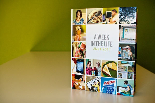
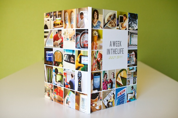
Here’s my AWITL photo book in all it’s hardcover glory. I went with the Image Wrap option which meant my custom designed cover is printed directly on the book and wraps around to the back.
I love love love it.
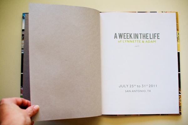
The first and last pages of the album are a really nice grey linen-ish paper.
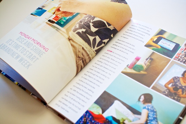
I’m chose the Premium photo paper for my book and I’m so glad I did. You can definitely tell it’s photo paper – the pages are nice and sturdy without being too thick.
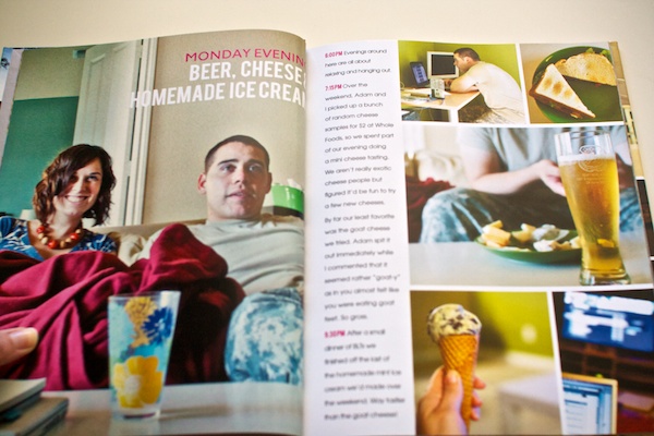
A look at one of the 10×10 photo spreads. These were the pages I was most concerned about because I wasn’t sure how the image would look being spread across the gutter.
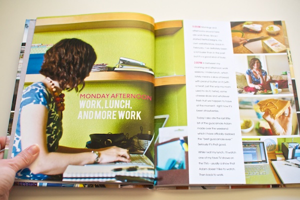
I had seen directions online about how to duplicate parts of the image to fill the gutter, but there was a lot of variables involved (like page and book thickness), and no guarantee it would work, so I decided to instead make sure whatever part of the image that was in the gutter was non-essential. If I were to do this again, I might play around with it more but I think it worked out mostly fine.
If you look closely at the bottom of the photo you can see where the computer screen doesn’t quite match up but in person it’s a lot less noticeable than in this photo.
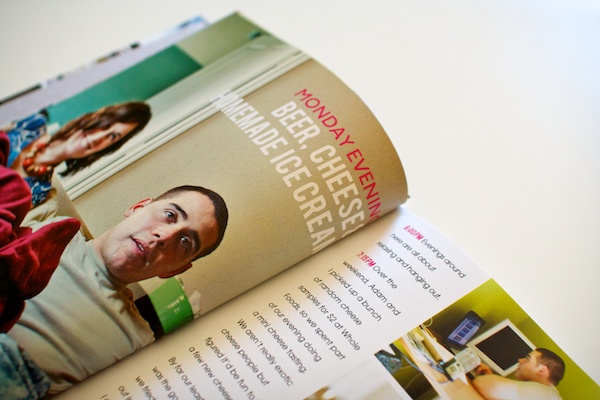
I did have one page where the text ended up in the gutter. I’m not sure what happened but I suspect the title moved when I was doing all my journaling and I somehow didn’t realize it. Lesson learned, definitely double-check that all your text is in that lovely grey safe area box!
If you open the page a little farther, you can see the end of the title, it’s just a wee bit closer than it should have been. Oops. Poor cutoff title.
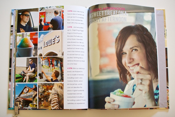
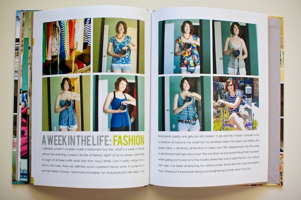
On a happier note, this might be one of my favorite spreads. I really love that photo blocking on the left page.
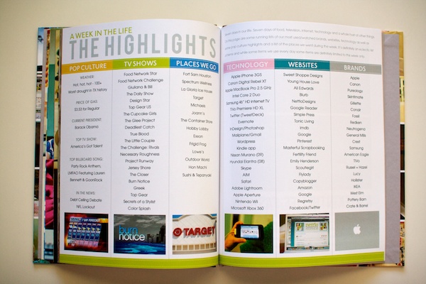
A look at two of the highlights pages:
On the last page of the album Blurb included their cute little logo.
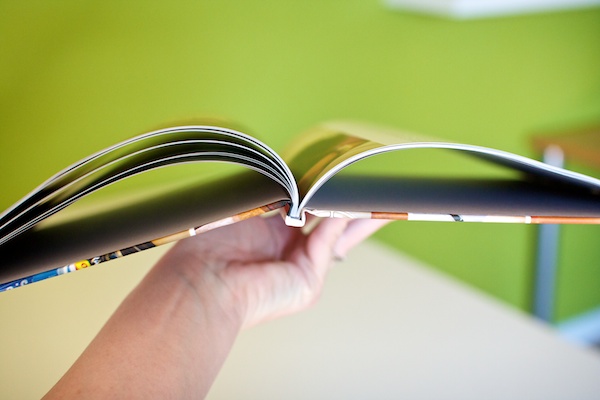
A little peek at the spine:
The back cover…
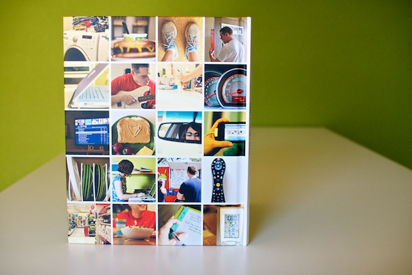
And the entire cover all together:
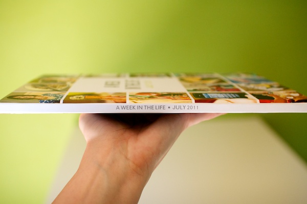
On the outside spine of the book, I included the title of the album and the date. I can totally imagine a bunch of these books lined up on a shelf.
A Week In the Life 2011: My Final Thoughts
Blurb Photo Book: Blurb definitely gets my stamp of approval. I’d heard a lot of horror stories from other scrapbookers who have printed photo books from other companies, so I wasn’t really sure what to expect, but the quality of the Blurb book is fantastic and the color and trim on the pages is totally true to what I saw on my screen. Plus using their PDF to Book InDesign Plug-in made the whole bookmaking and uploading process SO easy.
Photobooks in general: I definitely see more photo books in my future. I absolutely LOVED the clean photos + words format. I can see so many uses for it. I don’t see myself switching to printing my digital layouts in photobooks any time soon, but this project has definitely inspired me to tackle some of the photobook projects I’ve been wanting to do for awhile, like our wedding book and our year in Korea album.
A Week In the Life: I heart this project. A lot. Sure it’s a TON of work but the end result is so so worth it. Adam said it best – it’s like a time capsule of our life. And that is so so very cool.
Favorite AWITL moment: Adam’s dramatic reading of day one of my A Week In the Life album. If you think it’s weird to have other people read your journaling, try having them read it to you out loud in a dramatic fashion. Totally awkward and hi-larious.
More than anything, what I’m taking from this A Week In the Life 2011 adventure is this: I can do this. I can set out to do one of these major scrapbooking projects and actually finish it. Maybe not as quickly as someone else but as long as I stay focused, I’ll get there in my own time.
As someone who tends to leave behind a wake of unfinished projects, that is one awesome lesson to have learned.
What about you? Have you learned any awesome life lessons lately? Have you seen the photo book light like I have? Have any photo book adventures of your own to share? Feel free to let me know in the comments!
Psst…want more A Week In the Life goodness? See all my AWITL 2011 posts here.
Interested in creating your own album? Check out the Photobook Frenzy Photoshop templates in the shop.
Oh that is AWESOME, Lynnette! I’m so super inspired and I think for next year I shall adopt your photos + words layout. I hope to also print out an album (I kept it all digital this year). What am I saying–I hope to print out ANY photobook, lol. Yes, I haven’t printed out any albums yet *ducks* lol
LOL, well it’s taken me five years to work up to printing a photobook so I wasn’t exactly speedy either, haha.
Lynnette, I love your WITL photobook! Totally inspired by it. Instead of doing the Blurb book for WITL, I’m now thinking this format would be AWESOME for documenting trips! Thanks for sharing your book!
Thanks Christine! And yes, I’m totally loving the idea of using this format for travel books too. I’m terrible about scrapbooking travel albums but I could totally see this working for me.
Oh, that looks totally AWESOME!!!! It totally looks like a published book and love how it turned out when crossing the gutter. I’m totally going to have Mark read me my journaling dramatically… I bet we’ll be ROFLOL!!!
LOL, you should! It was hilarious but totally awkward for me. I finally told him he had to stop because it was just way too weird to hear what I’d written like that, haha.
PS- I have printed Shutterfly and Artscow books before and they turned out fine, both as photobooks and layout books. But I really want to try Blurb for my New 52 adventures this year.
Oh good to know! I think what scared me about some of the other options was having to worry about bleed and trim and all that. I like that Blurb made that so easy. But perhaps I am just a bit of a photobook wimp, haha.
OMGAAAAAAAAAAAAAAHHH!!!
That is AH-mazing Lynnette! So so so so very amazing! Now make more photobooks! Haha!
LOL, thanks Aggie! I’m glad you approve, haha.
That is seriously so awesome! I’ve still to figure out if I want to make my own WITL project in album or book format (see, you’re not the last one working on this project!). Seeing your book made me really lean more against the book option than the album option, though. I don’t have much extras to put in an album anyhow.
Thanks for sharing! 😀
It is rather comforting to hear I’m not the only one still working on this project, hehe. I really don’t think you can go wrong with the photobook especially if you don’t have any extra memorabilia. Since I’m doing Project Life already, I figured I didn’t need memorabilia for this project too which made the photobook an easy choice.
Wow! It looks amazing. I’ve already been looking at the Blurb site and you’ve convinced me their quality is top notch!!
To be fair, I haven’t printed with any other photobook company but I tend to be rather picky and I was definitely impressed by the quality!
Your book is awesome, Lynnette!! I keep toying with the idea of trying a photobook and this has just given me another nudge in that direction. I love the clean, graphic look! Thanks for sharing the process and completed book 🙂
You totally should! I put off doing a photobook for like 5 years and now I’m just wondering why I waited so long, haha.
That is so totally awesome.. I wan’t to print one up for my son’s mission in a few months of all the layouts I did for him. I will put this one on the list to check you for sure.. Looks FAB!
Tracy
That would be so fun!
your album is beautiful. I totally love the look of photo’s and text, while I choose to really scrap my album (it’s not even finished yet and I did it end May!)
It’s something to look into over and over again. Also the highlights pages are great, I can still do something like that in my album.
This is so completely inspiring – in look, design, and doneness! Congrats Lynnette – I hope you continue to enjoy your book!
Love your book! Great job!
Lynette, THAT is a work of art…fabulous stuff chickie!
Thanks Fee!
It is gorgeous! Yipee! I will do WITL someday, and someday photobooks will also figure in my life. In the meantime, I shall ogle over yours. hehe 🙂
Hahaha, ogle away. 😀
Love your book! It’s like a magazine! You rock!
I love this! I’ve always wanted to do this project, but never felt like I had enough stuff to fill up an album since I don’t have any kids. Your everyday moments, lists, and everything you put in yours are super inspiring. Thanks so much for sharing!
You totally should! I was a little nervous about it too at first but what I realized is not having kids doesn’t make my life any less “scrapworthy,” haha, it just means I have to be a little more creative sometimes. But that’s what’s awesome about this project – it can literally be anything you want!
Oh WOW! This turned out fantastic!!!
I’ve done AWITL before, but I LOVE how it looks in book form. Very inspiring!!
Thanks so much!
AWESOME!!! BEAUTIFUL!!!
Thanks!
Wow! This is incredible! Definitely one of my favourite scrapping projects EVER! Thanks for sharing. 🙂
Aww, thanks! You’re too sweet!
oh my word, this is AWESOME!!! i love Blurb, too. i have had an entire year of my blog printed by them several years ago & i LOVE this idea even more. i too did the WITL & have yet to work on my book. this is totally inspiring me to use Blurb for my book. hmmm, would even be kinda neat using Blurb for my Dec. Daily pictures, too. thanks so much for sharing your book 🙂
Thanks so much! I’ve never used Blurb before this book but I’m definitely a fan now too!
Your book is beautiful. Well done you!
I’m thinking this looks more like a coffee table book that WE could buy. LOL! Sell it, we’d buy it. 😉 Amazing work girl! 🙂
LOL, aww thanks Keela! I can’t imagine anyone wanting a book of my life on their coffee table, haha. I even told my mom she didn’t have to read the whole thing! LOL!
Hi!
Do you sell “The Highlights” templates? I promise I did look in your store before asking! I LOVE THEM!!!
I actually don’t at the moment but there have been some requests so I may consider it after the new year! I’ll let you know if I do!
Could you please let me know if you decide to offer the Highlights templates, too? 🙂
I’m starting to do my Project Life 2012 in InDesign thanks to your inspiring posts!
Yep, absolutely!
I would really love a highlights template as well!! Pretty please 🙂
Hi Jennifer! There actually is a Photoshop highlights template already. It’s included in the Photo Book Frenzy templates which can be found in both 8×10 and 12×12 sizes in the shop! http://modern-school.flywheelsites.com/shoppe/
This is awesome! Great job!
Aww, thanks!
As a person who tried this project and failed it repeatedly, I have to say 1. Go you for completing it and 2. It looks FABULOUS. Gorgeous collection of memories.
Well to be fair, I tried and failed previously before too. Starting with a plan of ahead of time was key for me actually getting it done this time.
OMG, this is AWESOME!!! I love this and I think I’m going to lift your whole idea for this year’s! I am also glad to find a fellow Military Spouse! Yeay us! LOL! Will bookmark your blog onto my favorites! Have a great day! Aloha!
Woohoo for military spouses! haha! So glad you found my little digi home!
It turned out fantastic! Yes it was a lot of work now but you’ll never look back and regret it!
I have lots of photobooks and usually use Shutterfly, because I get a lot of free codes for 8X8 books but I love how yours is more like a magazine in size. I don’t think they have that size available on Shutterfly. I have also used My Publisher and they offer lay flat pages: http://www.mypublisher.com/products/options/layflat but again they don’t offer the size you used. But if you decide to do across the gutter pictures again that might be an option to look into. I’ve been very happy with their books.
Oh thanks for the tip! Part of the reason I went with Blurb was I used InDesign and they had an InDesign plug-in that made creating the book to their specs super easy. But if I go the gutter pics route again, I might look for something different for sure.
Ok so, I just discover you tonight. I love, love this photo book.
Im doing my soon…
do you do yours in InDisign?. I started to do my in InDisign and them went back to Photoshop.
You inspire me chica!
Yep, I designed my book using InDesign. I have a post about that process here: http://modern-school.flywheelsites.com/2011/09/15/a-week-in-the-life-2011-bringing-it-all-together/
I went with InDesign because it integrated with Blurb and it’s a program I know well so for me it was faster than putting individual pages together in Photoshop. But you can totally use Photoshop as well!
Found you on pinterest and must say, thanks for sharing!! I started using Blurb 2 years ago via a group and have made 3 books with them — each one was a photo book of a calendar year, so photos in order of everything that happened that year. I spent a million hours on them and my husband groaned about it…that is until he saw the finished product, then said, “Well shoot, you’re gonna have to do this every year!”
Since then, I’ve made 4 other ‘theme’ books using other websites. Recently, I posted an example of my latest book: A printed journal photo book….I wrote down all the cute things my preschoolers said last year then had it printed. Awesomeness!!
http://busybagcentral.blogspot.com/2012/08/journaling-cutenessabsolutely-worth.html
Again, thanks for sharing. I LOVE seeing what other people post on the Internet about what they do for photo books because I don’t know anyone in-person who does them! Love it!
So cute! Thank you so much for sharing!
Hi, I just found this post pinned on Ali Edwards’ scrapbook pinterest board. I love your book! It’s very colorful and looks so professional.
I’ve used blurb for several years – I make a year in review book in the small square size that I give as Christmas gifts – it’s always very popular. I make a longer version for myself and a shorter one for gifts. I’ve done books of trips we’ve taken and baby photo books for my nephew’s family. And I’ve begun converting some older albums and pictures into blurb books too… I love that I can print extra copies any time to give as gifts (and as a backup in case something happens to my copies). I’m about to make my first hardcover 12×12″ blurb book – seeing your image wrap cover I’m definitely going to go with that option =)
Hi Jo! So glad you found my little slice of the web! The image wrap cover is one of my favorite parts of my book – you should definitely give it try!
I’m so glad I found this site! I found you on Pintrest. I love seeing your photobook–it’s great inspiration on what you can do with this stuff. RIght now, I have a groupon for Picaboo so I need to use that up, but I plan on going to Blurb for my next book as it will likely hit 300 or so pages.
Also, wow, so happy to see another child-free scrapper!! We are the rare ones in this hobby!
Hi Melissa! So glad you found my little slice of the web! And yes, child-free is definitely a bit of a rarity in the scrap world. We’re a rare breed, haha!
This is awesome! You have inspired me like others have said here. I was just wondering, what fonts did you use for the book? In particular, the headings?
Hi Amanda!
For the titles I used a free font called Bebas which can be found here: http://www.fontsquirrel.com/fonts/Bebas For the day titles (like Monday Morning) I used a pay font called Grandby: http://www.myfonts.com/fonts/ef/granby/. You can probably find some similar but free fonts for that one though, I just happened to already own it.
Hope that helps and if you have any other questions, let me know!
Awesome! Thanks for the reply 🙂
Hey Lynette,
I love this! What format did you use for your cover?!
I’m not totally sure what you mean by format but I designed my book in InDesign using the Blurb downloadable templates. If you’re looking to make a similar cover using the photo grid design, I include Photoshop templates for doing so in my PhotoBook Frenzy templates found here: http://www.sweetshoppedesigns.com/sweetshoppe/product.php?productid=23217&cat=0&page=1
HTH!
did you use the dust jacket or the image wrap for your cover?!
I used the image wrap option.
This is awesome and you are adorable! So love your design and style.
Thanks Lindsey!
I love your album! I’m working on my 2011 album right now. Since the announcement of the dates for 2013, I’ve been inspired to get cracking on my unfinished ones! 🙂 I have done several photo books for my digital layouts, and I love them!! For Week in the Life, though, I actually prefer to do it in page protectors. I like to include some ephemera. I figure I can manage to collect stuff like that for just one week, but I do not collect it the rest of the year for my Project Life album (which will also be in photobook format — I usually print with Shutterfly, but have done a Blurb 7×7 book for an event, and love it too). ANYWAY… just wanted to say I LOVE your album!! 🙂
Hello
I am going to do a photo book with blurb. I really like your cover and I was wondering if you had put all the photos together with the blurb software or if you did it first and then put it on the software. Thanks
I designed all my pages in InDesign and uploaded them as a PDF to Blurb but you could also create your collage in Photoshop and upload it as a jpg using one of their cover templates. I don’t know if there’s any way to get that photo collage look from within the Blurb software.
Wow! Your book turned out fantastic! I’m in awe of the Highlights page. My new “In Design brain” is a bit overwhelmed with thinking how you did it but it’s something to strive for . . . to be able to set up that page! Thanks for the inspiration.