For the Sugarbabe September Portfolio challenge over at Sweet Shoppe Designs, I was tasked with creating a digital scrapbooking layout based on inspiration I had saved/favorited/pinned.
Since I have an love obsession with Pinterest, I turned to my scrapbooking pin board and selected this super awesome layout by one of my absolute favorite paper scrapbookers, Kelly Purkey. She’s a girl after my own paper-lovin’ heart with the way she rocks patterned paper!
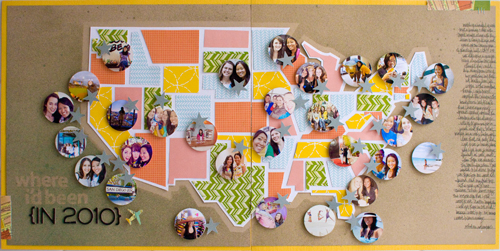
Specifically what inspired me about this layout was the graphic shapes she gave to the states and her bold use of patterned paper against the kraft background (no surprise there, haha). I also loved all her little circle photos representing all the places she had visited.
Now while I love to travel, I certainly don’t travel as much as she does, so I decided instead to theme my layout around all the places Adam and I have lived so far. Since we have yet to live on the East Coast (it’s on our short list of places to go next since it’s the one US time zone we haven’t lived in yet, haha), I decided to simplify my layout and do a single page featuring the Western half of the United States.
Here’s my finished layout featuring Zoe Pearn’s super adorable Sunshine & Lollipops kit:
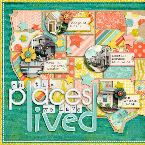
Since I posted this layout over in the Sweet Shoppe gallery earlier this month, I’ve gotten a some questions asking how I put this layout together. Kelly has an awesome tutorial over on her blog showing how she designed her map using paper, but since my layout is 100% digital, I’ve whipped up a little tutorial to show you how you can get this same look using Photoshop.
A little note: this tutorial was written based on Photoshop CS3 so it should work in other versions of Photoshop, but I haven’t tried it using Photoshop Elements. As always, there are a million different ways to do the same thing in Photoshop so I’m just sharing what worked for me.
Ok, on to the tutorial…
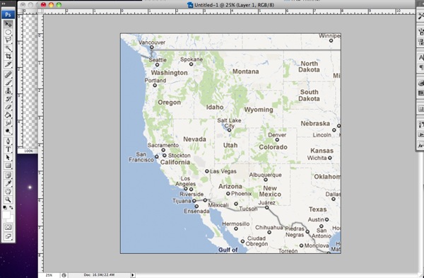
Step 1: The first thing you need to is find a map of your desired location. I took a screenshot from Google Maps for my map but any map image will do as long as it has the outlines of the states/countries on it.
Once you have your map, you need to drag it onto your scrapbooking canvas and resize it to the size you want your final map to be. I made my map fill the majority of the page. Don’t worry if your map image ends up pixelated, it won’t show in your final layout.
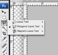
Step 2: Next, you want to grab your Polygonal Lasso Tool. You’ll find it under the normal Lasso tool – it’s the lasso with the weird angles on it.
Step 3: Now we’re going to use the Polygonal Lasso Tool to draw a shape around each state using the lines on the map as a guide. Don’t worry about all the little detailed areas, we’re going for the angular look of the shapes in Kelly’s inspiration layout so we want to keep the shape simple.
If you’ve never used the Polygonal Lasso Tool before, it’s really easy. You just point and click where you want to add a corner on your shape. If you want to draw an exact straight line between two points, hold down the Shift key and it will give you either a 90 or 45 degree angled line. To close off your shape, bring your arrow back to your starting point and move it around until you see a small circle. Then click to close the shape.
If you’ve done it correctly, you’ll end up with a shape surrounded by marching ants like this:
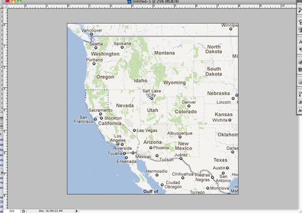
Step 4: Our next step is to fill the shape we’ve created. The easiest way to do this is to hold down the Shift+F5 key which will bring up the Fill dialog box that looks like this:
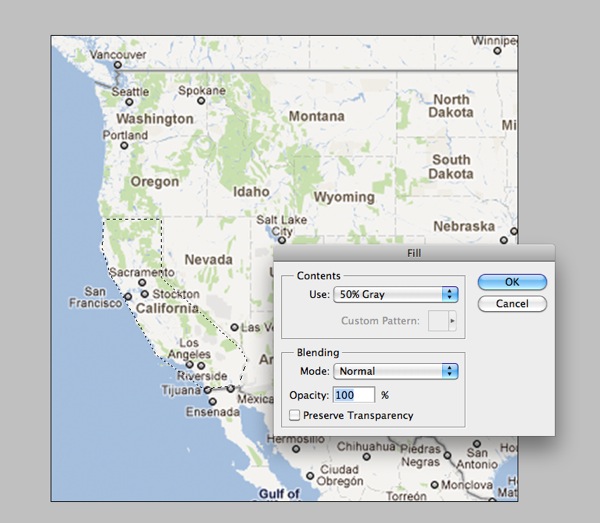
Step 5: Select a color for your shape (I went with grey tones but it doesn’t really matter) and then click ok. Your shape will now look like this:
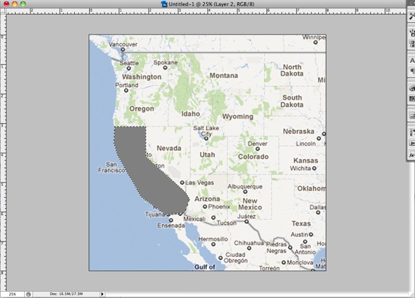
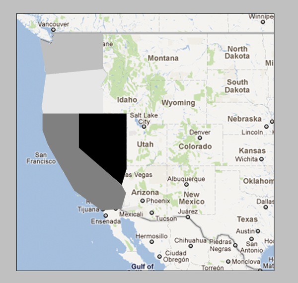
Step 6: Now you want to deselect your shape (Cmd+D on a Mac, Ctrl+D on a PC) and repeat steps 1-5 for ALL of the states or countries on your map. For my original layout this meant the entire Western half of the US but for the sake of this tutorial, I’m going to just do four states.
Here’s what your map should look like once you’ve completed all your shapes. Notice at this point there is no space between the shapes – they all fit together nice and tight. That’s what you want.
Step 7: Our next step is going to be to add space between the shapes so our mat layer will show through. (On my layout the mat is kraft, on Kelly’s layout the mat is white.) To do this we’re going to contract each shape down by the same exact amount.
First you need to get the marching ants around your shape again. A really easy way to do this is to hold down the Cmd/Ctrl key and click on the layer thumbnail for that layer in the Layer palette. Once you have your shape selected, go up to your toolbar at the top of your screen and choose Select>Modify>Contract:
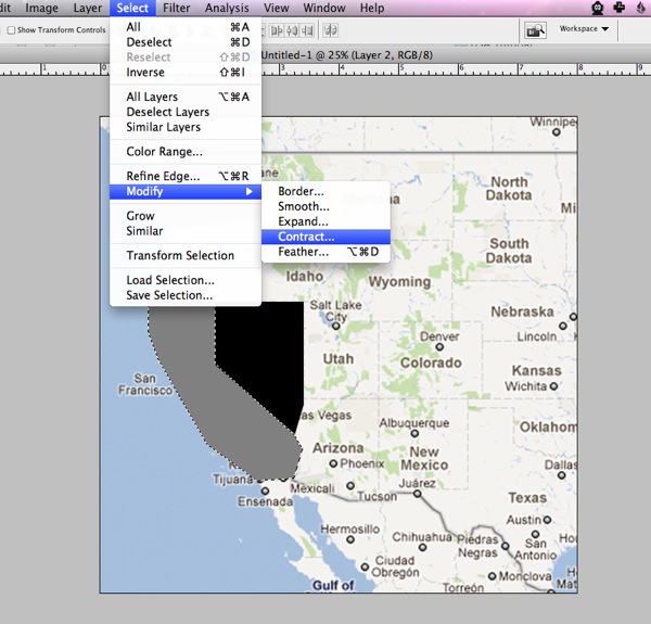
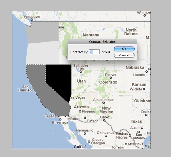
Step 8: We’re going to contract each shape by 10 pixels so enter a 10 into the dialog box and click ok.
Your marching ants should now be slightly smaller than your original shape:
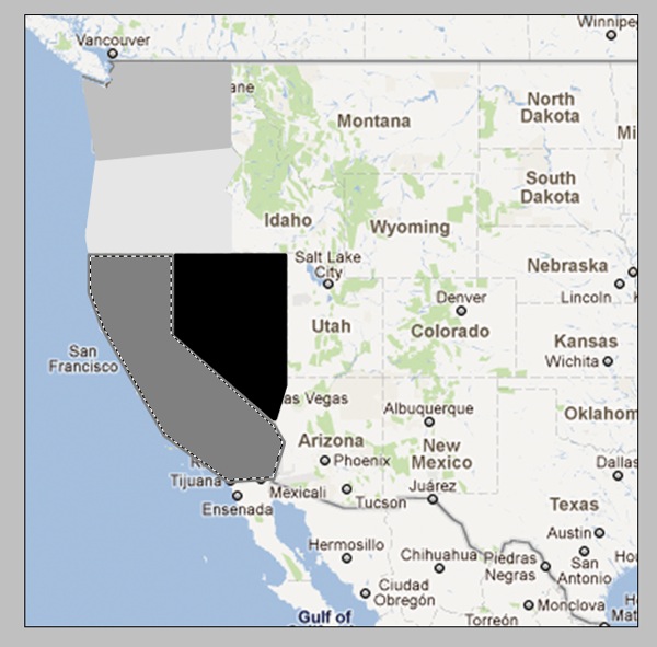
Step 10: Now we’re going to inverse the selection by hitting Cmd+Shift+I (Ctrl+Shift+I on a PC) and then hit the Delete key to remove the extra part of the shape like so:
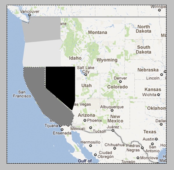
Now your shape should have an empty border around it that separates it from the surrounding shapes:
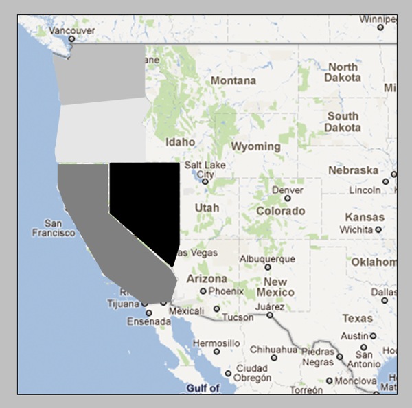
Step 11: Now you’re going to repeat Steps 7-10 for all the shapes on your map. As you contract each shape, you may find that you need to adjust the placement of some of the states. Since you have already drawn all your states, you don’t need to worry about the states lining up perfectly with the map layer anymore. How they relate to each other is more important. I just eyeballed the spacing based on what I thought looked best.
Your finished product should look like this:
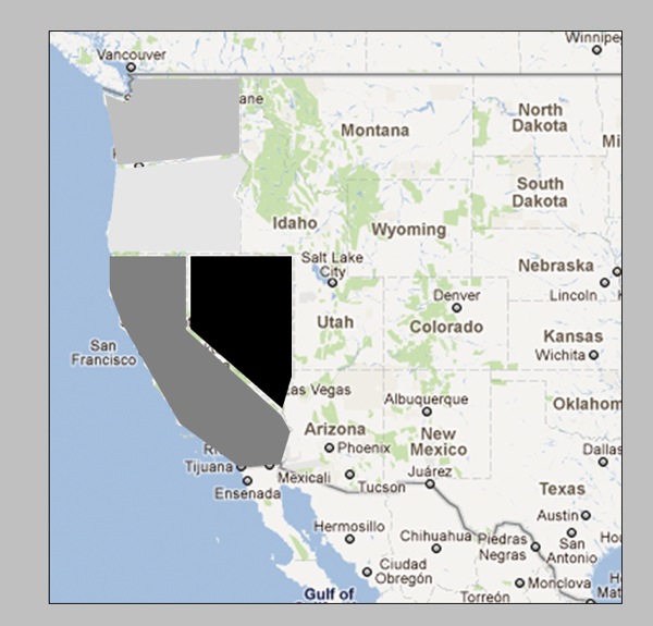
Which if we hide the map layer will look like this:
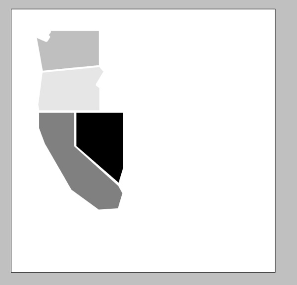
See, we have nice even borders between each of the shapes.
Now if you’re wondering why I essentially told you to create each shape twice rather than just contracting the original selection, the answer is because I found it much easier to draw out the shapes when they were all touching. I did try a few different methods for adding space between the shapes but ultimately the Contract & Duplicate gave me the best results. Yes it’s a little tedious this way but once you get into a rhythm it goes pretty quickly.
Step 12: Once you’ve got all your shapes drawn and contracted, the final step is use the Polygonal Lasso Tool to draw a shape for your mat layer. The steps are the same as how you originally created each state, just on a bigger scale.
I didn’t worry about the mat being the exact same size all the way around so I just eyeballed the border to get this:
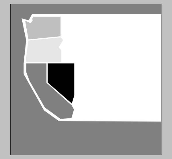
And that’s pretty much it! You’ve created your very own map template! Now all you have to do is add in all your photos and papers and elements and you’re good to go.
The great thing is this method will work for any map so if you’re not in the US or are wanting to do something more country or even world focused, you can totally follow the steps in this tutorial to create a layout based on any map your heart desires.
Now I’m sure there are some of you who are reading the tutorial and thinking, “well that’s great, Lynnette, but it sounds like a LOT of work and I would much rather be pinning on Pinterest.”
Which is why I also created a little something extra for all my fellow US-map lovers. And because I was feeling extra generous, I even included all of the Eastern half of the US for you as well.
And best of all?
It’s FREE!
Yes, that’s right I am offering up this awesome template for FREE for personal (non-commercial) use. If you’ve never purchased one of my templates before, here’s your chance to see what NettioDesigns is all about.
All I ask in return is you spread your love for the template on Twitter/Facebook/forums/blogs and let everyone know they can download it right here at NettioDesigns. Oh and if you post your layout in any gallery, please credit NettioDesigns and where allowed, include a link back to this post.
The template is a single 12×24 inch file so if you use the entire template you’ll end up with a two-page layout similar to Kelly’s layout or you can use your crop tool to crop the template to create a single page layout like I did.
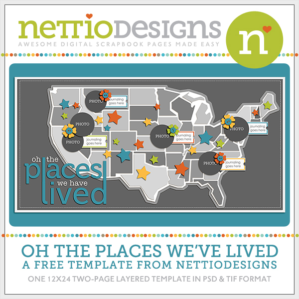
Download here
I can’t wait to see what you create so if you use the template or tutorial, be sure to link me up to your layout!
Happy scrapping!
