Hello, hello and welcome to another installment of Tips from Team Awesome where the lovely ladies from my awesome Creative Team share their favorite scrapbooking tips and tricks. In today’s post, Jen shares how she used the Photo Book Frenzy templates to design her wedding album. Enjoy!
Hey Everyone, I’m back again to share some thoughts with you on how to use Lynnette’s awesome A Week In The Life and Photo Book Frenzy templates for a completely different project.
When Lynnette first released these templates, I was in love, but I had no idea what I wanted to use them for. I’ve never done A Week In The Life, and these templates were just begging for an awesome project.
Then inspiration struck: my wedding album.
When I first started scrapping 4.5 years ago, the first real project I did was scrap my wedding album. It had been a great learning experience, but I almost immediately regretted how I had scrapped it, but I had no idea how I wanted to change it.
Originally, the focus had ended up being on the kits and templates I used, rather than on the photos and story. This was my chance to redo my wedding album in a cohesive design that focused on the photos and story- and I was crazy enough to see just how fast I could do it.
I decided to start at the beginning of our wedding story- our engagement- and to work through the templates in order, roughly.

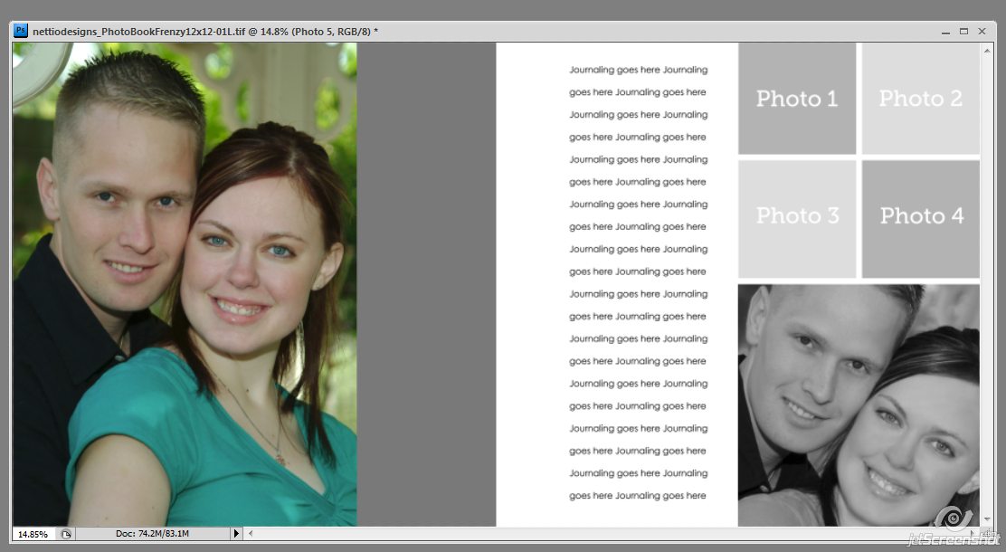
The first thing I did was pick photos. Because I’ve been married 5 years now, and digital cameras back then were nowhere near as nice as they are now, I couldn’t blow my photos up to 12×12 without losing a lot of focus. I also wanted to designate a place on each page for the title, rather than write on my photos.

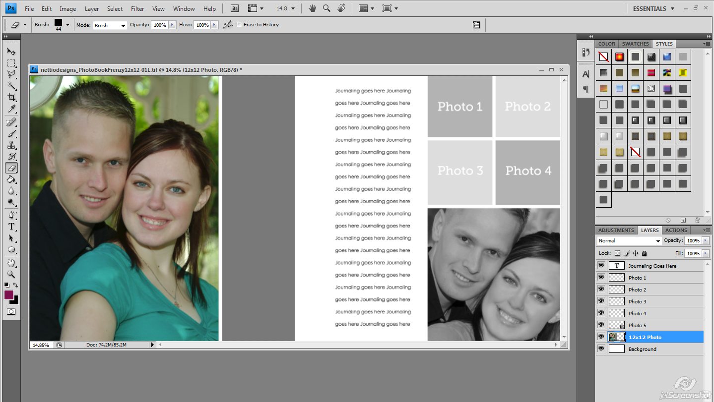
So I decided to just split the large 12×12 photo, depending on how the main photo(s) for the page fell, and use the remainder of the box for the title. After some very scientific testing, I can tell you that the space between photo boxes can be matched with a square eraser set at 44 px. I divided the box as needed, then filled it with a color pulled from my main photo.

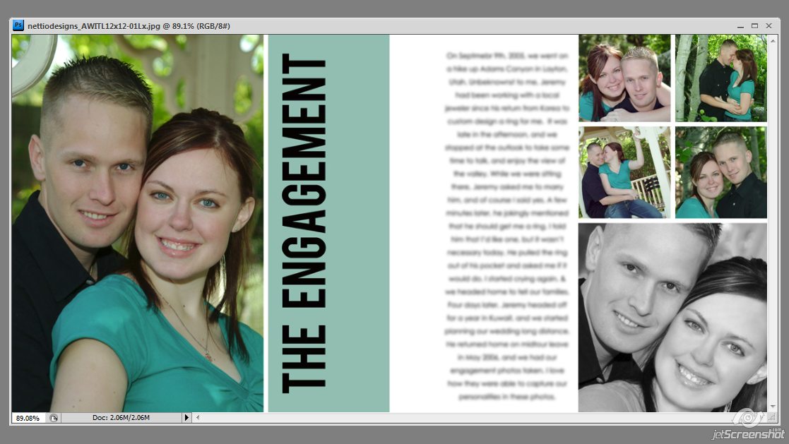
After that, it was simply a matter of titling the layout, and adding my journaling. I made sure to stay away from the center to allow for a binding when I print. I’ll double check all my bleed settings before I print, so make sure to take that into effect when you plan your layouts as well. I edited the templates as needed for each story, and it was so quick to do.
The only part of my album that ended up being completely created by me was the title page and last page in the album. I matched the style of the rest of the album in order to tell our story completely.
In just over 36 hrs, I was able to scrap our entire wedding, and have that story finally told the way I wanted it. It has been nearly two months since I finished scrapping this, and I love the album just as much as the day I did it. I can’t wait to print it later this year, and to be able to see our story in print format on our anniversary this year. This is such a versatile album and I’m planning on using it for many projects to come.
I hope that you can see just how versatile this album is. Even if you don’t do A Week In The Life, it’s so easy to use these templates for any project. Family vacations, December Daily, Pregnancy Albums, Baby’s First Year, Our House, Our Town- any project you can think of, this set of templates can work for it. Don’t be afraid to let your imagination take on these templates. Have fun with them, and enjoy telling your story with this template set.
If you would like to see my entire album, the web size version can be seen on my Flickr, here http://flic.kr/s/aHsjyK64qe
Thanks so much Jen! If you have any questions or comments for Jen, be sure to leave them in the comments section.
Psst…Want to make your own awesome photo frenzy album? Pick up the Photo Book Frenzy templates here at Sweet Shoppe Designs.