Hello, hello and welcome to another installment of Tips from Team Awesome where the lovely ladies from my Creative Team share their most awesome scrapbooking tips and tricks. In today’s post, Inga is sharing a rather ingenious tip for how she chooses a kit to match her chosen template and photos. Take it away, Inga!
Hey fellow scrappers,
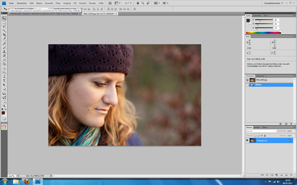
Today I’m going to share my little trick, how I check which kits go well with my images. I am a big template scrapper. So I usually pick my photos and a matching template first. In this case I had a relatively new portrait of my beautiful sister Maria. I also knew, I wanted to use a template from Lynnette’s newest re-release, Paper-tastic Vol. 2 (check it out here). I opened them both in Photoshop.
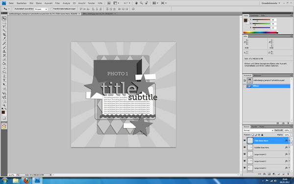
Then I put my photo in there and clipped it to the photo layer. I re-arranged the title elements and some embellishments to fit my needs better and show more of the image. But now came the difficult part: Which kit should I use?
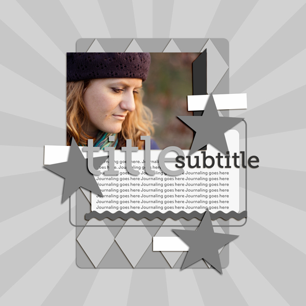
I have a pretty stash to choose from. The portrait was one I took over the Easter weekend. Using the first mild days with beautiful weather and golden light. A spring kit from the wonderful Kristin Cronin-Barrow came to mind. On the other hand her darker hat and the colours also reminded me of an autumn picture. I LOVE autumn kits and wouldn’t mind scrapping it with them. Those were practice portrait shots and not meant to capture a certain day. I narrowed it down to three additional kits, I could see me using here.
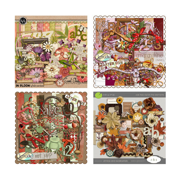
What to do? Whenever I am in a situation like that, my method is to do a quick check of all options. Here’s how. I simply drag all previews onto my template canvas. Yep, those tiny 600×600 pixels images. As you can see, they are pretty small.
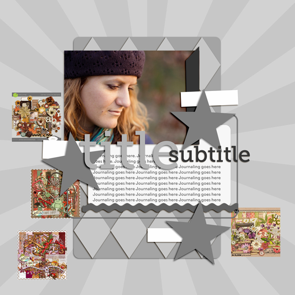
So, I blew them them up by using transformation. When you do that, they will look incredible pixelated. Don’t worry, as soon as you confirm the transformation PS will adapt them. Mind you, they would look horrible now, if you zoomed in to 100%. But luckily you don’t need to do that. You just need a quick glance.
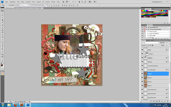
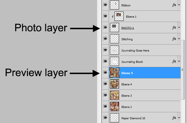
As you can see, I didn’t put them in right under the photo layer. I left the journal mat visible over them, so my photo doesn’t get lost completely in the preview. I usually look for a few layers between the previews and the photos. Sometimes it’s already enough to leave the photo frames visible.
Also, in this case I used the older completely grey version of this template. With coloured elements, I either turn them invisible, into grey shades or I just ignore the fact that their colours might throw me off a little bit.
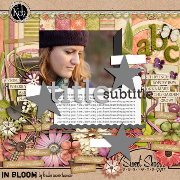
Now I turned the different preview layers visible/invisible as I went along and checked the overall look with each of them. Hey, my initial idea with the spring kit looked great!
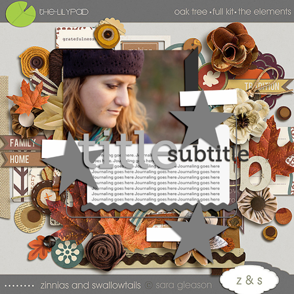
This would have worked perfectly as well.
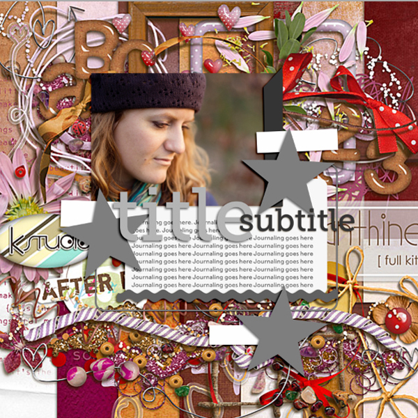
This one? Not so much. An easy elimination.
I usually click through them back and forth, comparing how I feel about each kit. Very often I find a photo/kit combination that just clicks for me! That will give me exactly the look or atmosphere I envisioned. I also use this method, to check if bolder kit choices will work or not. So there you go, a quick and easy way to test your kits with your photos! I hope, you’ll find it useful.
Awesome tip, Inga! So smart! If you have a comment or question for Inga about this tip or anything else, feel free to leave a comment in the comments section of this post.
Kits included in this post are: In Bloom by Kristin Cronin-Barrow, Oak Tree by Sara Gleason and Mint Julep and Amaranthine, both by K Studio.
Want to pick up the Paper-tastic Vol. 2 template featured in this post? You can find it here at Sweet Shoppe Designs.
I would never have thought of this – what a great tip! Definitely going to give this a try!
I’m glad you want to try it. Word of warning: Can get addicting trying out every possible kit in your stash… 😉
Indeed a very cool tip !! Thanks.
Thank you. I’m happy it is useful to others, too.
This is so cool….I often see myself clipping papers and think…no this isn’t right and delete everything again and start over…..like 5 times!
Heh, that was me too. I admired those ladies, that would always pick such perfect kits, even when it didn’t seem like an obvious choice. I couldn’t pull it off, so I had to find a way to cheat a bit…
This is an awesome tip – thank you!!! 🙂
You are very welcome. I am always nervous before such a blog post, that maybe nobody will like it. So it means something to me, that you are all taking the time to leave me a comment.
Hi Ginger,
I can totally relate as to your posting, I feel pretty much the same way but this really was a great thought starter for me as I’m all thumbs when it comes to templates to begin with. LOL
I had another thought as to “reversing” this tutorial. Sometimes I have a kit and not sure as to the photo. I spend a ton of time searching (either way.) By that I mean, I can put my new kit in the template as described above, then the photo (if that makes sense.)
Again, thank you and I wish you much success going forward!
What an awesome tip!!! I never would have thought about doing that.
Thanks. I cannot really remember, how I started doing that. But it sure helps.
Fabulous post! This sounds like such a great idea to help choose a kit to match!
This is a great idea! I’m definitely trying this out… maybe even tonight!
Great idea! can’t wait to give this a try! thank you
Absolutely awesome tip. I never would have thought of that but it works perfectly. And so easy. I always clip umpteen papers until I realize that it won’t work out. What a time saver! THANKS!
Thank you! I am working on a hudge project for my son’s wedding. I have some old windows that have four panes in them. I am using one pane for my son and one for his wife. Taking pictures from birth to 18 years of age. Then one pane will have how they look today. And the last pane will have a wedding poem.
Thanks so much for this tip. I love this idea. I shared this with a friend and she jokingly said, “Surely she means narrow it down to 300 kits.” lol. We both have way too many kits to choose from, haha… but this is a super idea.
Great idea! I’ll have to give this a try next time!
That is a great tip; I never thought to do that either 🙂 Thanks for sharing ♥ Petra
So simple, so easy, so AWESOME! Love it, why couldn’t I think of that? Thank you for sharing!
What a wonderful idea.
thank you
Great idea!!!What a time saver too. Don’t have to try different kits and delete a bunch of things. Love it, thanks!
Love this tip and will be using it. I spend way too much trying to decide what kit to use, so this should help eliminate so of that. BTW, which kit did you choose to use?
Thank you! It makes so much sence. i CT and do often start w à kit to scrap and then à photo, just usling the preview and try out photos on it before starting Will help me à LOT à think, I Will so try this.
You say you turn the templates Gray if needs. Can I ask you how? Nerver thoughts of that Esther, and have no clue how to
Hi Åsa! An easy way to take out the color in the elements is to desaturate the layer. Select the layer you want to remove the color from and then go to Image>Adjustments>Desaturate and it’ll change that element into a shade of grey. The nice thing about doing it this way is it’ll maintain all your layers and layer styling as well.
Hope that helps and if you have any other questions, just let me know!