Hello hello and welcome to another installment of Tips from Team Awesome where the lovely ladies of my Creative Team share their favorite scrapbooking tips & tricks. This week Kim is going to share how she adapts my templates for her clean and simple style. Take it away, Kim!
I’m a pretty clean and simple scrapper most of the time, so I always enjoy the challenge of taking a Nettio Design’s template and making it my own. Lynnette is known for her use of embellishments and patterns, and I’m none of those things. I tend to let the photos and words tell the story. That doesn’t mean that I can’t take one of Lynette’s templates and still make the layout feel like my own. I just have to think about what speaks to me in a template and go from there.
Let’s walk through my scrapping process…
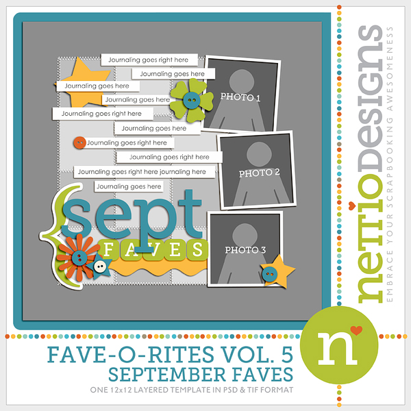
I decided to start with one of Lynnette’s Fave-O-Rites Vol. 5 Templates.
To my simple and clean lines eye, there is a lot going on here. My scrapping process usually starts with choosing the template (if that’s what I choose to use), then choosing the photos, and then choosing a kit. I open everything up in my photo bin.
My next step is to look at the template and try to find what is visually pleasing to my eye. I usually look for a visual triangle. A visual triangle helps lead the eye through the page and just plan makes me happy when I see it. To help you see what I see in this layout, I actually drew the triangle on this screen shot.
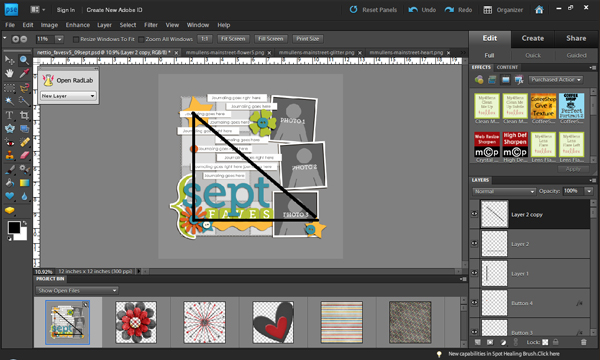
Then I got “hide this layer” happy. Any embellishment that didn’t fall on the points of the triangle were hidden. I just clicked on that little eyeball over there in the layers palette and it disappeared from view. I did some messing with deleting then adding back in before I was happy with the layers I chose to use.

The next step is one of those “your mileage may vary” steps. I personally go in and delete all my hidden layers, then highlight all the layers and remove the layer styles. Lynnette adds drop shadows to all her template layers, and that’s a great thing… I just like to use my own shadows and they distract me when I’m actually working on the layout.
My next step is to edit the photos and add them to the layout.
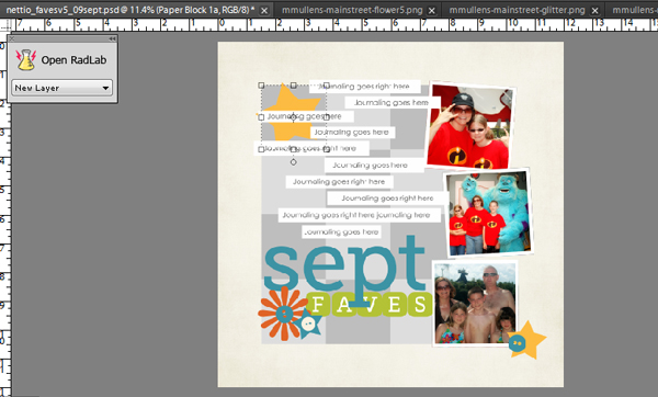
I’ve already added the background paper in that screen shot, so I need to decide on which patterns I want to use on the squares that are the focal point of the layout. I know it would look great with a mish mash of patterns all mixed together… but I just can’t handle that. So how about choosing just two classic patterns for those squares? I go with a blue dot and a multicolor plaid, then get on a roll adding elements, listing my faves, and finishing the raw layout.
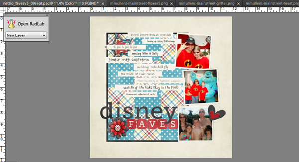
As you can see, I ended up deleting a few more layouts and using a few less elements than I intended. I also didn’t like the look of the patterns just sitting there, so I added a black border around the paper block. Lynnette originally had stitching around the papers to anchor them, but that was a little more than I wanted. I think the crisp black line kept it clean and simple. Finally, I add all my drop shadows, resize for web and sharpen. And within a half hour, I’m done with a layout that makes me smile, fits into my own personal style, and using a template that makes completing that layout much easier.
The finished product:
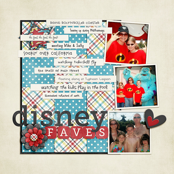
Awesome tips, Kim! I so love seeing people how adapt my templates for their personal style. If you any comments or questions for Kim, feel free to leave them in the comments section of this post.
Kim, how interesting that you draw imaginery triangles and delete elements according to them. Never thought of that before!