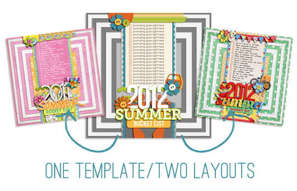
Last week I shared my 2012 Summer Bucket list. If you were paying close attention to the design of the layouts in that post, you may have noticed the designs of both of my 2011 & 2012 summer bucket lists were exactly the same. That’s because this is one of my favorite ways to use my own digital scrapbooking templates!
I take a layout I already love, turn it into a template and then use the template for a second layout based off the first. As much as I love coming up with new designs for my layouts, sometimes in the summer I just want to keep things simple and easy and this is an awesome way to do just that.
But if you’re worried about your layouts looking too similar when you reuse the same digital scrapbooking template design, here are a few tips:
1) Choose kits with different (or even opposite) color schemes
One of the awesome things about digital scrapbooking is how spoiled we are when it comes to variety of kits and products available to us. So when you’re starting with the same basic design for your layout, an easy way to make sure each layout pops is by selecting kits with different or opposing color schemes for each layout.
Even though I used summer themed kits for both of my summer bucket list layouts, I purposely chose two kits which had almost opposite color schemes. For the first, I used 12 Months: June by Penny Springmann which had pink, yellow and orange tones and for the second I used 100 Days of Summer by Meghan Mullens which had red, blues and greens.
This way when I was scrapbooking my second layout, I didn’t have to worry about what specific papers or elements I chose because I knew my second bucket list would stand apart from the first based on color alone.
2) Mix up the alphas & fonts
I’m sure you have your favorite go-to alphas and fonts – I know I do! But when reusing the design of a layout, an easy way to add variety is by mixing up the fonts and alphas. Try using a different style of handwriting font or a colored alpha instead of a white one. Even though the placement of the titles and journaling is the same, changing the look and feel of these elements will keep each layout unique.
3) Embrace the consistency
Often in digital scrapbooking, we put a lot of pressure on ourselves to come up with awesome new designs for our layouts each time we scrapbook. But a little design repetition can be a great way to adding consistency to your albums!
Rather than placing two similar layouts directly next to each other, think about how you can break them up in a way that makes sense with the overall flow of your scrapbooking album. With my summer bucket layouts, I plan on using them almost as section title pages in my album with all my 2011 or 2012 summer adventure themed layouts behind them. That way the repeated design seems purposeful.
Using a digital scrapbooking template you love for two different layouts is an awesome way to get more use out of your templates. Just add a little variety to the colors and elements in your layouts and you’re good to go!
What about you? What’s on your bucket list for this summer? Do you ever use the same design over and over again because you just can’t get enough of it?
Looking to scrapbook your own Summer bucket list layout?
 Check out my Summer Lovin’: Fun In the Sun Templates or pick up Summer Lovin’: The Complete Collection to get 9 summer-tastic templates for one great price.