 I’ve known since the beginning of this 30 Creative Adventures project that one of the projects I wanted to do was another photo book. I had designed one once before for my Week In the Life album in 2011 and I thought it’d be a fun challenge to do another one.
And since I designed my WITL photo book using Adobe InDesign the first time around, I thought I’d give designing a book in Adobe Photoshop a try since I know that’s what most of you use and I was curious to see how the process works for you.
Let me just preface this post by saying, designing a photo book in InDesign? WAY easier than using Photoshop. Seriously. But I survived and am so very in love with my completed mini photo book that all the hard work was worth it.
Which brings me to Creative Adventure #5: Designing A Hybrid Mini Photo Book With Photoshop
Creative Adventure #5: Designing A Hybrid Mini Photo Book With Photoshop
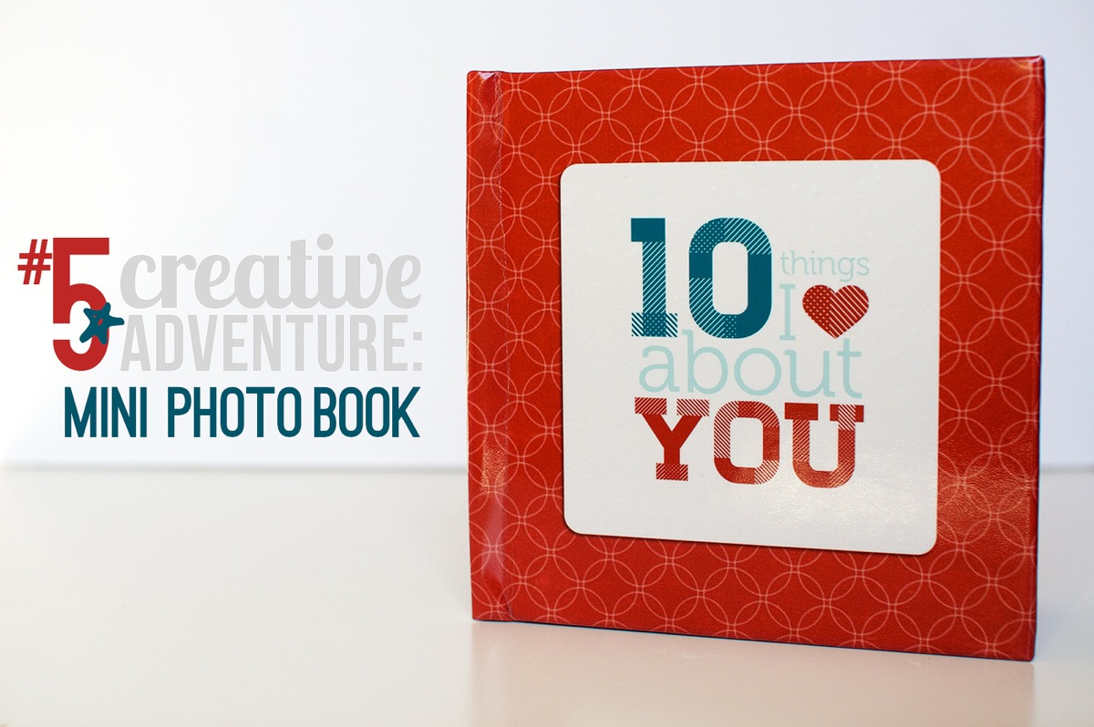
Step 1: Planning My Mini Photo Book
When I started this project, here were a few things I knew:
- I wanted to use Photoshop to design my book, as I mentioned
- I wanted to do something smaller, like a 6×6 or 5×5 book as opposed to the 8×10 book I did for WITL
- I didn’t want to pay a fortune to have it printed
Since Valentine’s Day was coming up, I thought it’d be fun to make a little book as a gift for Adam. So I came up with the idea to do a 10 Things I Love About You mini book because a) I love lists and b) it seemed like it’d be fun to design.
After drawing up some sketches, I decided I wanted to go with a repeating pattern of 2-page spreads: an accent/number spread and a full photo/text spread using the word YOU as the focus for the text.
So I made a little mockup version on scratch paper to see how it would work:
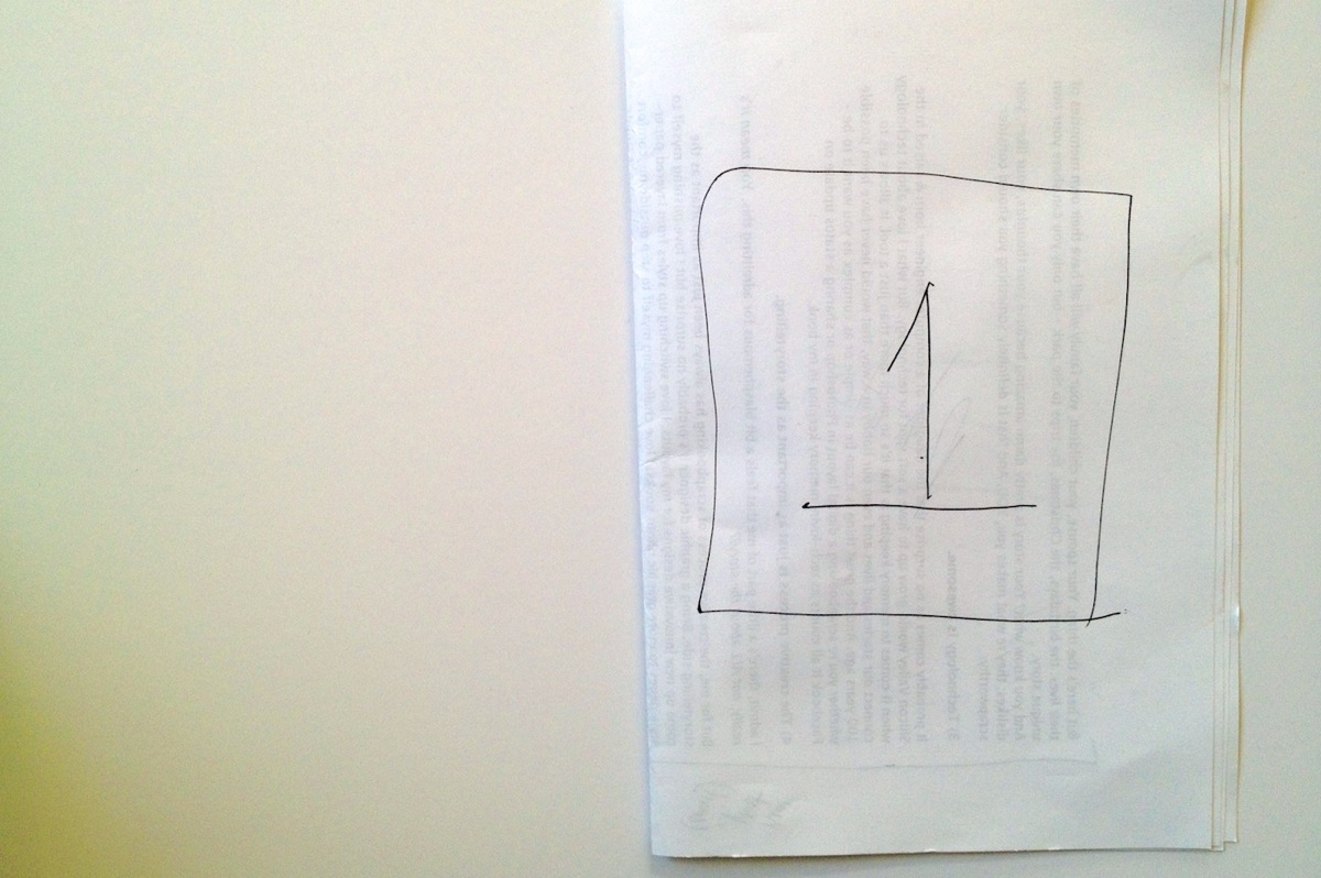
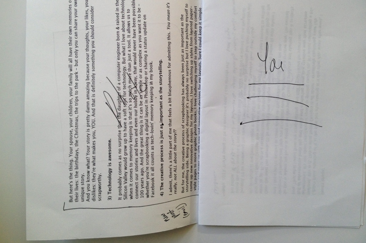
Then I drew out a bigger version of all the pages I would need since I wanted to make sure whatever printer I used could handle the number. I also decided to keep all the number pages on the right side of the spreads but I wanted the photos/text to alternate with every other number like so:
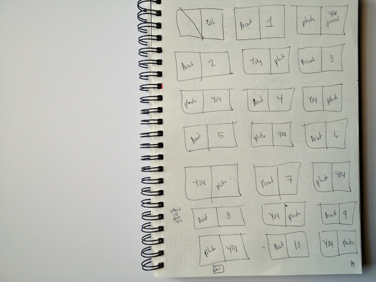
Super high-tech, I know, haha. But I find it really helps to give me a feel for sizing and/or the flow of the book.
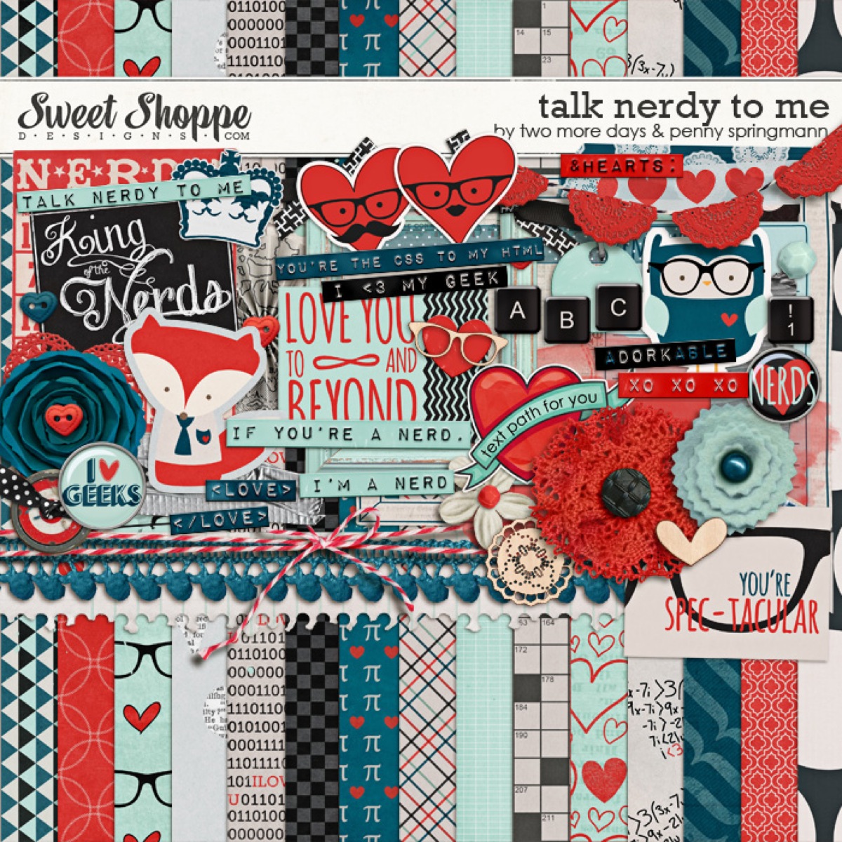
Once I had a general feel for the design of the book, I went on the hunt for a kit that would work with my design. As soon as I saw this super adorable Talk Nerdy To Me kit from Penny at Sweet Shoppe Designs, I knew we had a winner. A+L definitely equals nerdiness, haha.
The final planning decision I needed to make to decide on a final size and book printer. I like to do this before I design any actual pages since the final size of a printed book varies depending on the printer and this way I can account for any bleed/trim since every book publisher does things a little differently.
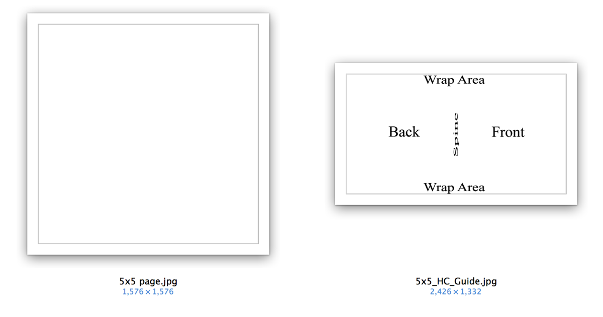
After looking around a bit, I finally settled on an Mpix 5×5 Hardcover book (it’s under their Coffee Table Books in the left sidebar). A huge selling point for me was they had templates I could download to make sure I got the sizing just right and their books were reasonably priced:
Step 2: Prepping My Mini Photo Book
Since I like to design two-page spreads as a single file, I used the 5×5 page template to make a single 5×10 document. The actual size ended up being around 5.25 x 10.5 since their 5×5 pages are actually 5.253 x 5.253. This is why checking the sizing for the book printer you want to use is so important before you start – because it’s much easier to design your pages correctly the first time than it is to make adjustments later on, especially if you want full-bleed (images going all the way to the edge) pages which I did.
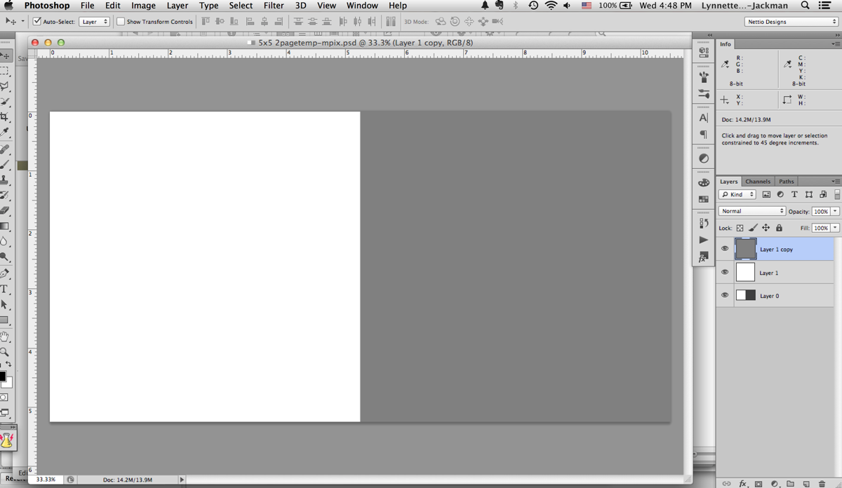
Once I had my two-page template made I made two master templates: one for the accent & number page and one for the photo & text page.
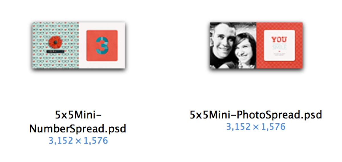
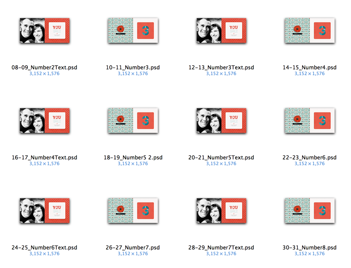
Then I duplicated and renamed all those files to represent each spread in the book. This is basically the same exact process I would use in InDesign: design master pages first and then duplicate them as a template for all the following pages. But in InDesign it’s much simpler since all these pages are in a single document. Since I was using Photoshop this time around, I had to make all the pages by hand as individual files. #sotedius
Step 3: Designing My Mini Photo Book
But once I finally had all the planning out of the way, now came the fun part: designing the book! This was the easy part, haha.
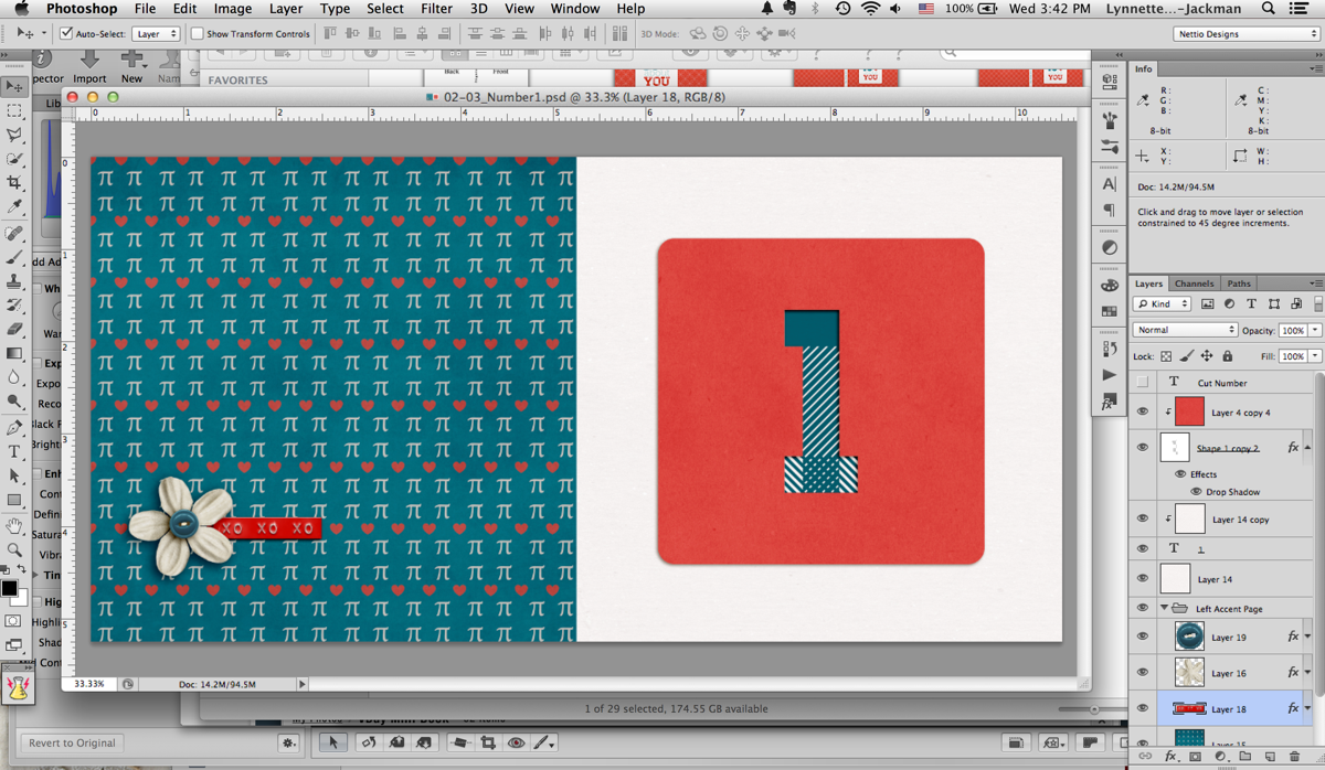
Since I was trying to keep this a secret from Adam, I designed all the accent & number pages one night while we watched TV (I just told him I was making a mini book) and then I did all the photo & text pages while he was at work one morning.
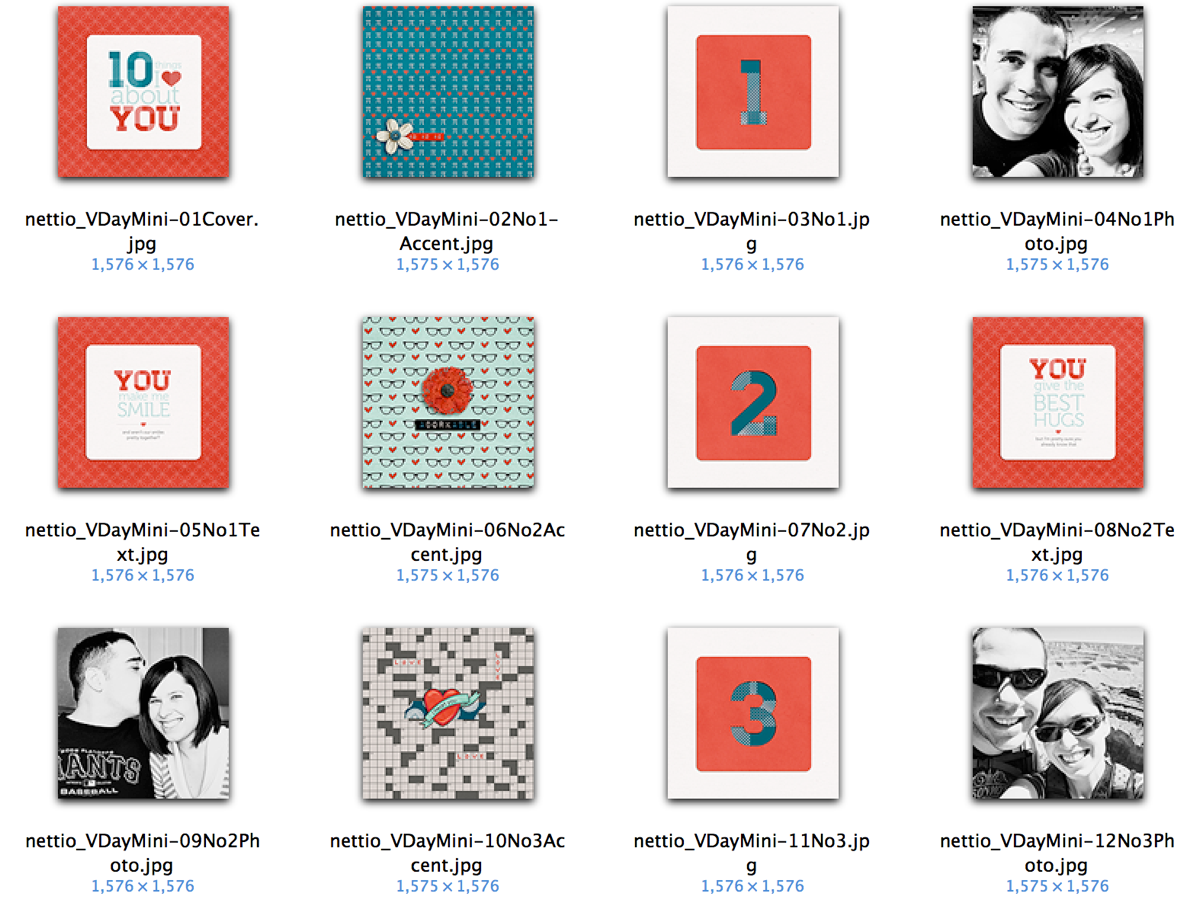
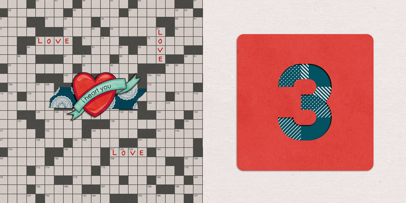
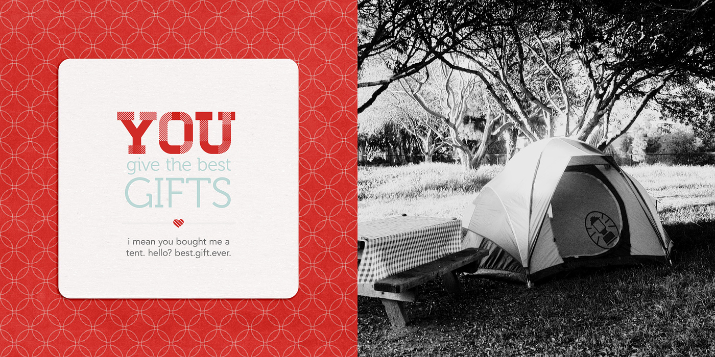
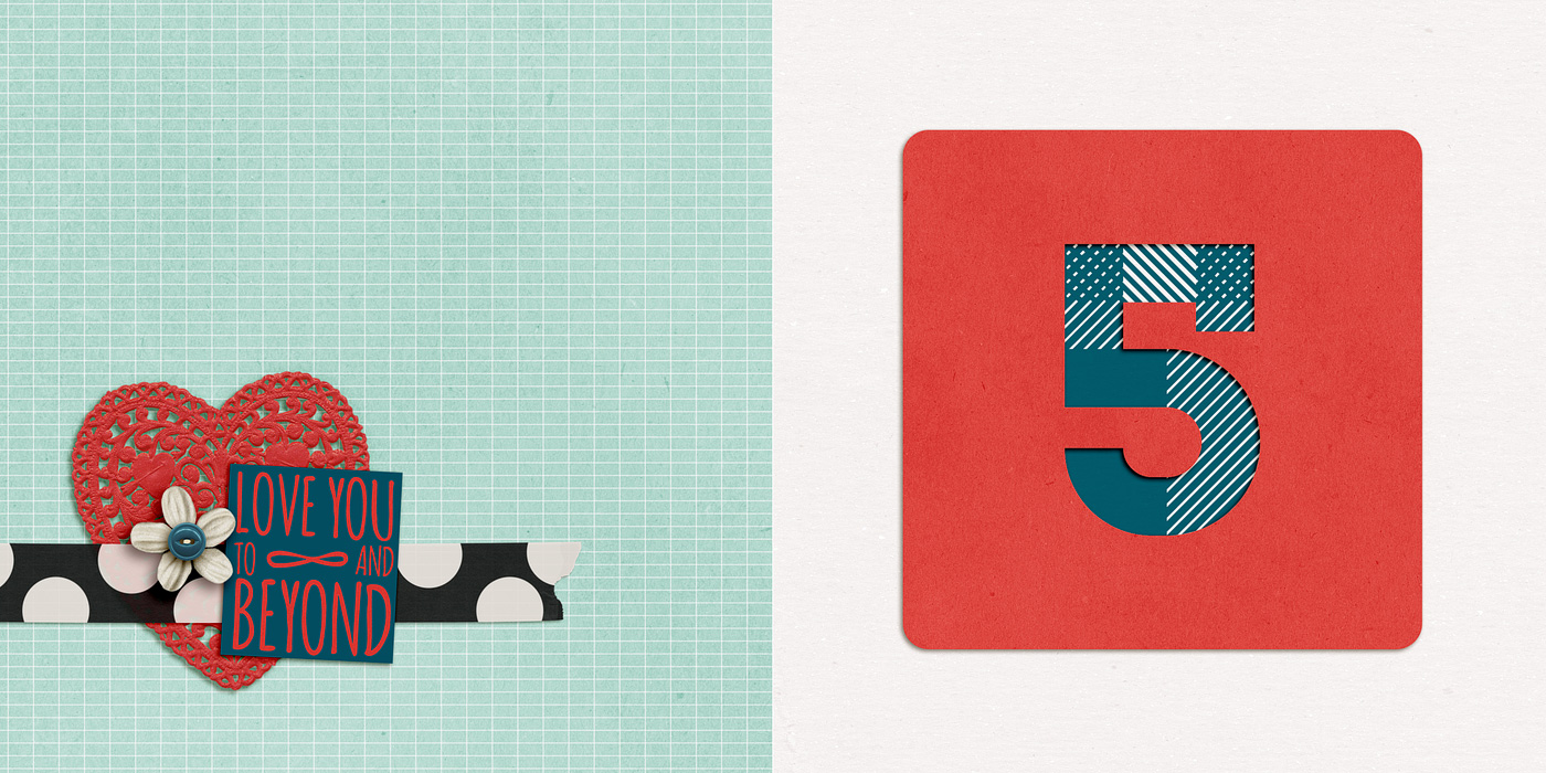
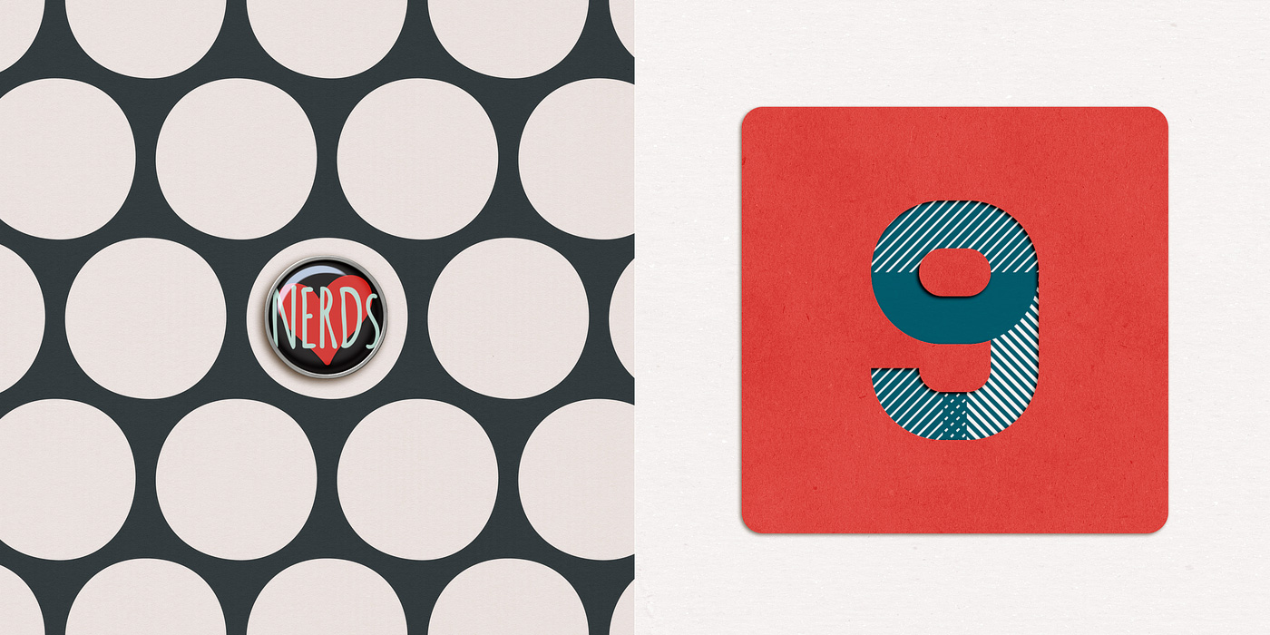
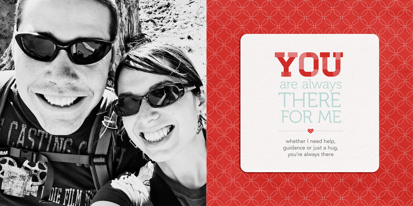
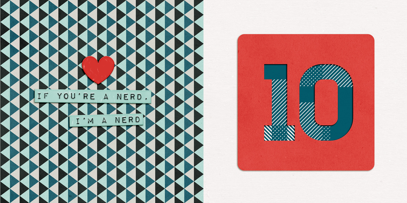
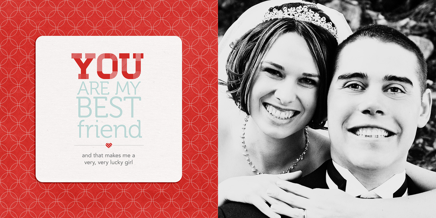
Here’s what the pages looked like once I had them completed:
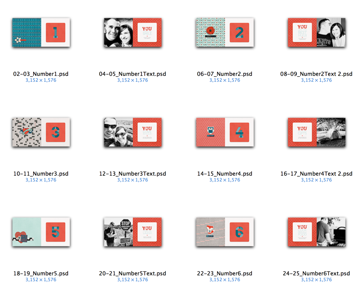
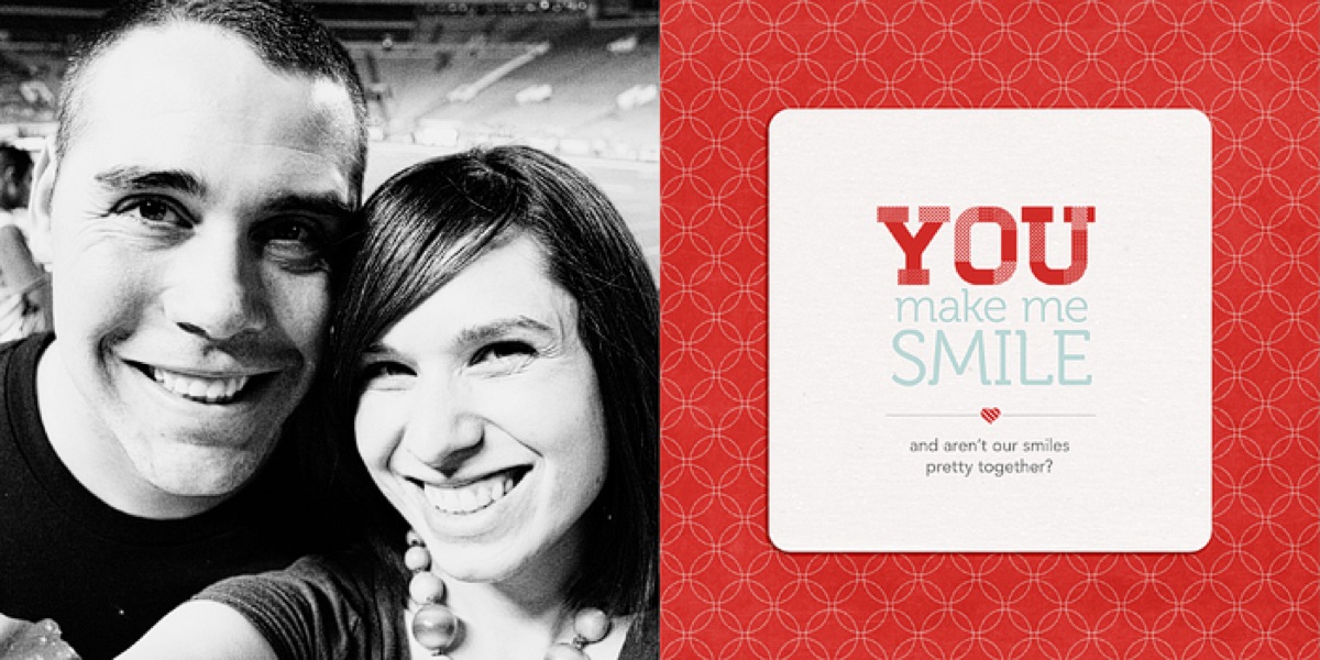
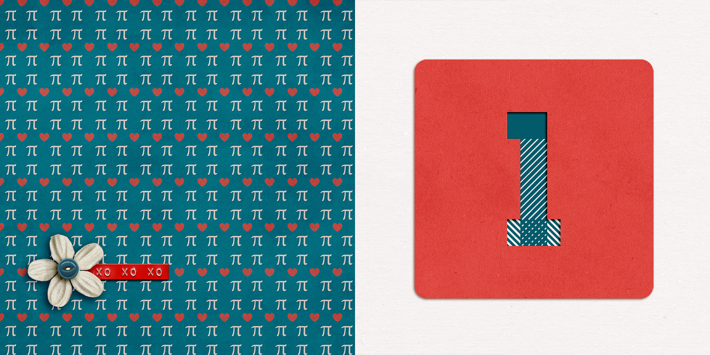
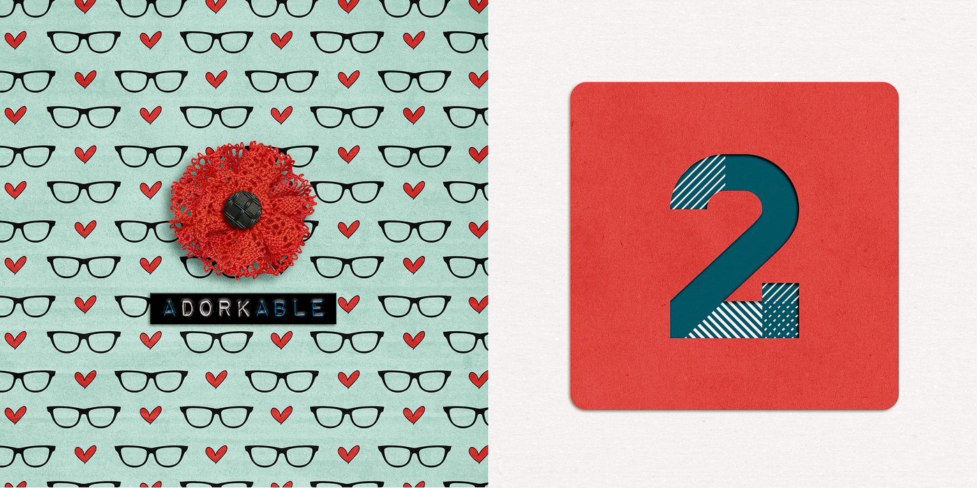
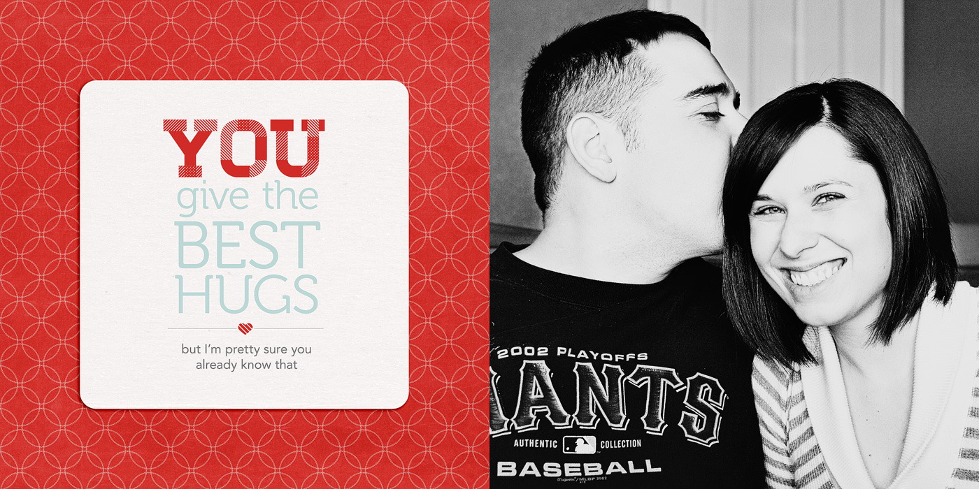
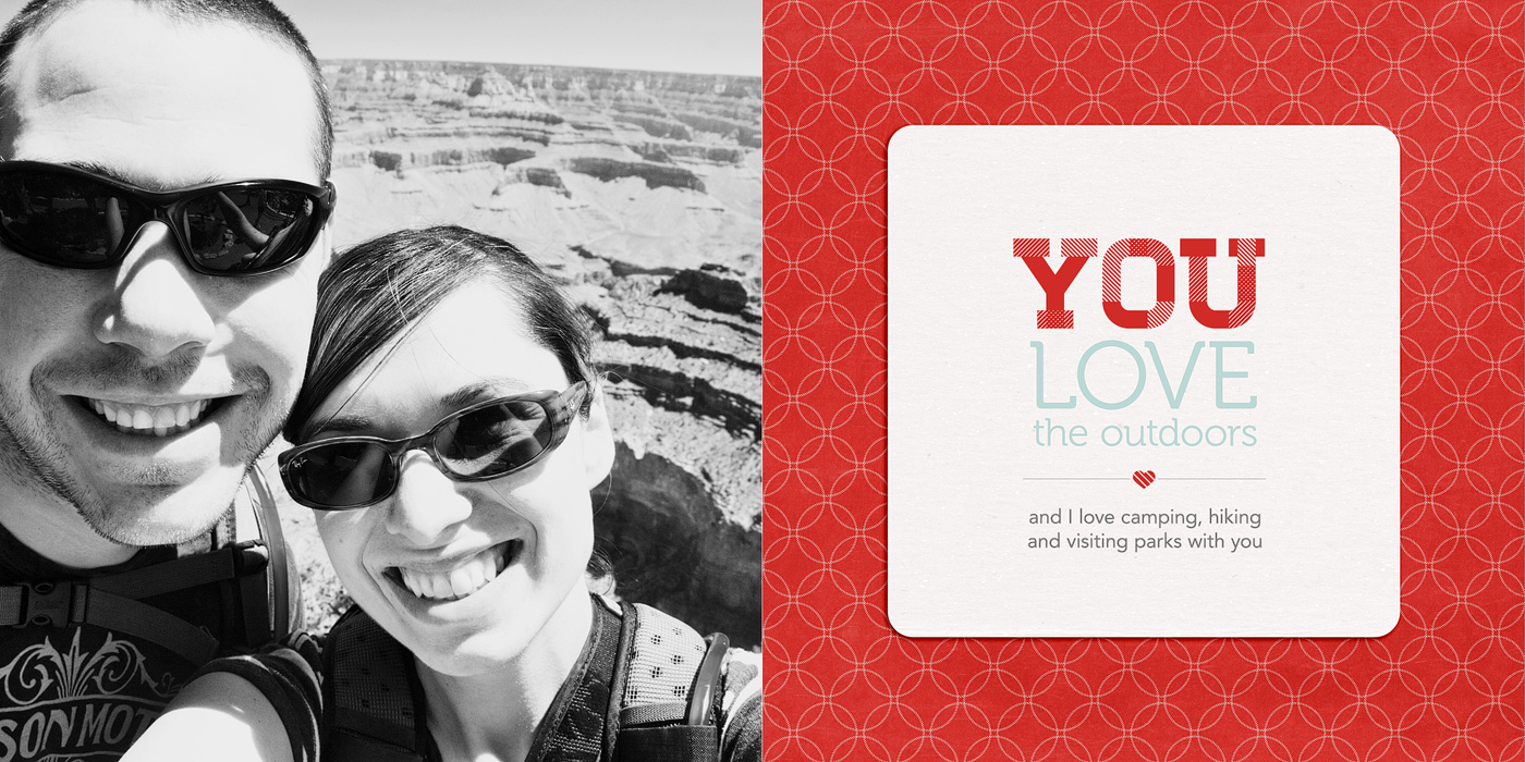
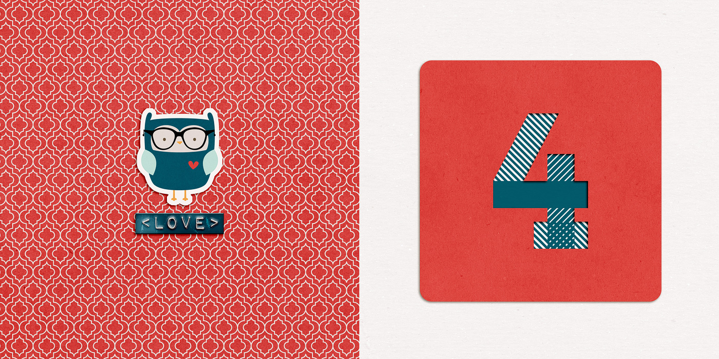
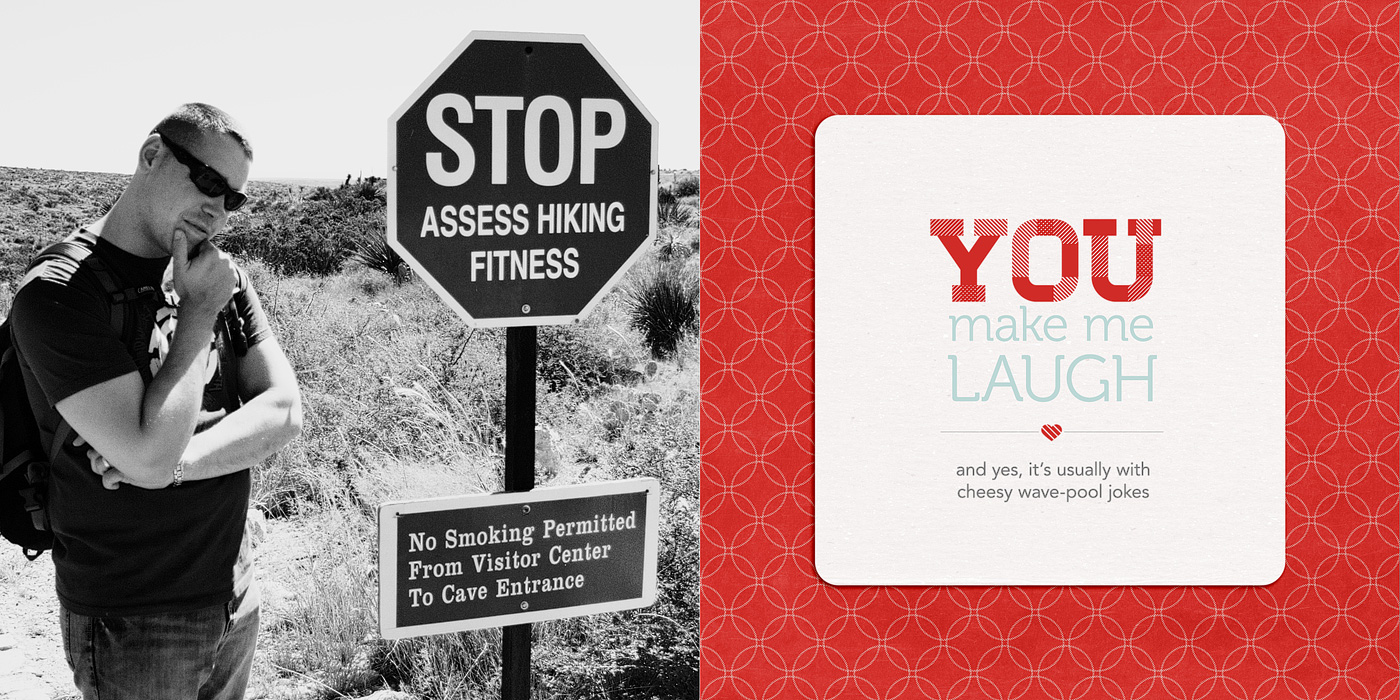
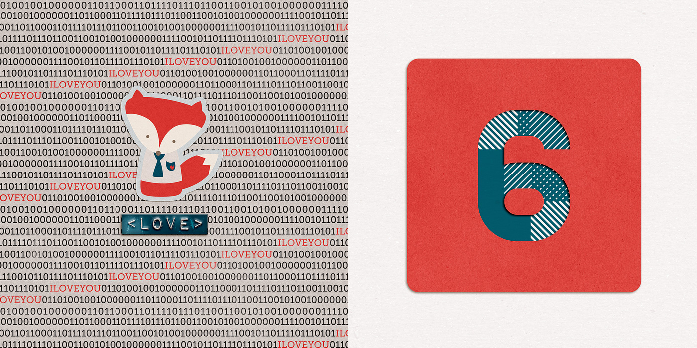
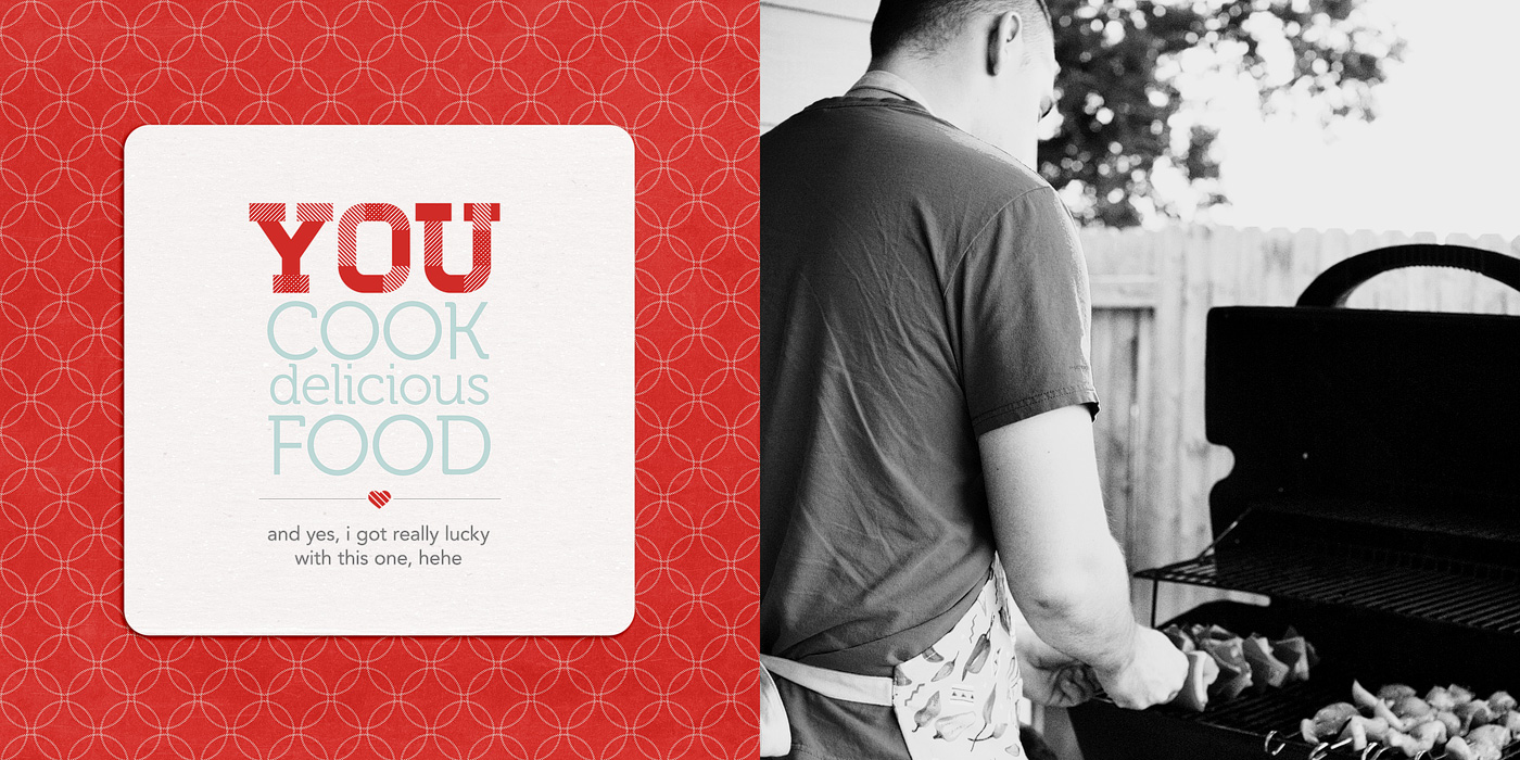
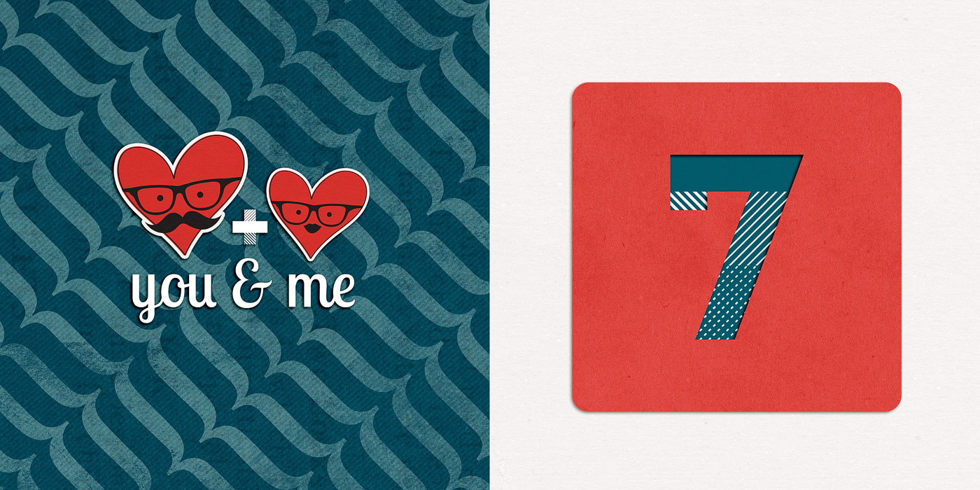
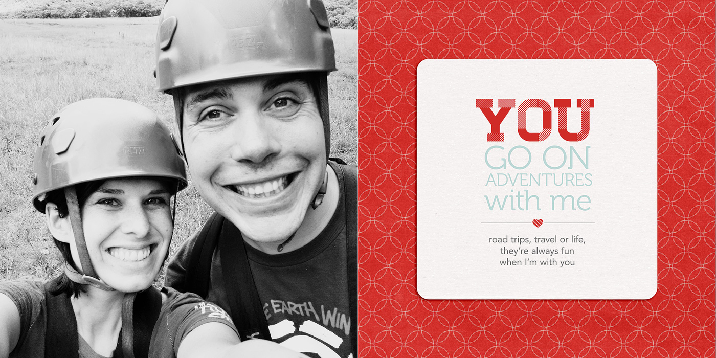
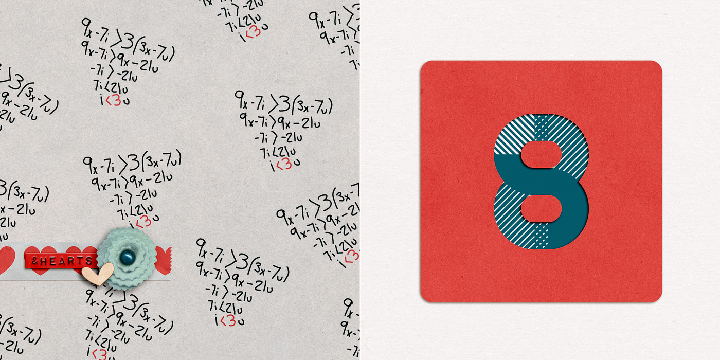
And here’s a bigger version of the two spreads for Reason #1. Each “reason” basically gets 4 pages.
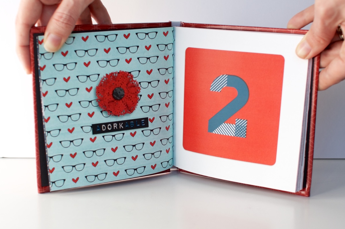
Accent & Number page:
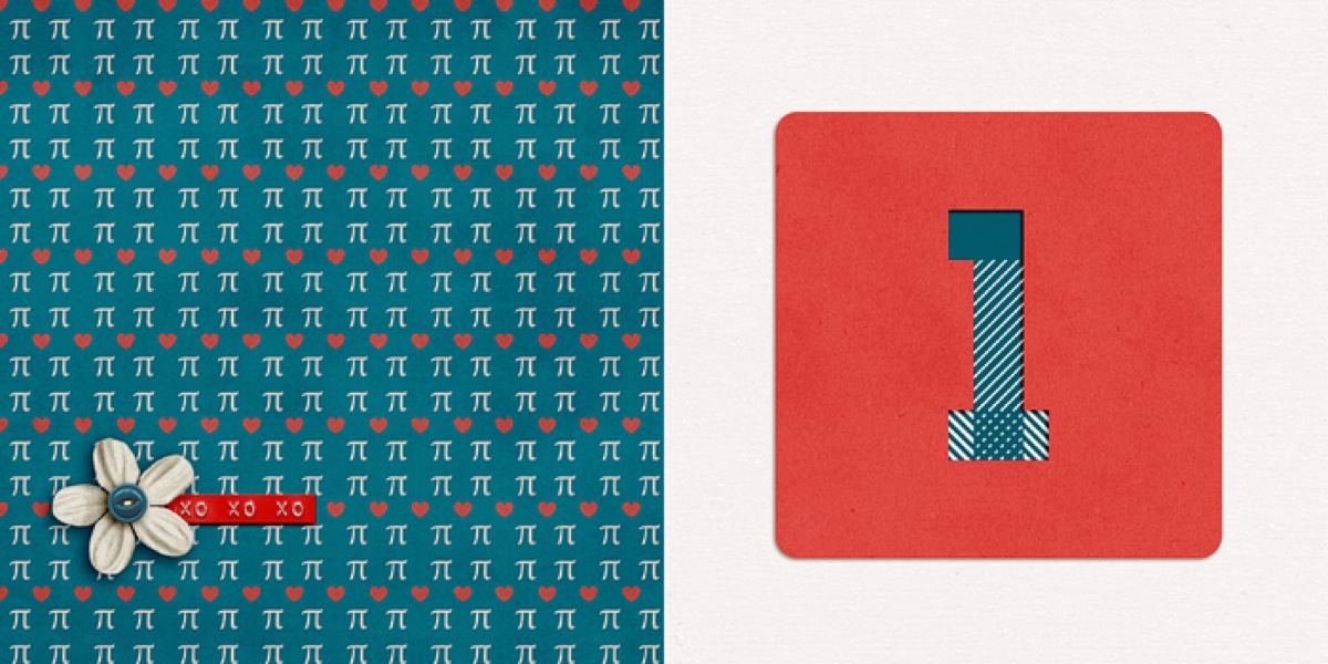
Photo and text page:
Here’s a little slideshow that includes all my pages in case you want to see them all together…
Step 5: Printing My Mini Photo Book
Once I had all my pages designed, the next step was to save and upload them to be printed. Which meant cropping each two-page spread back into single files. Blah. Not my favorite part of the process but a bit of a necessary evil I think since designing the pages together makes more sense than as separate files. But it definitely made me long for the “upload a single PDF to Blurb” process I did with my Week In the Life photo book, haha.
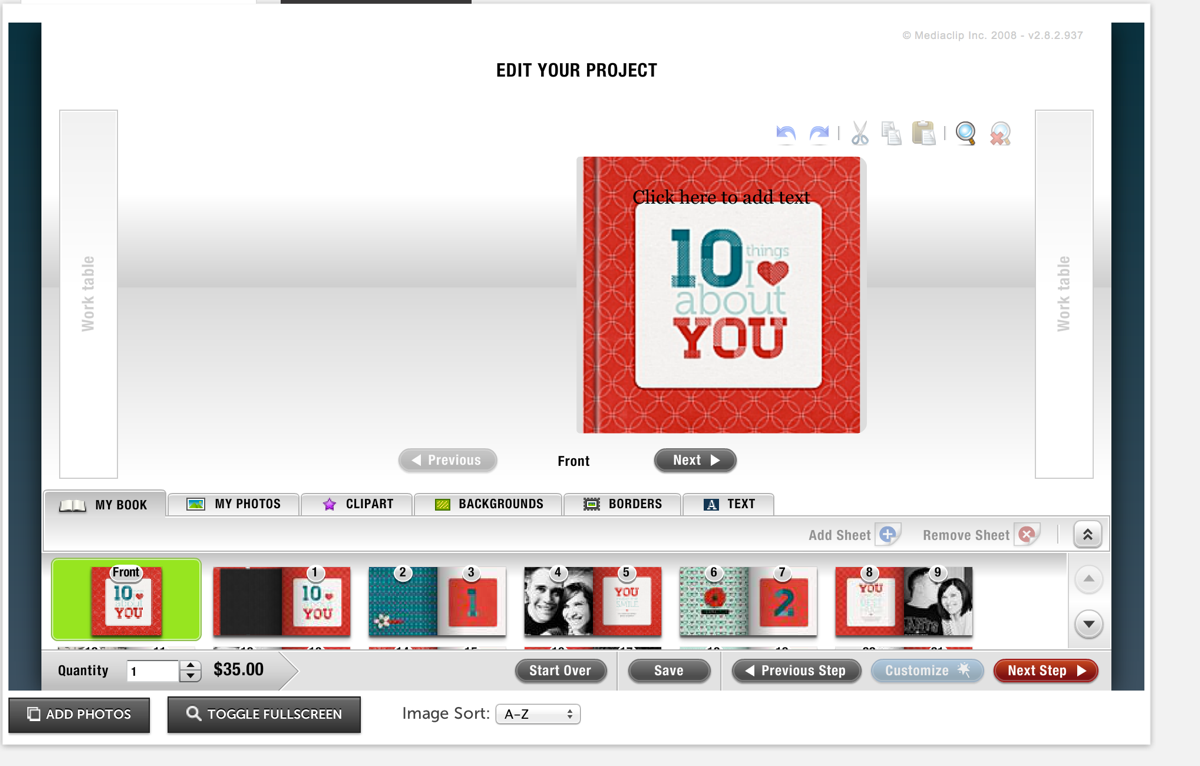
Thankfully, one of the fastest parts of the process was uploading my pages to Mpix. Two thumbs up for their online software because it was really easy to use. Just upload your images, drag them onto the pages of the book and set them as a background. My pages all fit perfectly since I’d used their sizing template when I designed them.
I did run into some issues getting the cover just right but I think that was more due to user error. Once I went back and double-checked my page against their template, it worked fine.
Step 6: Receiving My Mini Photo Book
Another huge positive for Mpix, they printed SUPER fast. Like within a day or two my book had shipped. And since I’d paid for 1-day shipping since I wasn’t sure how long the process would take, my book arrived in like 3 days. I was amazed.
And even better, I’m really happy with how my mini photo book turned out!
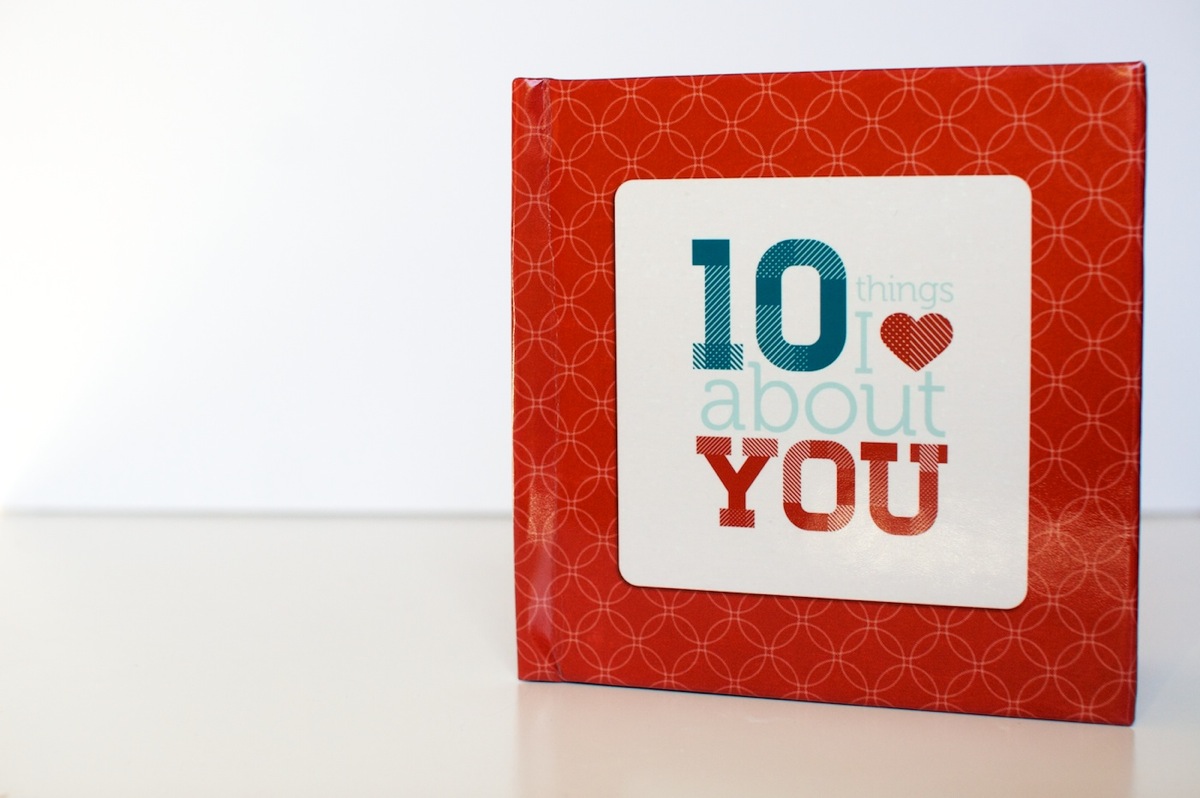
Here’s a look at the cover. I went with the custom 5×5-inch hardcover book and it’s nice and sturdy – sturdier than the cover of my Blurb photo book. Plus I love that it has a glossy finish to it. Adam’s comment when it saw it was that it looked like I’d had a real book published.
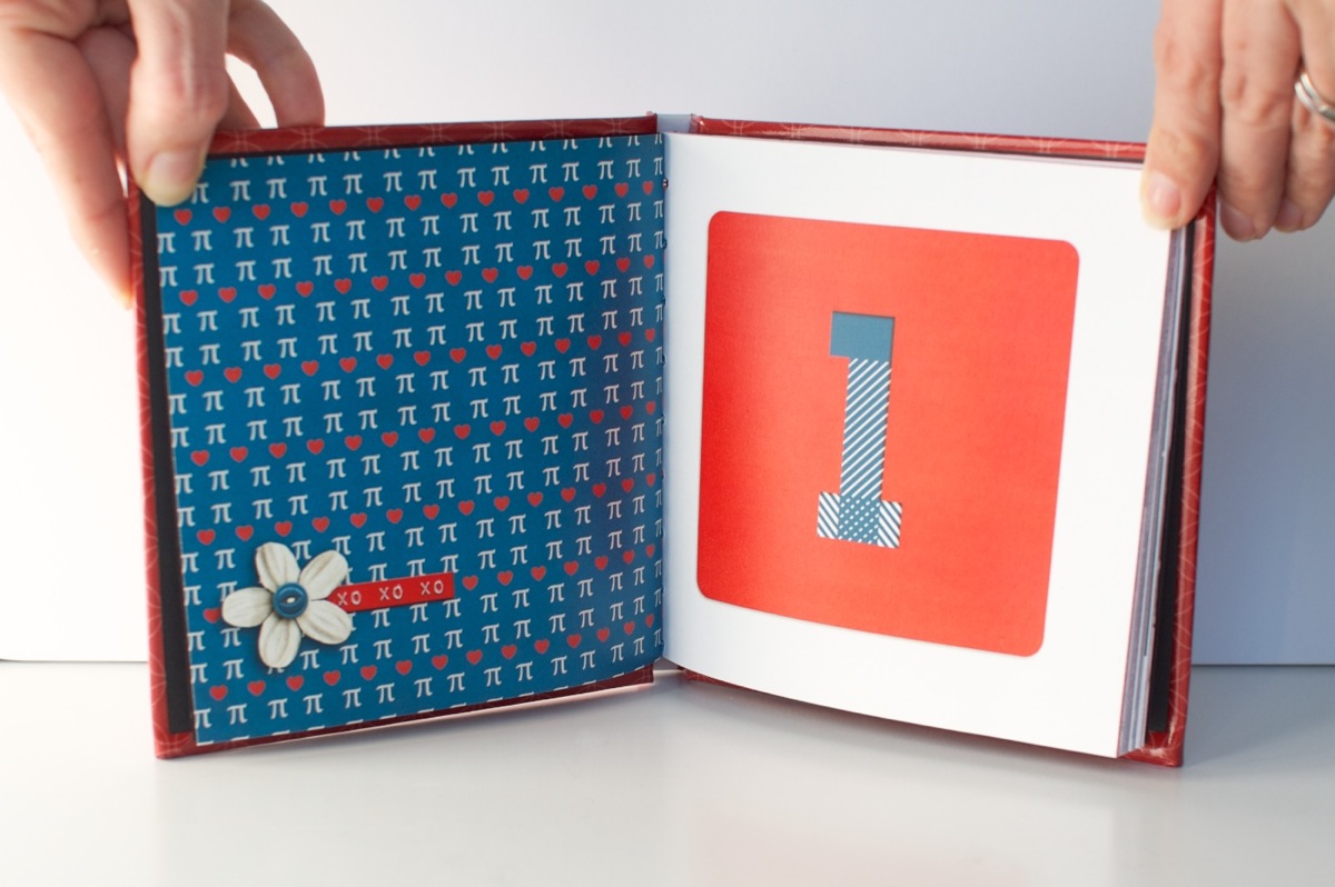
A look at the interior pages. The one thing I don’t love is the binding on the book is really tight, almost too tight. It’s hard to keep the pages open and it makes me nervous to pull the book open too far because you can start to see the stitching at that point. It also made taking these photos a bit interesting, haha.
A look at one of the photo/text pages. The actual color is more rich and less saturated than this photo – it’s looking a little crazy here, haha.
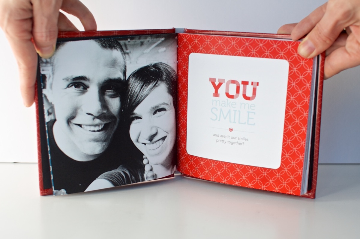
I do love the way the cover design wraps around the edges of the book. Makes it seem legit, haha.
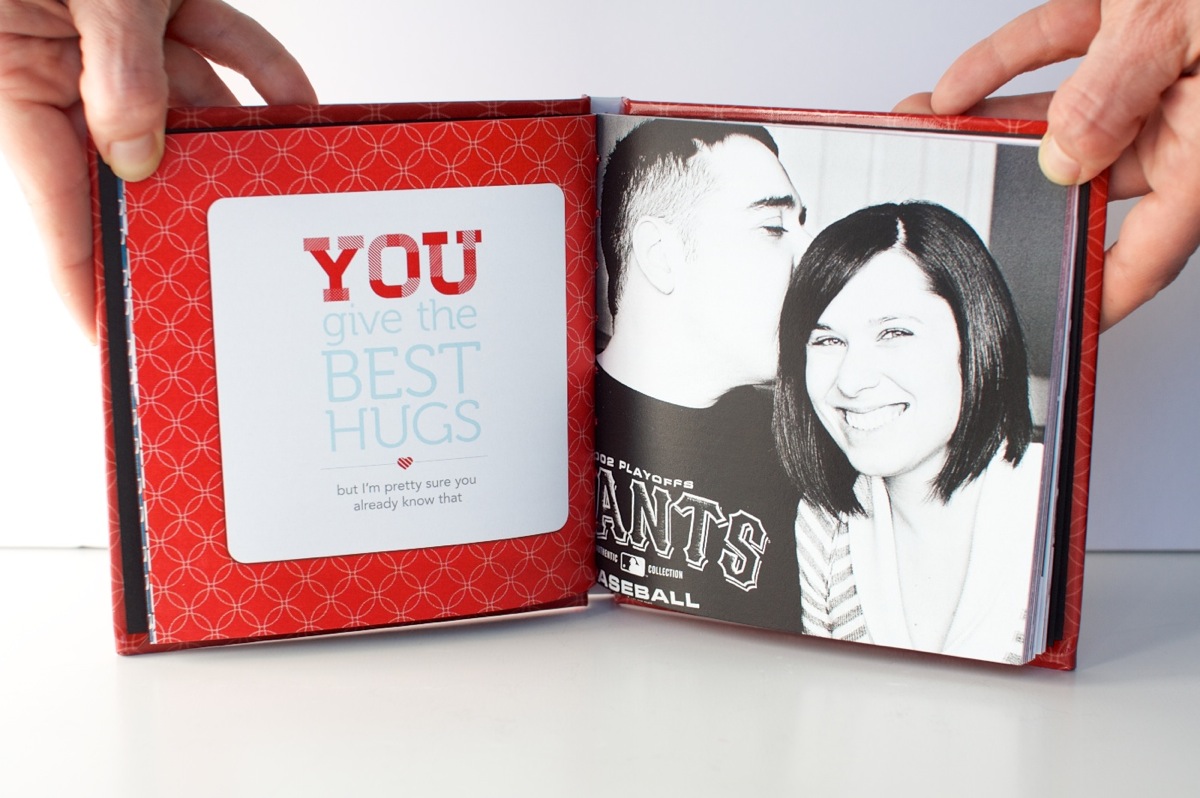
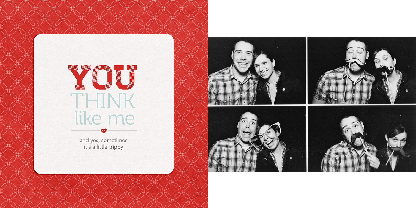
Another photo/text page, this time with the text on the left & the photo on the right.
This page may just be my favorite. The photos make me laugh every time. And no, other than saying things like “let’s do a normal one first” or “silly face” the poses were not planned. Apparently “silly face” means “mouth opened really wide & crazy” to both Adam and I, haha.
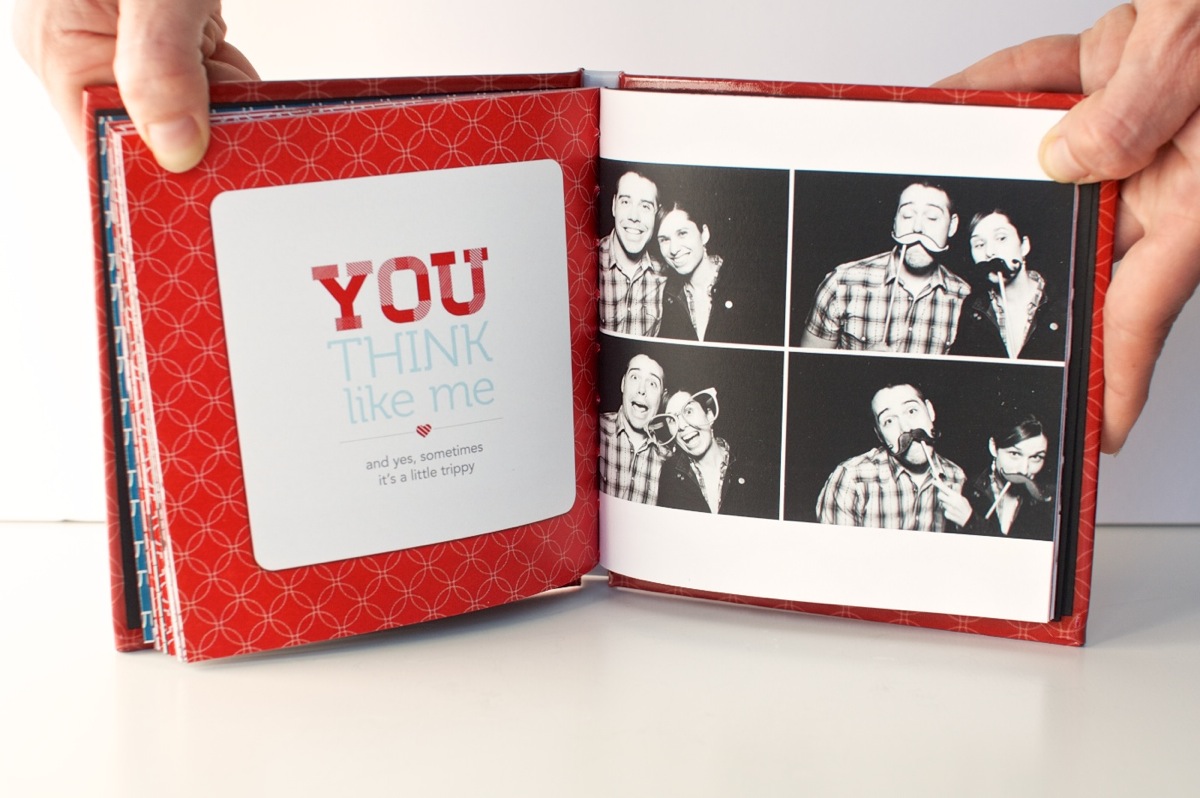
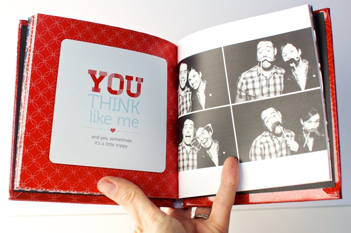
A closer look at the book. This is a good example of how far you can open the book. If you open it too much more you start to see the binding.
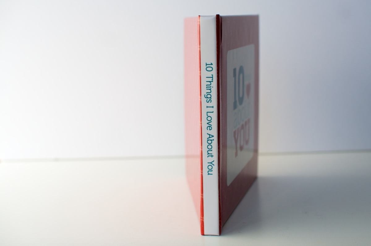
A look at the text on the spine. Using the template made it pretty near perfect. Good thing since I was worried about it!
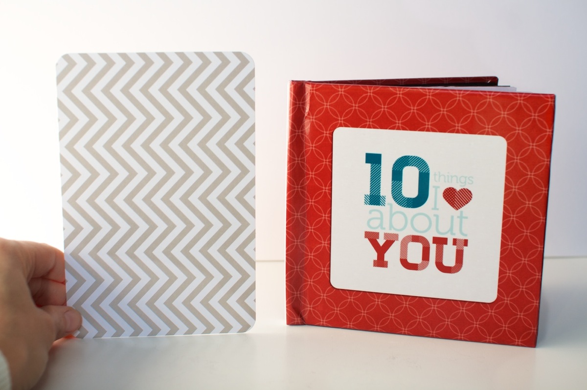
And for those of you wondering about the 5×5-inch size, here’s the mini book compared to a 4×6-inch Seafoam Project Life card. It’s pretty petite but exactly the size I was imagining in my head so I love it. I don’t know that I’d do a super detailed book in this size though – I think it works best as being similar to a mini album. I can totally see it being a fun way to do like a vacation highlights album or something though! Hmm, now there’s any idea…
And that’s how I used Photoshop to create a hybrid Valentine’s gift 5×5 mini photo book! I have to say while it was a lot of tedious work, my only comment when I got the book was “WHY DO I NOT DO MORE OF THESE!!” Seriously, I was excited, haha. It’s just so so cool to see something you’ve designed as it’s very own little book.
And as a Valentine’s Day gift, Adam gave it too thumbs up. Maybe even got a little teary over the fact that I, the non-mushy one in the relationship, had gone to all the trouble to make him a little book. Thinking I scored some major wifey points there, haha.
If you’re interested in making a 10 Things I Love About You mini photo book of your own, stay tuned, because I may just have a little something coming tomorrow (Feb 1st) at Sweet Shoppe Designs. Just consider this an extra special sneak peek, hehe.
And with that, I’m calling Creative Adventure #5 a wrap! How about you? Have you ever designed a photo book using Photoshop? Do you design your two pages together and then crop them into separate files? Do you find the process a bit tedious but well worth it like I did? Have any tips to share? Let’s discuss in the comments below.
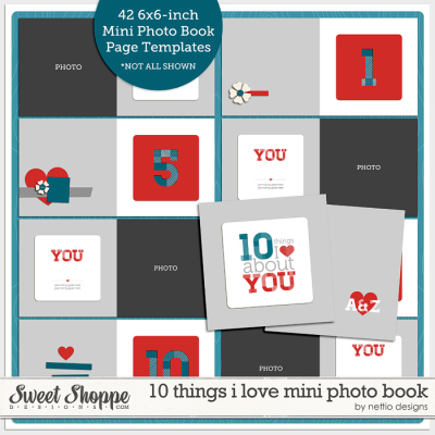
Want to make your own “10 Things I Love About You” mini photo book and show your love in fun & creative way? Then check out my 10 Things I Love About You Mini Book Templates available at Sweet Shoppe Designs.
______________________________________________________________________
ABOUT THIS PROJECT

In honor of my 30th birthday, I’m challenging myself to go on 30 creative adventures before the end of 2013. This is Creative Adventure 5 of 30. You can read all the details behind this project here and find links to all my completed adventures here.


COMPLETELY amazing!! Love this book!! ♥ You two are adorable! Would be so fun to make one for each of my kids and my hubby… with the templates it might not be too time consuming! 🙂
Thanks Aly! I can pretty confidently say with the templates it would be really quick to put together. Even designing it from scratch only took me a few evenings – it was easy once I had a game plan. Cropping everything was the slower part, haha.
You did an amazing job with this book! I agree you 2 are too cute and I so need to do this soon for myself 😉
Thanks Mary! 🙂
This is so so awesome and cool! LOVE it!
Thanks Christine!
Stunning Lynnette, just stunning! Adam is such a lucky guy! 😉
I did design a book for a fellow Border Collie lover who’s dog died and she had only very old pics saved in 72 dpi. Eeeeks! Thanks to creative iPhone photo apps and filters in PS I was able to make them look artistic like it was meant to be this way. 😉 If you can’t make it fake it 😉 The photos were merely as an illustration, the focal point were the many stories she had written about him over the years. The book was a great hit and she ordered dozen of copies.
I used inDesign though. The only way I know how to do desktop publishing, especially with text involved.
My teacher would go into cardiac arrest if she knew I would use PS for designing what inDesign is made for 😉 You’re a very brave woman!
But if I had do it in PS I would definitely not design the pages together and than having to spilt them up again. I would be too scared something would go wrong. Again, very very brave of you!
To bad about the binding. Do you think a softcover would be more suitable for small sized books like this? Maybe they are more flexible and do not have the binding issue?
I did my book in 8×8 softcover and I loved that. I’m wondering about the 6×6 and doing the binding myself, something artistic[cough] but not too much work because I’m not that handy. 😉 Or some other kind of binding, will do some research. I have a bare Bo-Bunnies 6×6 album that is waiting to be used.Will report back!
Hahaha, yeah as an InDesign user for many years (before I even used Photoshop), trying to design the book with Photoshop was an interesting experience. 😀
As far as softcover vs hardcover, I don’t know! I read some reviews of Mpix before I purchased from them and it was a comment I’d seen from others so it wasn’t unexpected. Really it was mostly a pain for taking photos of it for the blog – reading through it is fine. And yes, I think like a printed mini album style binding would be super cute too!