Welcome to Project Life, Weeks 7 & 8.
I realized this past week that I need to give myself a bit more time to put together these Project Life sharing posts. As much as I love sharing my pages, these posts take practically as long to put together as designing the pages themselves! So starting now my goal is to share my Project Life pages every other Monday but with a week in between – so Weeks 7-8 are being shared now at the start of Week 10 and Weeks 9-10 will be shared at the start of Week 12.
Up to this point I’d been trying to put together my two weeks of pages, take & edit photos and write the post all in one day and well, it was so.not.working. So I’m hoping this’ll give me time to play and send my photos out for printing since I know printing at home has been a major sticking point for me. But I do reserve the right to change my mind at any point if this totally doesn’t work either, haha.
With that out of the way, let’s get to Weeks 7 & 8, shall we?
These two weeks were so much fun to put together because it was my first time adding additional inserts to my weekly spreads. I knew I wanted to capture our weekend adventure to Big Bend National Park and since the trip loosely spanned across two weeks (we drove home on Monday of Week 8), I decided the easiest plan was to create a single page each for my everyday type stuff and then use the extra pages and some additional insert for the trip. I LOVE how it turned out.
Week 7: Feb 11-17
Here’s a look at the Week 7 spread. On the left is everyday stuff from Week 7 and on the right is the start of the trip pages.
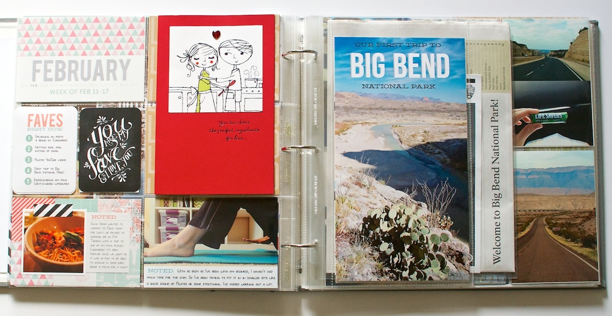
Included in this week are all 3 of my new Bits & Bytes Project Life themed products released this past weekend at Sweet Shoppe Designs: 2013 Weekly Title Cards, 4×6 Journalers – Paper Love and 4×6 Journalers – Graphic Love. The black accent card was a printable freebie from Studio Calico for those on their Project Life wait list. I thought it seemed fitting for Valentine’s Day plus “you are my fave” – you know I’m going to be all over that. #faveslove
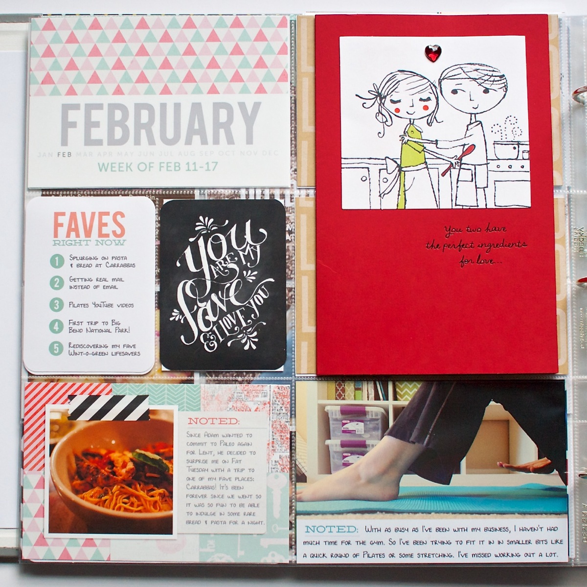
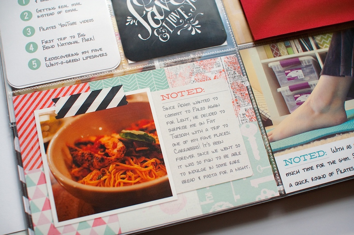
Here’s a closer look at the 4×6 Journalers – Paper Love card. These templates made these cards SO easy to put together and I love the little pop of pattern and color they add to the page. I chose papers from the same kit I’m using for my February title cards (You Hold the Key to My Heart by Zoe Pearn & Jenn Barrette) to keep things cohesive.
In the right corner you can see one of the 4×6 Journalers – Graphic Love. I love the balance of the clean & graphic vs the scrappy and paper-lovin’.
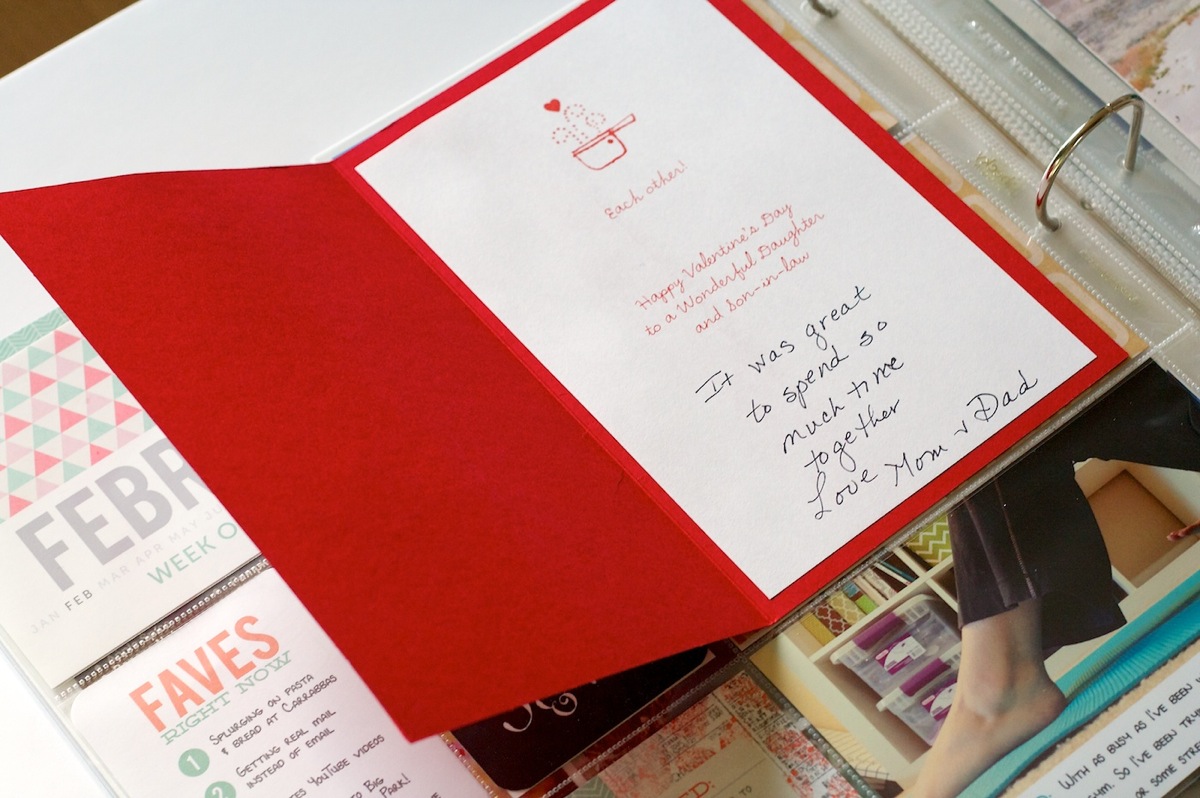
My mom mailed me a Valentine’s Day card and since I wanted to be able to open it and not chop it up to fit in the pockets, I ended up using some tape runner (Scotch Adhesive Dot Roller) to attach it to the front of the page protector.
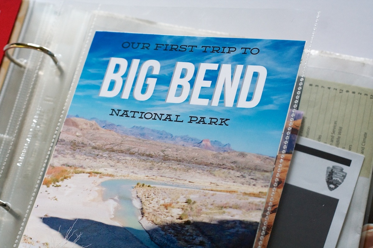
Here’s a look at the start of the right side of the Week 7 spread. Since the trip was kind of a big deal, I decided to make it it’s own title page to signify that this was the start of the trip. It’s 6×11 and I just added it to the album using an American Crafts 6×12 page protector.
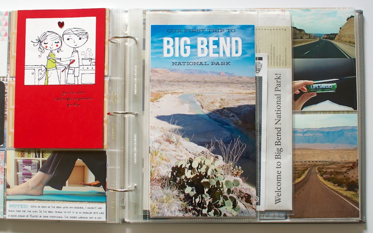
Playing with type and especially adding text directly to photos may just be my favorite part of Project Life.
When you turn the title page, you’ll find a map of the park as well as an 8.5×11 page protector (from We R Memory Keepers) that holds some of the papers we were given at the park.
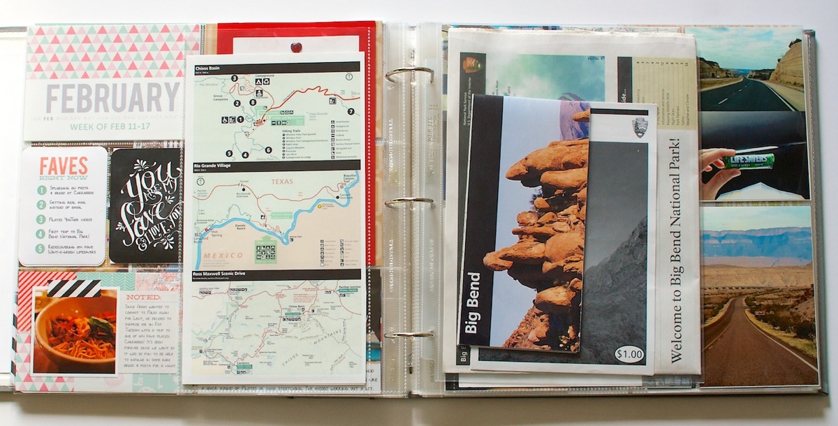
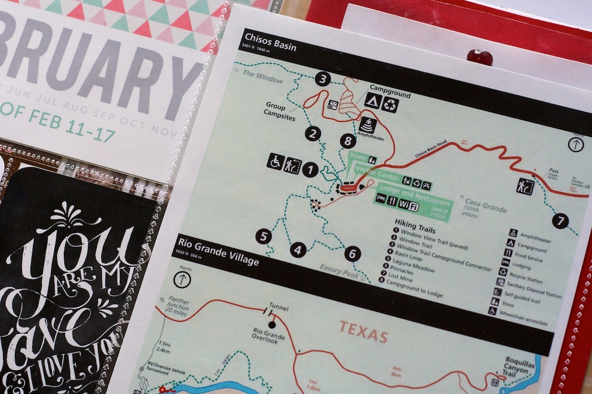
On the back of the 6×11 title card, I added a printed version of the map of the park. The National Park Service has downloadable PDFs available on their website so I just downloaded that, placed it into Photoshop, cropped and printed.
For my trip journaling, I added two additional 6×12 page protectors to hold four 6×11 journaling cards. To make my journaling cards, I copied the text directly from this blog post and then formatted it using Adobe InDesign. SUPER easy and saved me the trouble of having to rewrite what we did on the trip.
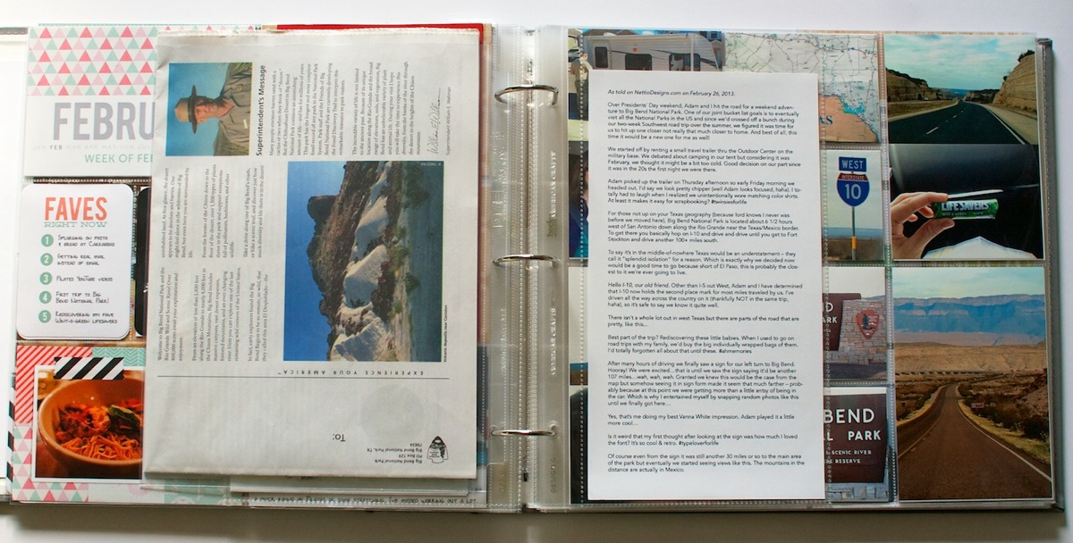
Since the Epson Premium Presentation Paper Matte I have is double-sided, I decided to try printing my journaling double-sided on a single sheet of 8.5×11 paper. A tip for doing this if you’re printing 6×11, make sure you align the text on the backside of the card opposite from the front side – front aligned to the left of the page, back aligned to the right. Otherwise when you go to trim the 8.5×11 sheet of paper down to 6×11, the journaling will be cut off.
Here’s a closer look at my printed journaling. I can definitely see using this format again as a way to get longer stories into my album. I love the way the photos peek out from behind the text like a little preview of what’s to come.
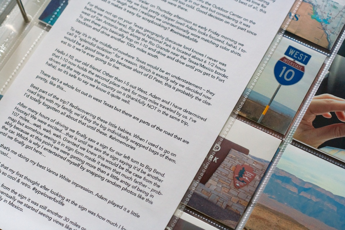
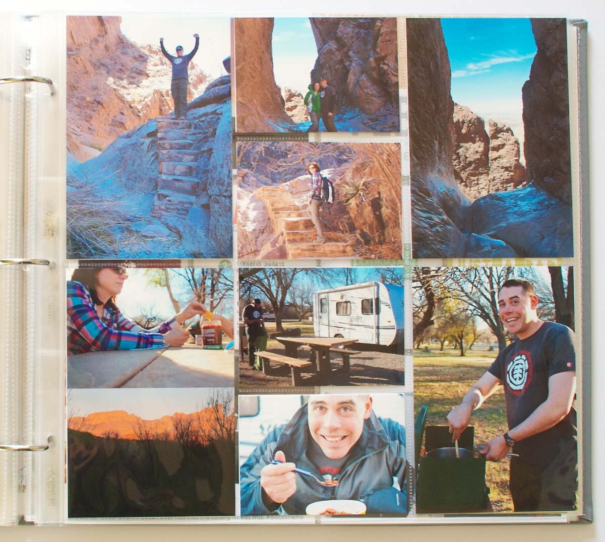
The right side of the Week 7 spread. I used two Project Life Design D page protectors for my trip photos since I loved the mix of vertical 4×6 and smaller horizontal pockets. They worked really well for my photos.
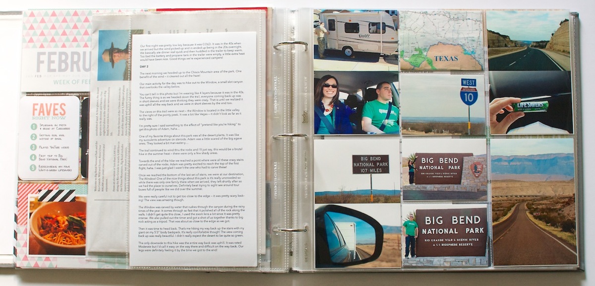
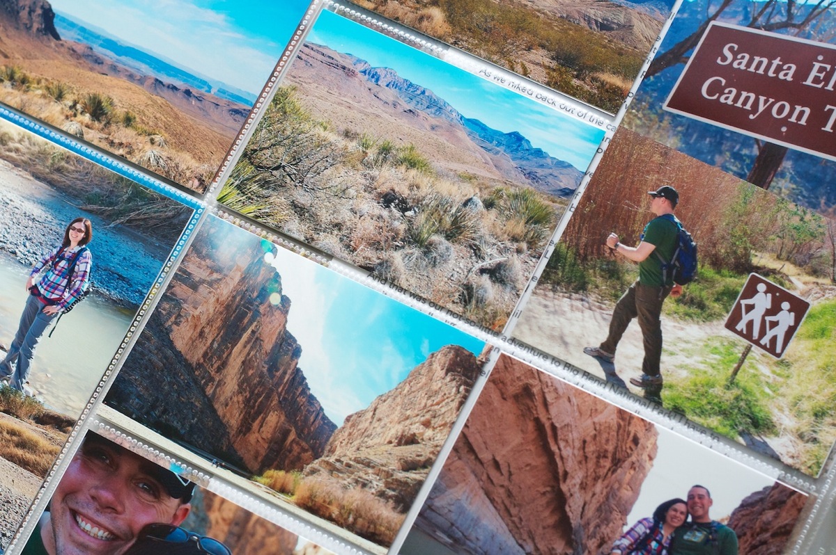
A closer look at the photo page. Since I had more photos than I had pockets for, I ended up printing two 3×4 photos on a single 4×6. I love it plus it reduced the amount of trimming needed!
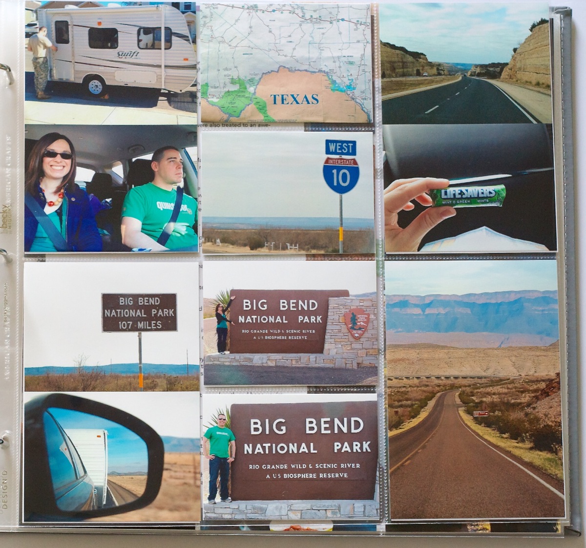
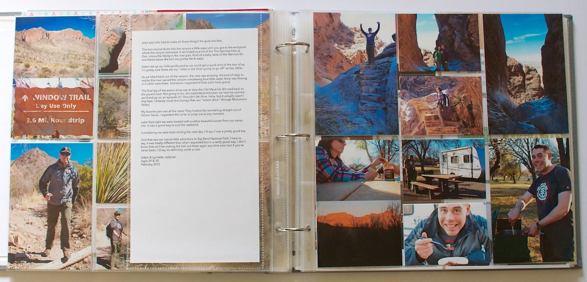
Here’s the second half of my journaling and photos. I decided to space the journal pages out since the spacing worked out that the journaling on the first card fit with photos on the first two pages and the journaling on the second card fit with the second set of photo pages.
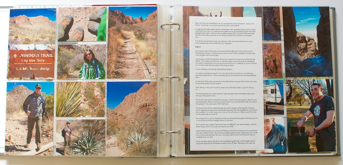
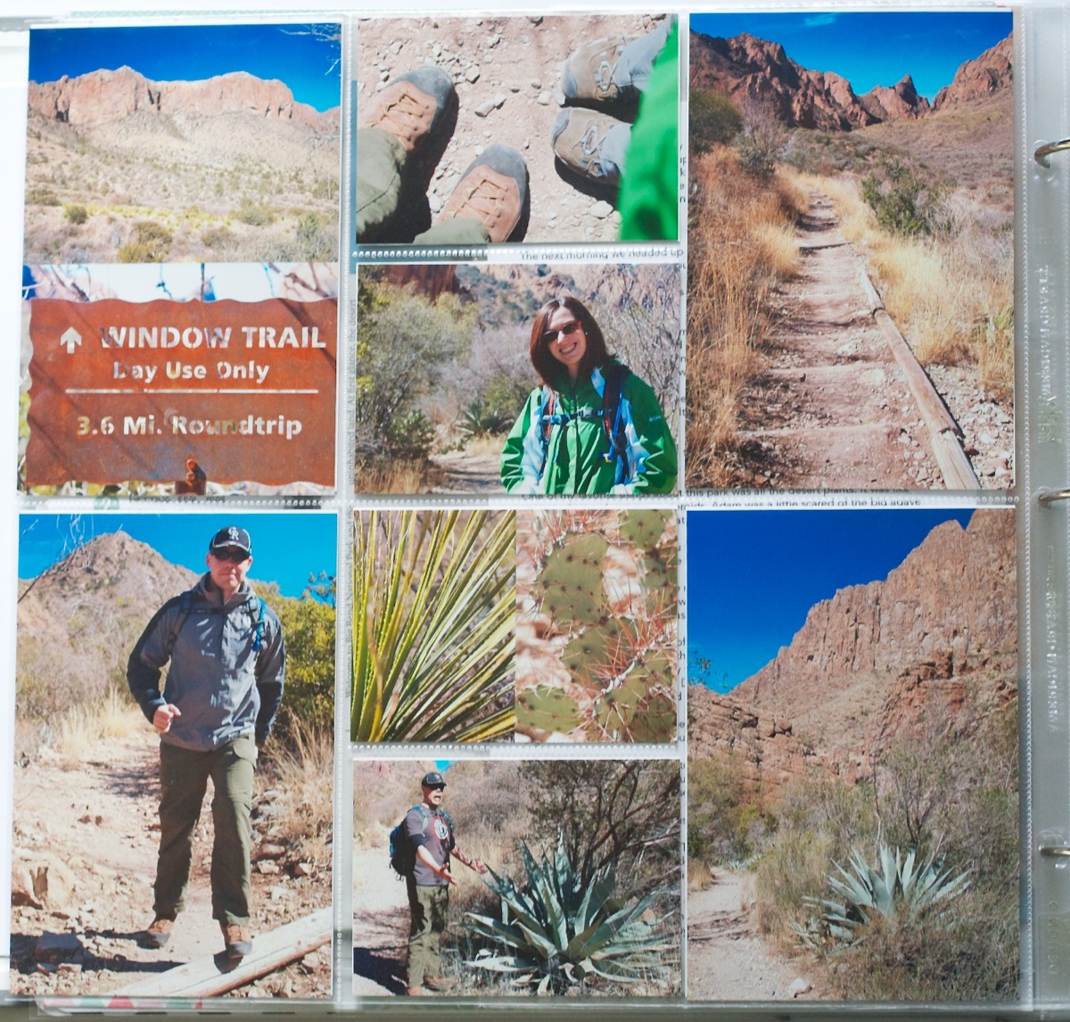
Close up of the left side photo page. These pages are the first ones I’ve done where I’ve laid everything out in Photoshop first and then printed. It was definitely faster than my previous post-it note method!
Back of the second journaling card and more photos:
Close up of the photo spread. I tried to feature a good mix of photos in my larger vertical 4×6 pockets.
Week 8: Feb 11-24
And here’s the Week 8 spread. On the left is the final set of photos from the trip and on the right is everyday stuff from Week 8. It was a little tricky narrowing down 6 days into one page but I’m happy with how it turned out.
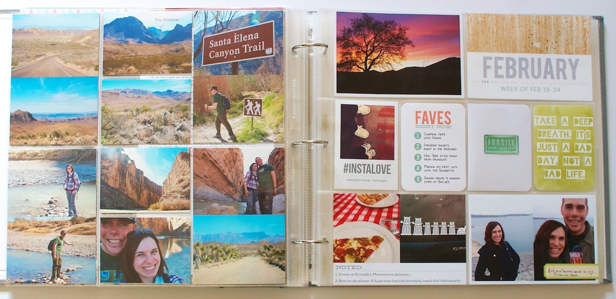
Close up of the final photo page from our trip. This page didn’t actually end up having any true 4×6 photos – they all were two 3×4 photos on a 4×6 sheet. I really wish there was a Project Life page protector design that had horizontal 3×4 photos like this!
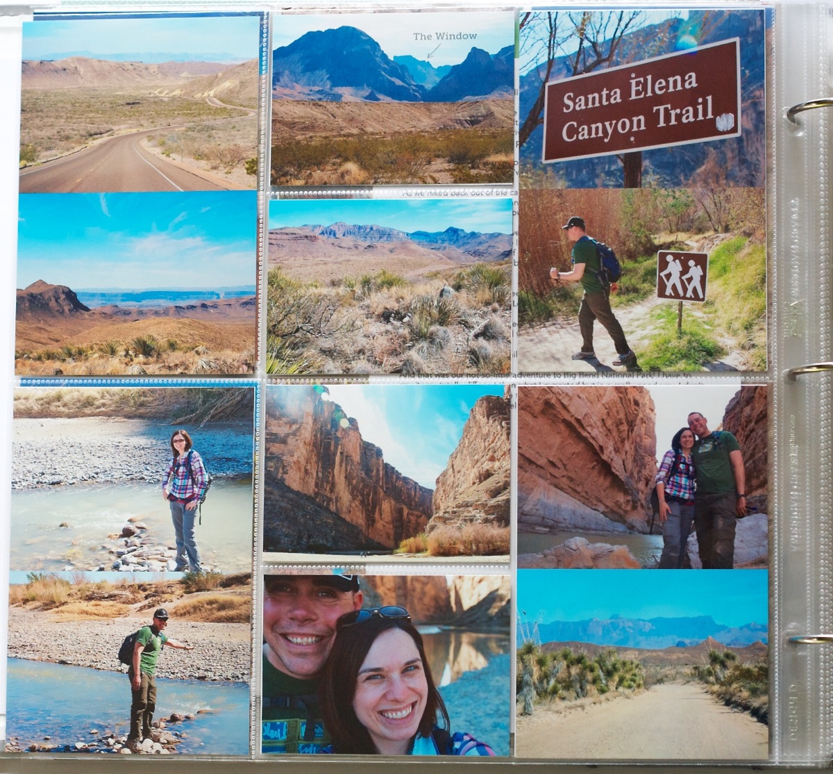
The trip photos are the first set of prints I’ve sent out for printing since starting Project Life and I have to say, as much as I like the flexibility of printing at home, I love the ease of uploading and slipping in printed photos even more. Sure beat babysitting my printer for 24 photos! I sent them to our local Target and while the blues came back a little too saturated overall I was happy with the quality of the photos.
Here’s a closer look at the right side of the Week 8 spread. Everything this week was fairly normal: Monthly Title Card, Faves card (available for free here), another 4×6 graphic journaler and a couple of photos. The sunset photo was taken one night from our backyard – other than deepening the blacks a little, it’s pretty much straight out of the camera. The sky was really those colors!
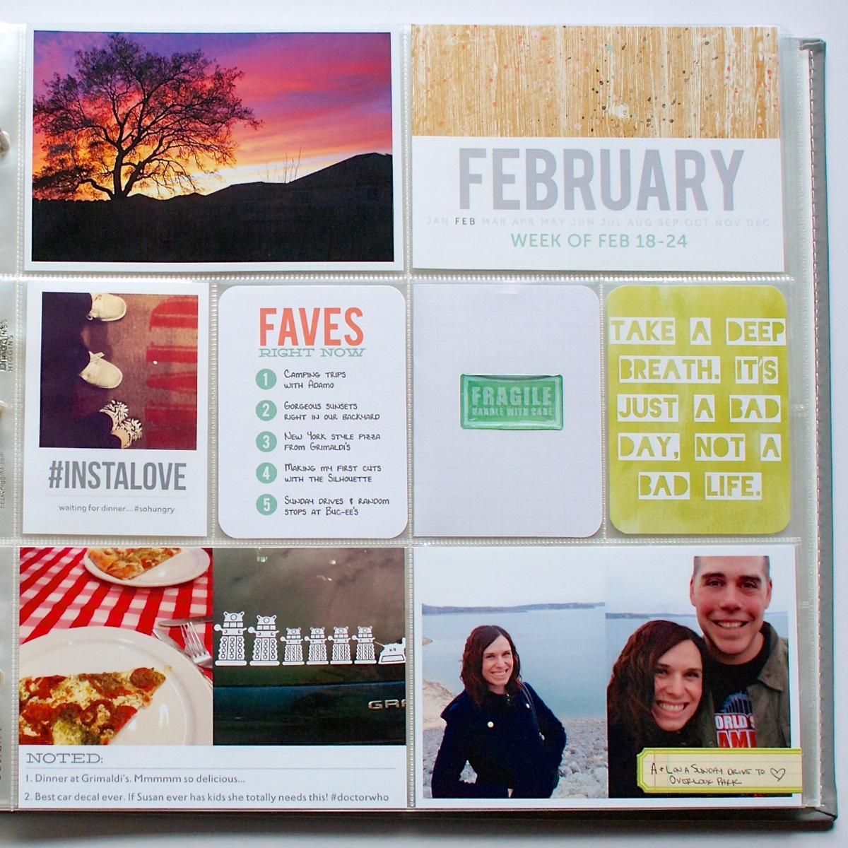
The Fragile Handle with Care card is actually a folded 4×6 journal card from the Project Life Seafoam core kit which includes some personal journaling I wanted to capture but didn’t want out for just anyone browsing my album to read. This seemed like a good compromise. That’s also the only card from the Seafoam kit I used this week. Everything else was either photos, my templates or printable accent cards. The take a deep breath card is from Jenn Barrette’s Resolutions: Patience, Relax, Breathe 3×4 cards set.
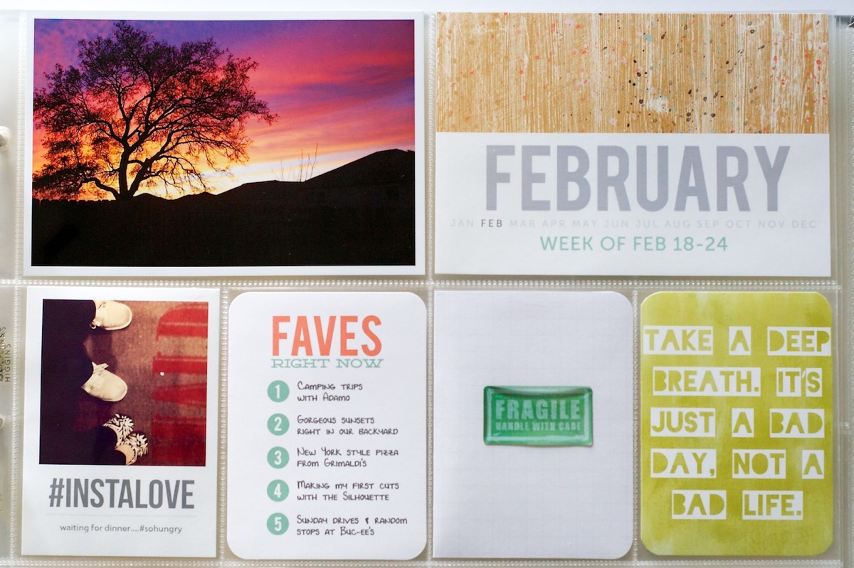
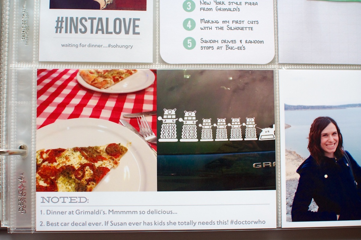
The InstaLove hashtag card is something I whipped up real quick (and am totally in love with) and the Noted photo card is from my 4×6 Journalers – Graphic Love templates. The Doctor Who themed car decal photo is actually a photo Adam sent me from the parking lot at his work. It was too awesome not to include!
Random thoughts this week:
- After 8 weeks of doing this (minus Week 1 which I still have to go back and add), I am starting to see the bigger picture of the album come together and I am so in LOVE with it. It’s a ton of work but so worth it when I watch Adam flip through the weeks and smile at all these small stories captured. I asked him if he thought this format was more approachable than my digital pages and he said he thought so. I think it’s because it’s more clean & streamlined and less product focused. I still love digital pages for more personal journal-type pages but I love this format for these types of stories even more.
- This is by far the quickest I have ever scrapped travel photos from any of our trips. In fact, it may be the only complete trip I’ve ever scrapped. #craziness #thanksbeckyhiggins
- Slipping printed Target photos into the pockets totally reminded me of the days when I’d drop my film off at Target and add my photos into regular photo albums. #goodtimes
- I’m definitely considering sending all my regular sized photos out for printing moving forward. While it’s not quite as immediate, it’s pretty inexpensive and a lot less hassle for me than printing at home.
Supplies used this week: Project Life Design A & Design D page protectors, American Crafts 6×12 page protectors, We R Memory Keepers 8.5×11 page protector, Seafoam core kit, Nettio Designs Bits & Bytes 2013 4×6 Weekly Title Cards, 4×6 Journalers – Paper Love, 4×6 Journalers – Graphic Love, Nettio Designs free Top Five Faves 3×4 card, Studio Calico February Project Life kit, Resolutions: Patience, Relax, Breathe 3×4 Cards by Jenn Barrette, You Hold the Key to My Heart digital scrapbooking kit by Zoe Pearn & Jenn Barrette. Photos/elements printed at home are printed on a mix of Epson 4×6 Premium Photo Paper Glossy & Epson 8.5×11 Premium Presentation Paper Matte and the Project Life 3×4 White Cards.
And that’s it for this Project Life 2013, Weeks 7 & 8 update! How are you doing with your Project Life album? Have you learned anything new after 8 weeks? Are you starting to see the big picture come together?
Project Life is a memory-keeping system created by Becky Higgins. New to Project Life? Learn more here & find all my Project Life posts here.
Design B is the best I’ve found for 4×3 horizontal photos the bottom row is like your page with 6 4×3 spots but the top is 4×6…I agree a full page of them would be awesome!
Oh yes, I debated about that one (among others) but decided I liked the flow of the other one better and I liked the idea of the two page protectors being the same. At the time I thought I’d have more full 4×6 verticals than I ended up with, I didn’t actually expect to have so many 3x4s.