I mentioned last week that part of the reason the ‘ol blog here has a been a wee bit quiet since March is because I’ve been working on a major design project behind the scenes here at Nettio Designs. Well that design baby has finally arrived and I can’t even tell you how excited I am to share it with you!
The second installment of the Everyday Storyteller idea book series, Everyday Storyteller Vol. 2 contains 83 pages of practical scrapbooking goodness from a group of incredibly talented memory keepers. It is a book that is equally perfect for digital scrapbookers as it is for paper scrapbookers and let me tell you, our contributors have really outdone themselves this time around. I learned so much just as I was layout out the pages!
The coolest thing is that, like it’s predecessor Everyday Storyteller Vol. 1, it not only comes in eBook format (print-quality PDF) but also as a soft bound print book. A real life book!
While I’m currently stalking my mailman waiting for the official printed proof books to arrive from Amazon, I thought it’d be fun to share a little behind-the-scenes peek at some of the design changes we made with Everyday Storyteller Vol. 2. It’s safe to say that Jennifer, Neisha and I learned a TON from the process of creating Vol. 1 and lucky for you, all those lessons added up to an even more kick-ass product the second time around.
LOGO REDESIGN
One of the first changes we made was to design a new logo for Everyday Storyteller. We liked the logo from the first book but I think we were all craving something a little bit more clean and streamlined. After lots and lots of sketching and debate about colors and details, this is the one we loved the most:
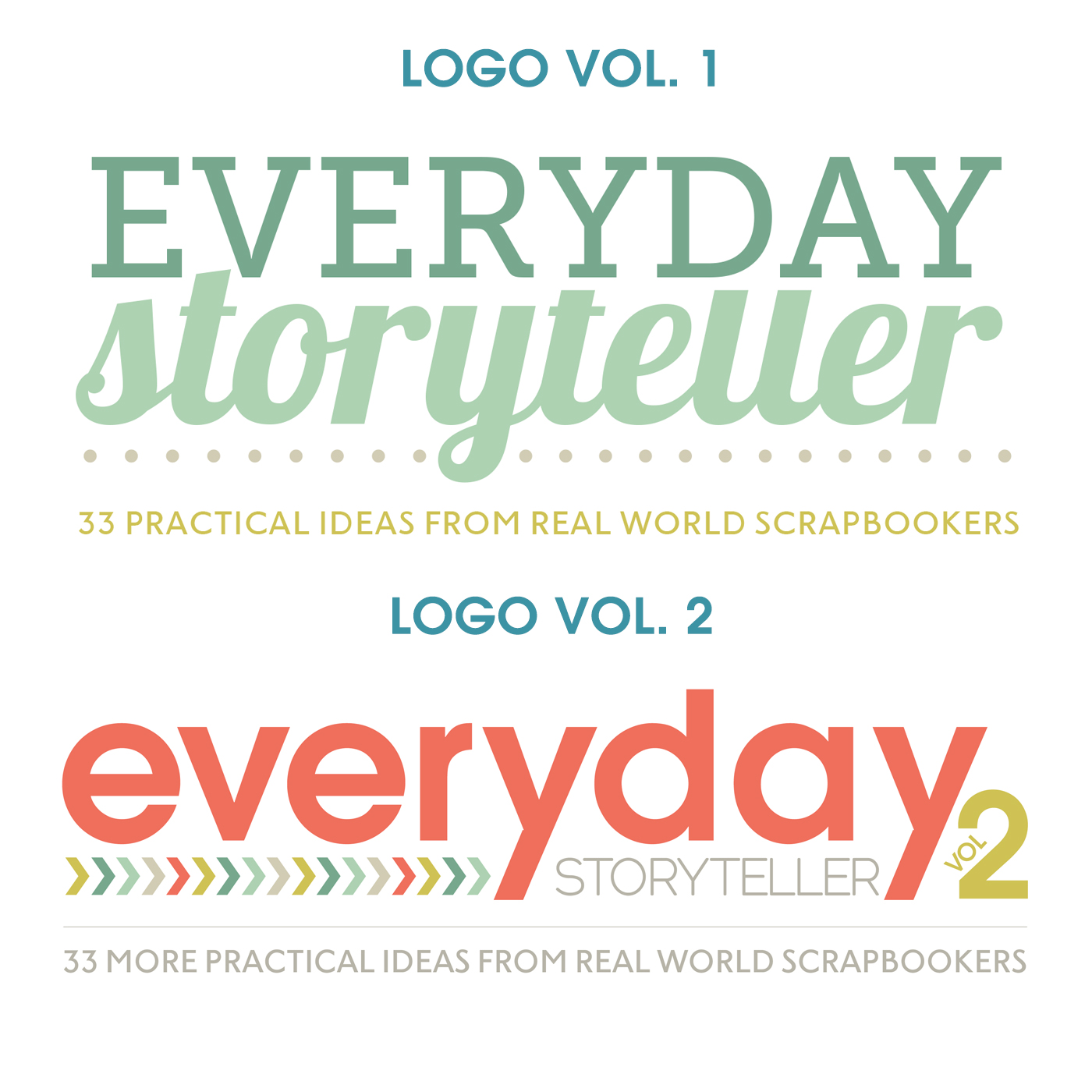
And here’s a look at the Vol. 1 vs Vol. 2 logo. Quite the evolution, no?
MORE WHITE SPACE
When it came to the design of Everyday Storyteller Vol. 2 book, we knew we wanted an overall design that felt like a sister to Vol. 1 – something that stood on it’s own but when you saw the two side-by-side, you knew they were related.
So while the color scheme and overall format stayed the same (one two-page spread per contributor), all of the headline and accent fonts were updated to reflect our new logo design. I also scaled down the main body copy font a smidge to not only give all of our amazing content more room to breathe, but to also allow for maximum readability in both the digital and print formats.
LOTS & LOTS OF QUICK TIPS
One of our biggest lessons from Vol. 1 came during the contributor content process. The first time around we were flying blind a little bit in terms of how much and what kind of content would work best in this format. The second time around we knew exactly what we wanted. Not only did this streamline the design process in terms of editing, but it also allowed us to really cater the design to the content we knew we’d be receiving from our amazing contributors.
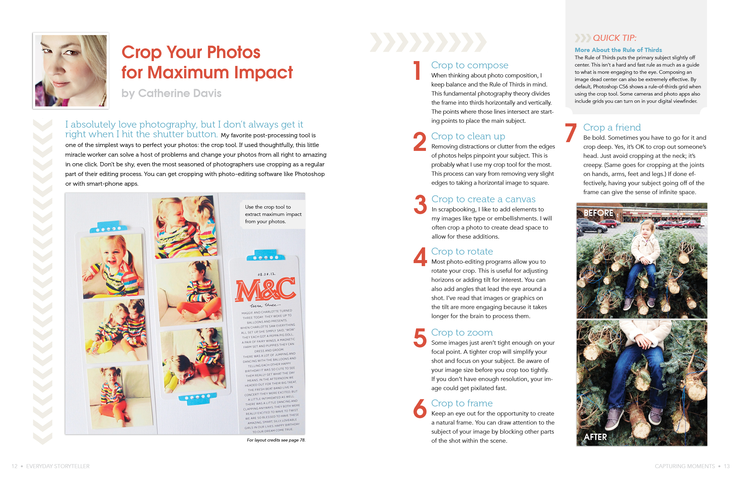
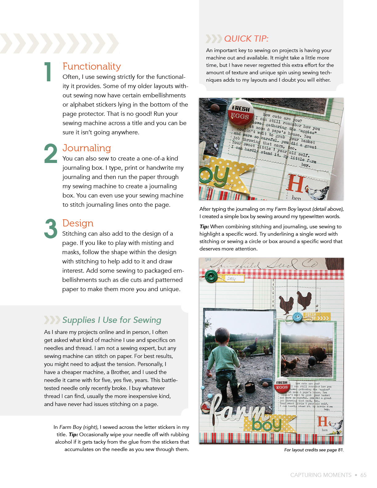
One my favorite changes is the addition of our new Quick Tip callout boxes. These bite-sized bits of information not only add a fun element to the page design, but they’re great for when you just want to flip through the book but still pick up a lesson or two.
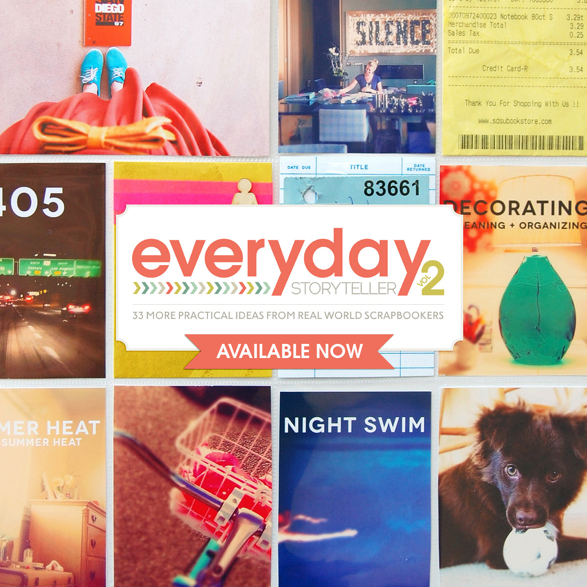
I am so excited and proud to be finally able to share this with you, as it represents such a collaborative effort over 5+ months. In a way, it’s kind of surreal that it’s finally here! You can click here to check out the new book. Oh, and if you don’t yet have Everyday Storyteller Vol. 1, you can save $5 when you buy them as a bundle!
Disclaimer: all of the links in this post are affiliate links but given just how much time I’ve spent pouring over all the details & content in Everyday Storyteller Vol. 1 & 2, I’d say I feel pretty confident recommending it to you, hehe.
LOVE LOVE this book!!! Thanks for the inspiration!!
Thanks Janet!