The Summer Love FREE Mini Course will officially start next Tuesday, July 2nd but I wanted to take today to answer a few of the questions I’ve been getting about the Summer Love Mini Templates and Mini Course.
Summer Love Mini Album Templates
How exactly do the Summer Love Mini Album templates work?
Much like my popular Holiday Faves Mini Album templates, the Summer Love Mini Album templates are designed to give you a fun & easy foundation for capturing all your favorite things about summer. The core of the album is built around a top ten list of “Summer Love” journaling cards with summer-themed photo and accent pages sprinkled throughout. But unlike the Holiday Faves Mini Album, you don’t have to do any prep work before the summer starts because this album is designed to be filled in as you go.
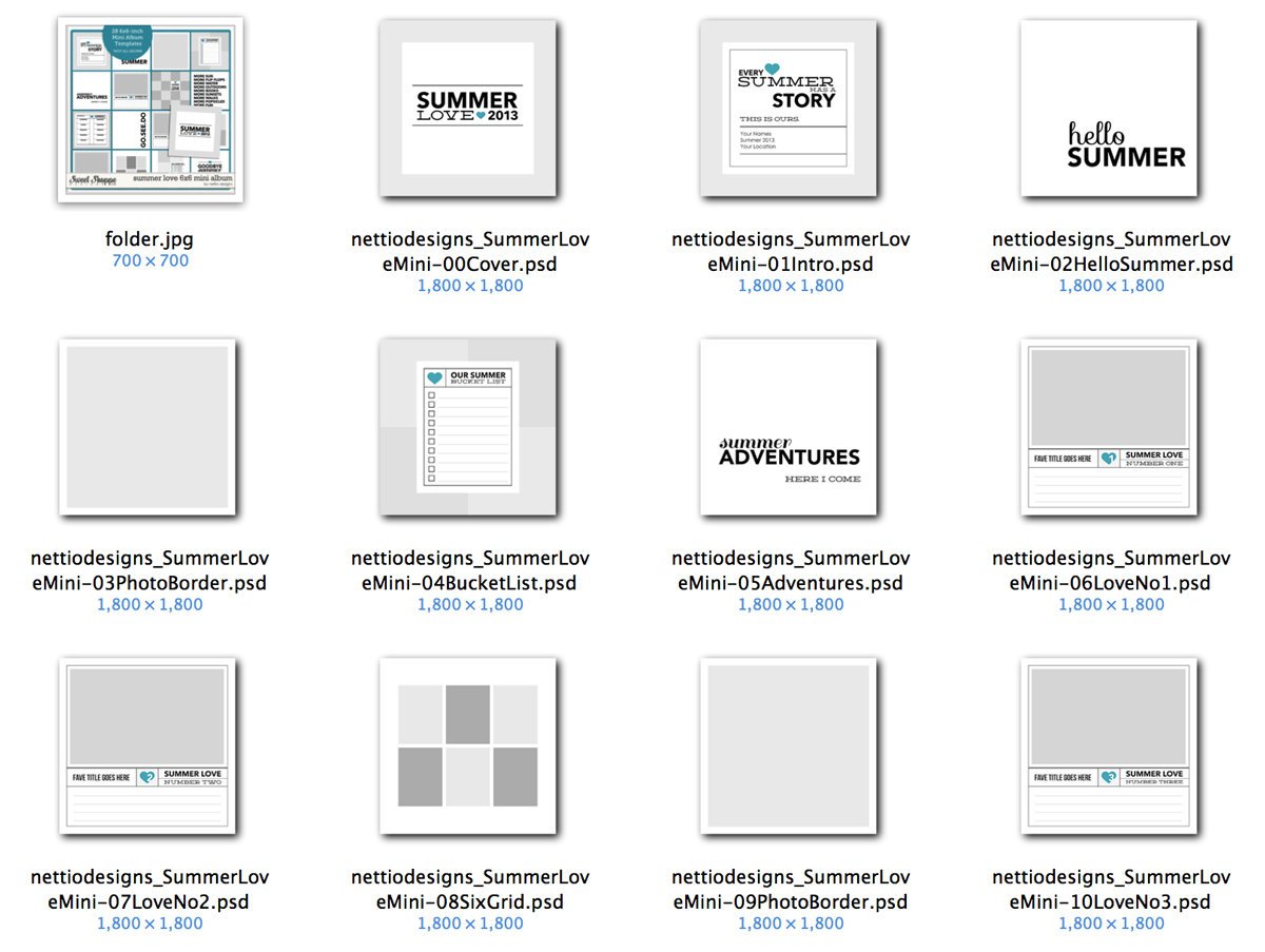
What’s included with the Summer Love Mini Album templates?
Included in the Summer Love Mini Album Templates are 28 6×6-inch layered summer-themed Photoshop page templates including:
• 1 6×6 Summer Love 2013 cover page
• 1 6×6 Summer Story intro page
• 5 6×6 Text accent pages – perfect for creating overlays or cutouts
• 6 6×6 Photo grid pages with room for up to 9 photos
• 10 6×6 Summer Love photo journaling cards, numbered 1-10
• 1 6×6 Summer Bucket List themed page
• 1 6×6 Summer Currently themed page
• 1 6×6 Summer Insta-Love themed page with room for up to 15 square photos
• 1 6×6 Summer Highlights themed page with room for up to 5 photos
• 1 6×6 Goodbye Summer back cover page
There is also a font list and a sample layout PDF included to give you a visual guide of how the album will flow once it’s finished.
What is the exact size of the Summer Love Mini Album templates?
All of the Summer Love Mini Album templates are exactly 6×6-inches square. Each template represents one page in the finished mini album.
Do I have to use the templates in a certain order?
Unlike my Holiday Faves Mini Album templates which are designed to be mixed and matched, the Summer Love Mini is designed to flow through summer, starting with your summer bucket list, moving through your loves and ending with your summer highlights. Each mini template is labeled with Of course you’re always welcome to do your own thing and move the pages around to fit your stories, but Team Awesome and I will all be using the pages in order to keep things consistent for the mini course.
Do my Summer Loves have to captured in chronological order?
Nope! Other than the Summer Love journaling cards being numbered #1-10, there are no date references anywhere in the album. If you want to have Summer Love #8 be from June and Summer Love #9 be from August, no one will ever know. That’s one of the reasons I love the list format over a date format for these kinds of mini albums. It gives you the flexibility to have weeks where you have lots of loves you want to capture balancing out other weeks where you don’t.
Do you recommend digi or hybrid for my album?
It’s really up to you! I chose the 6×6-inch size for these mini templates because it’s so friendly for either a digi or hybrid album. If you want to create a hybrid mini album, you can easily print all your pages at home on an 8.5×11 sheet of card stock (I use Epson Premium Presentation Paper Matte) and then write directly on them in your own handwriting. Or if you want to create your album digi-style, you can design your pages and print them all at the end as a photo book or individual pages like you would any regular layout.
Where can I get my 6×6-inch pages printed once I’m done with my album?
Well of course, you can print your pages at homem but if you’d like to send out your pages for print, Persnickety Prints offers 6×6 prints for $0.99 each. Once you have your printed pages, you can either put them in a handmade mini album or a store-bought album like the American Crafts 6×6-inch album.
If you’d like to print them as a 6×6 photo book, both Artscow and Persnickety Prints offer 6×6-inch photo book options. Keep in mind that with a photo book, you may have to adjust the sizes of the templates to allow for the correct bleed & edge margin for that specific book printer.
Can I resize the 6×6 templates to 8×8?
Because the majority of the text in the templates is rasterized, I would recommend against increasing the Image Size to 8×8 at its current resolution of 300ppi. But you can increase the image size to 8×8 with the Resample Image unchecked in the Image Size dialog box, which will give you an image of 2400×2400 pixels with a resolution of 225ppi. I normally scrapbook 8×8 and have occasionally printed my layouts at 12×12 at 200ppi and they always turn out great so they should print just fine. Just keep in mind that if you do this, all of your scrapbooking elements which are 300 ppi will look oversized when you initially drag them onto the canvas but it’s nothing a little transforming can’t fix.
The other option would be to increase the Canvas Size instead of the Image Size and just have an additional border around the pages. That could look really nice too.
I’m not really a fan of mini albums. Do you have a regular 12×12 template option for summer scrapbooking?
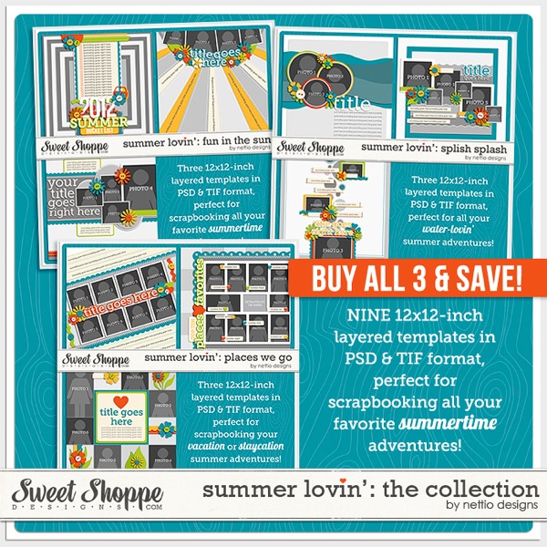
Indeed I do! Last summer I released the Summer Lovin’ collection which featured nine 12×12-inch summer-themed templates which would be perfect for this.
Summer Love Mini Course
How long does the Summer Love Mini Course last?
The Summer Love Mini Course will officially begin Tuesday, July 2nd and continue through Thursday, August 15th. New content will go live Tuesdays and Thursdays on the Nettio Designs blog.
How much does it cost?
It’s totally 100% FREE.
Do I have to buy the Summer Love Mini Templates to be a part of the class?
Nope! Anyone who’d love some Summer Love inspiration is welcome to follow along. Just keep in mind that all of the examples will use the Summer Love Mini Templates but the tips/ideas should be relevant for anyone.
How can I make sure I don’t miss out any of the fun?
Sign up for the Summer Love Mini Course email list! This list is completely separate from my regular Nettio Designs email list so you’ll only receive summer-tastic updates through it. Click here to sign up or use the signup form at the bottom of this post.
Is there somewhere I can share my own Summer Love Mini pages with Team Awesome?
There will be but I’ll be sharing those details in Tuesday’s post.
Using the Summer Love Mini Templates
What’s the easiest way to recolor the flattened text layers/elements in the templates?
Because I used non-standard fonts for the majority of the text in the templates, all of the text layers have been flattened. So what’s an easy way to recolor these flattened layers? Well here are my two favorite options depending on whether you’re using Photoshop or Photoshop Elements:
In Photoshop:
For recoloring flat, non-textured elements like text or accent lines in Photoshop, I like to use a Color Overlay layer style. Layer styles are non-only quick to use because you can easily apply them to multiple layers but they’re also non-destructive which means I can easily recolor or remove the color completely by adjusting the layer style.
To apply a Color Overlay layer style in Photoshop:
1) Select the layer in the Layers Panel
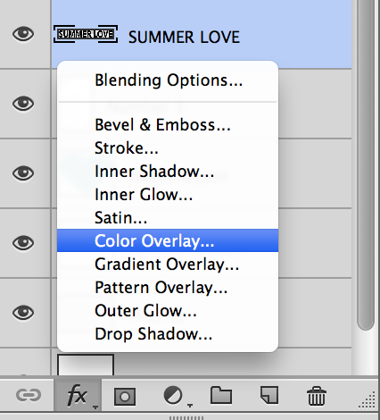
2) Click on the FX symbol at the bottom of the Layers Panel and choose Color Overlay
3) In the pop-up window, click on the color box to select the color you’d like. By default it’s a crazy shade of red. You can also select a color from your Swatches palette.
4) Click Ok and then Ok again and your layer should be recolored with a little FX next to the layer name in the Layers Panel.
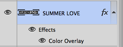
If at any time you’d like to change the color, simply double click on the FX symbol and adjust. You can also drag the FX layer style to the trash to remove it or hold down the Alt key and click and drag the layer style to another layer or right-click on the FX symbol to copy and paste the layer style to other layers.
In Photoshop Elements:
To recolor a non-textured element in Photoshop Elements, you can use the Fill option to fill the selected element with the color of your choice.
To Fill an element in Photoshop Elements:
1) Cmd/Ctrl+Click on the layer thumbnail in the Layers Panel. If you’ve done it right you’ll see a selection (marching ants) around your element.
2) Hit Shift+F5 to open the Fill dialogue box.
3) In the drop-down menu, choose whether you’d like to use your pre-selected Foreground or Background color or select Color to bring up the color picker.
4) Select your color and choose OK.
5) Hit Cmd/Ctrl+D to deselect your newly filled layer.
How can I easily get my digital journaling to match the journaling lines in the templates?
If you’d like to type out your journaling digitally, you have two options. You can either turn off the Journaling Lines layer in the template and simply add a new text box in the open space or if you’d like to use a handwriting type font and make it look like you wrote on the page, you can adjust the spacing between the lines of text, also known as the leading, until the text lines up with the journaling lines.
To do this:
1) Select your Type Tool (T) and drag out a new Type box in the area where you want to add text.
2) Add your journaling or type in some placeholder text like so:
3) Double-click on your text paragraph to select the text.
4) In your Character Panel (Window>Character), open the Leading drop down, it’s the one with the two A’s on top of each with an up and down arrow next to them.
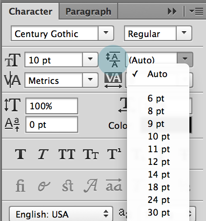
5) Adjust the leading size until the lines of text match up nicely with the journaling lines. In my example I used a 10pt Century Gothic font with a 20pt leading.
A quick tip for Photoshop users: If you hover your cursor over the Leading symbol next to the drop down, you should see a hand with two little arrows next to it. If you drag the cursor slightly to the left or right, it’ll adjust your leading accordingly without you having to guess on numbers. Not sure if this works in Photoshop Elements or not but if someone wants to try it and let me know, I’ll be happy to edit the post.
Any tips for planning/finishing my album?
Yes, don’t stress! The point of the Summer Love mini is not to stress you out or make you feel guilty if you don’t keep up or finish your album. In fact, that’s the awesome thing about this format: if you get to the end of the summer and you’ve only filled in say, five Loves instead of all ten, no worries! Simply remove those pages and call it done. You’ve still captured your summer adventures and no one but you will ever be the wiser.
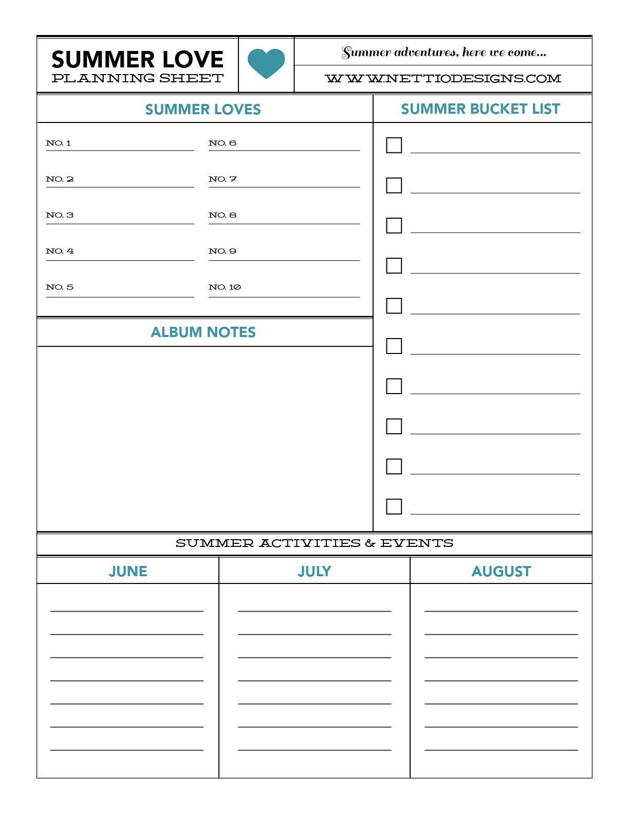
Of course, if you’d like a little help with your album planning, I’ve also put together this free downloadable planning sheet to get you started. It includes room for your summer bucket list, a list of Loves, space for any album notes and room for listing activities, etc, you’ve got coming up that you might want to include in your album. Just click the button below to download!
[wp_eStore_download_now_button id=54]
Well I think that’s it for this FAQ! If you have any other questions I didn’t answer above, feel free to ask them in the comments below. And don’t forget to sign up below for Summer Love Mini Course email updates. Wouldn’t want you to miss out on the fun!
[catalyst_hook_box name=”summerlovesignup”]
Hi, I’m planning to buy this awesome mini album, but I was wondering if I could re-size all of them to 8×8? The local printing shop we have here doesn’t have 6×6 photobook printing, and also the photobooks I have were printed in 8×8 as well. Thanks a lot 🙂
Hi Cherry! I’ve had a couple of people ask me this so I went ahead and added it to the FAQ but here’s what I told them:
Because the majority of the text in the templates is rasterized, I would recommend against increasing the Image Size to 8×8 at its current resolution of 300ppi. But you can increase the image size to 8×8 with the Resample Image unchecked in the Image Size dialog box, which will give you an image of 2400×2400 pixels with a resolution of 225ppi. I normally scrapbook 8×8 and have occasionally printed my layouts at 12×12 at 200ppi and they always turn out great so they should print just fine. Just keep in mind that if you do this, all of your scrapbooking elements which are 300 ppi will look oversized when you initially drag them onto the canvas but it’s nothing a little transforming can’t fix.
The other option would be to increase the Canvas Size instead of the Image Size and just have an additional border around the pages. That could look really nice too.
Hope that helps and if you have any other questions, let me know!
I tried to subscribe, but it didn’t look like anything happened. Usually I get a message that I am subscribed or have to check e-mail and confirm. I DO want to subscribe to your special newsletter, so pleae put me on your list. Thanks!
Hi Noelle! I double-checked my list and you are signed up so if you didn’t receive the email yesterday, let me know. 🙂
Yikes! Ooops, sorry if I haven’t read the whole content of this post ;(, I came from the post before this and thought that I put my comment here so it’s on your first blog post.
Thank you for your reply, I’m gonna have to take note of that, but I like the last option you gave – additional border around the page 🙂
Have a great day always!
No, no worries. I edited the post after you asked the question. 😀