 Woohoo, it’s time for another installment of the Summer Love Mini Course! Today Team Awesome and I are sharing our third set of Summer Love journaling spreads, Summer Loves 5 & 6 or pages 13-16 in the mini album. Can you believe we’re halfway through our mini albums? Page 13 marks the midway of this 26-page mini album so we’re here!
I mentioned last week that at this point in the mini album process, it’s normal to feel a bit uneasy about how the album is all going to come together. So to ease your mind, I thought I’d show you a peek at how the first half of my mini album is shaping up so you can see how it flows even though each page is unique.
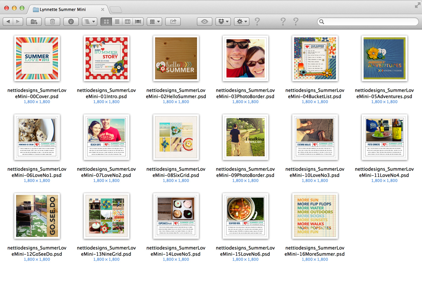
One trick I’ve found really helpful for designing my pages is to actually open the Finder window seen above as I’m working. This allows me to see all of my pages at once so I can keep track of how many times I’ve used a page and where I may need to add or subtract pops of color.
For example, on page 13, the Nine Grid layout, I’d originally left the background white but when I saw all the pages together like this, I decided to duplicate the cream background paper from the Six Grid layout on page 8 to add some cohesion and consistency to my mini design. So if you’re uncertain about how your mini album is shaping up, don’t be afraid to look back at your pages as you keep moving forward.
Now on to this week’s pages…
Summer Love | Summer Loves 5 & 6 Pages 13-16
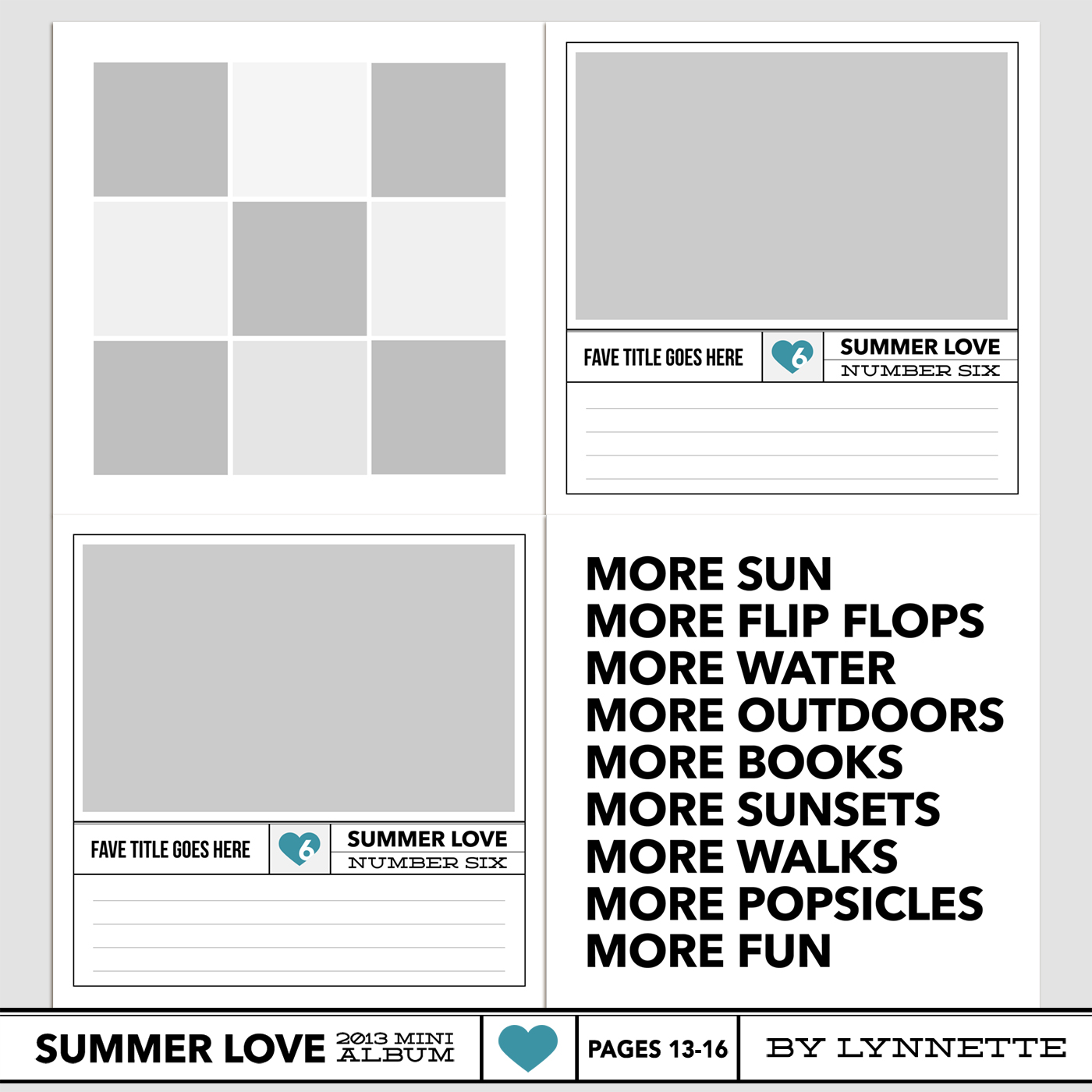
Here’s a look at the Summer Love 6×6 Mini Album templates for pages 13-16:
By Lynnette
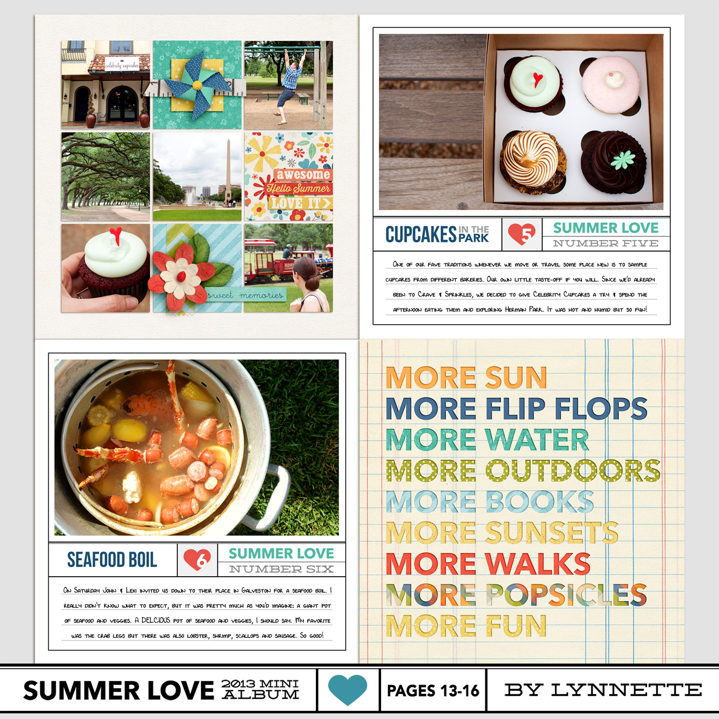
Here’s a look at my page 13-16 layouts. I love grids so I was really excited that it was time to use this nine grid page. I’m also realizing that a lot of my Summer Loves have to do with food which I suppose shouldn’t be a surprise because we do love to eat, haha.
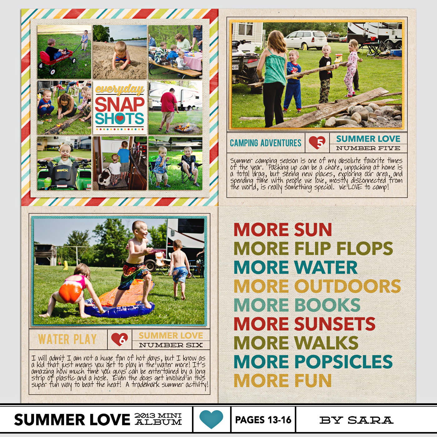
Here’s a look at Team Awesome’s pages 13-16:
By Sara
I’m loving the way Sara’s matting all her photos with a solid paper – it’s a great way to add a pop of color to those pages.
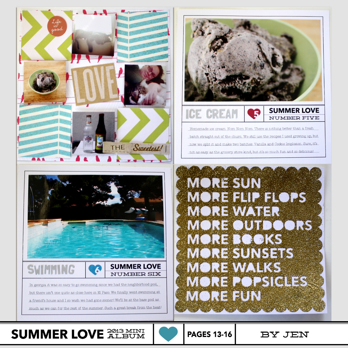
By Jen
Jen’s hybrid pages are so fun! If you’re curious how she’s creating her pages, be sure to check out the Silhouette tutorial she posted on Tuesday.
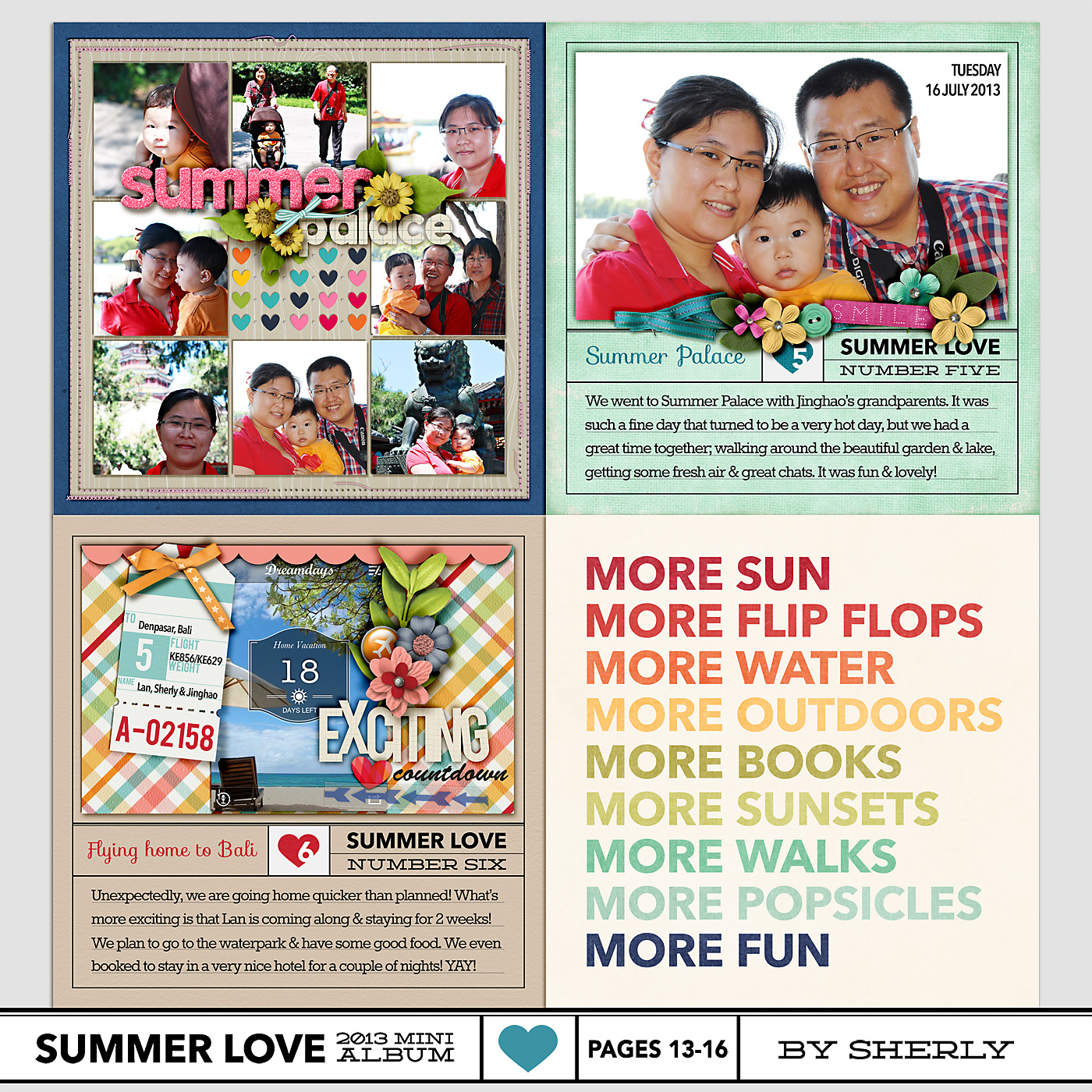
By Sherly
I’m SO in love with the rainbow effect Sherly did on page 16. So pretty!
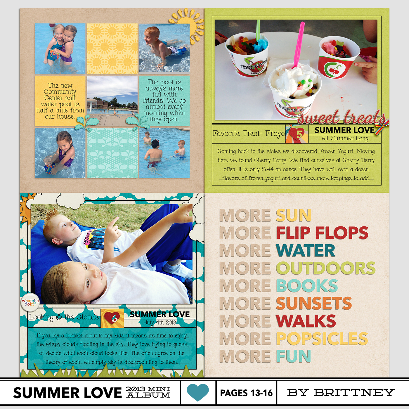
By Brittney
Brittney’s been swapping out the numbered text title under “Summer Love” in the templates to add in a date. Such a smart idea!
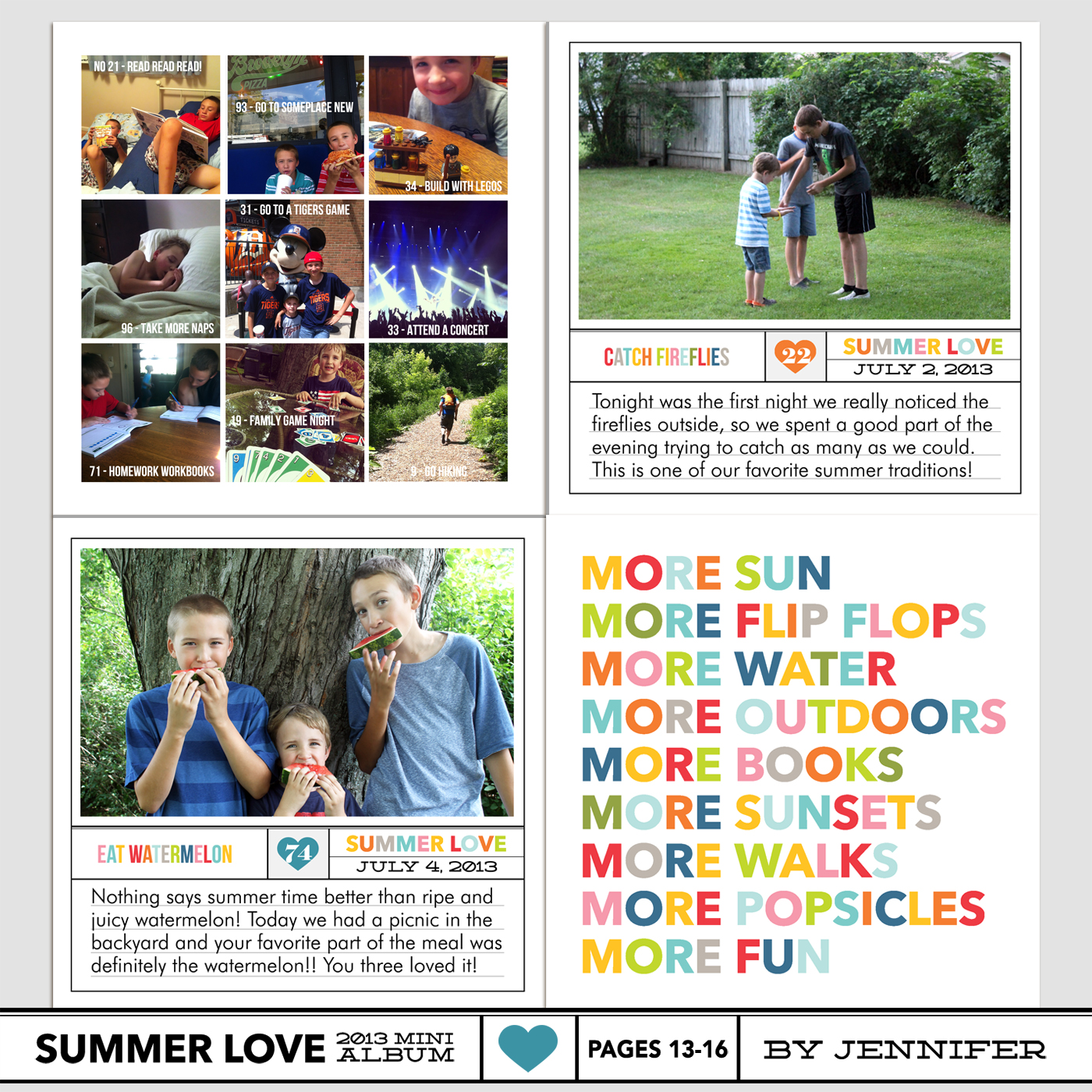
By Jennifer
Jennifer’s family looks like they’re having the best summer ever! I love how she used the nine grid page for all photos.
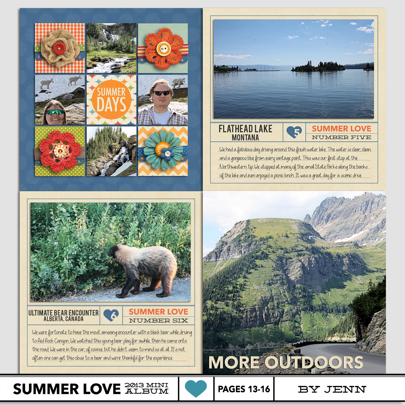
By Jenn
Jenn’s done a great job adding large photos to her album and this one is no exception. I love how she adapted the text on page 16 to fit with her photo and that bear photo – oh my!
Ok, well that’s it from us today, but now we’d love to hear from you! How are you feeling now that we’re halfway through our mini albums?
Want to share your mini album progress? Feel free to add them to my designer gallery at SSD and link us up in this thread at Sweet Shoppe Designs.
Coming up next…On Tuesday, July 30th, Team Awesome member Amy will be sharing tips for printing your albums. See you then!
[catalyst_hook_box name=”summerlovesignup”]
__________________________________________________________________
Previous Summer Love Mini Course posts:
View all Summer Love Mini Course posts here.
