If you happened to stop by Nettio Designs of late, you may have noticed the site’s been in maintenance mode all week. That’s because the web-coding elves, aka me, have been busily working behind the scenes on a fresh new look for Nettio Designs!
Like most web design projects this one took on a life of it’s own, but considering how long it’s been on my to-do list it feels good to finally check this baby off as done.
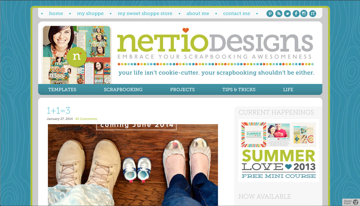
For reference, here’s what the site looked like before:
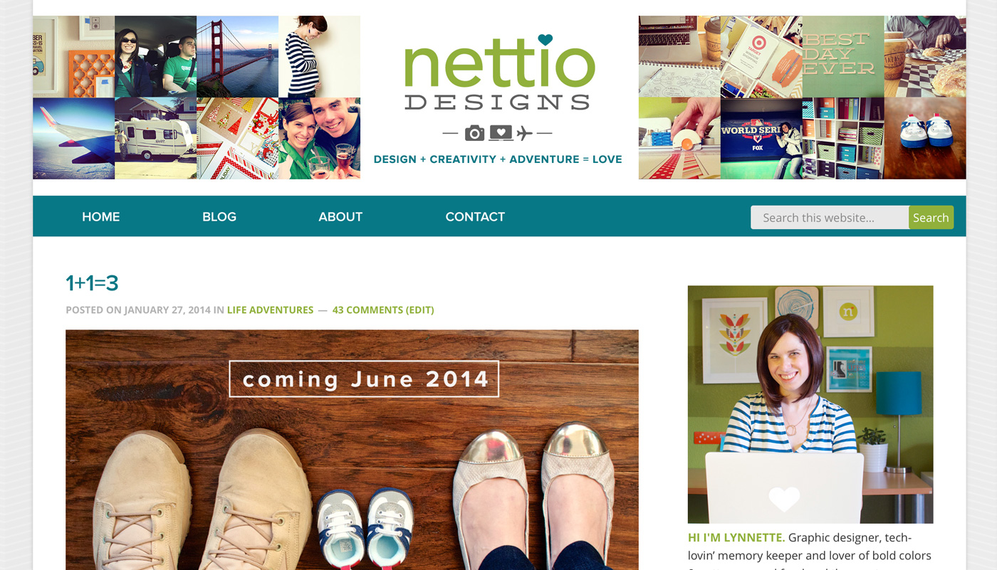
And here’s what it looks like now:
A moment of silence for the loss of our beloved woodgrain…
My goal for this redesign was two part: a) to give the site a fresh modern new look that feels more me and b) to make the site easier to navigate for you.
If you’re reading this post in a feed reader or email, I highly recommend popping over to Nettio Designs to check it out! There’s a bunch of new features you won’t see from the screenshot alone. And if you aren’t seeing the new design, you may have to clear out your browser cache so that it serves up the new images instead of the previously saved ones.
With that, there’s a couple of new features I’m excited about that I wanted to point out:
1) A Responsive Design: The site has been rebuilt from the ground up on a new framework and child theme (Genesis Framework with the Dynamik Website Builder child-theme for those of you who like to know those things) which means it’s now fully mobile responsive. What this means in the real world: the design will adapt to display for whatever size device you happen to be browsing on whether it’s a laptop, tablet or smartphone. As a Mac/iPad/iPhone lover who does the majority of her browsing these days on mobile devices this was really important to me and well worth the extra time and effort to make it happen.
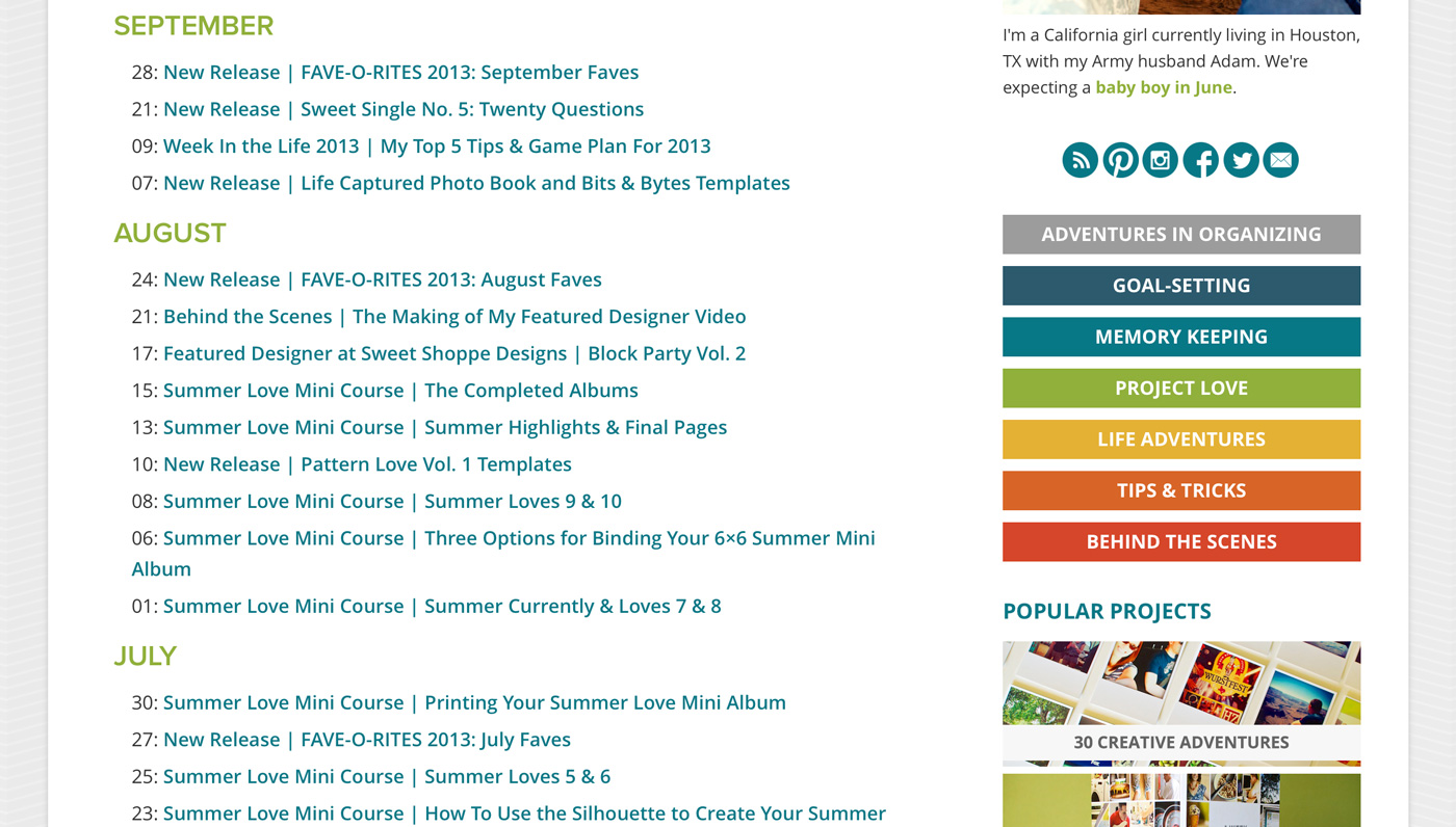
2) Updated Sidebar Links: The blog sidebar not only has a new look but has been updated to make it easier for you to find all my best content including: links to my main blog categories, my top 5 most popular projects and a list of must-read posts, chosen by yours truly.
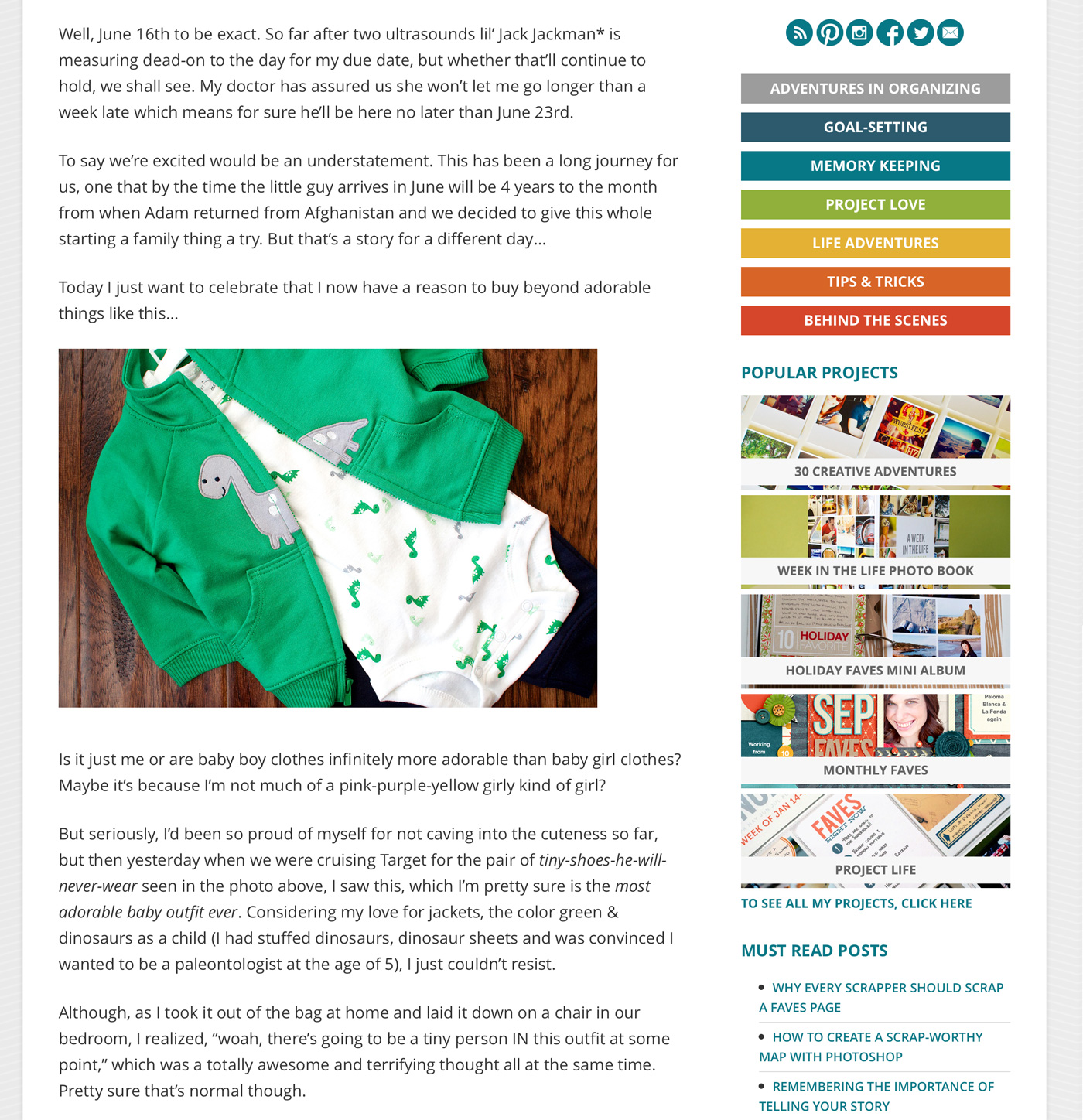
I’m also really proud of the new Archives page which not only made me realize I blogged more last year than I thought, but should also make it much easier for you to find that specific post you know exists but aren’t sure where to find.
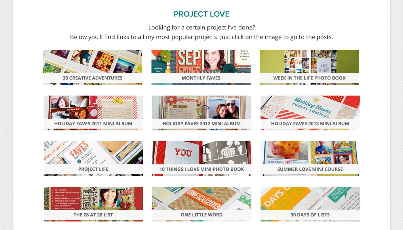
3) A New Project Page: In addition to the popular project links in the sidebar, there’s now a dedicated projects page where you can find images and links to ALL of my projects included Week In the Life, Holiday Faves and much more. Check it out here.
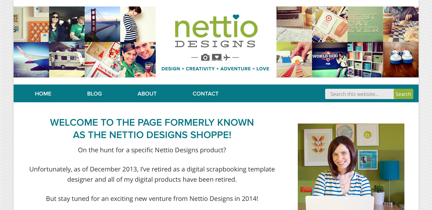
4) The Nettio Designs Shoppe is Officially No More: Yes after three years, the Nettio Designs shoppe is officially closed for business. A few of you had discovered you could buy really really old products through the store and while I appreciate the support, it was time for the templates to go. All product links now redirect to the shoppe homepage where there’s a friendly note about my retirement as a product designer and to stay tuned for what’s next.
Of course there’s still a few tweaks I’d like to make (aren’t there always?), like an updated About page, a Work with Me page, a project category with all my digital layouts and some more category customization, but for the most part I’m super happy with how it turned out. It feels fresh and new and makes me excited to share in this space once again.
And finally, if you’re wondering how the Nettio Designs redesign fits into my plans for 2014, just consider this phase 2 of my three-step plan for 2014:
Phase 1: Retiring as a template designer
Phase 2: Redesigning Nettio Designs
Phase 3: The launch of something completely new which I promise I will spill the details on very soon.
For now I’m going to take a break from the world of web coding and try to remember what it’s like to speak in a language that doesn’t involve CSS, PHP or HTML…and maybe take a shower, haha. If you happen to stumble upon anything wonky with the design, feel free to leave me a note below to let me know.
Can I take Levitra if I am taking other remedies at the same time
Site looks really great! But you’re such a tease! LOL I was thinking THIS is the post you’ll reveal your new adventure! 😉
I know, I’d been hoping too! But there’s no good way for me to share more until it’s ready to go and I didn’t want to keep this site under wraps until then. So rolling it out in phases it is.
The site redesign looks awesome, Lynnette! Crisp, clear and colorful – not an easy combination to hit all the right points on, but you did it. I can’t wait to find out your next adventure.
I love the new look!!!
I love this fresh clean look, Lynnette!!
I am really excited about the new venture you’re going to announce, hopefully, soon!! I keep checking in everyday, just so that I didn’t miss anything!