As part of my word OPEN this year, I’m focusing on being more of an open book about why I do what I do when it comes to my creative adventures. So to kick that off, I’ve decided to start a new semi-regular feature called Scrapbook Saturday where each week I’ll share my most recent scrapbooking layouts as well as a little bit of my thought process behind those pages.
Since I’m not the most prolific scrapbooker in the world (slow would be a better description, haha), I can’t promise there will be a post every Saturday but I am hoping that sharing more layouts like this will encourage me to scrapbook more. And since a large chunk of the layouts I do are for Sweet Shoppe Designs New Releases, if you check out the post on Saturday, there’s a good chance at least some of the products I use will still be on sale in case there’s something you just have to have.
Ok, let’s get to this first installment of Scrapbook Saturday!
This week I have two layouts for you, both themed around the start of the new year. I admit, I’ve been feeling a little rusty with my scrapbooking so far this year, partly I think because I’m still shaking off the holiday scrapbooking dust and partly because, since having my son Ryan last year, I still haven’t figured out exactly the direction I want to go with my scrapbooking.
What I do find interesting about these two layouts is that they ended up being much more similar than I’d intended. Both feature stock photos (from Death to Stock Photo) and both feature white backgrounds that give them a brighter/fresher more modern look then my usual style. That’s a style I’ve been drawn to a lot lately (thanks to Pinterest) so I’m excited to play around with it more this year.
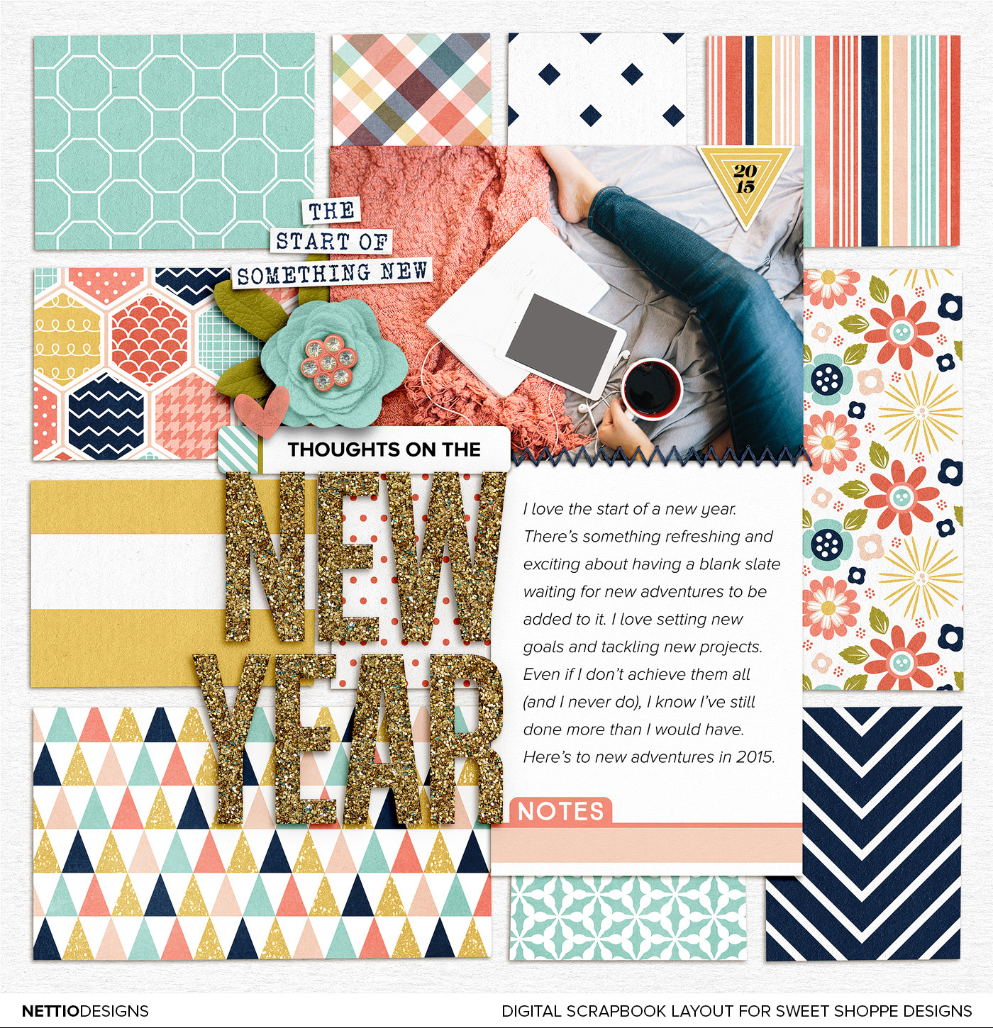
Layout No. 1 | Thoughts On the New Year

For my first layout of 2015, I decided to scrapbook about my love for the start of the new year. Even though it’s true it’s technically just another day, I love that feeling of starting fresh each year.
When I pictured this layout in my head, I knew I wanted to use the sparkly gold alpha from Lauren Grier but I was feeling a little stuck when it came to the rest of the design until I saw Brook’s ABC’s of Me template and realized I could use the paper blocks from the template as my background.
In general, I’m not a huge template user (outside of my own) but pulling out individual pieces of templates is one of my favorite ways to use digital scrapbooking templates because it saves me time and gives me a jumping off point for the rest of the layout without tying me down to a specific design.
Credits: Happiness Is: New Beginnings by Tickled Pink Studio and Meghan Mullens; All A Glitter Alpha by Lauren Grier; Doubles 01 – ABCs of Me by Brook Magee (paper squares only). Photo from Death to Stock Photo. Font is Proxima Nova.
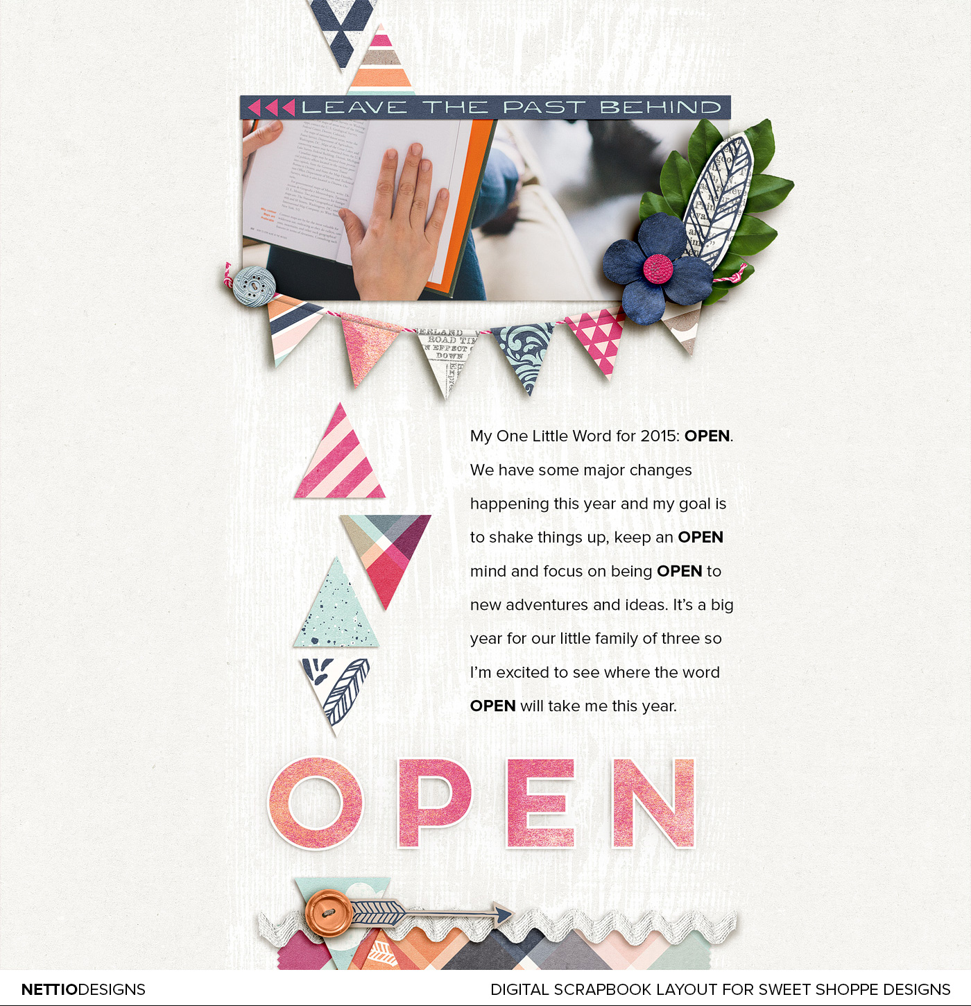
Layout No. 2 | One Little Word: OPEN

For my second layout I chose to tell the story behind my One Little Word for the year, OPEN.
I initially thought about pulling the text directly from this post, but since it was long and I scrapbook 8×8 it felt like to much to include on one layout. So instead I decided to give a brief overview of why I chose my word and then used the design to reinforce the feeling of “open” by using white space, a white background and a more open font (Lulo Clean Outline) as my title.
The layout itself was feeling a little sparse to me at first so I added some paper triangles (my current geometric love) down one side of the design, because you know, my paper lovin’ self must have patterned papers on the layout. I also added some really subtle white paint underneath the design to add some dimension.
The paint was something I toyed with for quite awhile, trying it on a darker blue background first, then with a gradient to make it less in your face, before finally settling on plain white paint on the white background. This for me is when the History panel in Photoshop always comes into play because I’ll take snapshots of different ideas then cycle through them until I have one that feels right. It’s one of the benefits of digital scrapbooking for sure!
Credits: Free Spirit by Shawna Clingerman. Photo from Death to Stock Photo. Fonts are Lulo Clean Outline and Proxima Nova.
And that’s it from me this week! What about you: what have you been working on lately? Have a question? Ask it in the comments below.
Disclaimer: All Sweet Shoppe Designs products were given to me free of charge as part of my Sweet Shoppe Creative Team responsibilities. All thoughts and opinions are my own.
In need of more scrapbooking inspiration? Find all my Scrapbook Saturday posts here.
Great layouts, and really a good start for a scrapbooking year. We used to have Scrapbook Saturday too, and looking forward to more of this from you 🙂
I’m setting aside Sundays for scrapping around here!! Here’s a recent page I worked on. http://www.digitalscrapbookinghq.com/inside-album-one-little-word-2015/
I’ve also got two pages in progress for Lucy’s album oh AND my holiday album LOL.
So fun to see your pages Lynnette
I just have to say how happy you just made me! I always thought all ‘you designers and such’ always used your own photos, and they were always so perfect. And to find out that you used stock photos on these layouts, just made my night! And I love the idea of using them to tell something about yourself. Thanks for ‘giving’ me permission to do the same when I don’t have a photo I want for a story.
I don’t use them a ton but they are handy for when I don’t have the right photo. Or I’m just feeling lazy and don’t want to find and edit a photo that’ll work, haha.
I missed your pages Lynnette, so happy to see you scrapbooking again!
Thanks Aggie!