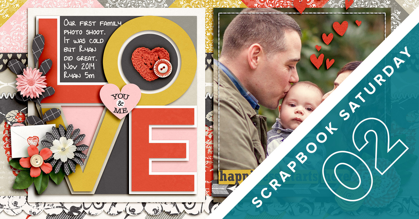
As part of my word OPEN this year, I’m focusing on being more of an open book about why I do what I do when it comes to my creative adventures and design process. So to kick things off, I’ve started a new semi-regular feature called Scrapbook Saturday where each week I’ll share my most recent scrapbooking layouts as well as a little bit of my thought process behind those pages.
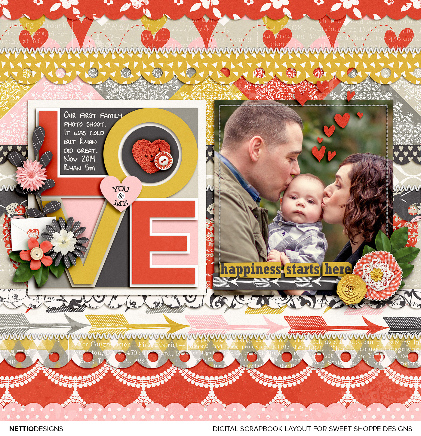
This week was an interesting week as Adam traveled for work which always means two things: I lose my pre-baby morning work hours and I stay up way too late in the evenings. Thursday night I decided to put my late night adventures to good use by scrapbooking this layout using Ru (Studio Basic Designs) & Krystal’s new kit, Be Mine 4 Ever.

Credits: Be Mine 4 Ever by Studio Basic & Krystal Hartley; Single 81 – I Heart U 7 by Cindy Schneider; Green leaves from Free Spirit by Shawna Clingerman; Straight Line Stitched White No. 2 by Anna Apnes. Photo by Captured Simplicity.
A couple of fun facts about this layout…
1) I used a template again…sort of.
As I’ve mentioned before, I’m generally not a big template user outside of my own templates, because my brain follows a certain pattern when I scrapbook and using another designer’s template makes me feel like I’m trying to read someone else’s mind as I scrap.
But as soon as I saw this new template from Cindy, I instantly knew I wanted to scale it down and use it as an accent on my layout rather than the foundation of my layout – and I love how it turned out!
I built the entire design of this layout off the scaled down template. For the photo, I duplicated the paper mat from the template so my photo would be the same size and then centered both on the page. Then because I’m always looking for more ways to add patterned papers to my layout, I used the shape tool and two of my own scallops shapes to create my own super patterned paper background.
I didn’t realize it at the time but the LOVE template was actually made up of a bunch of paper layers (each triangle section is it’s own paper shape) so I could have easily filled it with patterned paper and used a solid background instead. But I’m happy with how this turned out.
2) Where are the ribbons?
One surprise I had as I was creating this layout was when I discovered the Be Mine 4 Ever kit didn’t include any ribbons. No ribbons in a girly Valentine’s day kit? That kind of threw me for a loop. I made it work with a paper strip and some additional stitching but I’m still missing the extra subtle texture that ribbons add to the design. It helps balance all the patterned paper and I feel like I’m missing that here.
Since this is a creative team layout, I did my best to stick with what’s in the kit (which is why I didn’t pull any ribbons from another kit) but I did end up grabbing a green leaf from Shawna’s Free Spirit kit (which I used last week) because the greenery in my photo was standing out like a sore thumb. Once I added the two leaves, the whole layout finally came together – sometimes it’s the details that make the biggest difference.
3) The photo/word strip combo cracks me up.
Do you ever have moments where you don’t notice something about your layout until you’ve uploaded it to a gallery? And then you have that internal debate with yourself whether to fix it and reupload or just go with it?
That’s what happened to me when I noticed the irony between the “happiness starts here” word strip and the look on Ryan’s face. If that’s the look of happiness, I’d hate to see what his unhappy face would look like, haha. To be fair he was cold and a bit unsure about the whole photo taking thing rather than unhappy but the combo of the two together on this layout totally cracks me up.
Well that’s it from me for this second installment of Scrapbook Saturday. What have you been up to this week? Did anything that happened this week surprise you?
Disclaimer: All Sweet Shoppe Designs products were given to me free of charge as part of my Sweet Shoppe Creative Team responsibilities. All thoughts and opinions are my own.
In need of more scrapbooking inspiration? Find all my Scrapbook Saturday posts here.
LOL I love your comment on happiness and your son’s expression. I was also wondering why he was so serious looking! Cute layout! I love how busy it is but yet the focus goes straight to the title and photo.
Ha! I love your layout without the ribbons! 😉
I’m the total opposite. If you would ask me what is it that you hate a about a scrapbooking kit and prevents you from buying it, it would be flowers and ribbons and especially buttons. While I can get past the ribbons the flowers and buttons do me in.
Often there are so many that you can not see what kind of elements are underneath them and you kind of het to guess them. Than I pass them up. I guess I missed out of a lot of nice kits because of that. I also hate having to delete about 20 flowers and 10 buttons that I paid for.
I came into scrapbooking late, about 4 years ago and from the first moment on I was baffled why certain element were used in scrapbooking. I mean a button the middle or the edge of a photo? What purpose does it serve? I think that’s where my Graphic Design education jumps in as I have been taught that everything you use in a design should serve a purpose. 😉 I’ve seen many designs of mind that I worked on the whole weekend go into the shredder because of it. She was from Lithuania my teacher and did not speak Dutch very well, I lived in Holland at the time so we spoke English in class. She would call you out and look at you very sternly and say ‘and what is this eh?’ pointing to a line or a square to make a design more playful. or so I thought. And that she said ‘useless, completely useless’ ‘go back and try again’ And I will see it tomorrow’ And in the shedder it went. Meh. 😉 At that time I was not a teen I was in my 30’s and a single mom, drawing designs and fonts by hand and later years on a Mac.
I guess that’s been drilled into me, less is more. So yes there are a few objects I question why they are in a kit. 😉 Button, is one, safety pins is 2, keys is another etc. 😉 I have tried to loosen up by learning from you how to use patterned paper. There is one designer that I know I will like here elements so I don’t hesitate to buy it even though she has flowers, Kristin Cronin-Barrow, I love her use of color, especially the blue range. Her new kit Winter Bliss is gorgeous. And I now am starting to like some flowers, like the rolled up ones, the others with petals I still can not stand 😉
Ha, I love buttons!