As part of my word OPEN this year, I’m focusing on being more of an open book about why I do what I do when it comes to my creative adventures and design process. So to kick things off, I’ve started a new semi-regular feature called Scrapbook Saturday where each week I’ll share my most recent scrapbooking layouts as well as a little bit of my thought process behind those pages.
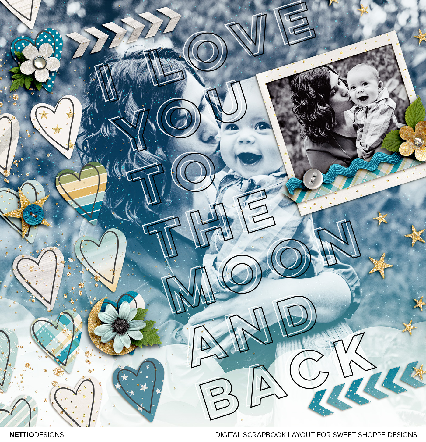
This week’s layout is a layout I created for the Sweet Shoppe Designs Bingo challenge. If you haven’t checked out the new Bingo challenge format yet, you totally should! It’s so fun and easy and to be honest, it’s my favorite format we’ve done…ever.
For my layout, I chose the challenge “Make 1/3 of your page a really big title.” I love bold type and typography but it’s not something I often do on my layouts so I thought it would be fun to give it a shot. Not gonna lie, I feel like my design style has been a bit all over the place so far this year but I’m so in love with how this layout turned out that I don’t even care!

Credits: To the Moon and Back by Kristin Cronin-Barrow; Every day: Cherish Hearts by Lauren Grier. Font is Lulo Outline. Photo by Captured Simplicity.
The idea for this layout was heavily inspired by Kristin’s new To the Moon & Back kit. As soon as I saw this kit I just had to use it. I mean, blues, greens and golds? Oh yeah, sign me up.
The design for this layout all started with the title which I took literally from the title of the kit. The large background photo was actually a happy accident. I dragged my black & white photo onto my canvas with the intention of scaling it down to fit within the smaller frame but as soon as I saw it behind the type, I knew I wanted to figure out a way to make it work.
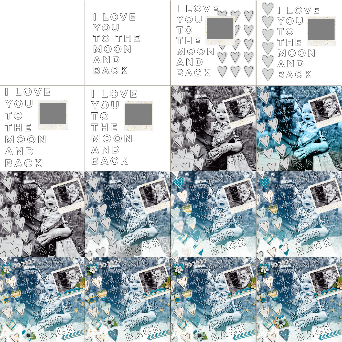
Since I feel like the design process for a layout can sometimes feel a bit magical, like “Poof! Blank page to amazing layout!”, I thought it’d be fun to break down for you how this layout came together courtesy of one of my most used Photoshop tools, the History Snapshot.
If you’ve never used the History Snapshot tool, you can find it in the History panel (Window>History) – it’s the little icon at the bottom of the panel that looks like a camera. When you click on it, it saves a snapshot of your document at that point in time, layers and all.
As I am the type of scrapbooker who likes to tweak and make changes until things are just right, I use the snapshot tool a lot to change things up and then toggle back and forth between snapshots to decide what option I like best.

For this layout I took 19 snapshots, 16 of which are shown here because in the others, the changes were too subtle to show up in the scaled down format.
As you can see I started by playing around with the type and the hearts, adding them on, off and then back on again. There’s a big jump in the second row because I don’t tend to take snapshots when things are flowing and I’m happy with where the layout is headed. I started taking snapshots again when I started playing around with what I wanted to do with the large photo – trying out different blend modes and papers until I had a look I was happy with. Then I added papers and embellishments until I had a design I liked.
If it looks like the bottom row is mostly the same, that’s because the only thing I was changing at that point was the placement of the blue flower and leaf. That’s not unusual for me – often the changes I debate over the most are the small details. On more than one occasion I’ve switched between two snapshots and asked Adam which one he likes better and he’ll ask “What changed?” haha.
After nine years, I’ve accepted this as part of my creative process but if you pride yourself on speed, it’d probably drive you nuts! I think it helps that I’m more focused on the creative side of scrapbooking than I am on scrapbooking all my photos or creating 30+ layouts every month. For me the design process is my favorite part so I’m happy to take the time to get it right.
What about you: are you a fan of the History Snapshot? Do you have any of your own scrapbooking quirks?
Disclaimer: All Sweet Shoppe Designs products were given to me free of charge as part of my Sweet Shoppe Creative Team responsibilities. All thoughts and opinions are my own.
Want more scrapbooking inspiration? Check out all my Scrapbook Saturday posts here.
Wow! Thanks for this! I was not aware of this history snapshot tool. So thank you! Love that you showed how you do it. That helps big time.
I’ll have to try this on a layout…when I get back into scrapping since I’m still recuperating from major back surgery last Dec.
Sandy/tx-nana-scraps
No problem! I hope you’re recovering is going well Sandy!
Thanks for the reminder about the history snap shot. I used to use it a lot. I don’t get the chance to scrap a whole lot anymore, so I can forget cool things like this. Thanks again for the reminder.
No problem Justine!
I don’t use the snapshot tool as I work in PSE, but I sometimes save my files under a new name, or just revert and un-revert my layouts 😀
Gorgeous page Lynnette 🙂 So precious!
Oh yes, if I do major major changes (or hate what I’ve done so far), I’ll rename it V2 and keep on going.
I heard about this tool before but I didn’t get used to using it yet and I think I should not only for my layouts but also for my designs, it would help a lot. Thanks for reminding me. 🙂
No problem! I use it for pretty much everything I do in Photoshop. It’s my right hand man, haha.