 I’ve known since I started this Creative Adventures project last May that one of the adventures I wanted to include this year was 30 Days of Lists.
If you haven’t heard of 30 Days of Lists before, it’s pretty much exactly what it sounds like it would be. It’s a month long event hosted by the lovely Kam of Campfire Chic and Amy of Lemon & Raspberry. It costs $8 to participate and then every day during the month of March you receive one list prompt posted on a private blog, covering anything from weekend goals to celebrity crushes. At the end of the 30 days you’ll have a collection of entries capturing a snapshot of your life right now.
Let’s be honest, a project featuring lists that captures a snapshot of my life right now? You know I’m all over that.
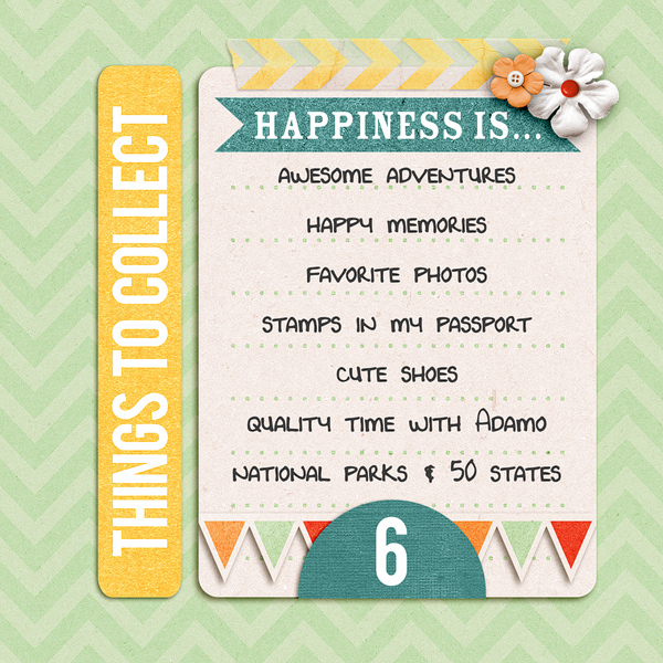
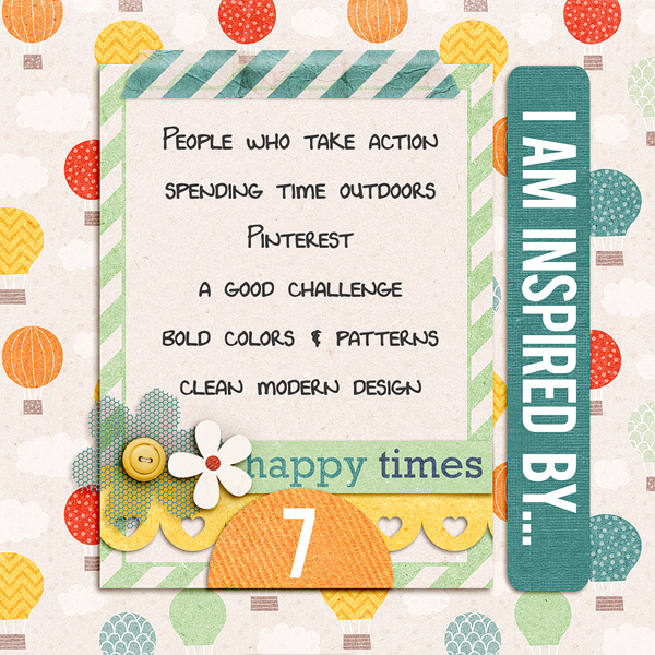
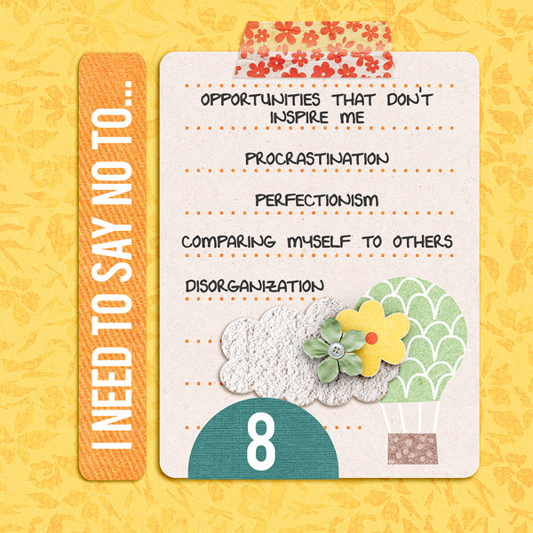
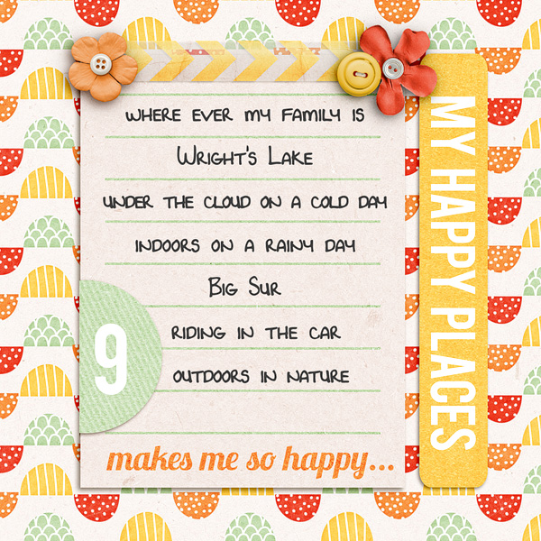
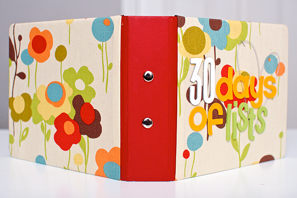
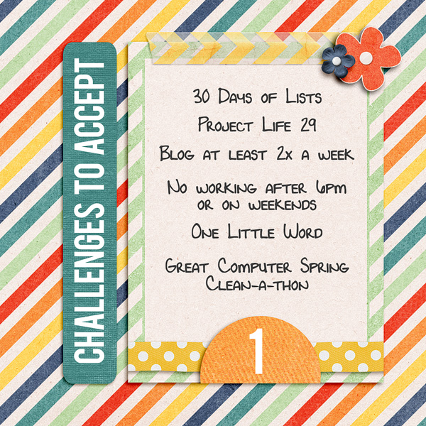
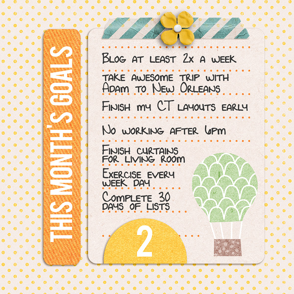
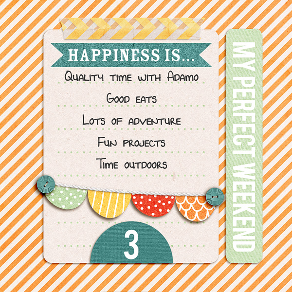
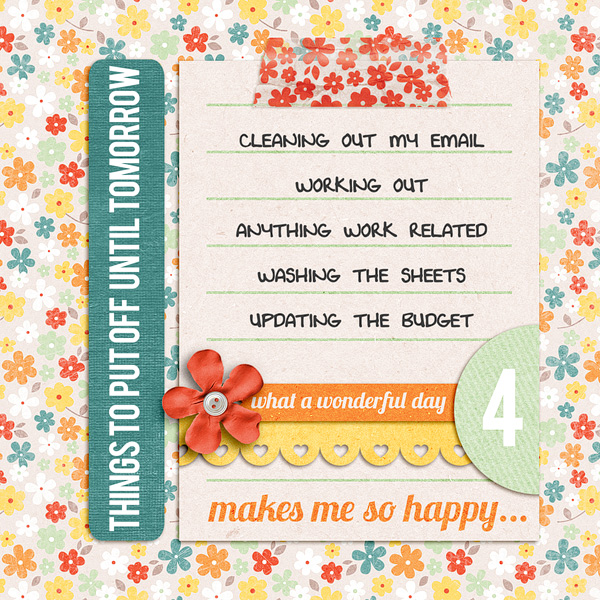
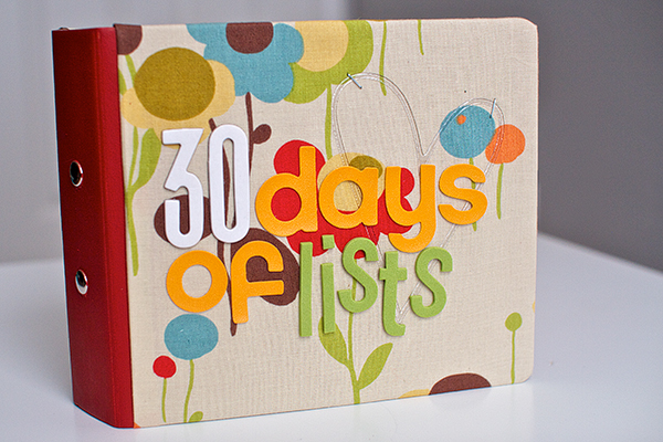
Last March I played along with 30 Days of Lists and created this 6×6 mini album for my lists:
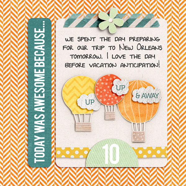
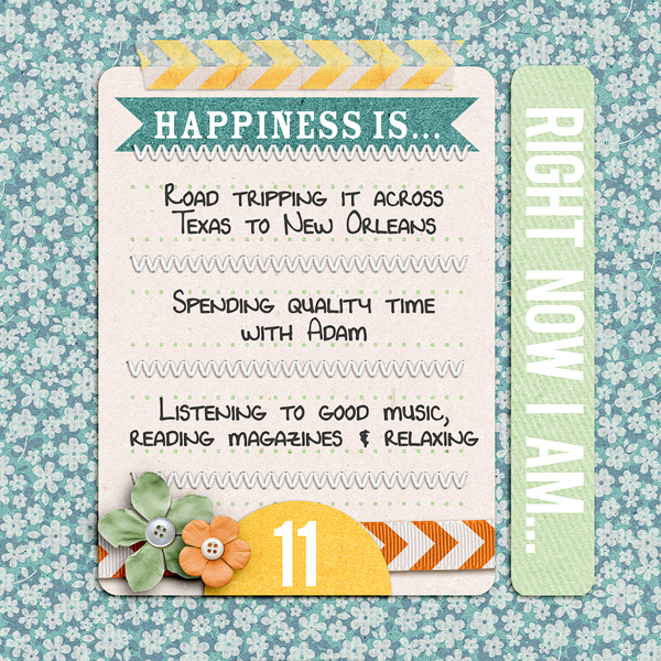
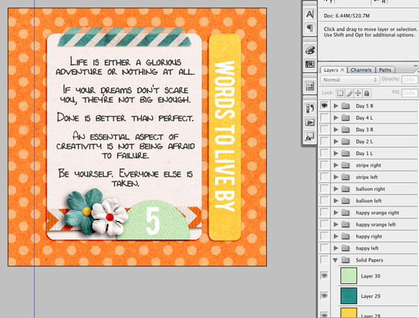
Here’s what the design for each page looked like:
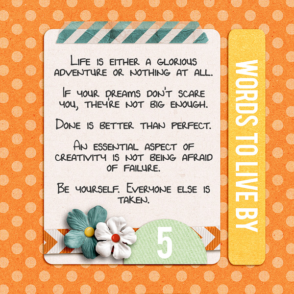
You can see my all my completed pages here: #1-5 and here: 6-11.
I LOVED how the pages turned out, but I only ended up making it through about Day 11 and I can tell you right now why: because as much as I loved my pages, they were too complicated. Too many details and decisions needed to be made for each one.
If there’s one thing I’ve learned in 7 years of scrapbooking it’s this: the more times you have to repeat something, the more simple the design should be or else you aren’t going to finish it. #wordstoliveby
Creative Adventure #6: 30 Days of Lists
So for 30 Days of Lists, the March 2013 edition, I decided to keep things super simple. And since I’ve been enjoying Project Life so much, I decided this year I’d include my lists as 3×4 cards as part of my Project Life album by including them in a series of Project Life Design F page protectors.
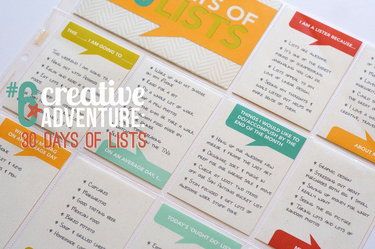
I started by designing a mock-up template in Photoshop and then printing it out to check the sizing of the type. I almost always start with a mockup when I know I’m going to be design multiple copies of something since the last thing I want to do is design a bunch of cards and then have to change them all. I designed all of the talk bubbles using the shape tool in Photoshop.
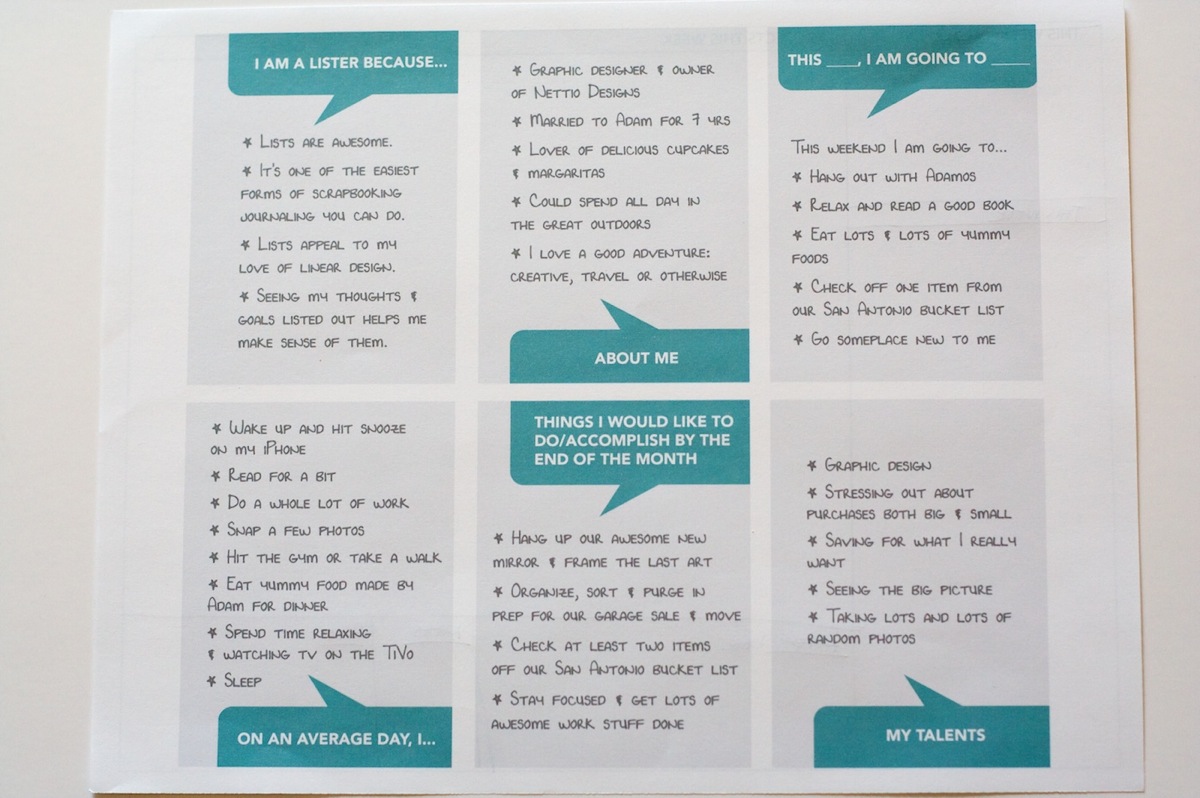
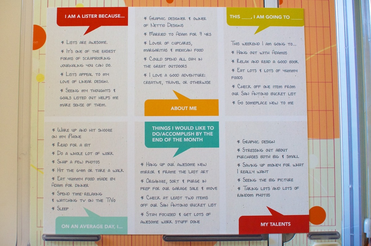
Once I was happy with the overall design, I started playing around with colors and papers. Since I knew I wanted to tie my color scheme into my March Project Life pages, I chose to use a background paper and colors from Libby & Shawna’s Oh Snap! kit which I plan to use for my March Project Life weekly title cards.
Once I had a design I liked, I printed everything on Epson Matte Premium Presentation Paper and then trimmed everything out with my Fiskars paper trimmer:
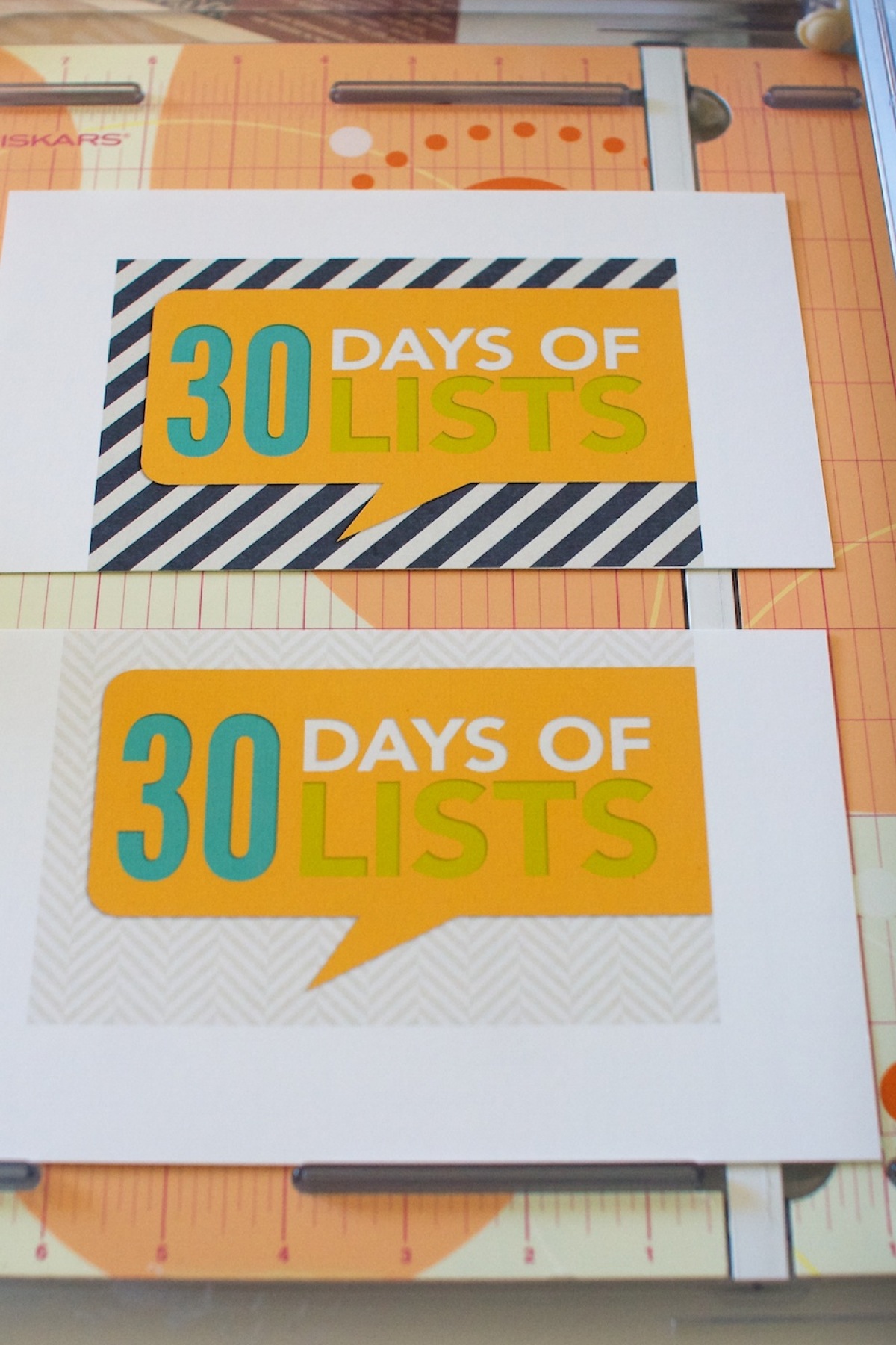
I also printed a couple of title cards to use in the 4×6 slot in the Design F page protectors. All of the patterned papers for these came from Libby & Shawna’s Oh Snap! kit as well.
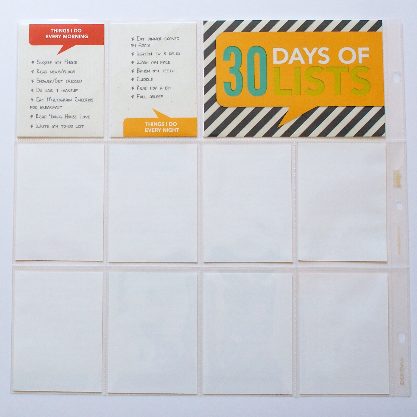
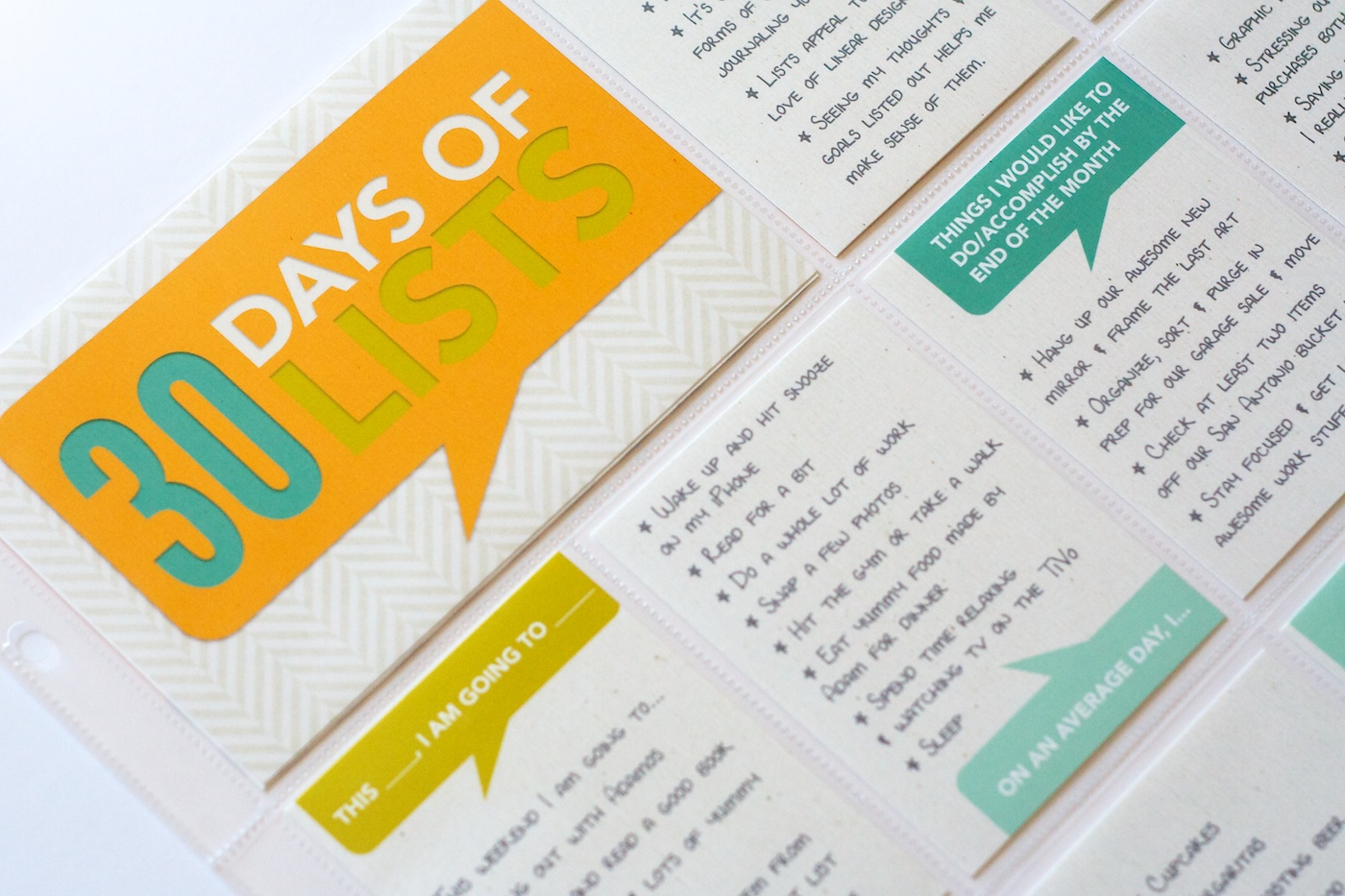
Here’s what all the cards looked like once I added them to the page protector. I’m not going to lie, I’m totally in love with the talk bubbles – they’re so fun! I can definitely see using them again as part of my regular Project Life pages.
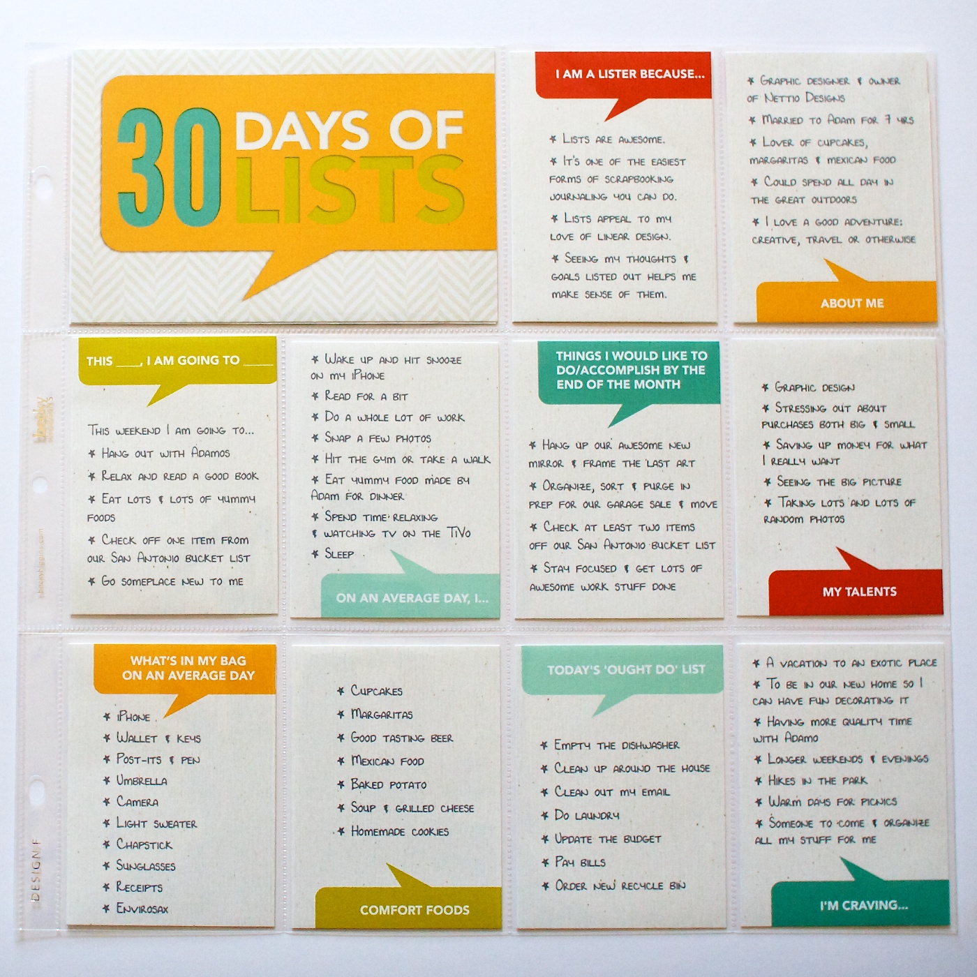
And here’s what the back of the page looks like right now. Since I’ve only done up through Day 12, the majority of this page is blank.
I purposely went with a textured off-white digital paper for the background of the cards because I wanted them to stand out from the regular bright white 3×4 cards I use for Project Life.
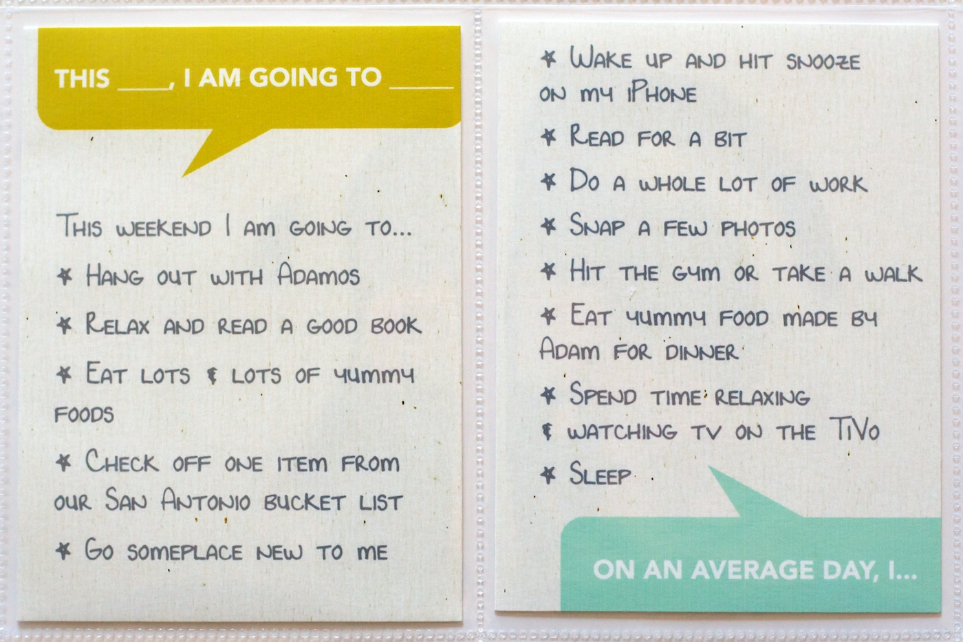
For all of the list titles I used the font Avenir and for the lists themselves I used my own journaling font Darcy Baldwin made for me. I love the way the handwriting font makes it feel so much more personal without me having to actually write everything by hand.
If you don’t already have a custom handwriting font by Darcy, RUN, don’t walk or wait for a sale, and get yourself one because they are awesome.
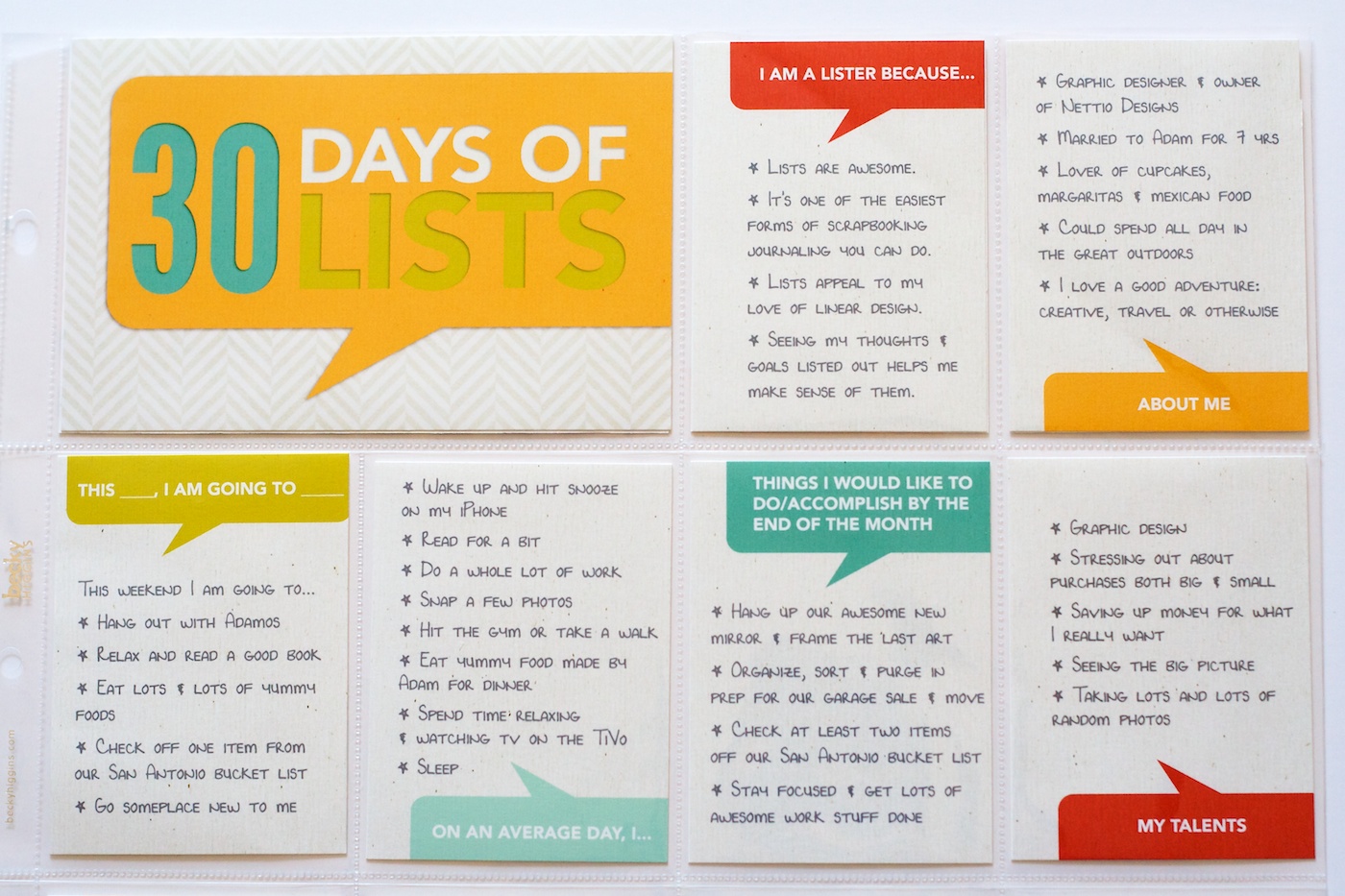
Here’s a close up of the texture of the cards. I really wanted the colored talk bubbles (which I made using the shape tool in Photoshop) to look like they were actually printed on the textured background paper, so I added a duplicate copy of the paper above the talk bubble layer and changed the blend mode to Color Burn. Because the paper was fairly neutral, it added a nice texture without altering the color too much.
If you’re wondering how I’m planning to incorporate my 30 Days of Lists pages into my Project Life album, the answer is I have a plan, but you’ll have to wait until my next Project Life update to see it in action.
And that’s pretty much it for this list-tastic Creative Adventure! I will be back to share an update of my album once I have it all completed but I have to say so far, I’m so very glad that I took the simple route this time around. This project is definitely a case where less is more.
______________________________________________________________________
ABOUT THIS PROJECT

In honor of my 30th birthday, I’m challenging myself to go on 30 creative adventures before the end of 2013. This is Creative Adventure 6 of 30. You can read all the details behind this project here and find links to all my completed adventures here.
Can I take Levitra if I am taking other remedies at the same time
