Friday was an awesome day around here. Sure it may have officially been my little sister’s birthday (happy belated birthday, Alyssa!) but the FedEx man arrived with a special gift just for me…
…my A Week In the Life Blurb photobook!
And as promised, I am back with photos of my new prized possession as well as some final thoughts about my entire A Week In the Life 2011 adventure.
Having never ordered a Blurb photo book before (or any photo book for that matter), I’ll admit I was a bit nervous about what to expect. So nervous in fact, that I let the box sit unopened until Adam came home and made me open it, haha.
But I have to say, all my worry was for nothing, as the photo book is gorgeous. In fact, I think my response when I opened it was something like, “wow, it’s like I’ve been published!” Somehow I didn’t expect it to be so, uh, officially book-like, haha.
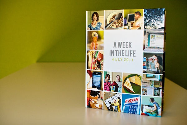
Here’s my AWITL photo book in all it’s hardcover glory. I went with the Image Wrap option which meant my custom designed cover is printed directly on the book and wraps around to the back.
I love love love it.
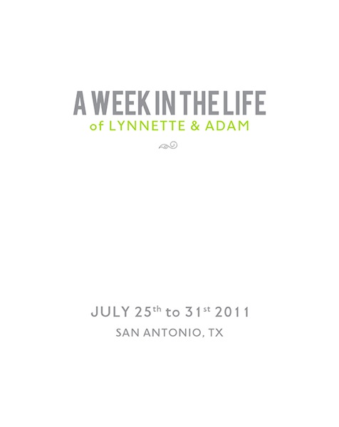
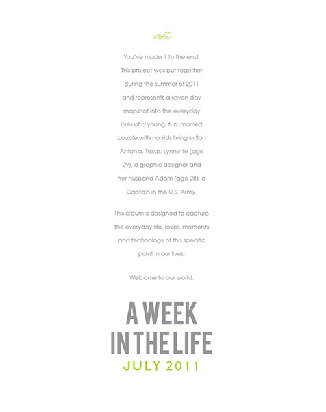
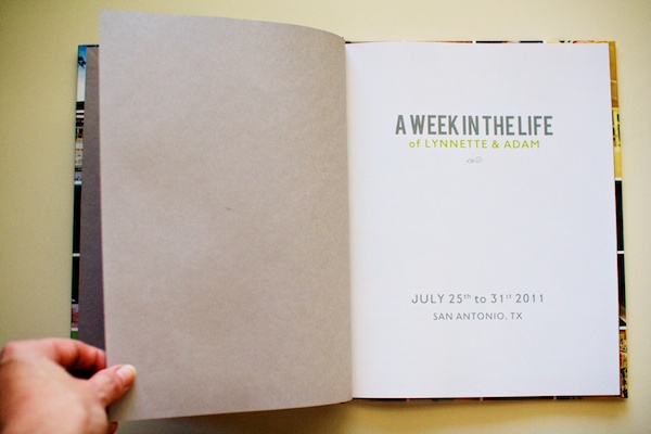
The first and last pages of the album are a really nice grey linen-ish paper.
I’m chose the Premium photo paper for my book and I’m so glad I did. You can definitely tell it’s photo paper – the pages are nice and sturdy without being too thick.
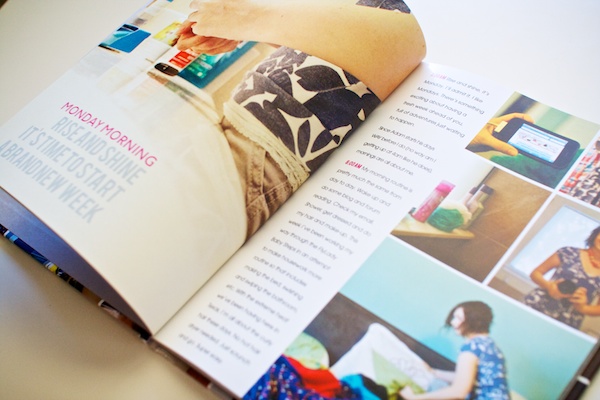
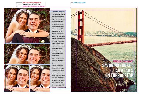
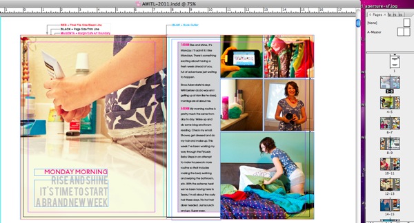
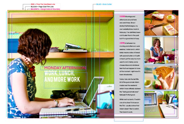
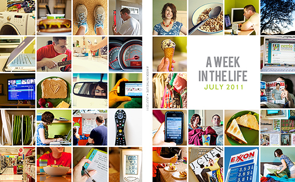
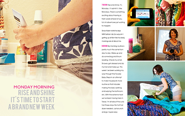
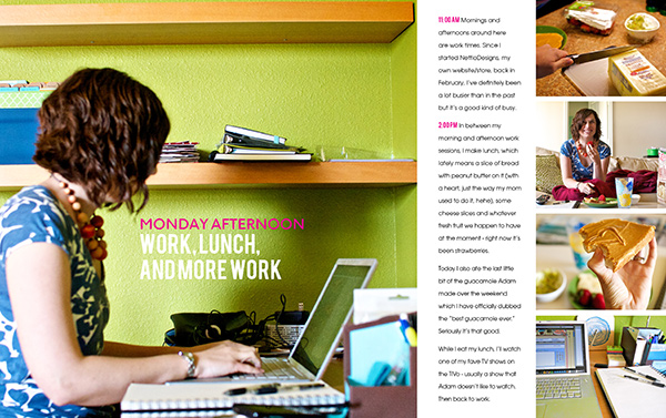
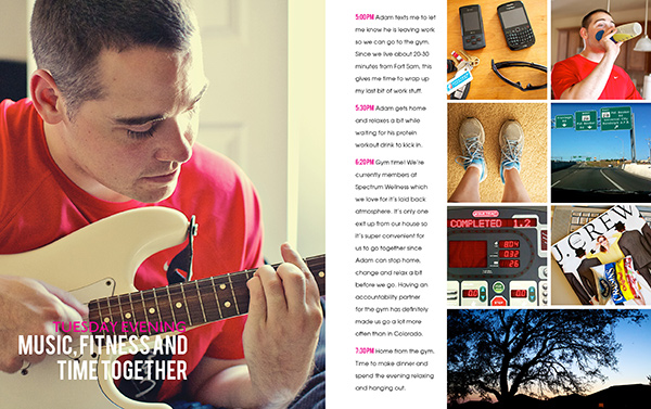
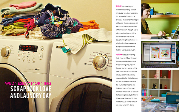
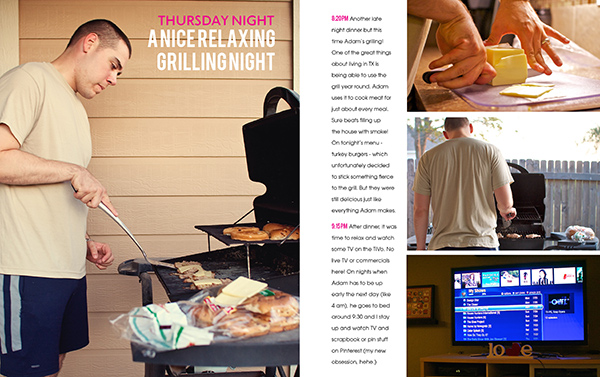
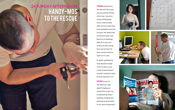
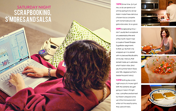
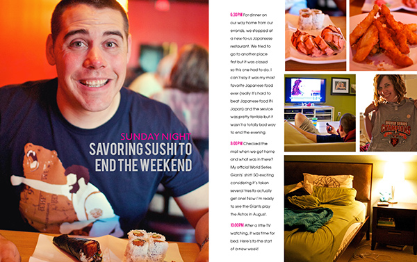
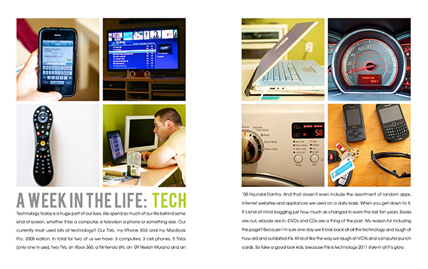
A look at one of the 10×10 photo spreads. These were the pages I was most concerned about because I wasn’t sure how the image would look being spread across the gutter.
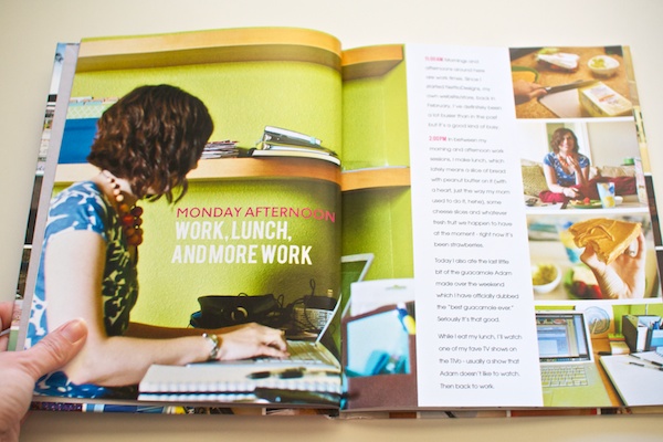
I had seen directions online about how to duplicate parts of the image to fill the gutter, but there was a lot of variables involved (like page and book thickness), and no guarantee it would work, so I decided to instead make sure whatever part of the image that was in the gutter was non-essential. If I were to do this again, I might play around with it more but I think it worked out mostly fine.
If you look closely at the bottom of the photo you can see where the computer screen doesn’t quite match up but in person it’s a lot less noticeable than in this photo.
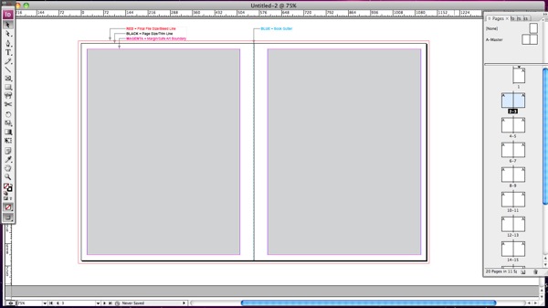
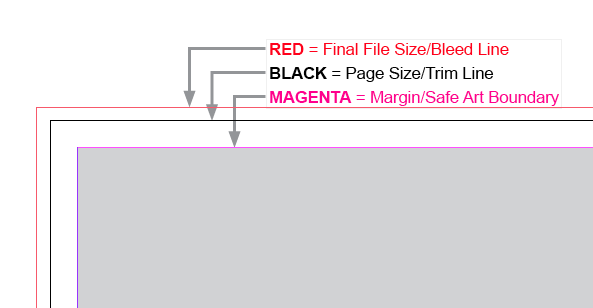
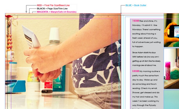
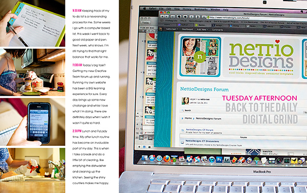
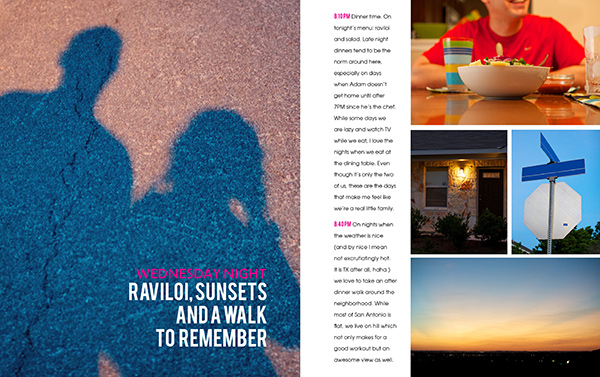
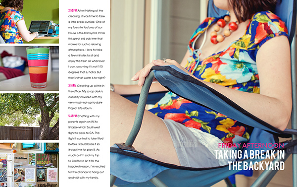
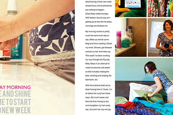
I did have one page where the text ended up in the gutter. I’m not sure what happened but I suspect the title moved when I was doing all my journaling and I somehow didn’t realize it. Lesson learned, definitely double-check that all your text is in that lovely grey safe area box!
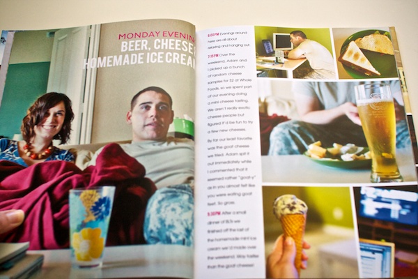
If you open the page a little farther, you can see the end of the title, it’s just a wee bit closer than it should have been. Oops. Poor cutoff title.
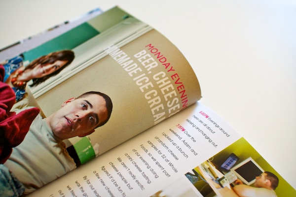
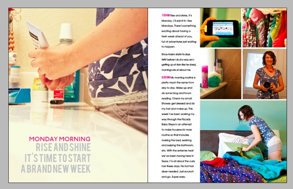
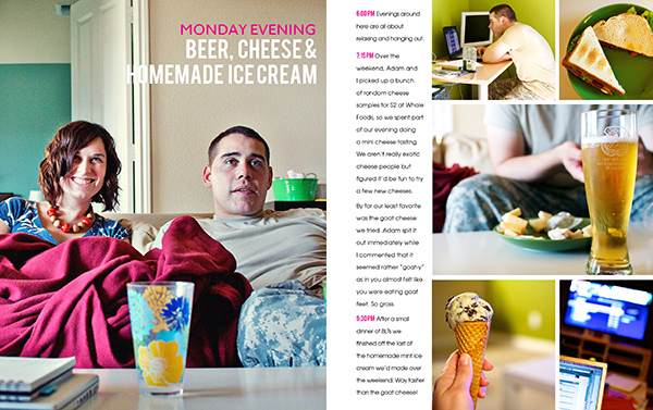
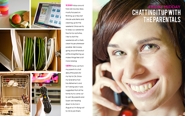
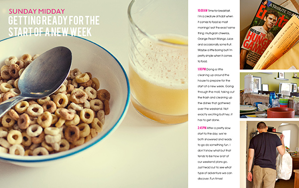
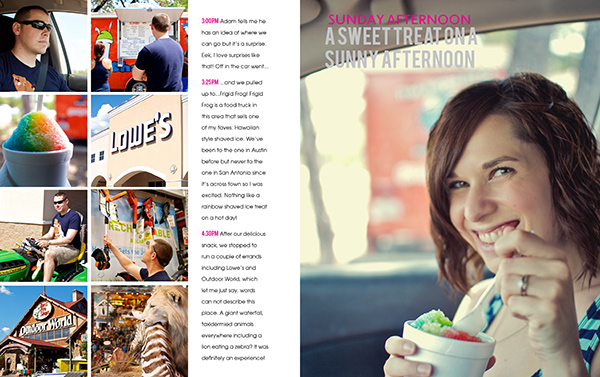
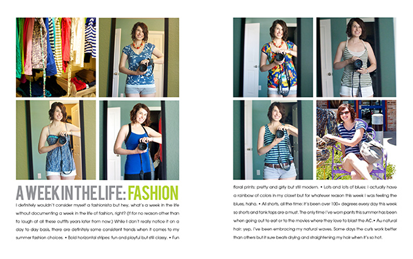
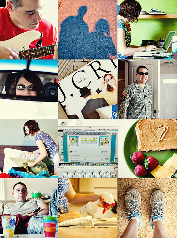
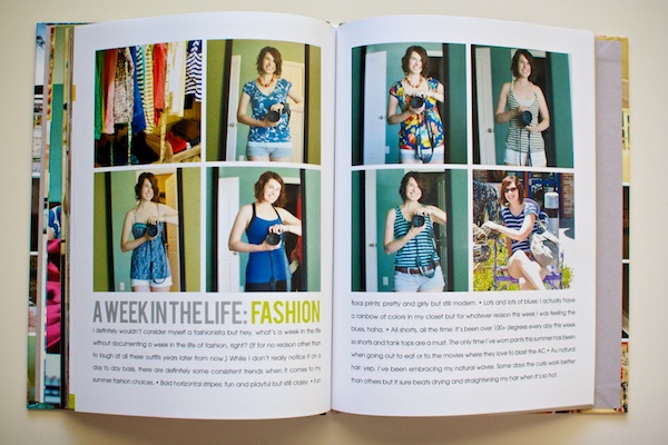
On a happier note, this might be one of my favorite spreads. I really love that photo blocking on the left page.
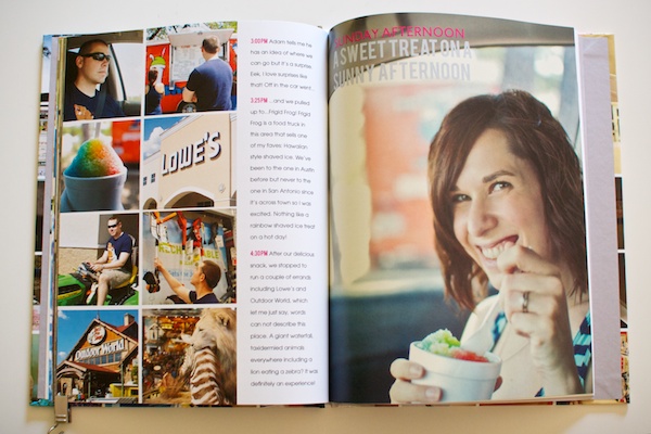
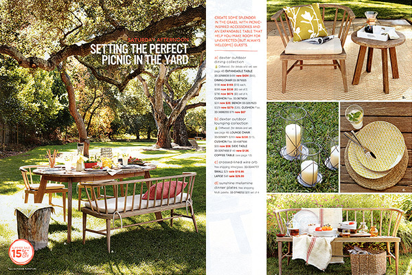
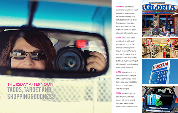
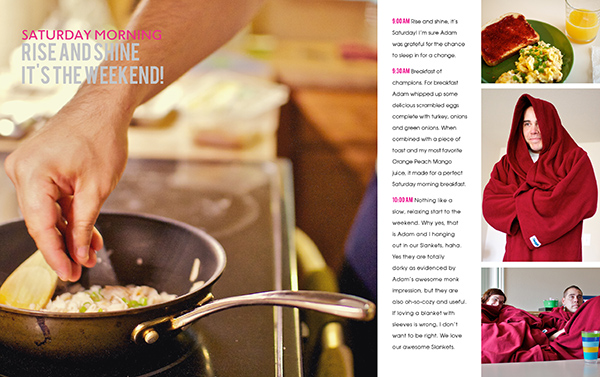
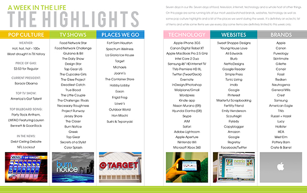
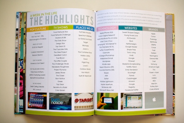
A look at two of the highlights pages:
On the last page of the album Blurb included their cute little logo.
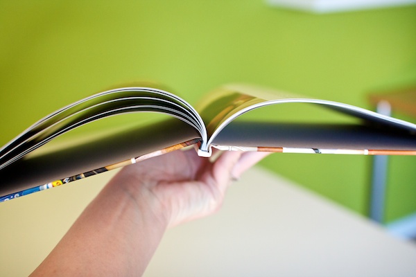
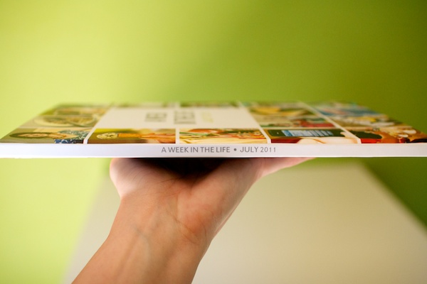
A little peek at the spine:
The back cover…
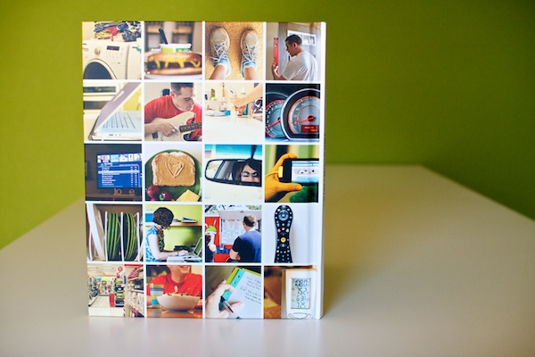
And the entire cover all together:
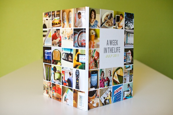
On the outside spine of the book, I included the title of the album and the date. I can totally imagine a bunch of these books lined up on a shelf.
A Week In the Life 2011: My Final Thoughts
Blurb Photo Book: Blurb definitely gets my stamp of approval. I’d heard a lot of horror stories from other scrapbookers who have printed photo books from other companies, so I wasn’t really sure what to expect, but the quality of the Blurb book is fantastic and the color and trim on the pages is totally true to what I saw on my screen. Plus using their PDF to Book InDesign Plug-in made the whole bookmaking and uploading process SO easy.
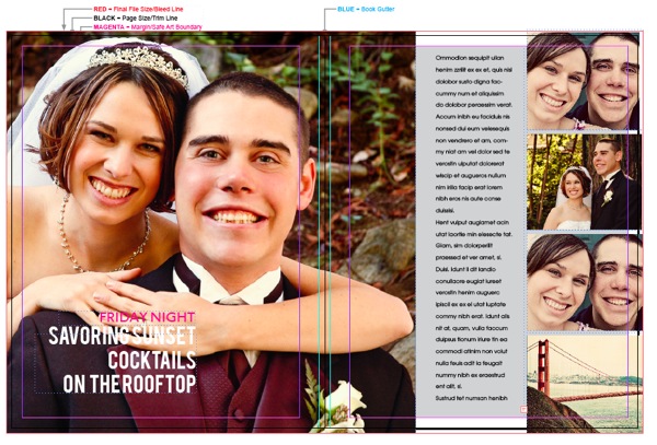
Photobooks in general: I definitely see more photo books in my future. I absolutely LOVED the clean photos + words format. I can see so many uses for it. I don’t see myself switching to printing my digital layouts in photobooks any time soon, but this project has definitely inspired me to tackle some of the photobook projects I’ve been wanting to do for awhile, like our wedding book and our year in Korea album.
A Week In the Life: I heart this project. A lot. Sure it’s a TON of work but the end result is so so worth it. Adam said it best – it’s like a time capsule of our life. And that is so so very cool.
Favorite AWITL moment: Adam’s dramatic reading of day one of my A Week In the Life album. If you think it’s weird to have other people read your journaling, try having them read it to you out loud in a dramatic fashion. Totally awkward and hi-larious.
More than anything, what I’m taking from this A Week In the Life 2011 adventure is this: I can do this. I can set out to do one of these major scrapbooking projects and actually finish it. Maybe not as quickly as someone else but as long as I stay focused, I’ll get there in my own time.
As someone who tends to leave behind a wake of unfinished projects, that is one awesome lesson to have learned.
What about you? Have you learned any awesome life lessons lately? Have you seen the photo book light like I have? Have any photo book adventures of your own to share? Feel free to let me know in the comments!
Psst…want more A Week In the Life goodness? See all my AWITL 2011 posts here.
Interested in creating your own album? Check out the Photobook Frenzy Photoshop templates in the shop.
