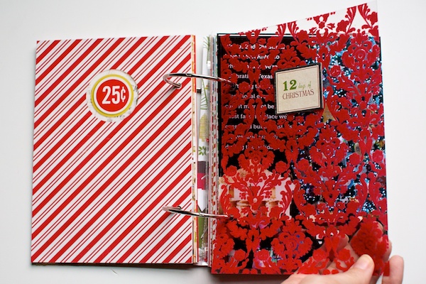
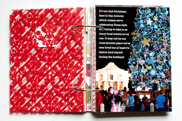
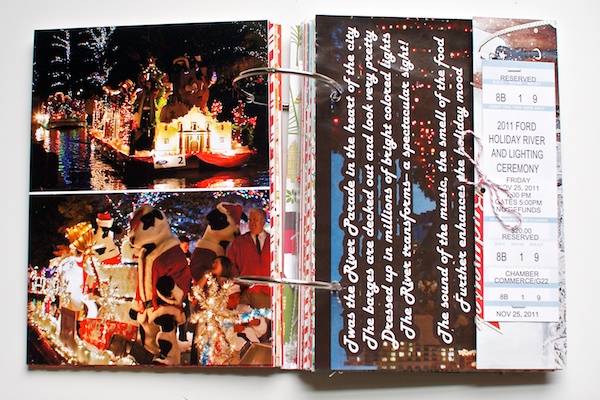
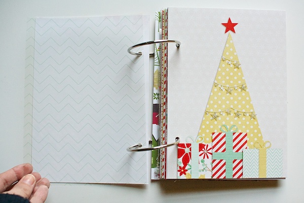
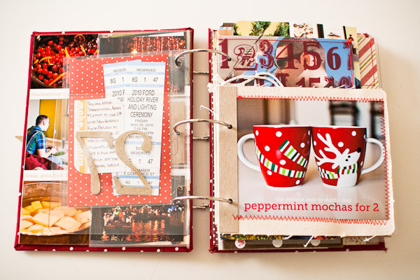
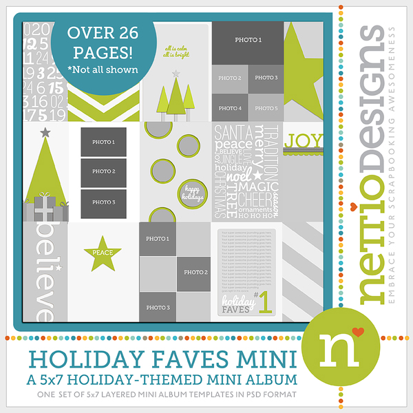
Things are moving along on my Holiday Faves Mini album. I made a new cover, finished up Faves 3 & 4 and have started on Faves 5 & 6.
I’ll admit I wasn’t totally sold on how things were coming together at first but after this latest installment I’m really starting to love it. I think maybe it just wasn’t feeling Christmas-y enough yet?
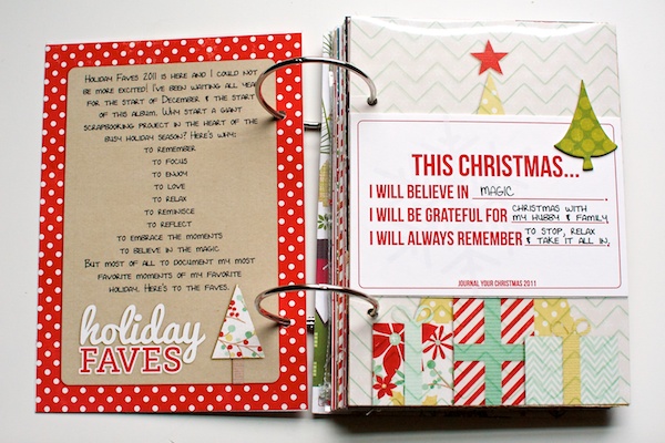
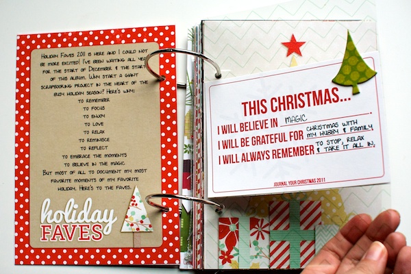
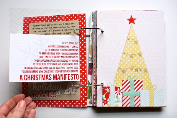
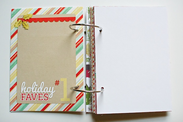
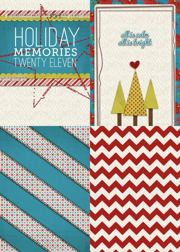
As I mentioned before, the cover for my album at first was just a 5×7 card stock page I printed on the computer, like this:
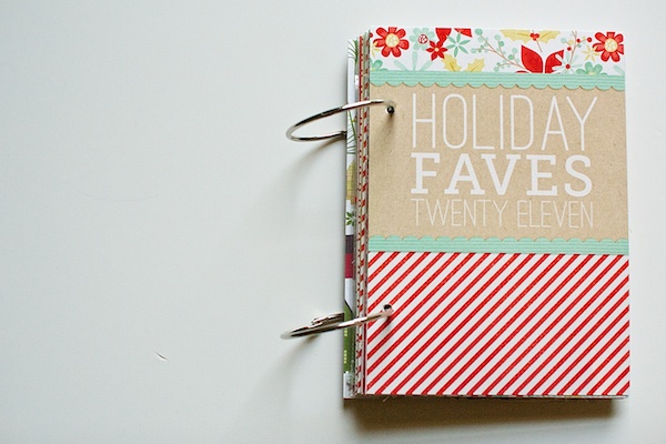
But I’d always intended to put together a stronger cover (no way would the paper cover survive traveling) so last week I got to work putting together a new cover.
Since I didn’t have any chipboard on hand that was the size I needed, I decided to stop by our local Michael’s to see if I could find something that would work. My goal was to find something that would not only be strong enough to maintain it’s shape but that would be able to handle some paint as well. And lucky for me, I found something that was perfect!
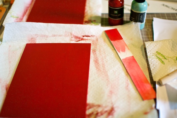
It’s called Watercolor Board – it’s a sturdy 1/8″ thick piece of board that has a watercolor paper texture one side. It’s a lot like this although my board is acid-free. The piece I purchased was 16×20 inches so I used an exacto knife and ruler to cut two pieces that were each 5.5 x 7.75″ for my cover. Then I painted them each with a couple of coats of Making Memories paint in Cranberry.
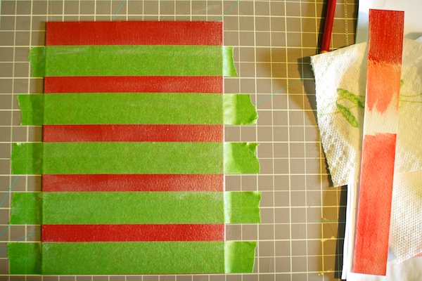
Once I had the covers painted, I decided I wanted to add a little pizazz by adding some horizontal stripes. So I broke out my trusty Frog Tape (seriously, LOVE this stuff!), and taped out some stripes. On my first attempt I taped out 5 stripes which meant I ended up with really skinny painted stripes, so on my second attempt, I only taped out 3 stripes instead so the stripes would be thicker.
I knew I wanted the stripes to be subtle so rather than painting with another color, I painted the stripes using Making Memories Scrapbook Glaze in Pearl. I like the subtle shimmer it adds.
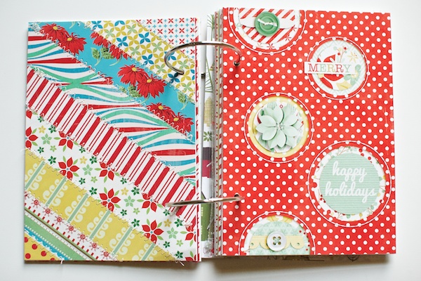
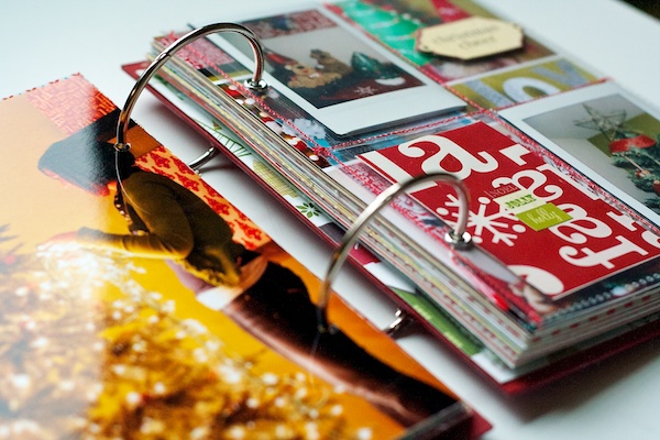
Here’s the look at the finished cover. I ended up using the thicker strips for the front cover and the thinner stripes for the back.
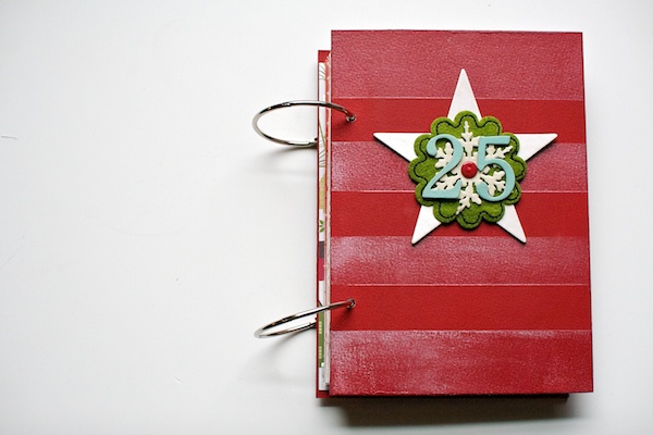
Here’s the back and front together. It’s a little mis-matched but since you’ll never see them together, I’m fine with it. (See, embracing imperfection is working!)
The painted stripes look a little uneven but it’s just because of the way the light was shining as I took the photo.
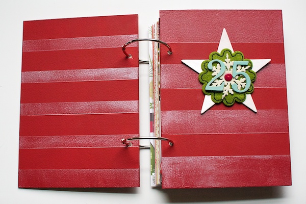
On the front, I added a cluster of elements. The star is from Jenni Bowlin which I painted with the MM Pearl Glaze as well and the green accent is from Making Memories. The chipboard numbers are from Basic Grey and I painted them with Making Memories paint in Funky Vintage – Sea Foam.
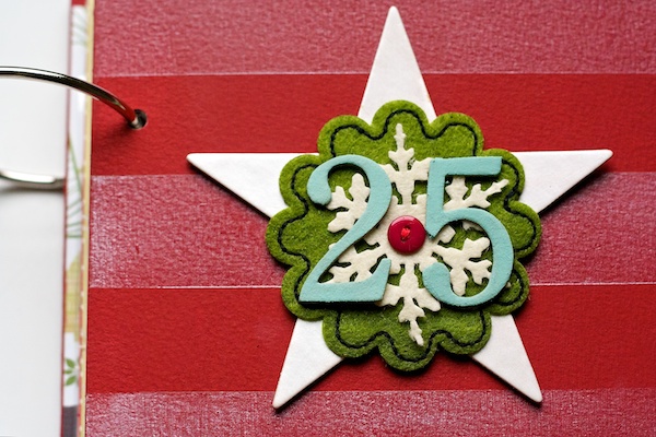
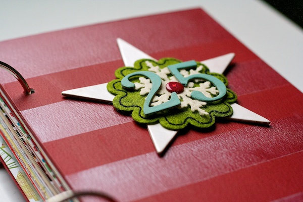
I love the subtle dimension the elements add to the album without it being too bulky to take with me. This is also the truest representation of the stripes. You can see how they’re shimmery but subtle. Love that.
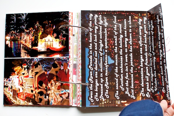
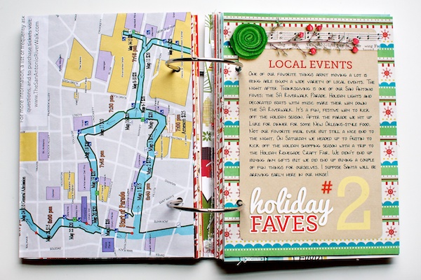
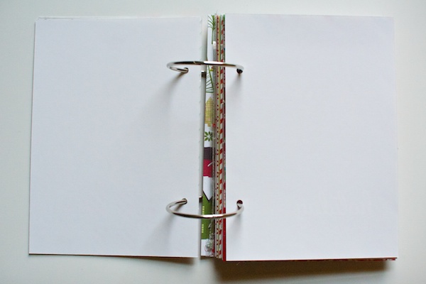
Once I had the cover finished, I decided to go back to that bare spread from Fave #2 and add some photos. This is what it looked like sans photos:
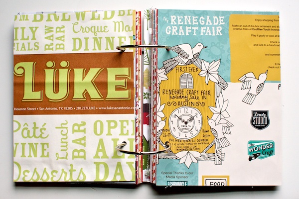
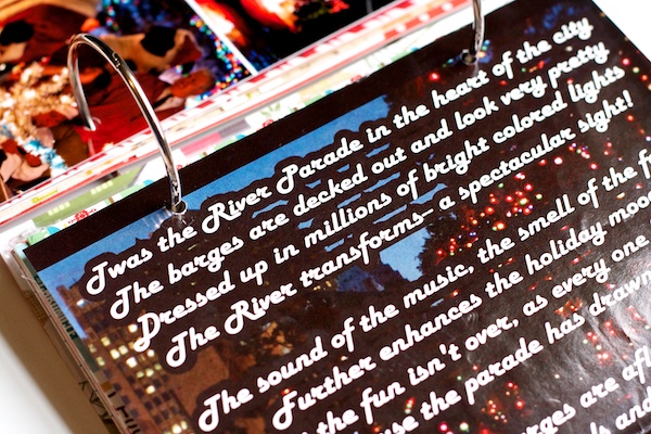
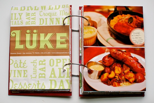
Rather than adding photos on top of the pages I already added, I added a new photo page in between. On the right side are our photos from our dinner at Luke the night of the River Parade.
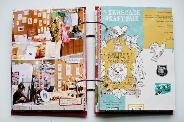
On the back of the photo page, I added photos from our trip to the Renegade Craft Fair. This was my second time attending the fair (you can read my recap from my first trip here) and I have to say, it is SO fun to shop Etsy-style shops in person. They are finished for the year but if you have a fair near you next year, I definitely recommend checking it out!
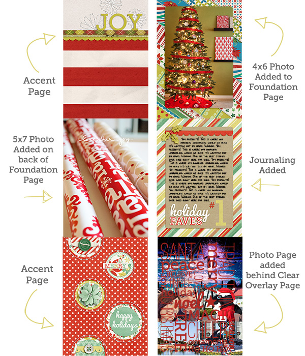
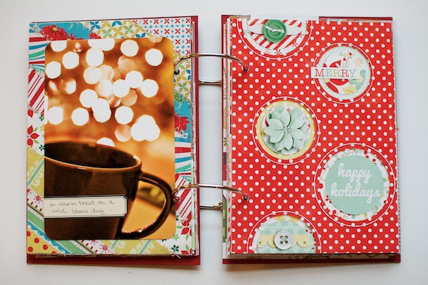
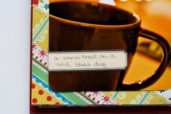
On the back of the Renegade Craft page, I added a 4×6 photo to the foundation page. Just a fun photo of a cup of hot chocolate but I loved the way the lights from the tree turned out in this photo. It feels very Christmas-y to me.
After the handwriting fiasco last week, I took the advice of my lovely commenters and went and bought a pack of one of my most favorite pens from college – the Uniball Gel RT Micro. I love these pens because they not only write smoothly but they don’t smear which when you’re a lefty becomes incredibly important (and surprisingly difficult to find). Plus I love the thinness of the tip. I still say my handwriting is a bit out of practice but at least it’s mostly readable this time, haha.
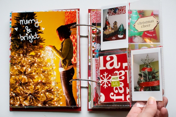
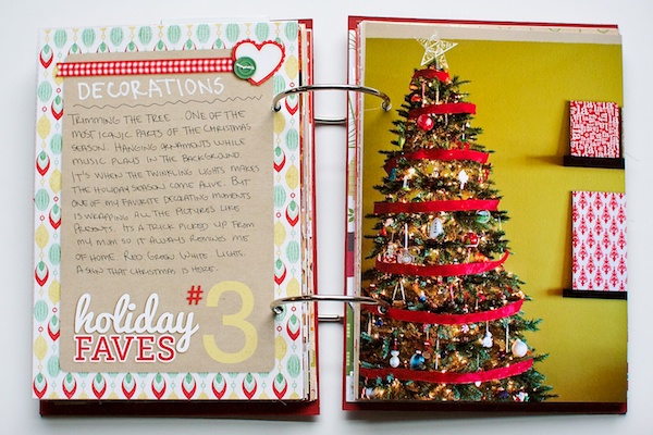
For Fave #3 in my album, I decided to feature some of the decorations around our house. On the left side I included a 5×7 photo Adam took of me putting the lights on the tree. And as an extra attempt at embracing my handwriting, I even wrote right on the photo with a Sharpie white paint pen. I’m no Ali Edwards, haha, but I still think it turned out pretty cute.
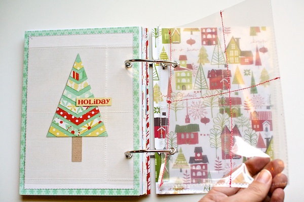
On the right side of the page I added one of the divided page protectors I’d sewn and included some Instax photos I took around the house. I love the vintage feel of the Instax photos. They remind me a lot of the photos my parents have from when I was a kid.
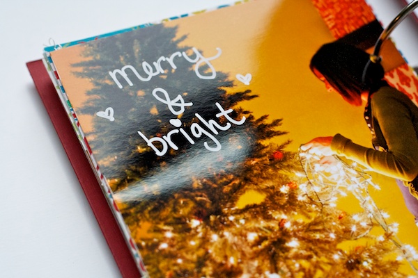
Another look at my awesome handwriting. I think the little hearts really make it, haha.
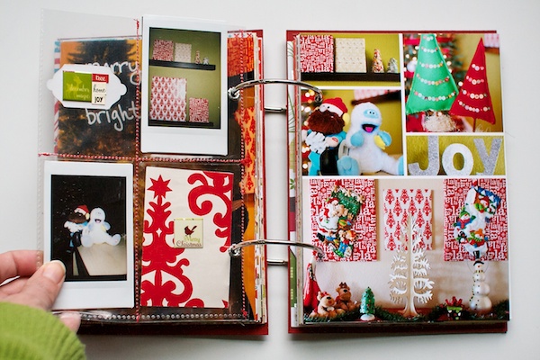
Here’s a look at the backside of the page protectors. To fill the pockets, I taped two Instax photos back to back. Then in the bottom corner, I added two pieces of the wrapping paper I used to decorate around the house.
On the right side of the spread, I created a photo collage in Photoshop of a bunch of our decorations. I have to say the photo of Yukon Cornelias and the Bumble might be my favorite. Although Bumble looks rather cute and happy considering he’s suppose to be abominable, haha.
A little detail shot of the page protector. Although I don’t bother to add eyelets to any of my paper pages, I did add them to the page protectors as the hole I punched with my Crop-o-dile was a bit messy. Just makes it a little easier to turn the page. You can also see the stitching a bit better here. I just did a simple straight stitch right through the page protector to make my pockets.
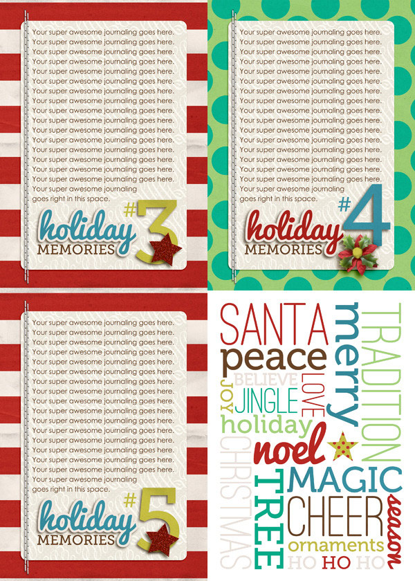
On the back of the photo collage is my Faves #3 journaling card complete with my handwriting. I love that depending on my mood, I’ll either write in a cursive-y all lower case font or in all caps like on this card.
To the right of the journaling card, I added a photo of our decorated Christmas tree. And yes, we do have an olive-y green wall in our family room but it’s not quite as bright as it looks in the photo, haha.
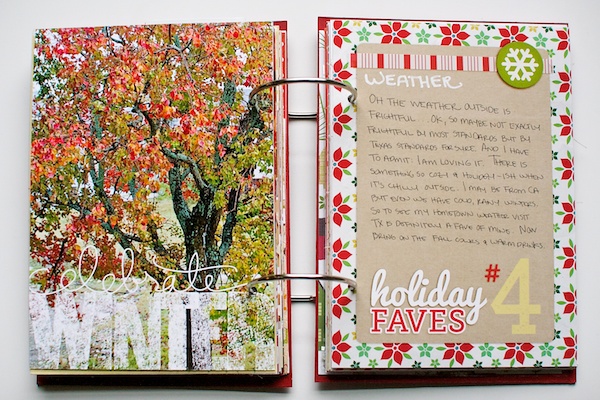
For Fave #4, I decided to talk about the weather, which considering the extreme heat we had for so long this year, this cooler weather has definitely become a fave of mine. I mean, I know I’m from California and all but it’s just wrong for it to still be 78 in December!
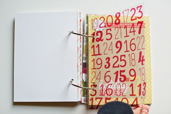
Originally I had this printed transparency in front of the journaling card but I decided to move it in front of the photo instead. I love that it kind of looks like falling snow or rain.
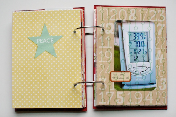
The photo on the right is a 3×5 photo of the day our thermostat finally showed a temperature below 40. I think that was the same night it actually went below freezing!
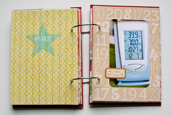
On the back of the foundation page, I added a photo of one of the trees outside our house. I loved the bright fall colors of the leaves, but it’s a good thing I took the photos when I did since all of the leaves have fallen off now. So sad.
On the right page is some more handwritten journaling. Woohoo, go me for embracing the handwritten imperfection. I’m rather liking the home-y touch it’s adding to my album.
And that’s where my Holiday Faves album is at so far! How’s your Holiday Faves (or December Daily) album coming along? Has anything surprised you about the process and/or your album? Feel free to share in the comments!
Psst…looking for some more Holiday Faves inspiration? I had the chance to chat with the lovely Melissa Shanhun as part of her December Daily Inspiration podcast and best of all it’s free to listen! You can check out my episode here.
Can I take Levitra if I am taking other remedies at the same time
