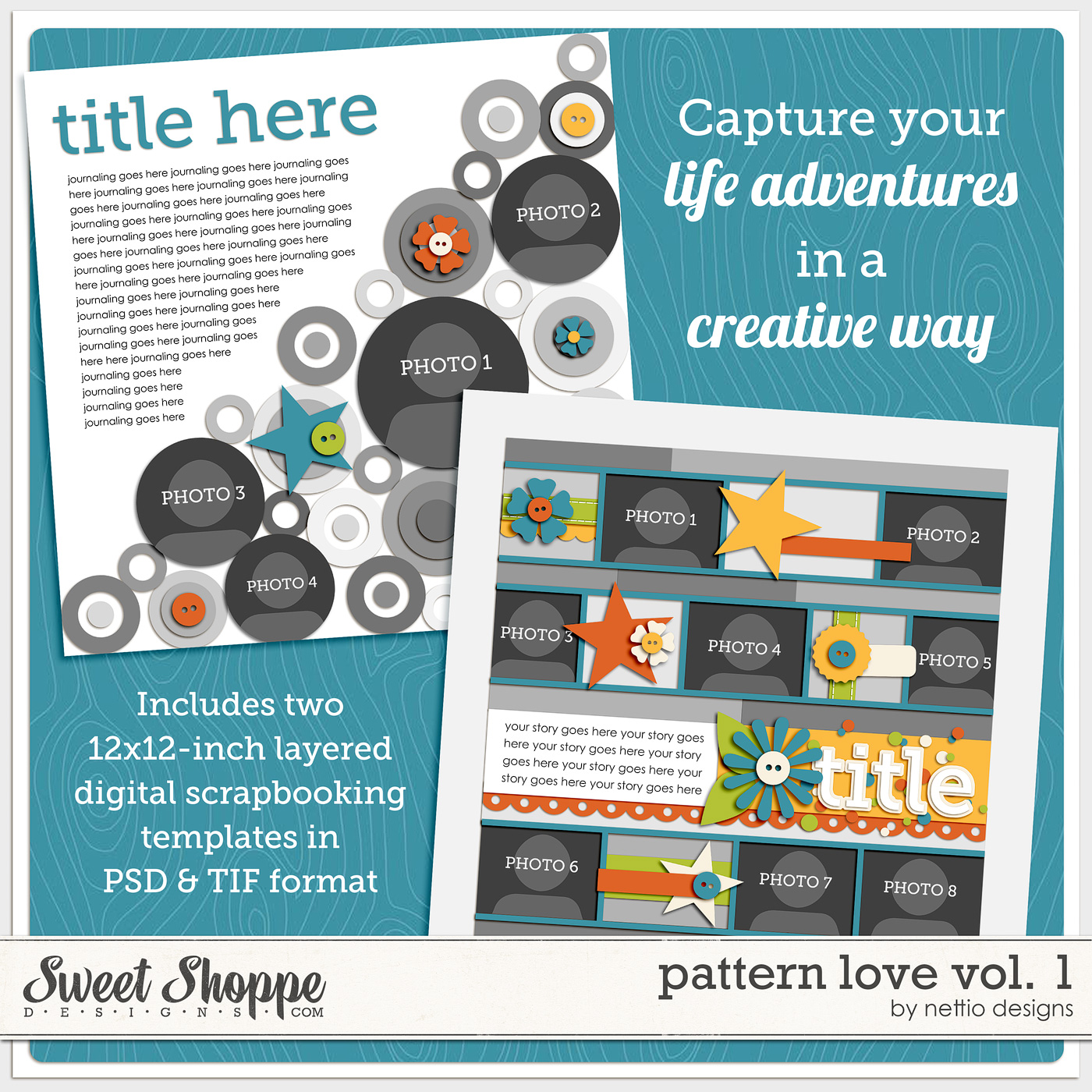
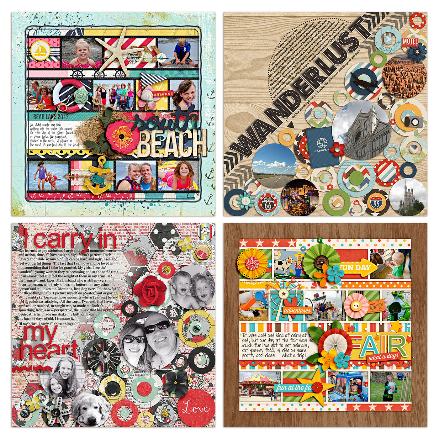
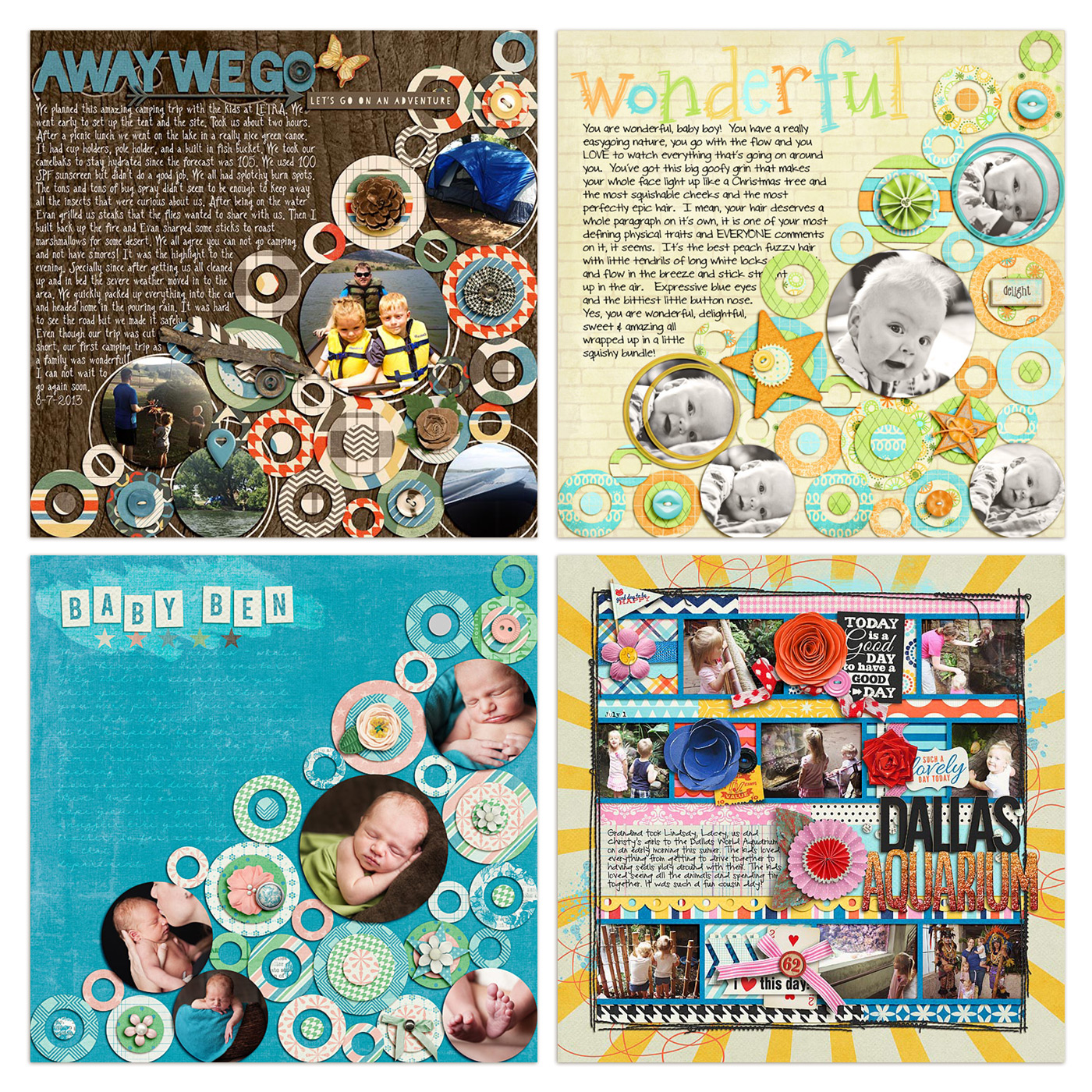
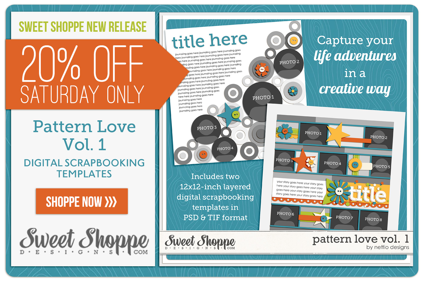
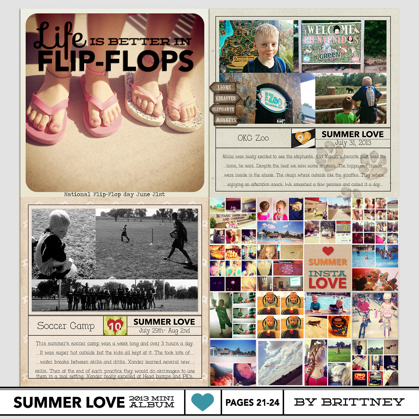
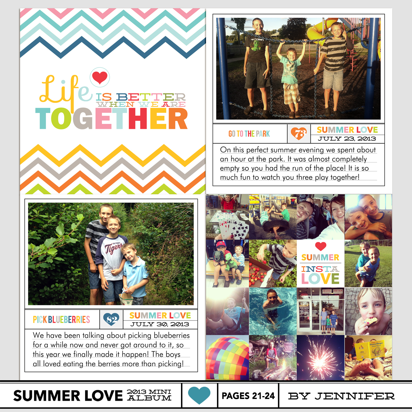
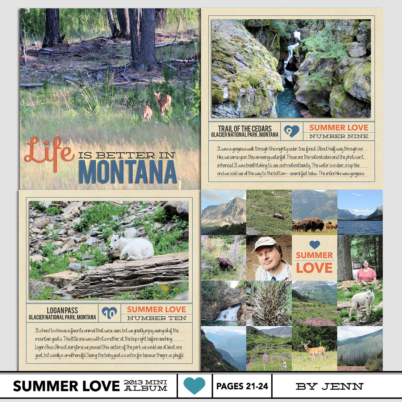
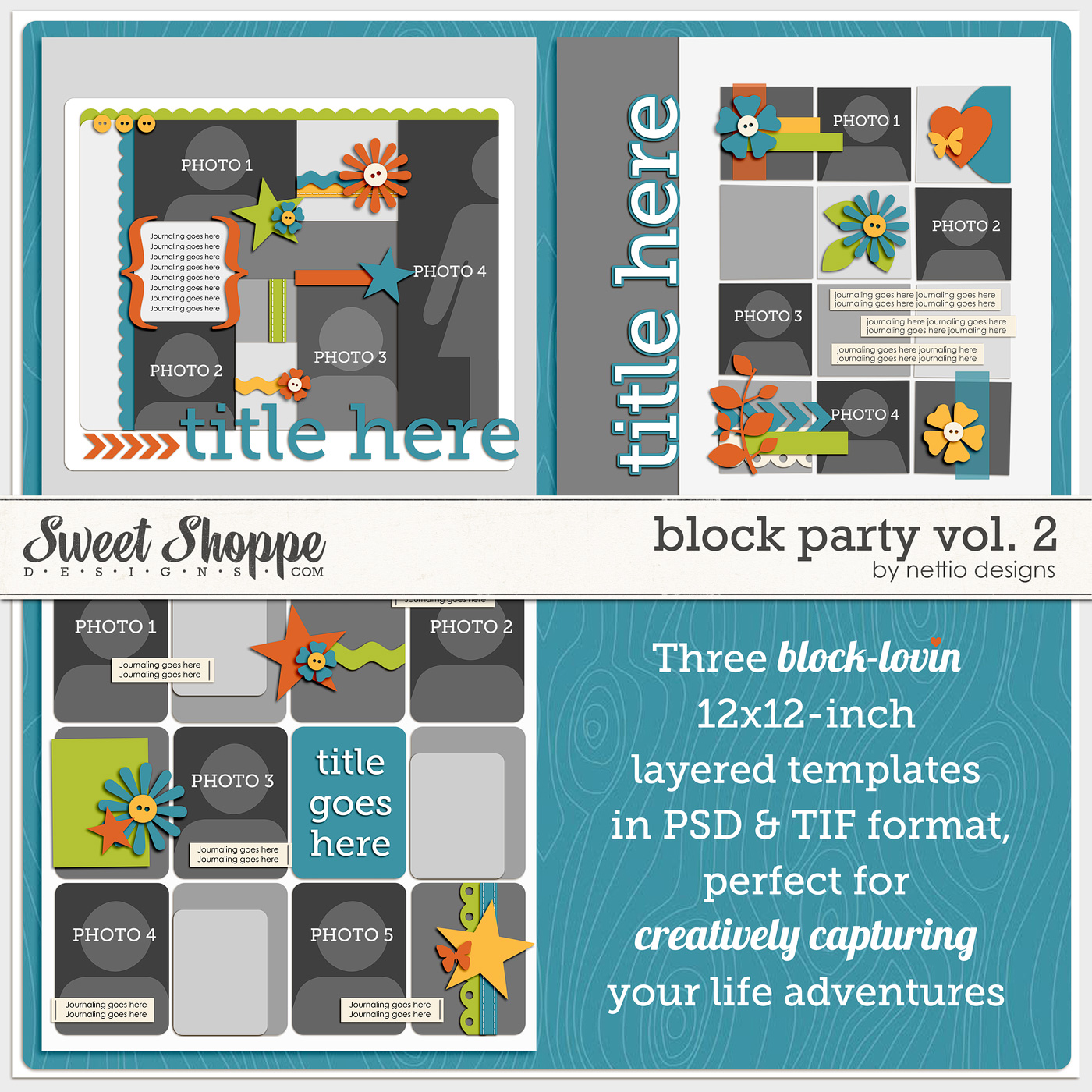
If you happened to stop by Sweet Shoppe Designs or read my new release email/blog post over the weekend, you may have seen that I am the Sweet Shoppe Designs Featured Designer for the second half of August, which means thru the end of August, you can snag my brand-new Block Party Vol. 2 Templates for FREE with any $10 purchase at Sweet Shoppe Designs. Pretty sweet deal, right?
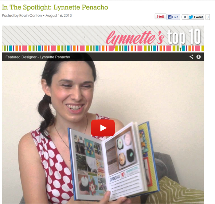
In addition to designing a new product, one of my responsibilities as the SSD Featured Designer was to put together a video featuring a top ten list about anything I wanted. Since I’m no stranger to lists, I decided to use my video as a chance to do a little in-person sneak peek of my August Faves 2013 list.
I know, me doing a Faves list? Try not to die of shock now. But I figured since I don’t usually explain much about my Faves on my Monthly Faves layouts, I thought it would be fun to share a little bit more about why my faves are well, faves.
I’m not going to lie, I was WAY nervous about recording the video. To the point that I basically left it until the very last minute I reasonably could after nervously agonizing over it for several days.
But in the end, once I got going, it was really fun…and surprisingly easy! And since I had such a good time, I thought it might be fun to share a little behind the scenes peek at the making of the video. So here ya go!
First, if you haven’t seen my Top Ten video yet, you can check it out below or hop over the Sweet Shoppe blog and check out my complete Featured Designer feature.
I shall worn, if you don’t want the Nettio Designs magic ruined, you may want to avert your eyes as you’re about to see me in all my dork-tastic glory. Don’t say I didn’t warn you, haha.
Video Fun Fact #1: The “outtakes” at the beginning and end of the video were from my pre-recording test runs, usually about 30 seconds of me saying “test test testing” to make sure the sound worked and the video was zoomed to where I wanted it to be. As you can see I got a bit more creative after awhile – and I know you’re all jealous of my awesome dance moves, haha.
Video Fun Fact #2: The main meat of the video was all done in a single take on the first try. Adam asked me if I’d written down talking points or notes or anything and nope, I didn’t, other than my August Faves list seen below. Clearly I get chatty when talking about stuff I love, haha.
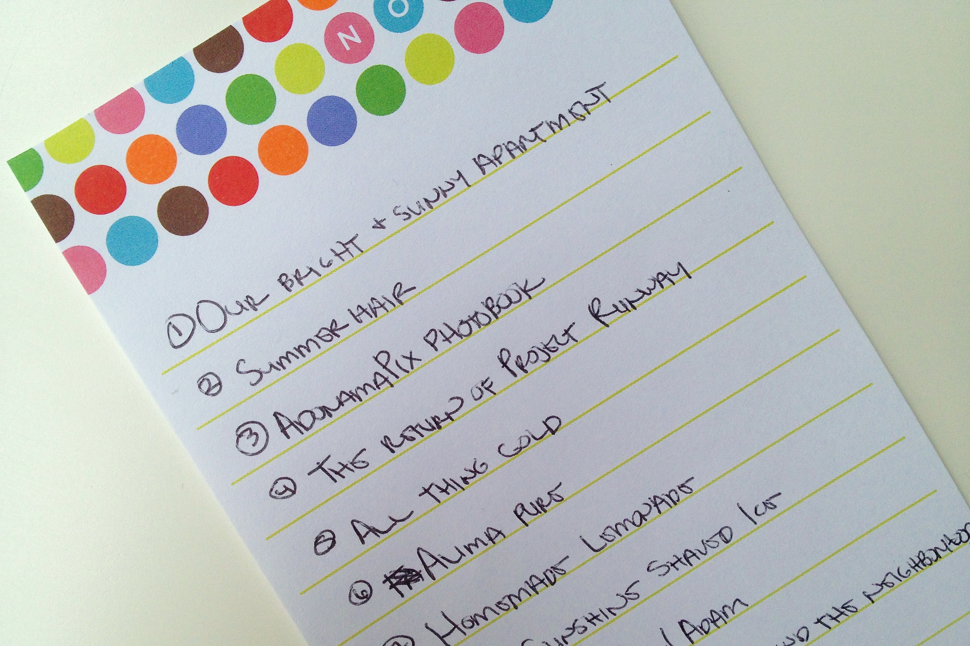
Video Fun Fact #3: This seems to be the most surprising thing to people who’ve watched the video, but yes, this is pretty much how I am in real life! To give you an idea, whenever I watch the video back, I can’t help but laugh. At myself. Which I’m pretty sure is just about the dorkiest thing you can do, ever.
Video Fun Fact #4: Weirdest moment for me while watching the video back? (Well, besides the fact that my voice sounds higher than it does in my head.) Recognizing facial expressions and hand motions as things my sisters totally do. I knew this to be true but somehow seeing it makes it that much more hilarious to me. And now it makes sense why a) we still occasionally get asked if we’re twins and/or triplets, even as adults and b) Adam says the three of us together can be a little crazy.
Video Fun Fact #5: The Technical Details
This was very much a low-budget production but for anyone curious, here’s the tools I used for creating my video:
- my iPhone 4s
- a “tripod”
- a chair borrowed from the living room
- iMovie
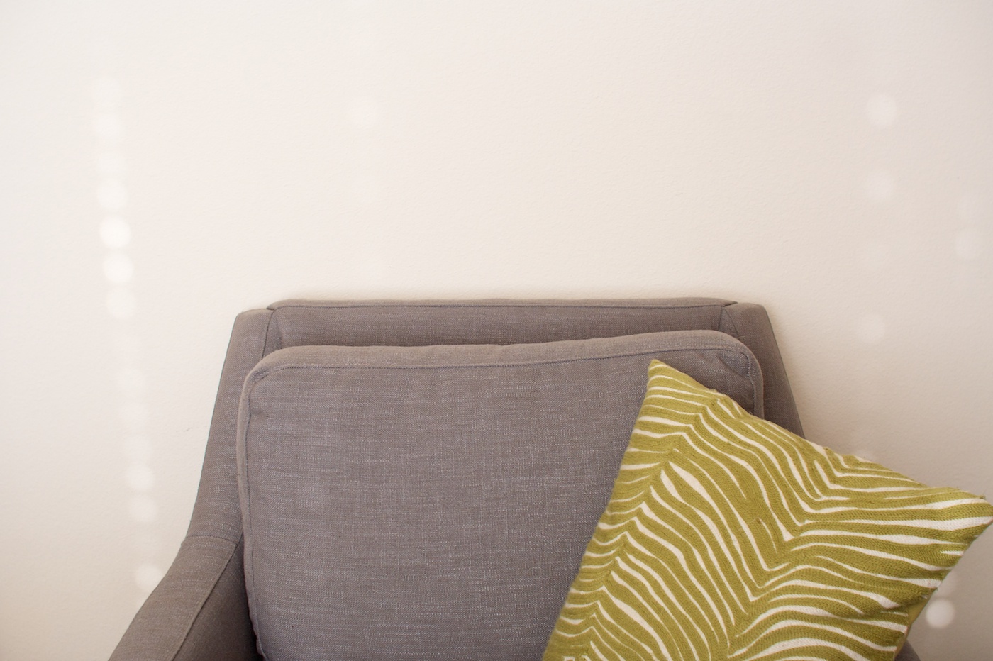
What I always find fun about photography or video, is you can pretty much make anything look good with the right crop. For example, here’s the view you see throughout the video. Just me sitting in a chair against a cream-colored wall.
But if we zoom out, here’s what the scene actually looked like:
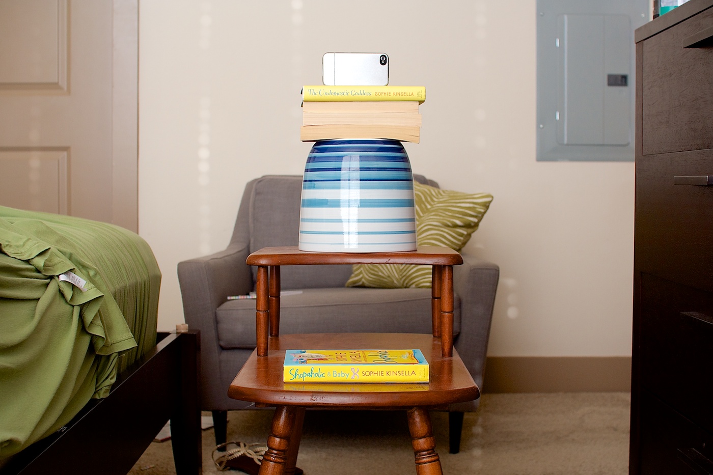
Before making my video, I went on a hunt in search of good light and a blank wall and this was the only space I found in our 1200 sq ft apartment that fit the bill at 4pm in the afternoon. So I dragged a chair from our living room into the master bedroom and squeezed it in between the bed, bathroom door and the ugly electrical grey box on our wall. You can’t tell from this picture but if you open the master bedroom door to the right of the chair, it’ll run firmly into the side of said chair.
On a side note: Can I just take a moment to say, as a designer, the grey electrical box being front and center in the master bedroom drives me crazy. Even more so when you consider on the other side of that wall is the master walk-in closet which means they could have simply put it inside the closet and avoided a hideously ugly eye sore in the room. #designfail
Here’s a bigger picture of my awesome tripod setup. Let’s ignore for a moment the fact that my camera is technically facing the wrong direction in all of these photos. Clearly I don’t have the re-enactment skills of South Beach Tow down just yet, haha.
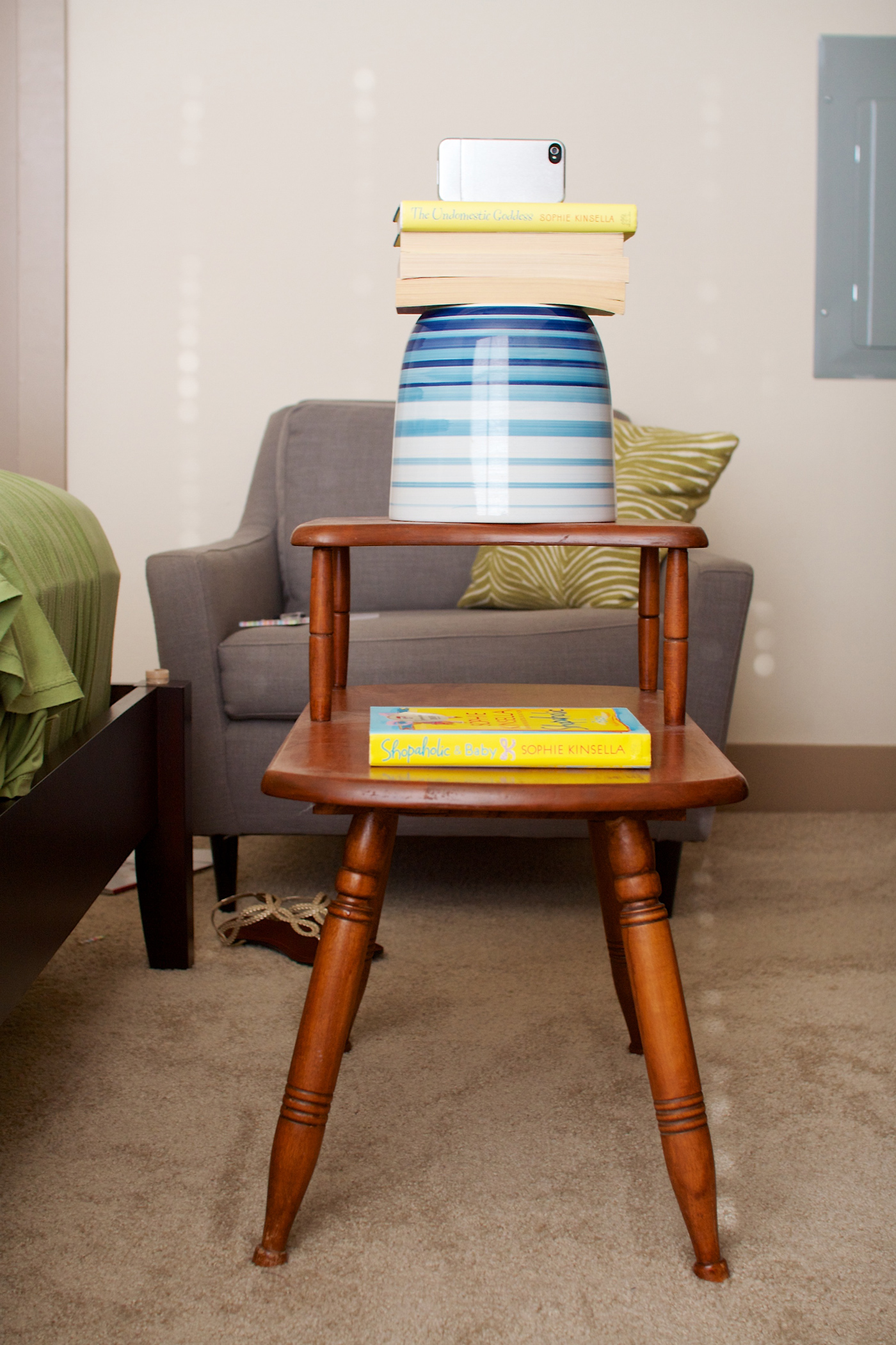
I keep trying to convince myself to splurge on a legit tripod, but really why spend the money when an old side table, an upside-down pot and some books will do? Other items I’ve used as tripods: a ladder, an ironing board and a dresser piled with books.
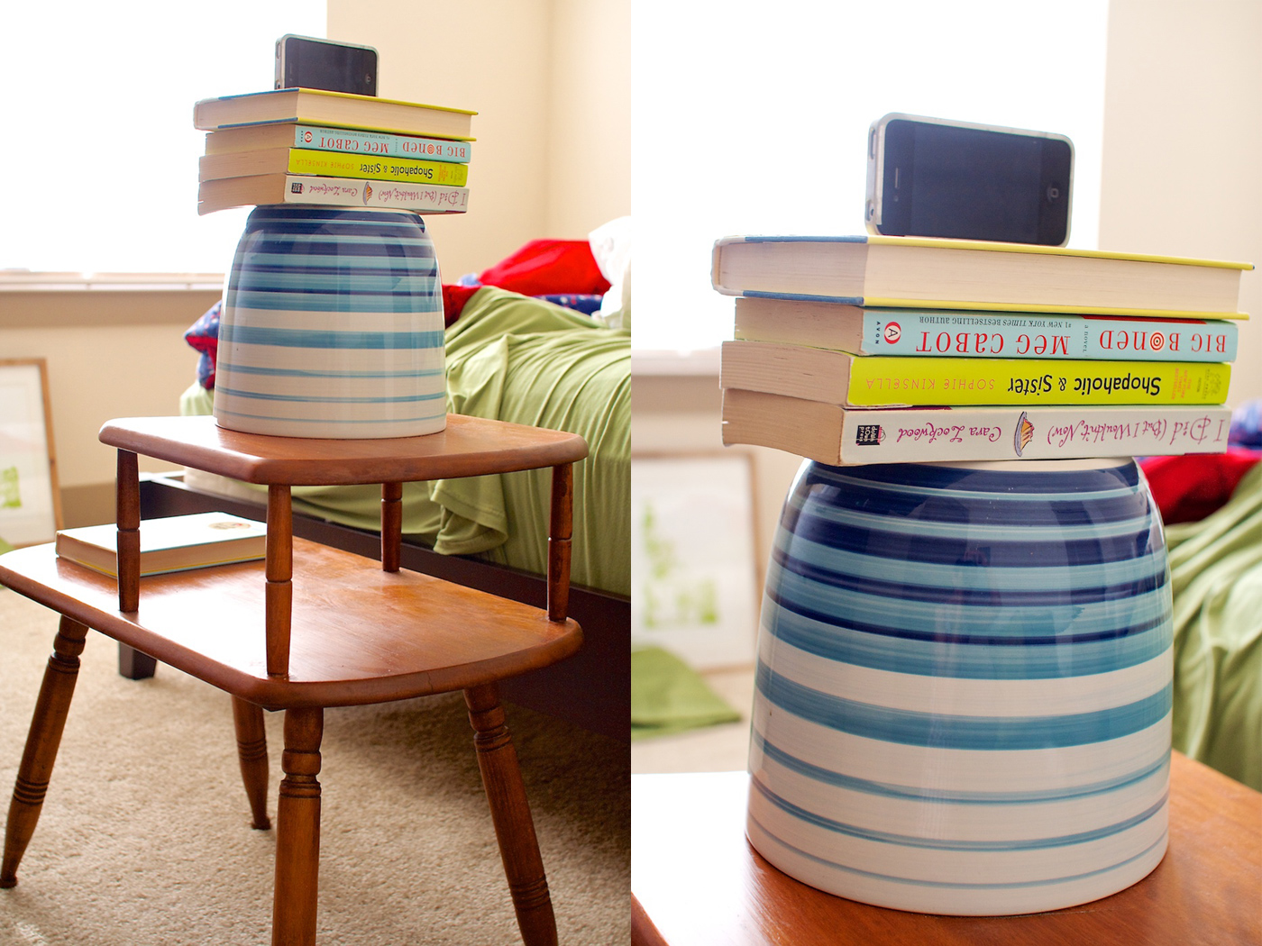
Who said the life of a digital designer wasn’t glamorous, right?
Anyway, I hope you enjoyed this little behind the scenes peek at the making of my featured designer video! Be sure to check out the rest of my Featured Designer: In the Spotlight post over at Sweet Shoppe Designs and don’t miss out on picking up my Block Party Vol. 2 Templates for free with any $10 purchase before the end of the month.
Can I take Levitra if I am taking other remedies at the same time
 Aw, sad day, the final day of the Summer Love Mini Course is upon us. If you’ve followed along with us this summer, WOOHOO, 1000 gold stars to you! I hope you’ve enjoyed our mini album adventures this summer.