From The Desk Of Nettio Designs Issue No. 4
I mentioned in From The Desk Of Nettio Designs Issue No. 2 that one of the key components of creatively capturing your life adventures is having an attitude of willingness to push outside your comfort zone and challenge your assumptions of what you think you’re capable of without worrying about failing.
We all have assumptions we make when it comes to our creative scrapbooking abilities, things like:
“I’m not a white space scrapbooker.”
“I can’t use bold colors.”
“I’m not as creative as so-and-so.”
While sometimes these creative assumptions are rooted in the reality of our skills and abilities (maybe we really don’t have the skills yet to pull off a certain technique), often times what they represent are our own insecurities: the fears & doubts we tell ourselves in order to keep us safe from failure. Because let’s face it, failing at anything, even something new, kind of sucks, right?
This is why actively challenging your own creative assumptions is so important to your growth as a creative artist. Because not only does it teach you what you actually are capable of (since almost all of us underestimate our true abilities), but with each step you take outside your comfort zone, the process gets a little bit easier.
Yes, there are going to be times when you try something outside your comfort zone and fail. That’s a given.
But that little voice telling you you can’t do something is almost always wrong. And to prove it to yourself, you have to ignore that voice and push outside your comfort zone in spite of your fear. Because that’s when the magic happens. Feel the fear and do it anyway.
At the end of last week’s From The Desk, I challenged you do exactly this by confronting one of your own creative assumptions. Scrapbook a layout in a style completely opposite of your own, try a new technique, scrap a topic you normally wouldn’t.
And I promised you I’d do the same.
Well I did and this week I want to share how it went when I challenged one of my own creative assumptions: designing simple & clean white space-focused layouts.
If you’ve ever seen one of my digital scrapbooking layouts, it probably comes as no surprise that designing simple, neutral, white space-focused layouts would be one of my creative achilles’ heels. I mean, I love me some bold colors and layered patterned papers and embellishments, so the idea of keeping a canvas mostly empty with just a few carefully placed elements more-than-a-little intimidates me.
Yet I constantly find myself drawn to these types of clean & simple layouts. I love the neutral backgrounds, the carefully placed elements and the generous use of open white space.
So I decided to design a simple & clean white-space-focused scrapbooking layout as my creative challenge this week.
Challenging My Own Creative Assumption: White-Space
Now I’m not going to lie, thinking about this challenge all week made me a bit nervous. A little knot would show up in my stomach and that little voice inside my head would come out with it’s “This isn’t what you do” and “What if you totally suck – you’re going to have to show this to people, you know!”
I’m going to tell you: this is a totally normal part of the process. Yes, it can feel a little bit uncomfortable in that moment, but I promise you it gets easier the more you do it. You just can’t give in at the first sign of fear.
In an effort to quiet my inner creative wimp, I decided to start with a small baby step by gathering inspiration. And to do that I headed to the first site I think of when I think clean & simple scrapbooking: Paislee Press. As Liz’s tagline says, I wanted to embrace my inner minimalist this week.
Quick Tip #1: This is what you want to do when you first start challenging your creative assumptions – start with a small step, a baby step if you will, that doesn’t seem so scary. Do a little research, find some inspiration. And then move on to the big stuff from there.
After spending about 30 minutes cruising through the Paislee Press blog, I narrowed my inspiration down to these four layouts from her Creative Team:
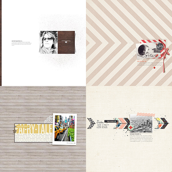
What I loved about these layouts in particular:
- Fantastic use of white space (obviously)
- Neutral yet still interesting backgrounds
- Pops of color
- Graphic use of text
- Mostly neutral/B&W photos
With these guidelines in mind, I set out to create my own clean & simple layout. And to make sure I didn’t fall back into my Sweet Shoppe layer-lovin’ ways, I decided to use a Paislee Press’ kit, The Weekender, as well. Figured I might as well help myself out a bit and use a kit designed for this minimalist style of scrapbooking, right?
Quick Tip #2: When first trying something outside your comfort zone, do whatever you can to make the process easier on yourself. Use a kit in the style you want to try, start with a template or sketch or even scrap lift someone else.
Now let me just say, most of the time as I worked this layout, I felt a bit out-of-sorts, kind of like I was trying to walk with my right shoe on my left foot. I felt out of my element and the design process didn’t feel as natural or easy for me as it usually does. Again, this is totally normal.
But I kept at it, adding elements, moving papers and reminding myself that in the wise words of Young House Love, “The middle makes no sense.” Even when I had doubts about how it was going to turn out, I continued to push forward until I had eventually had a completed layout I was happy with – a clean & simple white space layout with a Nettio-twist…
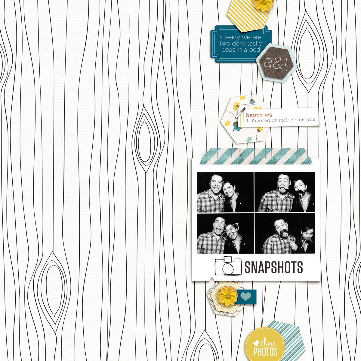
Neutral photo? Check.
Pops of color? Check.
Graphic use of text? Check.
Neutral yet interesting background? Check.
Fantastic use of white space? I like to think so.
And the truth is, I’m really happy with it. It’s me but more clean up and refined. Does this mean I’m suddenly going to become a white-space lovin’ scrapbooker all the time? Yeah, not so much. In fact there’s a major part of me that is itching to increase the size of the photo and add on a few more buttons and flowers to the layout, haha.
But the finished layout is not the point of challenging your assumptions anyway.
Quick Tip #3: It’s not about the end result, it’s about the journey of getting there. So slow down, don’t stress and just take this challenge one step at a time.
It’s all about the process of pushing yourself to try something you didn’t think you were capable of because it forces you to slow down, look at your creative process with fresh eyes and question what you’re doing and more importantly, why you’re doing those things as you design your page.
Because that can offer you some very valuable insight into your regular creative process.
As I was designing this layout, I was forced to question my creative instincts the entire time. To ask myself things like:
- Do the vertical shapes look balanced? Is there a good flow throughout the layout?
- Do I have enough variety in my colors & scale of patterns? Is it too much?
- Does it need more embellishments or is it good as it is?
All of these things are things I think about when I normally scrapbook a layout, but usually they’re so ingrained in my process and style that I don’t consciously think about them. But because I was scrapbooking in a style completely opposite from what I normally do, my brain had to stop and really question each design decision I made.
And as a result, I learned some valuable lessons:
- I love having my photos be a focal point of my layouts, which is probably why I love using single photos or a single repeating photo as opposed to many different smaller photos.
- Neutral backgrounds with pops of color & pattern can be fun – I should really try this more often!
- I like having space to tell my story – and I didn’t feel like there was enough room for that with this design.
- I heart geometric shapes.
- White space isn’t nearly as scary as it seemed like it would be – you just have to find a way to balance out all that space.
These are all insights I can apply to my regular style of scrapbooking. Are any of them mind-blowingly earth-shattering on their own? Not really.
But each time you step outside your comfort zone, you gain more and more insight into your own creative process and what you truly love. And that is ultimately how you create a style that is 100% all your own.
This is exactly why I push myself to do challenges like this and why I highly encourage you to as well.
Now It’s Your Turn
If you didn’t challenge your own creative assumption last week, I really hope you’ll take some time to do it this week. And if you did complete the challenge, WOOHOO, you get a gold star! I’d love for you to share all about what you did and how it went in the comments section of this post.
I’ll be back next week with a special Nettio Designs’ 2nd Anniversary edition of From The Desk where I’ll be sharing a behind-the-scenes peek at some lessons I learned in my second year as a crafty business owner. See you then!
This post is Issue No. 4 of my From The Desk of Nettio Designs weekly email series. Want to get in on the action? Sign up for Nettio Designs emails here.

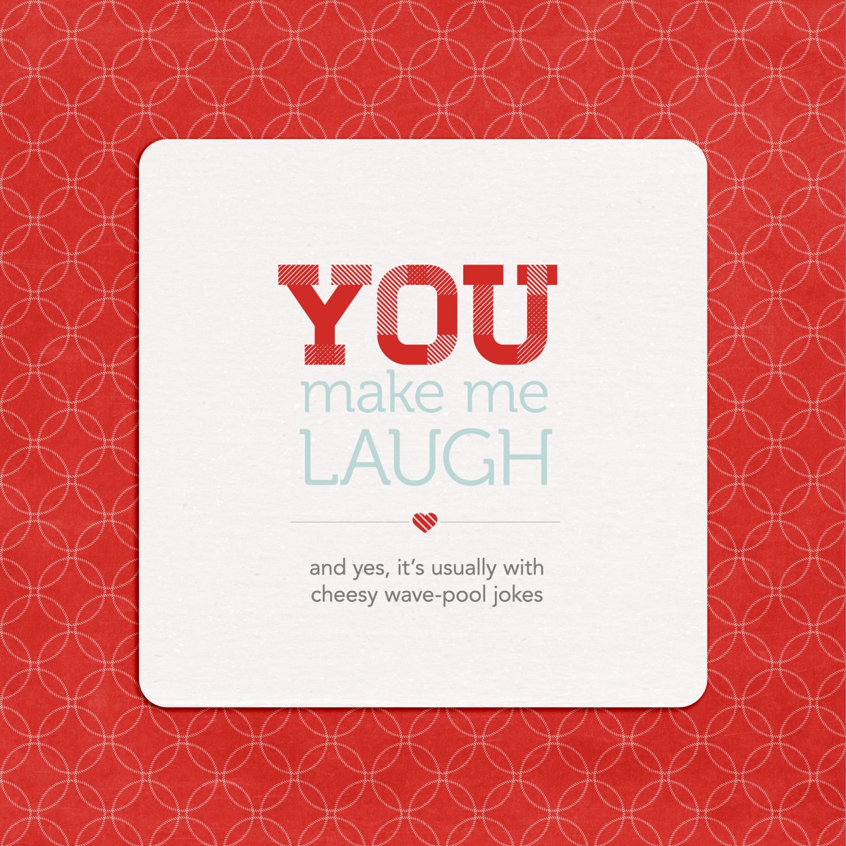
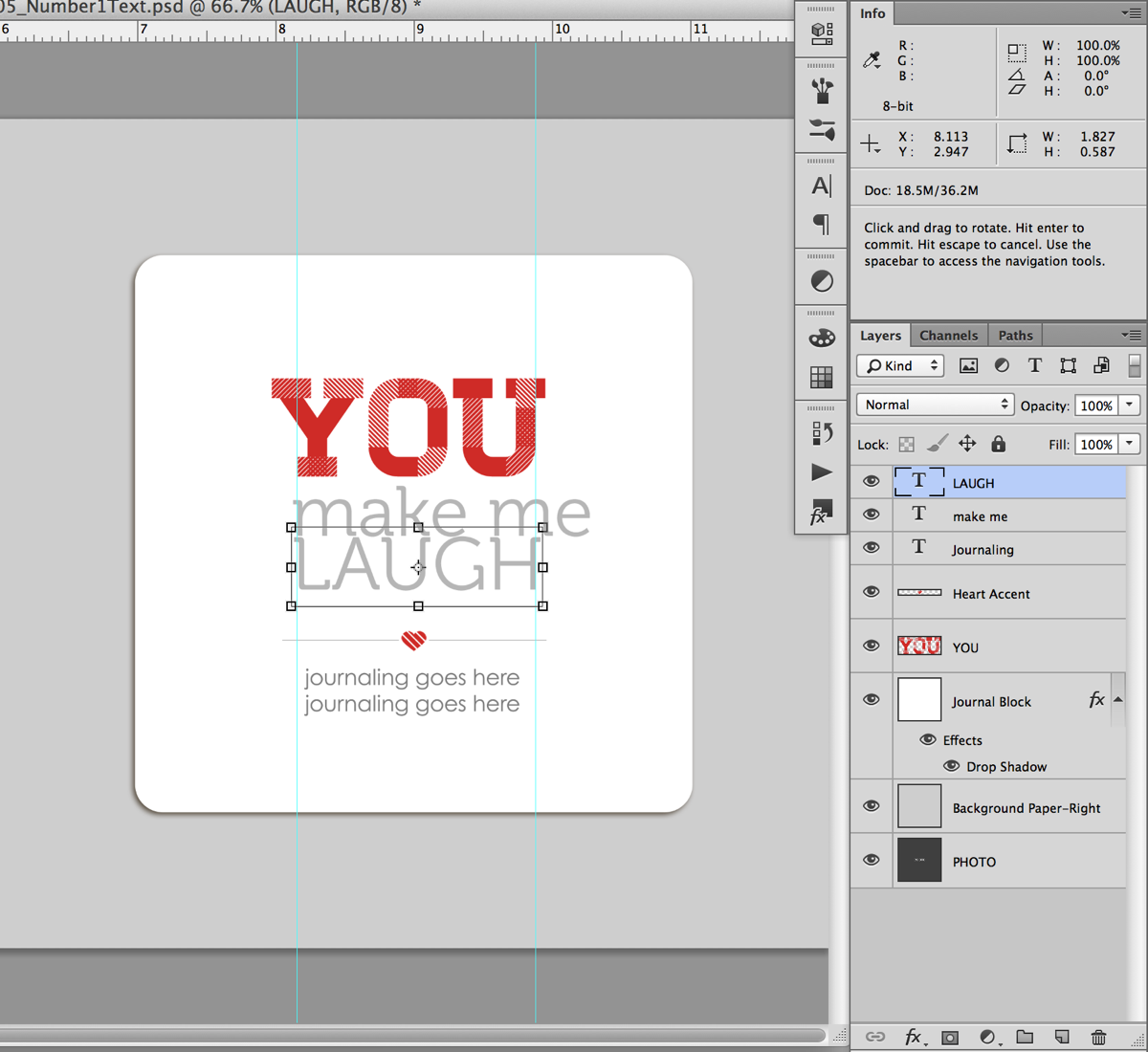
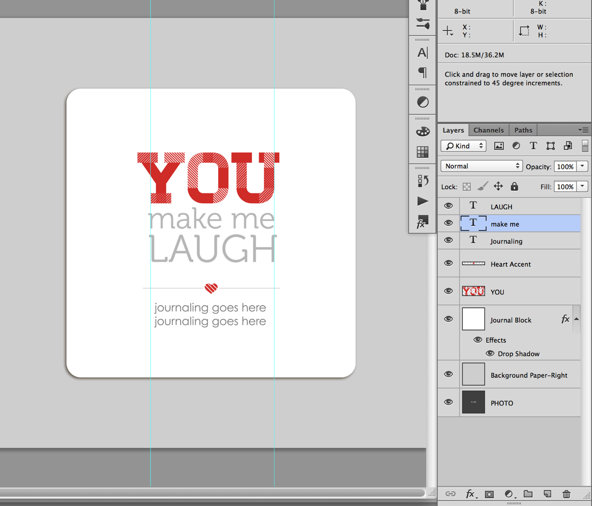
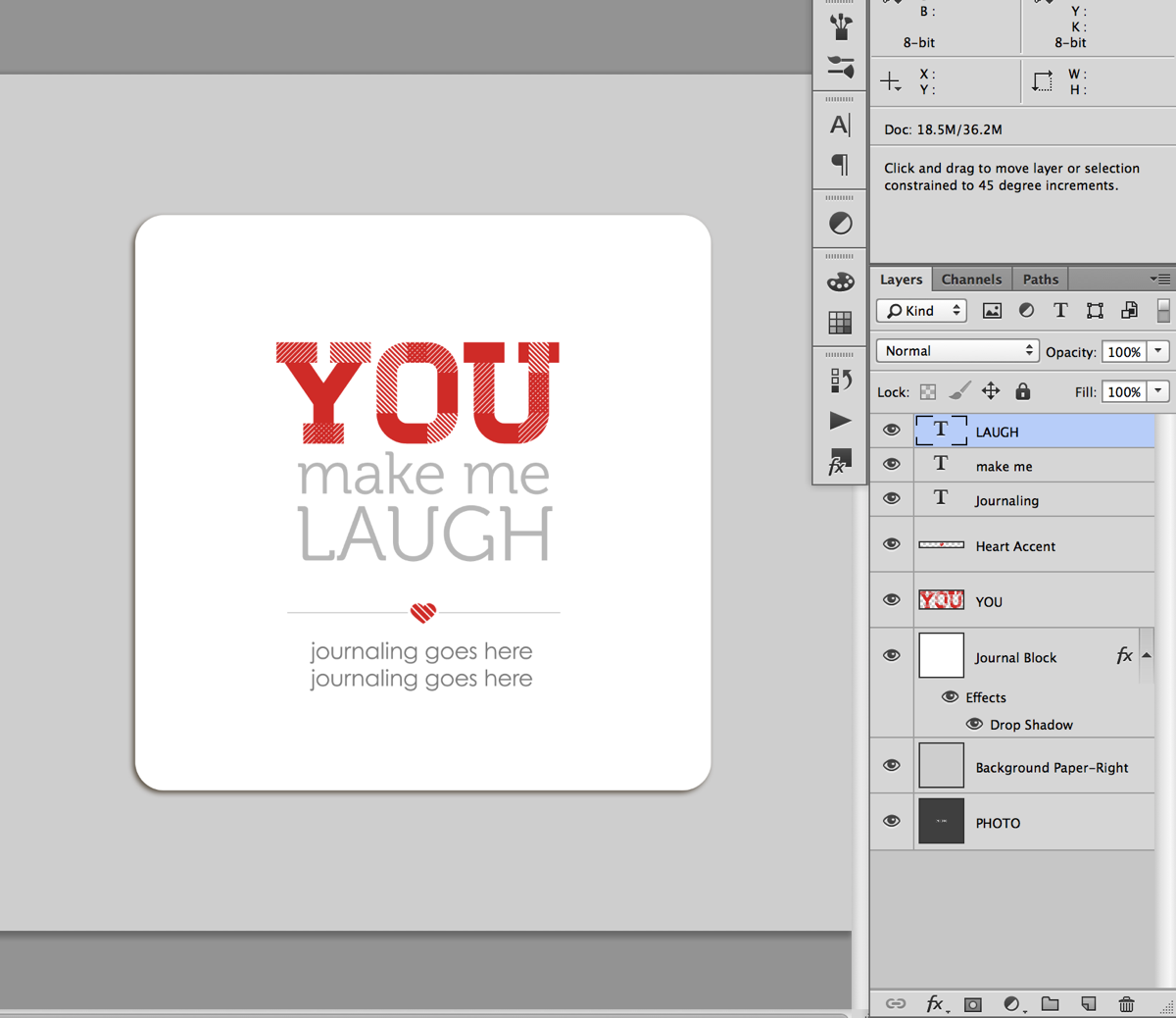
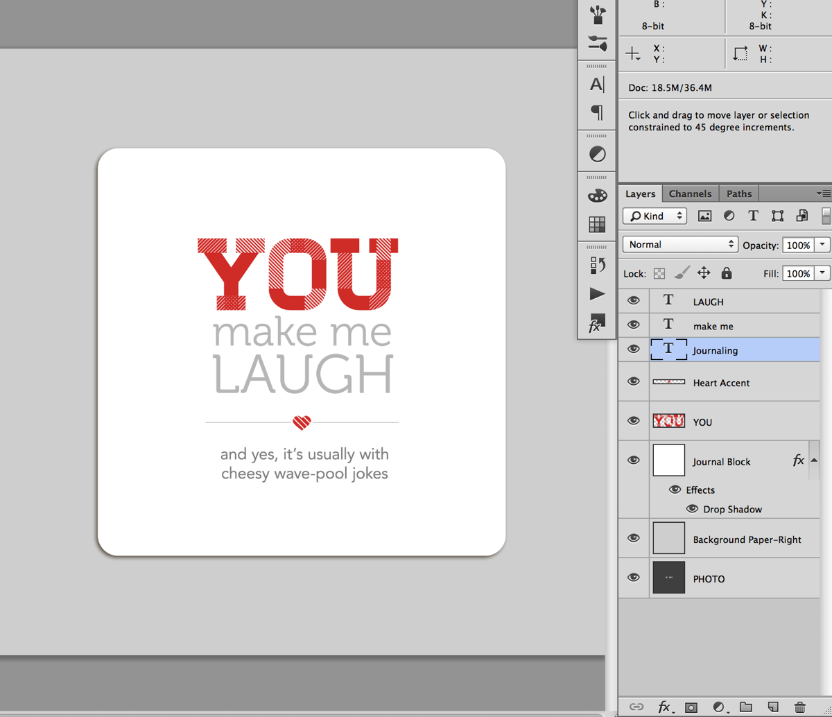
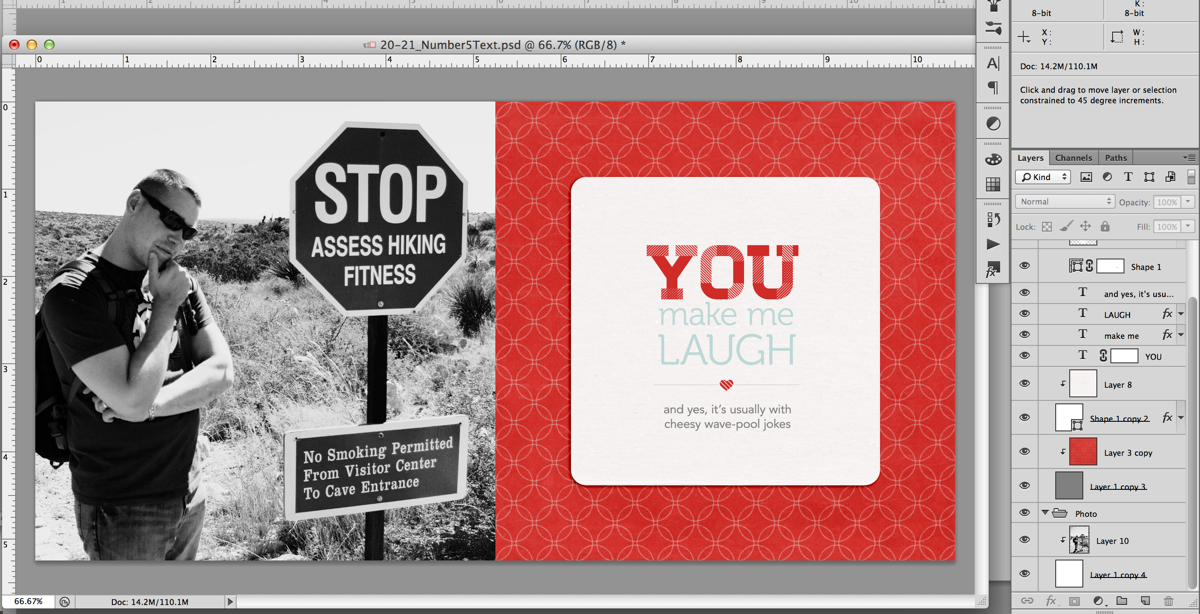
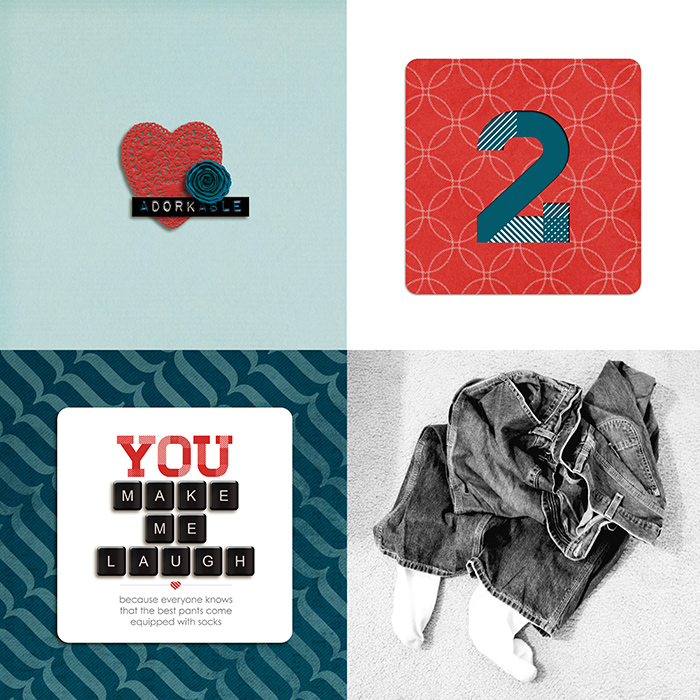

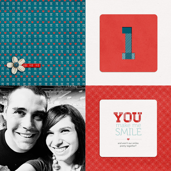
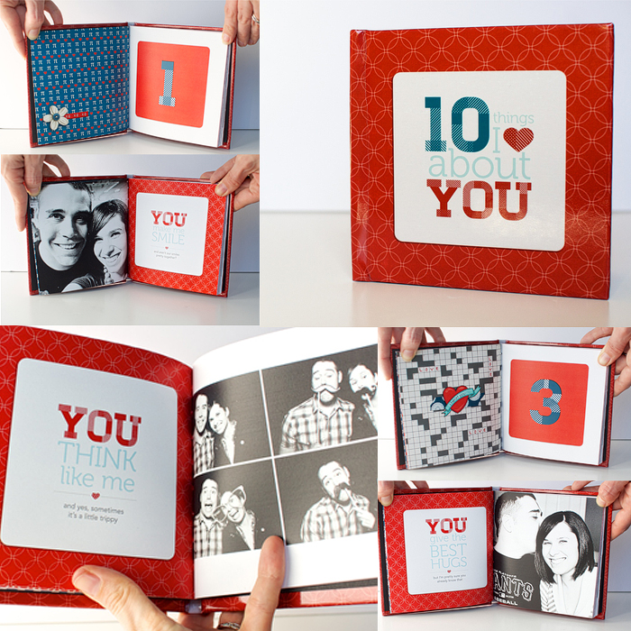
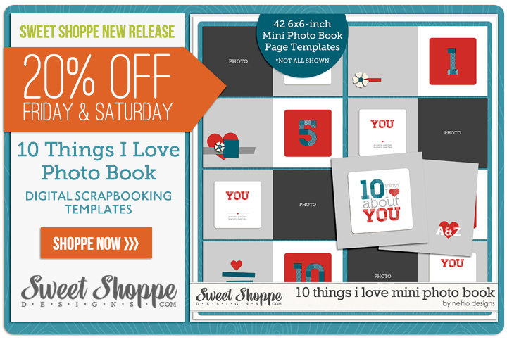
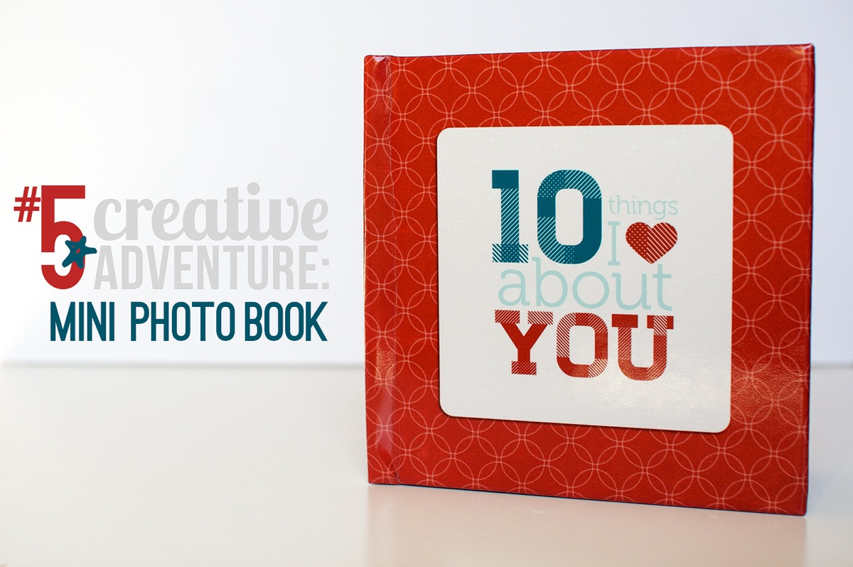
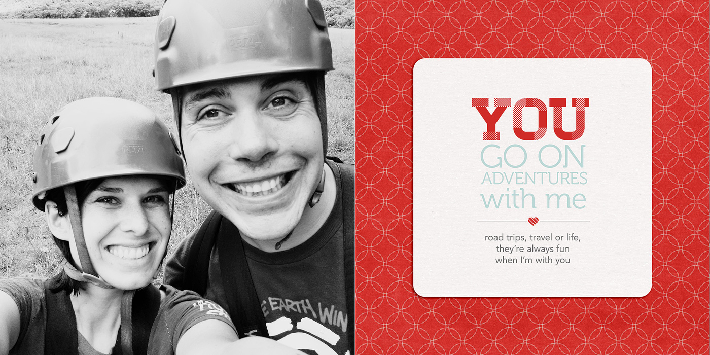
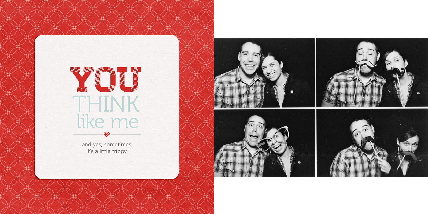
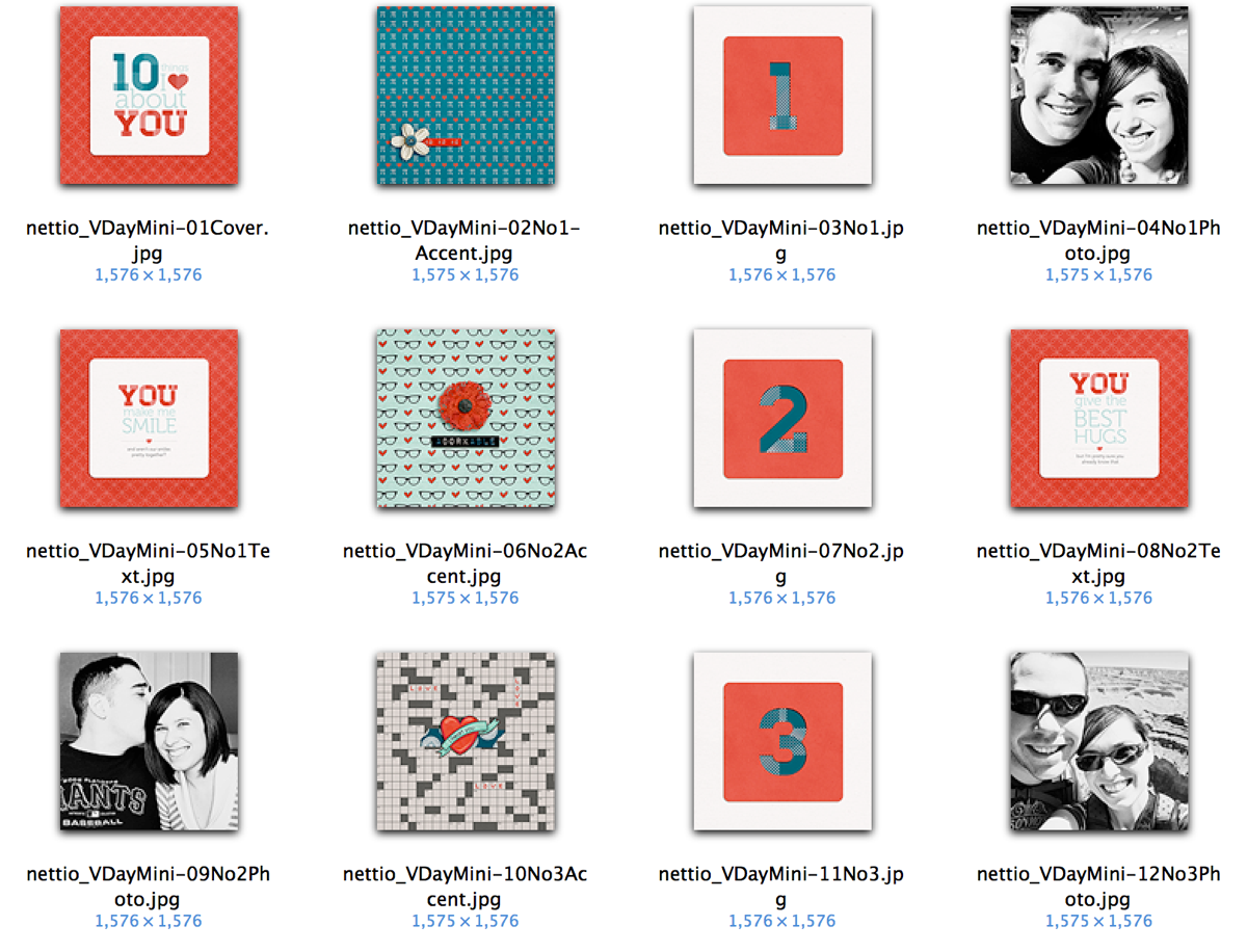
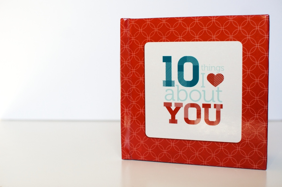
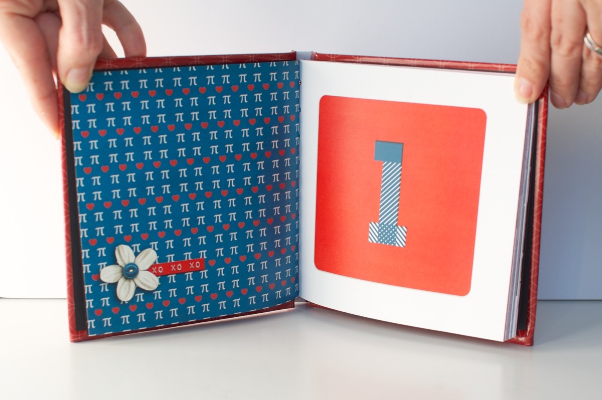
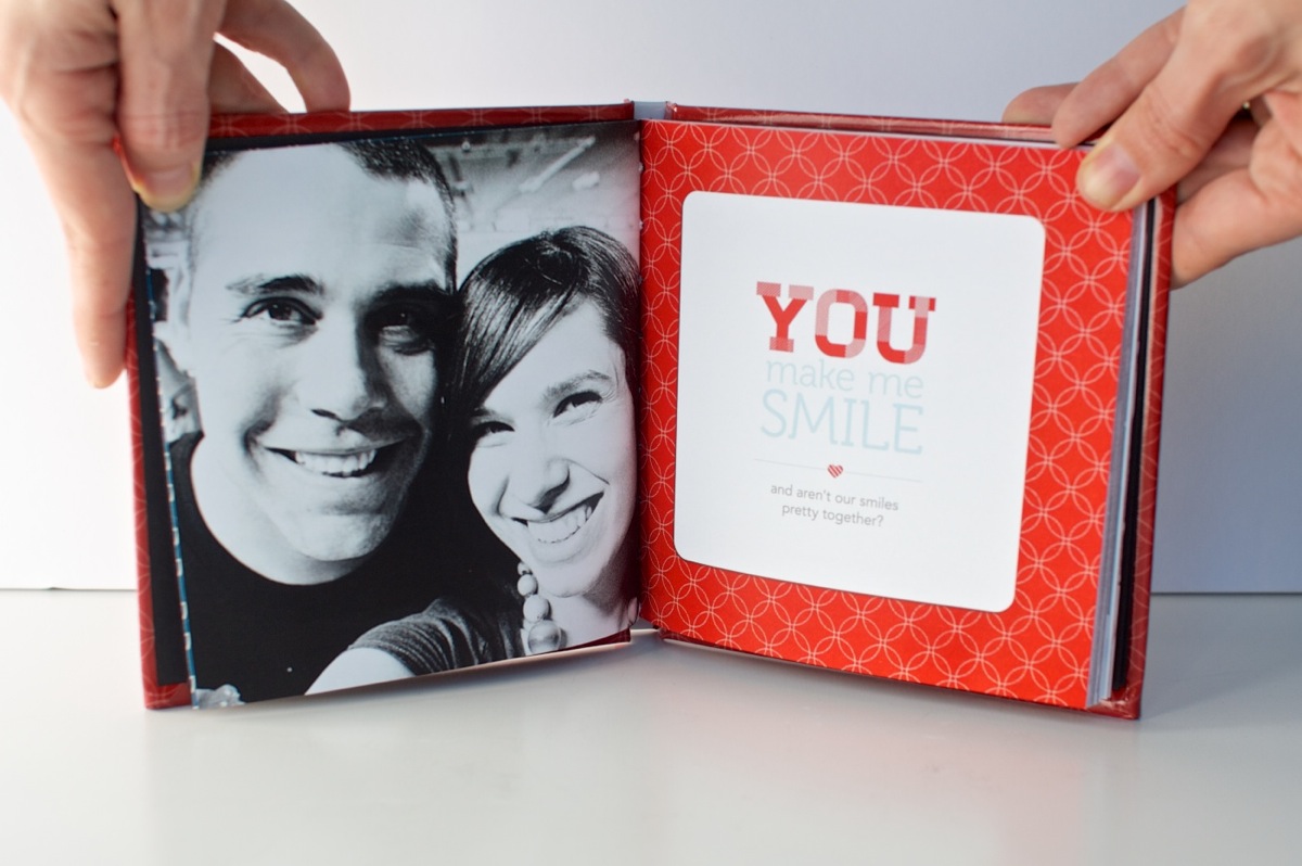
 I’ve known since the beginning of this 30 Creative Adventures project that one of the projects I wanted to do was another photo book. I had designed one once before for my Week In the Life album in 2011 and I thought it’d be a fun challenge to do another one.