 Since I shared a little bit about one of my favorite scrapbooking projects in my last 5th Scrap-i-versary Celebration post, I thought today would be a good time to share some of my scrapbooking hits and misses over the past 5 years. Think of it as an Oscar Best & Worst Dressed list but with less designer duds and more scrapbooky goodness. And no Joan Rivers.
HIT: Mixing it up design-wise
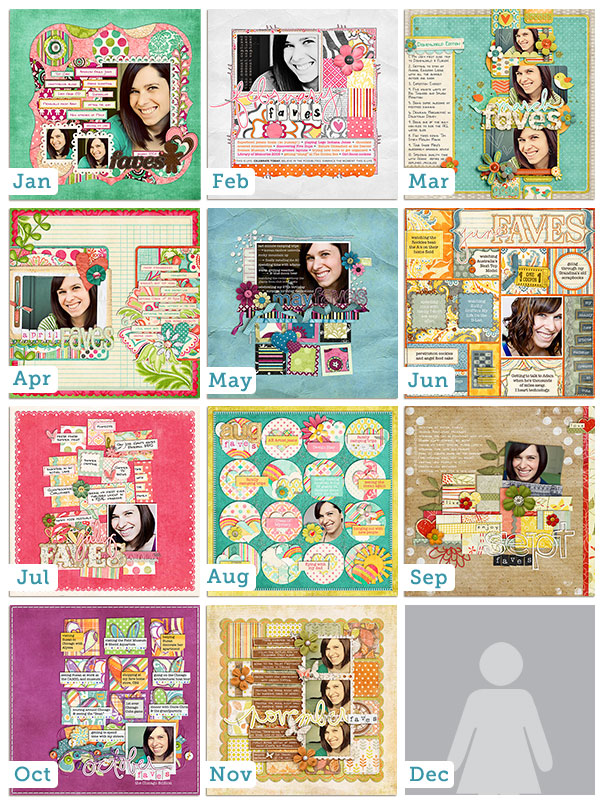
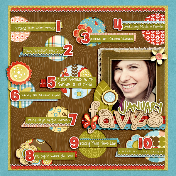
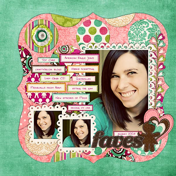
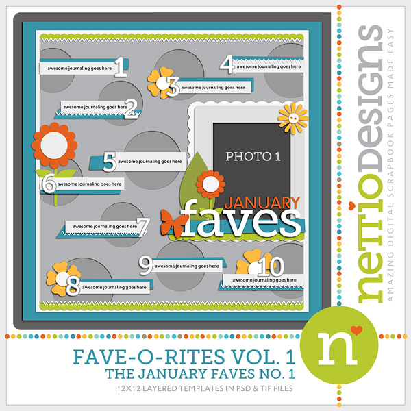
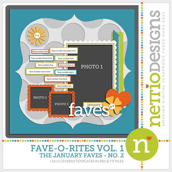
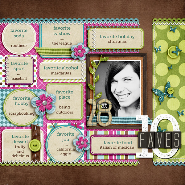
When I look through my folders of digi layouts of yore, one thing that really strikes me from my early days is the amount of design variety in my layouts. Back then not only did I scrap both 12×12 and 8.5×11 layouts but I regularly switched between a more paper scrapbooking style and a more graphic magazine style.
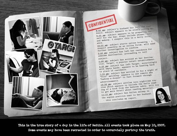
Over the years, I’ve moved away from this in favor of more paper-centric CT friendly layouts and while I don’t really regret it, I do miss stepping outside my regular style comfort zone more often. It’s good for my creativity and it pushes me to see things in a different light. Plus I love seeing the variety of sizes and styles in my albums. This is one relic from my early scrap years that I would definitely like to revisit more today.
HIT: Taking time to document life’s little moments…and quirks
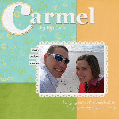
Whenever I look through my layouts, pages like this always make me smile a big goofy grin…
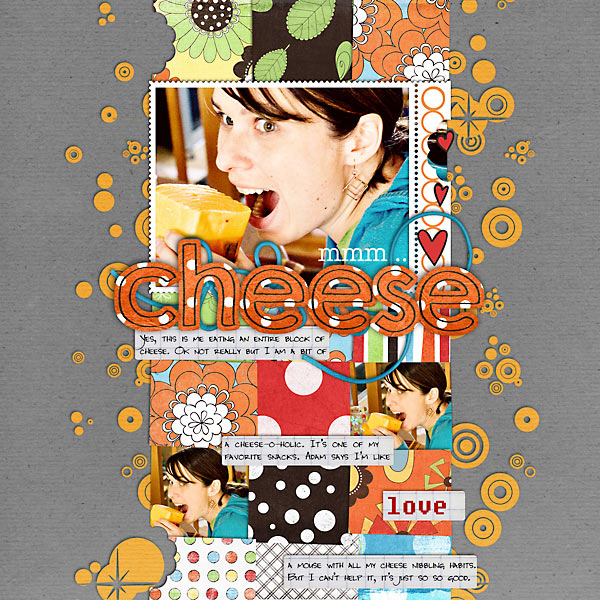
…because they are 100% me. And yes, that is me pretending to eat an entire block of cheese. Haha.
One thing I am forever grateful for when it comes to my scrapbooking is that I never got caught up into the whole idea of being, well, “caught up.” No having to scrap every photo in chronological order for this girl. I am all about keeping things low stress.
Perhaps this is a benefit of being a child-free scrapper and not having a constant reminder of just how fast my children are growing up, but I love having the freedom to scrap what I love most. I scrap the stories that matter most to me when they matter to me and I think there’s something incredibly magical about that. I LOVE looking back and seeing all these little bits and pieces of my life that I would have otherwise forgotten. My albums are essentially journals of my life during the past five years and I think that is oh-so-cool.
MISS: Not focusing enough on the story…or leaving it off completely
There’s one common thread throughout all my least favorite pages from the last five years and it’s this simple fact: they don’t contain enough story. Instead some form of wordy bits/brushwork/word art has been placed to add meaning to a page that really has no meaning. In some cases it works but as evidenced by this page, not always…
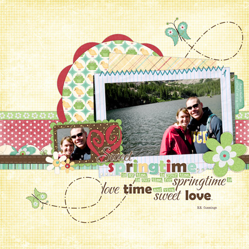
What makes this page especially cringe-worthy for me is the simple fact that that photo? Not taken in Spring. In fact the photo itself has absolutely nothing to do with spring.
That photo was taken in August right before Adam deployed to Iraq. It was a last little hurrah just days before Adam deployed and was also our first trip to Rocky Mountain National Park (which is an AMAZING place by the way). We had gotten up early all eager-beaver style to take a hike up to this lake with the plan being to arrive there just in time to have lunch. We’d even packed a lunch and everything! But apparently we were either in much better shape than we thought or the hike was just that easy because we managed to arrive at our destination lake by 10am. Oops. So instead we had a snack, hung out for a little bit and went back to our campsite for lunch.It ended up being a really nice, relaxing day.
But you won’t find that story above on this page. Why? Because I clearly felt it was more important to include some sweet springtime wordart that had nothing to do with the story. And that’s definitely a scrapbooking FAIL in my book.
HIT: Dare-ing to step outside the box
Aww, the Digi Dares. For three years I was a member of the The Digi Dares, a challenge blog where we posted weekly challenges designed to push you out of your creative zone both design and topic-wise.
Let me just say this, joining the Digi Dares was one of the best scrapbooking decisions I’ve ever made during my five years of scrapbooking.
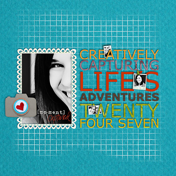
Not only did the Dares keep me scrapping on a regular basis but they forced me to think creatively, try new-to-me styles and scrap stories I wouldn’t have otherwise. When I look back at my three years of Digi Dare layouts, there is something oh-so-magical about them. Some of my most favorite layouts ever are from my Darer days.
When I stepped down from the Digi Dare team in December 2010, I knew it was the right decision. With Adam being deployed, my scrap mojo was at an all time low and well, after three years, I had gotten a bit burnt out. But there are definitely days when I really miss the Digi Dare experience. There’s no denying that the Dares helped me become the scrapbooker I am today. My time as a Darer is definitely a part of my scrapbooking journey I will forever look fondly on.
MISS: Angles for the sake of angles or otherwise known as getting too caught up in the it-trend of the moment
Aww, yes, the golden age of geometry…I remember it well…
Back when I first started digital scrapbooking, the “in” design style at the time was all about angles. Take a single photo, angle it a few degrees, slap a few elements on it and call it good. I remember one very popular scrapper at the time talking about how she would purposely angle an element by 12 degrees to the left on one side of her page and then balance it by adding that same angle going to the right to an element on the opposite side of the page. These were amazing times, folks.
Coming from a much more linear design background (it doesn’t get much more linear than newspaper design, haha), angles were SO not my thing. I can appreciate a well placed slightly tilted element but angles in an attempt to make things interesting with no real purpose makes me twitchy.
For the first two years of my scrapping career, I tried to make it work. Really I did.
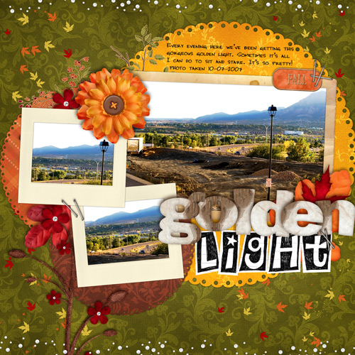
And I hated those pages. They were so.not.me.
The moment I realized all my favorite scrapbookers were ones who had a much more clean, symmetrical, linear style was the moment I started to find my own style and really create consistently pages I loved. Realizing that it was OK to focus on what I loved rather than what was in at that moment was a huge lightbulb moment for me for sure.
Even now when I look back at my layouts from those early days, I still love the layouts that fit this linear esthetic. Layouts like this awesome gem…
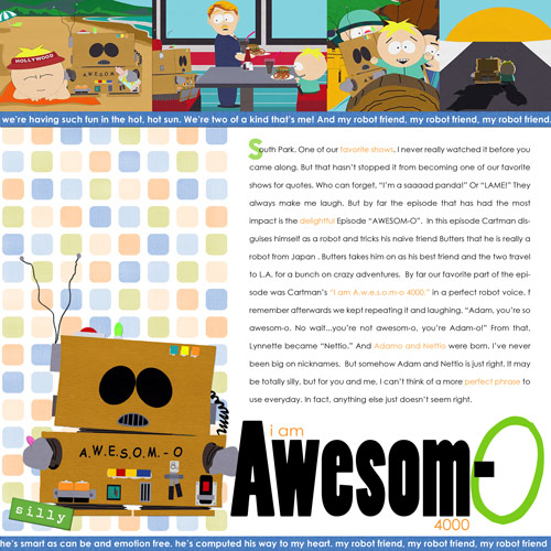
Which really, how can you not love a layout featuring Awesom-O? The fact that it tells the story of how the name Nettio was born is just icing on the cake.
But pages like the Golden Light layout above make my eyes bug out. I just want to reach out and deangle-fy everything. Kinda like needing to adjust a picture frame that’s just sliiiightly not level. Haha.
HIT: Getting my game face on
About a month after I scrapped my first digi layout, I signed up to compete in my first digital scrapbooking competition. I’ll admit, had I seen the list of scrapbookers who were competing before I signed up, I would have totally wimped out. But I decided to push forward and eventually submitted this layout (which was like my 4th layout…ever!) as my entry…
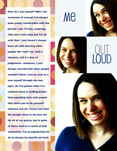
What’s more surprising than the fact that I still actually like this layout today, is the fact that I managed to make it through the first cut of the competition and into the top 100.
As a newbie scrapper, this was HUGE to me because there were definitely much more well-known scrappers who didn’t make it through. I ended up being eliminated after the 2nd round but even so, the boost of confidence I received from competing made me so glad I’d stepped outside of my comfort zone to give it a shot.
Over the last five years, I’ve competed in numerous digiscrapping competitions: Battle of the Creative Teams, Queen of the Crop, Stand Up and Scrap, just to name a few. And hey, I even managed to win one one time…
But as cliché as it sounds, these competitions are really not just about winning for me.
Every time I participate in a scrapbooking competition, I learn something new about my scrapbooking, my design style and myself.
Much like the Digi Dares, scrapbooking competitions push me creatively and I always come away with some of my most favorite layouts because I’ve pushed myself to do something beyond what I normally do.
But perhaps more importantly, they force me to ask this simple question:
“What can I do to be different? What can I do to stand out?”
I’ve always been a big believer in the idea that if you’re only doing what everyone else is doing, you’re just another face in the crowd. This is true in competitions, CTs, life, you name it.
You have to be willing to push yourself and try new and different things if you ever want to grow – as both a scrapbooker and in life. I have no doubt that every scrapbook competition I’ve participated in has helped me become the scrapbooker I am today.
MISS: Allowing product to overshadow the story
When I showed this layout to Adam earlier this week, his comment was, “It looks like you used a baby kit for a non-baby layout.” Which let’s face it, isexactly what I did.
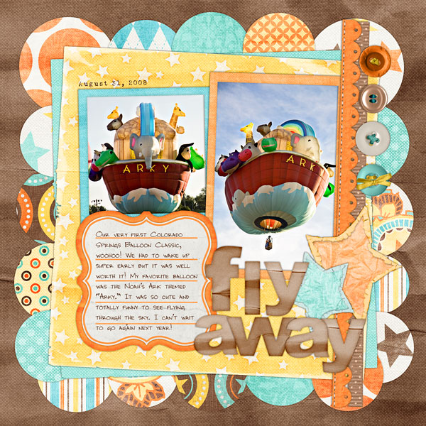
As any scrapbooker who’s ever been on a Creative Team knows, there are times when you have to do your best to rock a kit that maybe doesn’t fit 100% with with who you are or how you scrap.
Being a child-free scrapbooker I think I run into this more than most and normally I love the challenge of how can I make this baby/pregnancy/toddler-esque kit work for me?
In the case of this specific layout, it just didn’t work. To be fair, it’s not the kit’s fault. It’s a cute kit! But I tried to fight the spirit of the kit and well, lost, haha.
But the real loser here is the story. The photo and journaling are completely overshadowed by pattern and color on this page. (Not to mention that this design completely violates my no angles-for-the-sake of angles policy.)
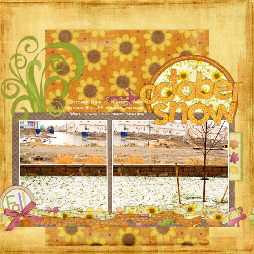
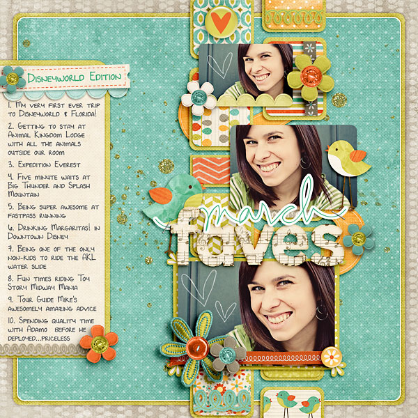
When I started scrapbooking in 2006, I don’t think I realized just how intertwined scrapbooking and my life as an Army wife would become. Scrapbooking has definitely become an outlet for me to deal with all the stress that comes with being a military wife – multiple deployments, moves, etc. It’s allowed me to keep perspective in the tough times and to remind myself to cherish the moments we have together when they are here. Because as every military spouse knows, there are times when those moments are few and far between. If you were to look through my albums today, I’d like to think you’d get a pretty realistic view of what it’s like to be a military wife in the 21st century. My struggles with careers, deployments, etc are all in there. When I look back at some of these layouts, I’ll admit, it’s tough. Sometimes I have momentary reservations where I think “holy crap, did I really put that out there?” But at the same time I embrace them for what they are. Because those emotions, those feelings, those moments – they are 100% REAL. They’re the story of a twenty-something Army wife trying to make sense of life and love through the art she loves. Having an outlet for dealing with a lot of these emotions has been so so beneficial for me. They represent scrap therapy at it’s best. Obviously no hits or misses list would be complete without including one of my dream CTs so pardon me while I gush a little, haha. Like a lot of digital scrapbookers, becoming a Sweet Shoppe SugarBabe was a dream creative team of mine so back in October 2007, when I received my email from Robin saying I’d been selected, I was beyond ecstatic. So many amazingly talented scrapbookers have been Babes at some point that it still boggles my mind that I am lucky enough to be one of them. I am truly thankful that Robin and the team took a chance on me back in the day and chose me represent them and their designs. To say being a Babe has influenced my design style in ways I never expected would be an understatement. But being a Babe is so much more than just amazing scrapbooking products. I feel so blessed to be able to be part of one of the truly sweetest teams out there. The Sweet Shoppe community is amazing and I have no doubt that one of the reasons I’ve made it through 5 years of scrapbooking has to do with all of the amazing people I have met thanks to my sweet digi home. Being a Babe is truly the sweetest digi gig out there. As I’m sure I’ve mentioned before, unlike a lot of digital scrapbookers, I didn’t come from a paper scrapbooking background. I knew very little about scrapbooking when I started which was both good and bad. Good in that I wasn’t bogged down by any preconceived notions (like being “caught up”). Bad in that I really think too much about how a paper scrapbooking layout was put together. Which occasionally made for some interesting design choices like this gem… Holy floating journaling, Batman! I honestly have NO idea what I was thinking when the placed journaling on top of those papers and arrow. It makes absolutely no sense. Did I hope the journaling would magically fade into the background? Even more perplexing is this would have been an easy fix. Add a little journaling block or journaling strip tucked in behind the papers with the arrow on top and voila! No more homeless journaling. But nope, I chose to leave it as is in all it’s floating glory. What makes this page even more cringe-worthy for me is this was the very first page I did as a Sweet Shoppe SugarBabe. Looking at it now makes me seriously question how I managed to ever get on the team way back when. Perhaps my reasoning for this design miss should be not guilty based on reason of temporary insanity due to newfound Babe-ness? LOL! Over the last five years, every one of these hits and misses have played a part in developing a style that I love. A style that is true to my love of scrapping small moments with clean, linear designs. Paper-centric scrapbooking with a bold, modern twist. My style has evolved in ways I never expected since I started scrapbooking in April 2006 and I can only imagine what the next five years will bring. But seeing the difference between this layout and the first layouts I created makes me so proud of how far I’ve come over the last five years. It’s been an amazing adventure and I am so excited to see what happens next. So what about you? What are your scrapbooking hits and misses? Have any cringe-worthy moments you’d like to get off your chest? Any layouts you’re especially proud of? Share them with me in the comments!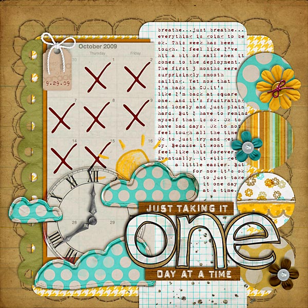
HIT: Becoming a Sweet Shoppe SugarBabe
MISS: Not thinking like a paper scrapbooker
HIT: Finding a style to call my own
Now It’s Your Turn
